
Visualization is not a very clearly defined field. There are many variations, ways of doing it, and ideas around it. That is valuable, because it keeps the field moving and brings in fresh ideas. But it also brings with it people who like using visualization's tools and talk about visualization, but what they are doing is something else. We need to start calling these things what they are: a cargo cult of visualization.
John Grimwade describes how his students are getting confused: My students keep bringing stunning examples they have found on the Internet. But they are rarely able to tell me what the graphic shows.
Say what you want about visualization, but its central idea is clearly the representation of data. Not being able to recognize what the data even is, and only being drawn into the image because it looks cool is a problem.
Cargo Cults
The term cargo cult describes a kind of religion or cult that is based on imitating behavior with the goal of material gain (the "cargo"). It started with relatively primitive societies observing the behavior of more technologically advanced ones, in particular during World War II on Pacific islands. After American or Japanese airbases had brought in fascinating new technology and material wealth (relative to what they had seen before), some cultures started building makeshift airports with towers and radios from wood, and mimicked the behavior of the airport personnel they had seen. The idea was that the behavior was some kind of cult that attracted the cargo, so imitating it would bring it back.
Richard Feynman coined the term cargo cult science, by which he meant work that is using scientific methods but that still fails to produce science. This even includes scientists, when they are not honest about their biases and let them taint their work: just going through the motions without understanding the actual issues is not enough.
Today, the term is used broadly for misappropriation and use of techniques without understanding what they are for. Just because they were successfully applied in one area does not mean they will also work in another (e.g., periodic systems).
Chart Fun
Common chart types are so widely understood that they are now used for jokes. The website GraphJam is a prime example, there are flickr groups that "visualize" song lyrics, FlowingData's Data Underload, etc.
One of my students also has this rather clever Van Diagram t-shirt.
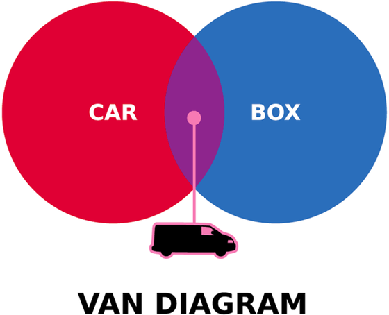
There's nothing wrong with these, but they need to be understood as using the tools of a field for something that is not its goal. That may be obvious when the topic is van diagrams, but in other cases it's a bit less clear.
Mountain Top Stock Charts
Perhaps the most obvious recent example are Michael Najjar's mountain top stock market charts (image at the top of this article). Najjar uses photographs of mountain tops and shapes them so that they represent stock market data. He argues that the virtual data mountains of the stock market charts are sublimated in the materiality of the Argentinean mountainscape.
This is, quite simply, nonsense. There is a place for art, and there is a place for visualization. Mixing the two is difficult and dangerous, and often leads to things that are neither. Throwing around art jargon doesn't make this any better.
The discussion about the sublime and how it might apply to visualization is outside the scope of this little article. I wrote a paper discussing this issue a while ago in case you are interested, and I am planning a posting or two about this topic here.
But the point is that the mountaintop images entirely obscure the data. This is not visualization. It may be art, but it's not some kind of hybrid of visualization and art. Just because data was involved at some point does not make this a visualization. The problem here is not that this was done, but that it claims to be something that it is not (unlike the poetry "visualization", for example).
Data Flow
Not to be mistaken with FlowingData, these two books collect infographics and visualizations. They are presented simply as images, without context such as what the data or task even were.
It's telling that even Andrew Vande Moere, who does not tend to be overly critical, felt that the case for the insightfulness of the presented work was overstated.
This is the type of presentation you can also find a lot on the web though, where people post pretty pictures from visualizations without any interest in the data or the actual expressiveness of the work. And unsurprisingly, most of them are pure junk.
The Ford Fiasco
Ford went all out to produce some pretty visuals for their Ford Fusion. They organized a kind of contest where they had six teams compete against each other. The tasks are mostly nonsensical, and seem to have been picked simply to generate data to transform into some of the worst three-dimensional bar charts I have ever seen (plus, of course, gauges and a kind of heatmap).

Visualization has become the tool to create pretty (or at least colorful) visuals that attract attention. There's about as much visualization in these images as in an actor depicting a scientist in a tv commercial.
Why We Need to Fight This
While the visualization community is still largely refusing to draw any lines, we are letting others blur the distinctions. To many people, visualization already is primarily about being pretty and colorful, and the data representation is only an afterthought. At the same time, people like the Data Flow editors are talking about insights when they are not even providing any kind of context for the images in their books.
Visualization needs to be more clearly defined, not less. It needs more limits, not more sprawling inclusion of all and everything. We need to start drawing lines in the sand or it will be too late.
Comments (25)
Posting new comments was disabled in 2020.