What do pies, waffles, and donuts have in common? They're charts, or rather metaphors for popular charts. Why do we need to name charts after food? And what can we learn from this for getting the idea of visualization across more effectively?
The heatmap is another example. As I learned recently, people like to call treemaps "heatmaps." And perhaps they're not even that far off, given that most of these are based on entirely flat data, anyway. And a heatmap is easy to understand: it's a map. It shows where it's hot. We're looking for the hot spots. What's hard about that? A treemap on the other hand looks nothing like a tree, and when it's actually showing a hierarchy, it gets confusing.
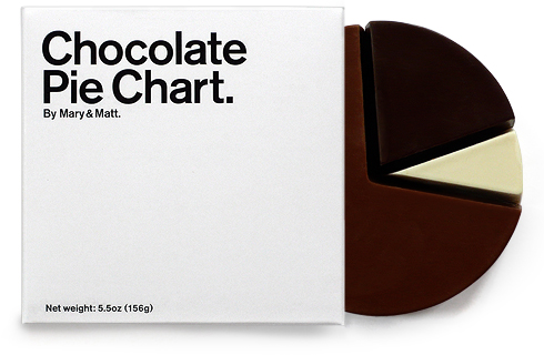
Some images have recently been making the rounds that revert the pie metaphor back to actual food. There's Pie I have eaten/Pie I have not eaten, and then there's Mary & Matt's Chocolate Pie Chart (which, confusingly, is not actually a pie). In addition to providing distraction for a few seconds, these images made me think about the food connection. Why charts and food? Is it because of the (rather obvious) pie chart?
Metaphors for charts go back all the way to Nightingale's mid-1800s Coxcomb Plot - using a flower metaphor. The coxcomb was meant to communicate data to Queen Victoria of England, who Nightingale would have put to sleep with her tables of numbers. The chart not only showed the data impressively, it was also pretty to look at (prettier than a bar chart).
Metaphors are important. They make abstract concepts easier to grasp and remember, and we often use them without being aware of them (did you notice my metaphorical use of the word "grasp" a moment ago?).
Metaphors are also dangerous. They can become overly cute and we can get lost in making a visualization fit a particular metaphor. I don't know how many flower visualizations I have seen, from a single flower to whole blooming meadows showing everything from survey data to live conversations in newsgroups. Few (if any) of them were actually useful.
But to capture people's imagination, we need to be a bit more metaphoric. Perhaps we should rename the scatterplot into the salt'n'pepper plot. Or call parallel coordinates the spaghetti plot. That might even lead to new ideas: what would a sushi plot look like? Or a cupcake plot? What about the new tea leaf plot?
Visualization is not doing a good job marketing itself, and the names of visualization techniques certainly don't help. While forcing a particular metaphor won't help us, perhaps we should invest a bit of thought into calling our next method something a bit more marketable than "parallel coordinates." Can we make visualization sound interesting and fun without being stupid?
Comments (2)
Posting new comments was disabled in 2020.