This book from 1945 contains a very interesting mix of different charts made by the ISOTYPE Institute, some classic and some quite unusual. As a book about labor and unemployment, it also makes extensive use of Gerd Arntz’s famous unemployed man icon.
Michael Young and Theodor Prager’s There’s Work for All is part of a series called *The New Democracy *that contains at least ten books. Like many books containing ISOTYPE charts from that time, the text makes no reference to the charts. They exist alongside, almost like a separate book within the book.
Many ISOTYPE charts are structured like bar charts, where you can read the chart by either counting the symbols or looking at the lengths the of rows as if they were bars. In a research paper a few years ago, my collaborators and I showed that people are quite good at reading charts like that and no worse than reading bar charts (but they remember much more about what they saw).
This book has an interesting mix of bar-like charts and more unusual ones. There are two types of bar-like charts here, ones that simply show numbers on their own and ones that provide some context (mostly population). The unusual ones all show distributions of some kind.
Bar-Like Charts
The straight bar charts include the following three, showing the production of wheat vs. pig-iron, the volume of ships built (I also showed this in my video about ISOTYPE and unit charts), and employment vs. unemployment in a number of industries.


The latter shows some context (unemployed vs. employed), but it’s not normalized to some general population number like some of the other charts. It also shows one of the issues with ISOTYPE: if the symbols you’re trying to compare aren’t the same width, you can’t compare them to each other by length. Only the bars of the same color can be read that way.
Bar-Like Context Charts
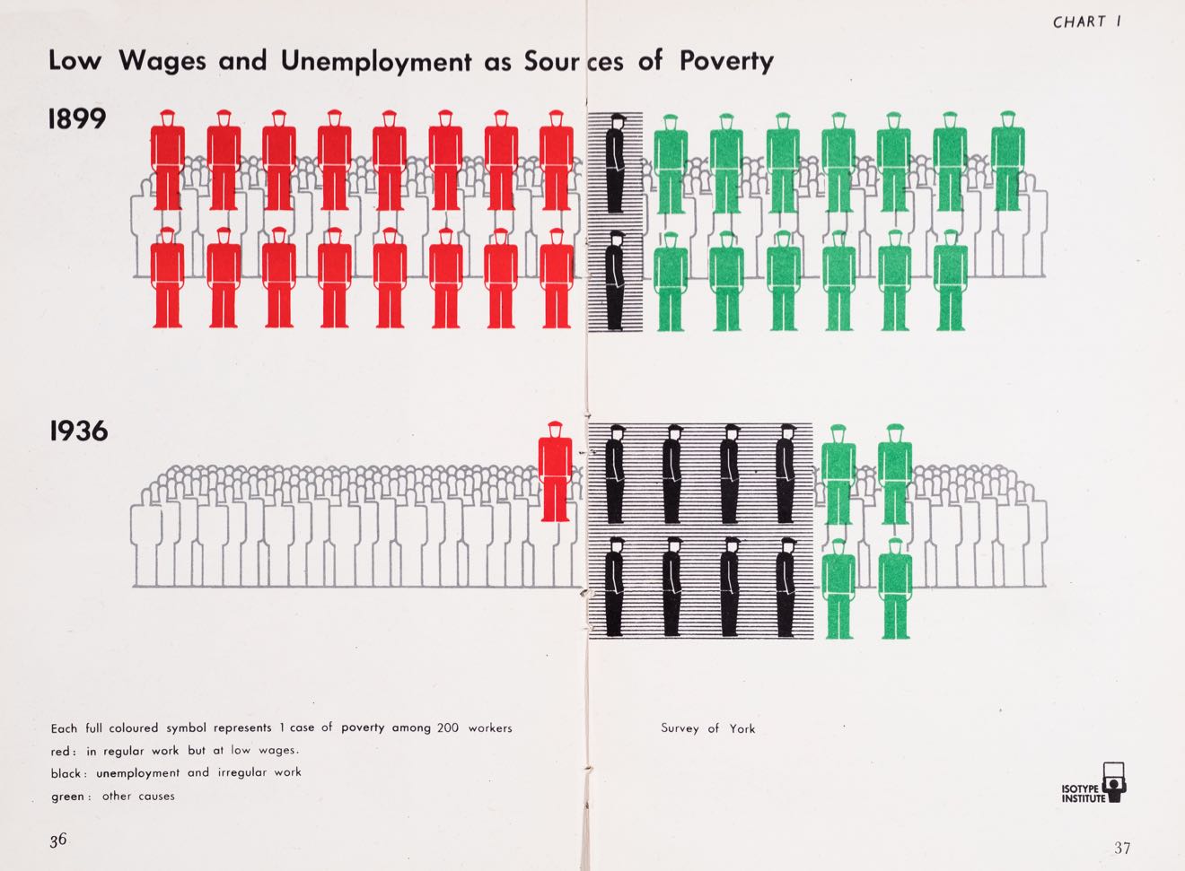
Then there are the bar-like charts with context. The first chart shows unemployment and underemployment for two years, 1899 and 1936, though oddly with a baseline of 200 people. This was presumably done to avoid having to show half a person for low wages in 1936.
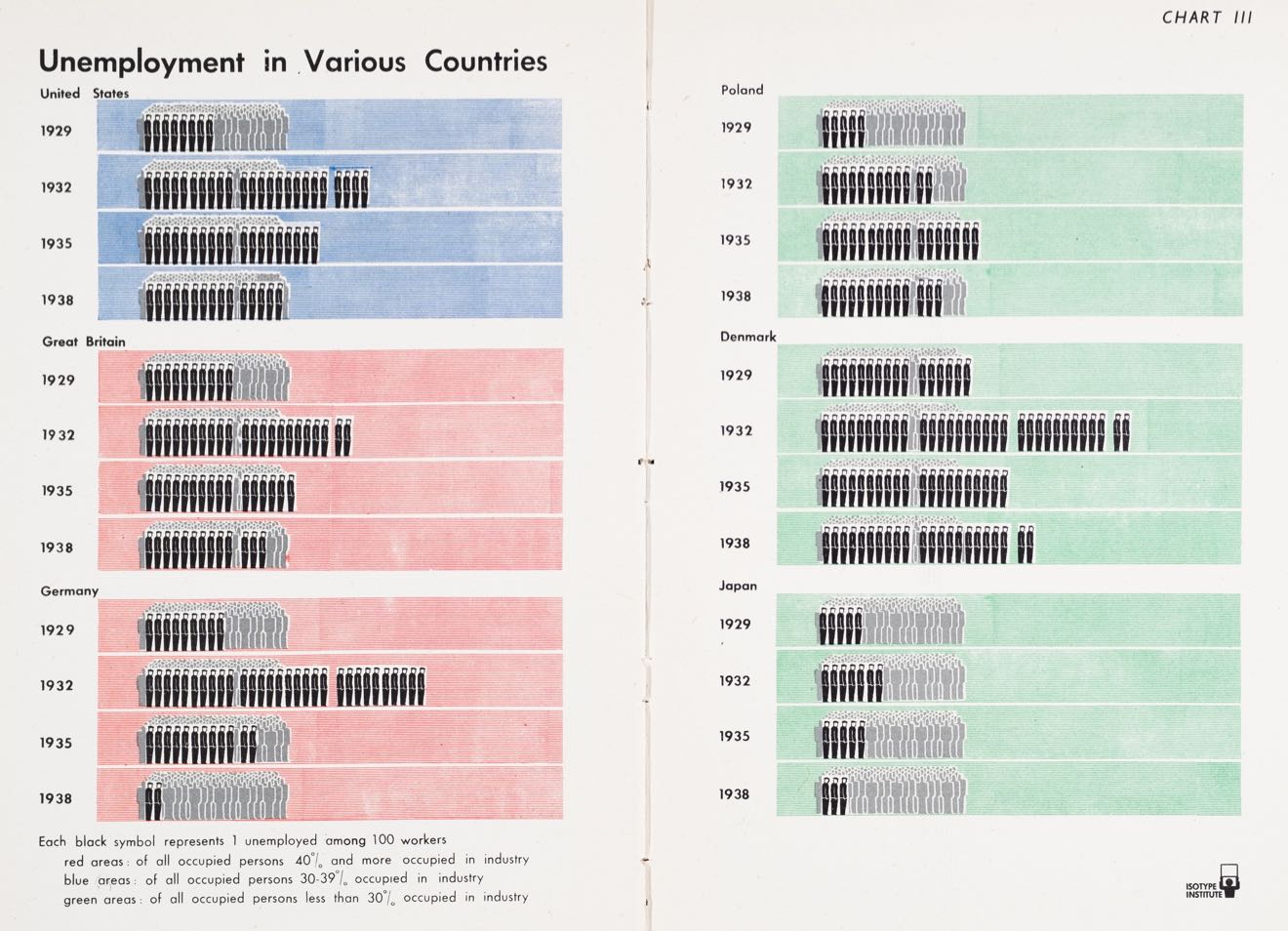
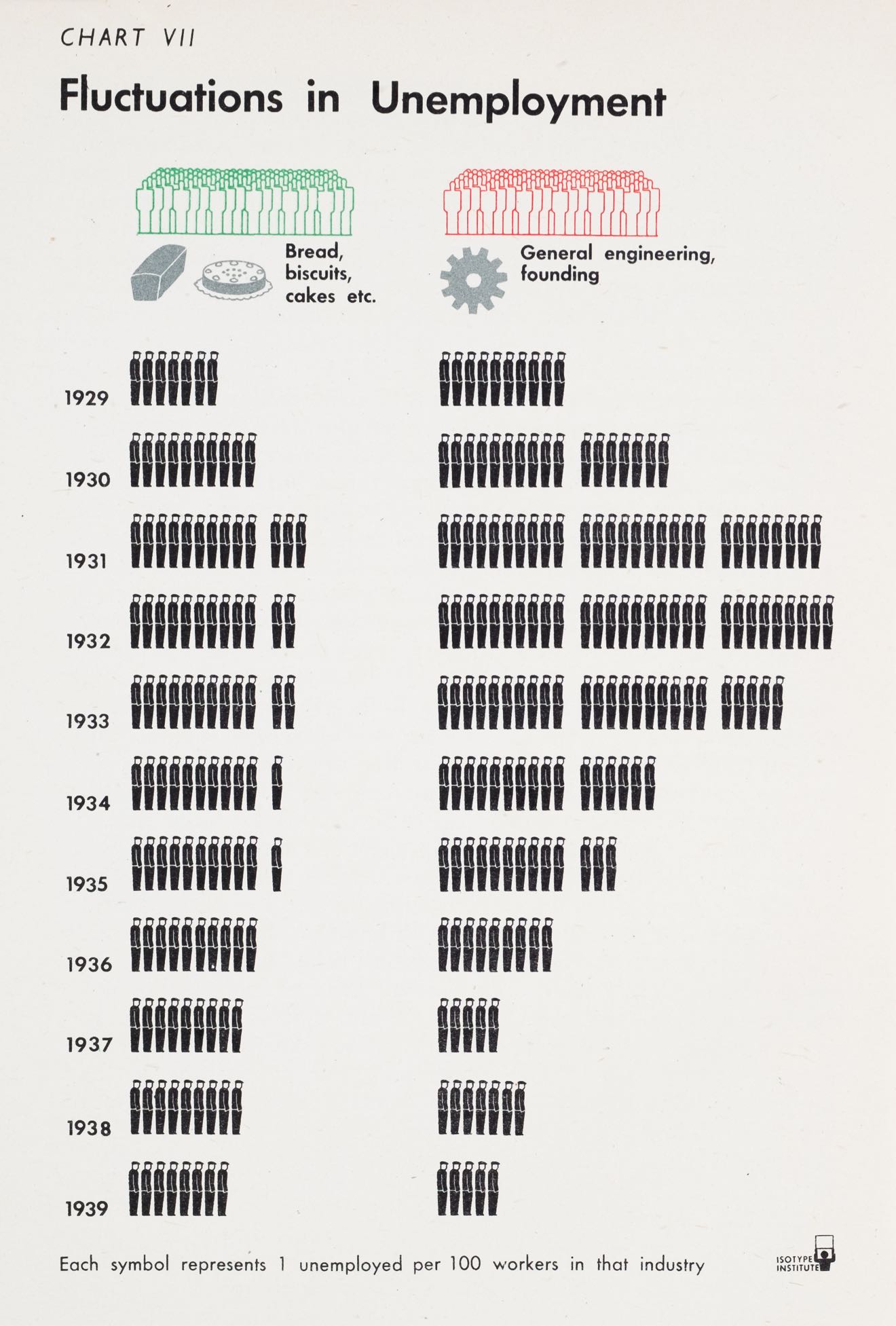
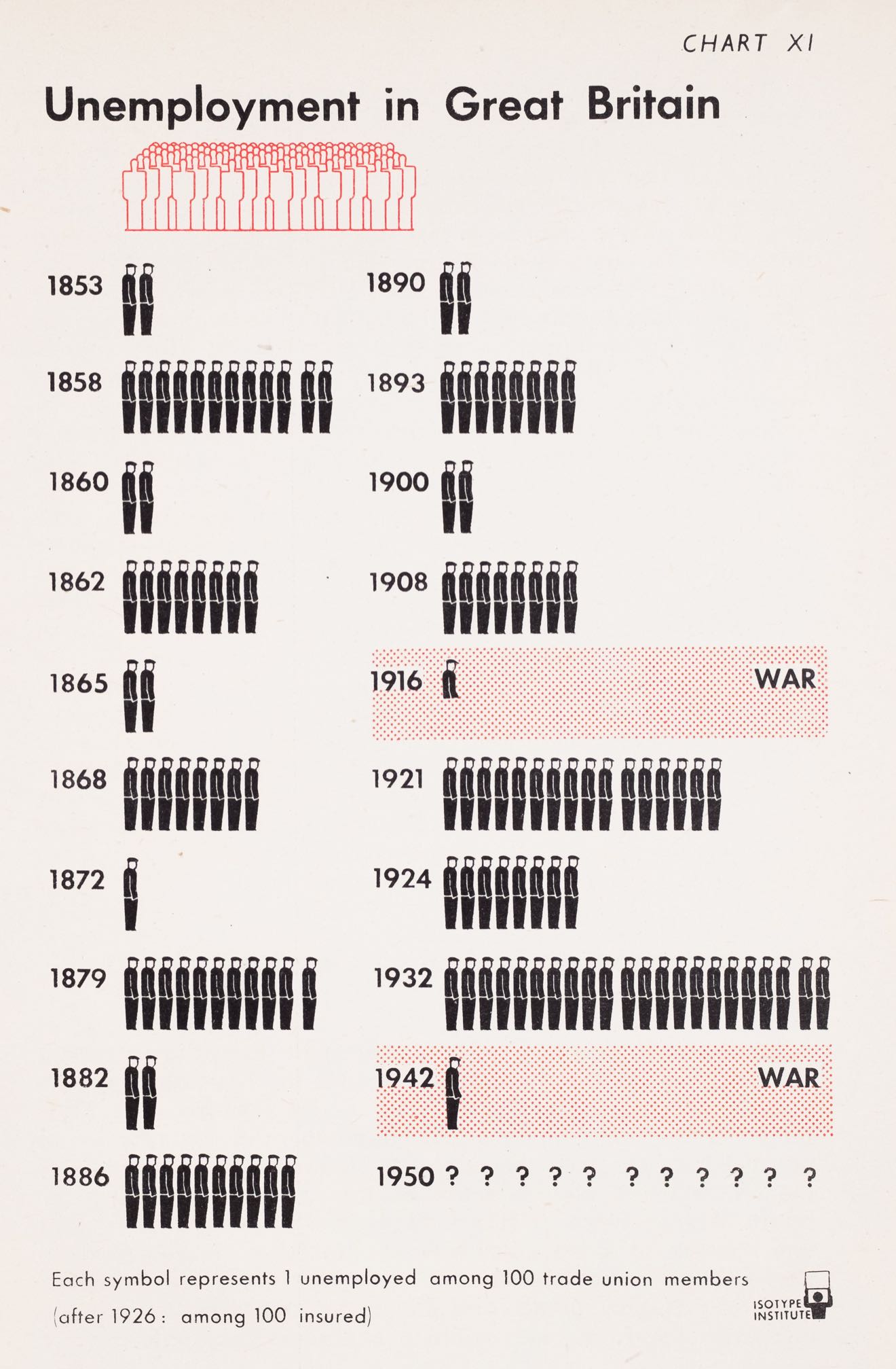
Other charts are compared to the more common 100-person baseline, by age group or by year for different countries.

The choice of showing the 100 people in the background behind the individual sections of the chart is odd, since those seem to live on a different scale than the actual data displayed in front of them. It’s also strange in light of the distribution charts they used in other places in the same book.
And even though the final example here is a map, it essentially works the same, with the baseline being shown behind the normalized numbers of unemployed for different regions of the UK.

This section makes extensive use of the sad worker (wearing the classic hat and with his head lowered) that is perhaps Gerd Arntz’s most famous creation.
Distribution Charts
The ISOTYPE Institute clearly struggled to show distributions, especially when they were extremely uneven. This combination of map and unit chart shows the number of unemployed people for a variety of countries. To normalize to the population, they use color! Red for countries with over 40% unemployment (!), blue for 30-39%, and green for less than 30% (these bins paint a pretty stark picture about how dire things were in the early 1930s). The symbols represent absolute numbers of unemployed people, which are quite difficult to compare between countries without knowing population sizes.

A different kind of distribution chart shows the tax burden for a family of four, and it’s perhaps the most confusing ISOTYPE chart I’ve seen. That may be partly because I think it is mislabeled: gross income (in green) is net income, gross is the total of net plus taxes. The taxes are stacked on top, and oddly color is used here for two different years. The main message appears to be that the tax burden has decreased overall (red is for the later years), but I’m not sure I can read much beyond that.

On the topic of taxes, there’s another chart that is also confusing at first glance but is easier to read in the end. It shows income vs. consumption for different income groups, together with the sizes of these groups. Full red circles show savings, gifts, and also personal taxes for some reason, while empty red circles show consumption beyond income – debt.

Two more charts showing distributions seem to be more successful. The first of these is a mix of a bar (okay, column) chart with units. The bars’ height shows the income, while the width is the number of people in that income group. This is reinforced by the symbols, which are grouped here so that each group of 10 is one million people, and each individual stands for 100,000. This grouping makes the numbers easier to compare over a larger range of values, but also much harder to read.

The most interesting chart in the book, and the least ISOTYPE-y, shows the distribution of wealth (rather than income), and uses percentiles instead of absolute population. Each person symbol here stands for 1% of the population, compared to the circles that represent percent of wealth. I find this chart easier to read than the bars because I can compare units to units (discrete to discrete) rather than units to length (discrete to continuous).

This is perhaps the most interesting ISOTYPE book I’ve seen so far. The subject matter strikes close to Otto Neurath‘s interests, and he was still alive when this book came out (he died at the end of 1945), so perhaps that led to the variety of different charts here. Though it may also have been mostly or entirely Marie Neurath’s work, like the later books illustrated by the ISOTYPE Institute.
Comments (2)
Posting new comments was disabled in 2020.