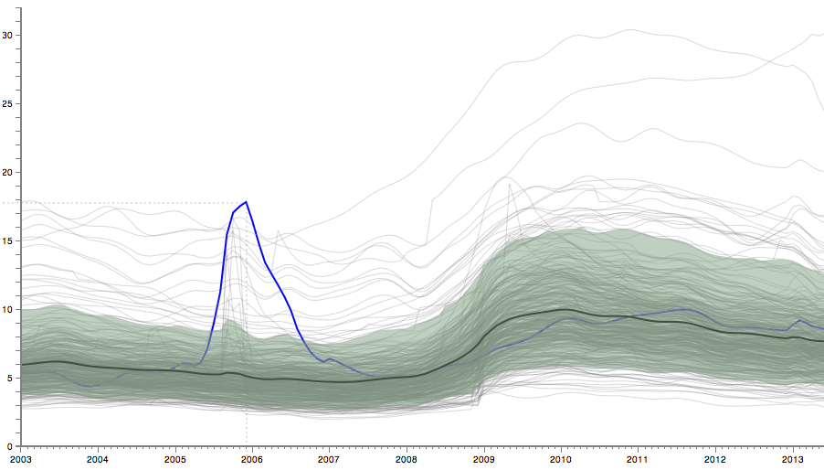
The visualization above shows the unemployment rate in 380 metro areas in the U.S. from January 2003 to June 2013 (data from the Bureau of Labor Statistics). Each of these is itself an average, but the overall mean is also shown as a heavier line. Mouse over to see individual metro areas highlighted.
As you explore, you will see many small and large patterns that the average, or mean, completely misses. You can see some outliers with very high unemployment, Hurricane Katrina, seemingly random spikes, etc. (click these links to highlight them in the visualization above, click again to turn the highlight off). That is part of the function of the mean: it averages away small changes. That can be a desired effect, but it is often glossed over when numbers like unemployment rates are reported. Does a small change in the average taken over 200 million people really mean much? Worse yet, does no change mean that nothing happened?
How do you account for the large variation in this data, though? One way is to include a range based on percentiles. The most obvious would be to report the range from smallest to largest value. That does tend to be very sensitive to outliers, however, which may or may not be desirable. Instead, perhaps a narrower range should be reported that covers most of the data, with the extreme values treated separately. But which one?
Percentiles are one of the simplest ideas in statistics: sort the data values, then pick the ones you want depending on their location in that list (as a fraction of the length of the list). The value in the middle is the 50th percentile, also known as the median. The value one quarter of the way into the list is the 25th percentile, etc. Picking the range of values from the 25th to the 75th percentile selects half the data (dropping the bottom and top quarters); this is also called the interquartile range.
A common way of looking at data is to drop the top and bottom 5%, which leaves the range from 5% to 95% (clicking these links will change the settings of the visualization above). That removes quite a bit of the range, though. Is 1% to 99% better? How about the interquartile range? Talking about percentiles in the abstract is one thing, but seeing how much data, and how much of the range of values, that ignores, is quite another.
Calculating percentiles requires additional data. With unemployment data, there is some on metro areas, sectors, and a number of demographic values. In other cases, that data is often not easy to find or simply not available. But whenever possible, we need to demand more context than a single number. A simple mean without such context is meaningless.
Comments (5)
Posting new comments was disabled in 2020.