How do we know what we can do with things in the world or in user interfaces? What makes us push buttons, flip switches, or pick up objects that fit our hands? This guidance comes from affordances, a clever and intuitive theory that has been around for decades but is often misunderstood.
The term affordance was coined by James J. Gibson in his book, The Ecological Approach to Visual Perception (Lawrence Erlbaum Associates, 1979). Gibson writes,
The affordances of the environment are what it offers the animal, what it provides or furnishes, either for good or ill.
The usual examples include flat surfaces at a certain height that afford sitting on, handles of things like hammers that afford grasping, door handles that afford pushing down, buttons that stick out of surfaces and thus afford being pushed, etc.
Gibson’s original idea was a description of the natural environment, and of physical things. The design of objects is based on cleverly providing affordances, whether explicitly or not, so that a person can immediately understand how to use a thing. This is even true of really big objects, like buildings.
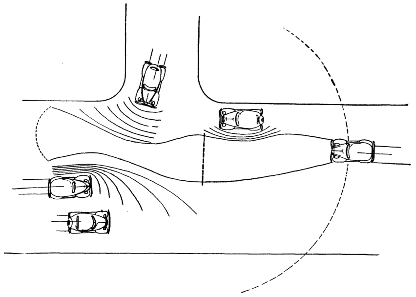
The Field of Safe Travel
An article in a special issue on Gibson and affordances of Ecological Psychology traces the idea back all the way to a 1938 article by Gibson and Laurence E. Crooks, A Theoretical Field-Analysis of Automobile-Driving. The article describes the perceived field of safe travel by a driver, which extends in front of the car and is pushed back by other cars, pedestrians, etc. This is not the same as an affordance, but it’s a predecessor and perhaps easier to relate to than the hammer and other examples. I also love the 1930’s era cars in the illustration.

Affordances Are in the Eye of the Beholder
There is sometimes a distinction between affordances and “perceived affordances,” which is rather nonsensical: all affordances are perceived, and they depend on who perceives them. A hammer may afford grasping to a human, but hardly to a snake or even a cat. The end of a rope similarly does not afford biting as the primary interaction to a human, but does for a dog.
It seems obvious that not only are physical traits and abilities important (a chasm might afford leaping over to some but not others), but also background knowledge and experience. What can seem obvious to you may not be to somebody else, since you may not share the same ideas about what is possible.
There is a lot of philosophy-heavy writing out there on the correct ontological role of affordances, and Gibson himself left this question open. The discussion mostly detracts from the usefulness of the concept, however: a purely perception-based idea of affordances appears to me as the most useful and logical.
Affordances Make User Interfaces Discoverable
How do you know which parts of the screen do something when you click them, and which don’t? Affordances. Something that appears to be raised affords being pushed down, is called a button. Something that looks like a handle affords to be grabbed and moved; OS X used to have little ridges in the lower right edges of windows you could resize that way.
More recently, things that respond when you move your mouse over them have become quasi-affordances. They require interaction and can’t be perceived without, but the idea is the same: move your mouse over something you think might be an active user interface element, and see if it changes color, bulges out, etc. If it does, that’s your hint that clicking the button there will do something. The reason this has become more common recently is because it leads to cleaner-looking user interfaces where the buttons can stay in the background and not compete with the content until they are needed.
This becomes more of an issue again with touch, where there usually is no hover. Making a touch interface discoverable is quite difficult, and requires a lot more visual cues and affordances that tell the user where things are hiding. With the release of Windows 8 and its flat and clean-looking Modern design (better known under its non-generic name, Metro), iOS can look a bit old-fashioned and overly embellished in comparison. But there is a trade-off between design minimalism and clean looks on one hand, and providing sufficient visual information so people can perceive affordances, on the other.
A lot of Jakob Nielsen’s recent criticism of Windows 8 has to do with the lack of affordances in that interface. When buttons no longer have gradients to make them appear raised, or even borders around them, any text string or icon could be a button. But not all are, which leads to a lot of trial pecking and frustration when some things don’t respond even though they look the same as the things that do.
Affordances in Visualization
Like interaction in general, affordances are underutilized in visualization. That is partly understandable, since affordances always play off of physical things, even as parts of user interfaces, and visualization can be very abstract. But there are clearly possibilities.
One is to have objects in a visualization glow or otherwise respond when the mouse moves over them. Another is to provide more physically-based cues when creating interaction elements for filters, etc. that can be moved.
But more than that, I wonder if there is a role for affordances to make it easier for people to find their ways around visualizations, understand the interactions (and what they do), and, most of all, encourage interaction.

Comments (6)
Posting new comments was disabled in 2020.