After my recent abstraction exercise created some interesting discussion but kind of went off in a slightly wrong direction, here is another experiment.
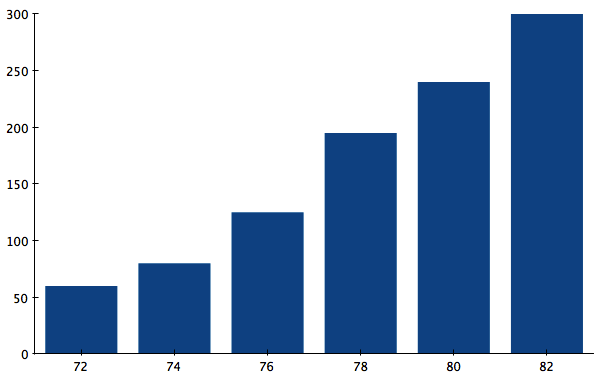
Let's take the data from Nigel Holmes' famous Monster chart and turn that into a simple bar chart. I chose a similarly basic one here as the one in Bateman et al.'s study, but the filled bars are slightly less ugly. The x axis shows years in the 20th century, the y axis millions of dollars.

The point here is fairly straight-forward: costs are rising. But how fast are they rising? Are they rising as faster at the end of the time period depicted than in the middle? It's not that obvious from this chart. So let's try a line.

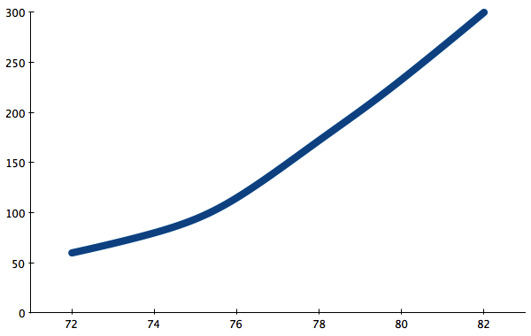
The line makes the rate of change easier to see, because it is turned into an angle. We are good at spotting differences in angles, especially with lines that are laid end-to-end. The increase was actually stronger in 1978, flattened out in 1980, and then increased again in 1982. Interesting.
But the overall story is still one about the overall increase. After all, that's the message of the monster, and it's what is most obvious in the bar/teeth chart. So let's depart from the actual numbers a bit and smooth the line out somewhat.

This is smoothing over the 1978 bump for a simpler message: costs have been rising, and they are rising at a faster pace in the early 1980s than they did in the early 70s. That sentence glosses over the little bump, so why does the chart need to show it? In fact, we could even go a tiny bit further and smooth out the line to make it look nicer and do away with the individual points.

This is now a more abstract version of the chart that no longer tells you how many data points there were and where: they could be anywhere on the line. The message is still the same, all I have done is remove some detail that is not essential for the overall point.
Where is data and detail necessary, and where does it become a distraction? To make a point, you don't need every detail. Just like there is no point in showing every single tiny variation in the consumer price index to talk about how the real value of the minimum wage is dropping, it's often unnecessary to depict every single detail in the data when presenting it.

Comments (10)
Posting new comments was disabled in 2020.