A Better Definition of Chart Junk

Maximizing the data-ink ratio sounds like a good idea, but when actually followed to the letter produces terrible and nonsensical results. Here is a more reasonable definition of chart junk that does away with the pretense of a mathematical formula and puts some common sense back into the question of good chart design.

Much has been made of Tufte’s famous data-ink ratio, and many people like to rail, privately and online, against chart junk. In short, the data-ink-ratio defines the amount of information your chart elements (“ink”) are providing, with the goal of maximizing that ratio. Since we can assume that the information is constant, this means we need to minimize the amount of ink. Any ink on your chart that does not convey data is considered junk.

While this extremely reduced definition makes for great flame war fuel, it places the emphasis on the wrong question, and when property followed, leads to largely nonsensical charts (this example is from Stephen Few’s recreation of Tufte’s argument).
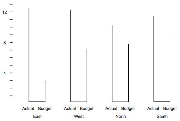
Minimal Bars

The first issue is the whole notion of ink. What does that even mean? If you live in a world of black ink on white paper, that may be a reasonable criterion. But add color and the whole thing breaks down. Color can be used well and can be terrible. Reducing ink does not tell us anything about that. The same is true for interactions like mouse-overs, sorting, and other conveniences our modern visualization machines afford us.

There is a parallel here with writing. While you might argue that using fewer and simpler words is generally preferable, nobody would argue that writing is merely a question of maximizing the information-to-letters ratio. Good writing needs clarity and simplicity just as it needs variation, voice, explanation, and many other things.

Which brings me to my alternative definition of chart junk:

Chart junk is any element of a chart that does not contribute to clarifying the intended message.

Do you have more bars than necessary? Get rid of them! Are you missing context that would help people understand the values better? Add it in! Is your use of color distracting from the message? Change it! Are people not able to figure out what you are telling them? Use highlights!

Do you see the difference? Instead of minimization at all cost, we are now asking questions about the purpose of this thing you are creating. We are no longer pretending that visualization design is a mathematical optimization, and instead thinking about what we want to achieve.

Chart junk is still chart junk. Don’t add meaningless nonsense to your charts! Don’t clutter them up! Reduce the impact of grid lines, etc. But also think about how you can clarify the message, how you want people to read your data, and what you want them to take away. Perhaps adding things will actually help. What was considered chart junk before might turn out to be useful.

14 responses to “A Better Definition of Chart Junk”

  1. Jonathan Avatar

    It is a complete exaggeration to say that Tufte’s idea “… when actually followed to the letter produces terrible and nonsensical results.” If your chart from Few’s essay is “nonsensical”, then please explain.

    Not only have you mis-represented Tufte as anti-aesthetic (he’s a patron of the arts for heaven’s sake, and has his own gallery in New York!), you have mis-understood the idea of chart junk. You say “Instead of minimization at all cost, we are now asking questions about the purpose of this thing you are creating.” But removing chart junk is done AFTER his first rule “Above all, show the data.” If the visual device you have chosen does not show the data, together with necessary context or highlighting then the data/ink ratio is irrelevant, and this post is similarly irrelevant to it.

    1. Robert Kosara Avatar

      The example is very similar to one Tufte drew himself, and it shows the data just fine.

      The point here is that there is a double standard: we supposedly follow “maximize data ink,” when we’re really making arbitrary decisions. What I want to do is find a principle that works the way it’s actually written.

      1. carlosscheidegger Avatar
        carlosscheidegger

        I agree wholeheartedly with Robert here. And what does “above all, show the data” really mean? If I write down a table with very small numbers and leave the rest of the page white, I am showing all the data, and am minimizing chart junk. Or am I?

        The whole point is that Tufte’s principles seem to require Tufte’s (admitted fantastic, perhaps unparalleled) aesthetic sense. But then, why not make the principle “you shall only let Tufte-like minds draw charts” instead? It would amount to the same outcome: Tufte can draw awesome data graphics, and few, if anyone else can follow his principles correctly.

        1. Jonathan Avatar
          Jonathan

          If you write down a table with very small numbers and leave the rest of the page white, then that’s not a statistical graphic. Sure, there might be a context in which doing that is better than a chart of some kind, but your argument is otherwise a straw man.

          1. carlosscheidegger Avatar
            carlosscheidegger

            You’re missing the point. It’s not about “lists vs charts.” I hate numeric tables with a passion. But I believe Robert is trying to distill an actual principle. Currently is no good, *general* principle of visualization that can consistently be acted upon. That’s the “definition” I think that Robert is going after. Everything else we have are just rules of thumb. That’s good for (some) practice, but not good for thoroughly understanding visualizations.

            Incidentally, there’s no good definition of statistical graphic, either! “plots ‘x, y, z, and w’ are statistical graphics” doesn’t count (yes, I have read Bertin, Wilkinson, Wickham, Stolte, MacKinlay, etc. It’s not there, at least not in any way that fundamentally forbids a numeric table from being interpreted as a graphic.)

      2. Jonathan Avatar
        Jonathan

        Robert, you’re not going to find a principle of aesthetic that works better than a guideline like the data/ink ratio, or indeed any other design principle for that matter. It’s fine to rail against the mis-use of, say, symmetry or density, but to suggest that those principles themselves are flawed is another matter entirely. And in any case, what is arbitrary about the data/ink ratio?

        1. Robert Kosara Avatar

          I did not say that the data/ink ratio was arbitrary, but that people claim to be maximizing it when they’re really doing something else (i.e., following some arbitrary rule or making ad-hoc decisions). There is nothing wrong with doing that, but I hate the pretense that we’re following a principle here, and that the principle, when followed, leads to good charts.

          Carlos gets it: my point is that we need to figure out a principle or rule that we can actually follow and that, when followed, leads us to a meaningful goal. I think that the one I’ve stated above does that, while Tufte’s definition of chart junk and data-ink does not.

          1. Jonathan Avatar

            The trouble with your principle (“Chart junk is any element of a chart that does not contribute to clarifying the intended message”) is that it’s completely subjective. The point of the data/ink ratio is that it’s a principle that can be tested objectively. If I think a 3D shade contributes to clarifying something, but you don’t, then your principle has nothing to say at that point. Meanwhile, the data/ink ratio does. It’s by no means alone among principles in being over-zealously applied. But that’s not a problem of the principle, it’s a problem with the people applying it.

  2. Ben Jones Avatar

    Hi Robert, I get your point here – whether you add or take away “ink” or pixels, as long as doing so helps to clarify your intended message, then do it.

    Your definition puts the emphasis on the end over the means, and so requires a contingency that the end is an ethical one. Intended messages ought to be accurate ones.

    Sometimes I find it can be tough to know whether a certain change will add clarity or not. Other than asking people what they think, do you have any other suggestions on how to do that?

    Thanks for the thought provoking post,
    Ben

  3. Trina Chiasson (@trinachi) Avatar

    “We are no longer pretending that visualization design is a mathematical optimization, and instead thinking about what we want to achieve.”

    Well said. The best solution depends on the context and desired outcome. A basic guideline for making an informed decision is important, but it’s also important to remember that there’s rarely a one-size-fits-all solution.

    1. Jonathan Avatar

      So what do you do when you see a principle being mis-applied or overly-applied? Conclude that the principle itself is wrong? Personally, I would conclude the person applying the principle is wrong, but Robert disagrees.

  4. Meic Goodyear Avatar
    Meic Goodyear

    Principles I try to follow:
    – Since any aspect of a chart is capable of conveying information to a reader, only those aspects intended to carry such information should be included. For example, if graduated colours are used the graduation should indicate something about the data represented (eg probability density)
    – Aspects and components of charts should be given visual prominence according to their importance to the message.
    – Components should be as clearly interpreted as possible (eg horizontal rather than vertical text if formatting allows).
    – Avoid redundancy (e.g. don’t repeat info already in chart headings in axis labels)
    – Additional non-chart features may be added if (a) they cannot be interpreted as conveying informations and (b) they are likely to added to the retention of the information in the memory of the reader (see Frances Yates’s “The Art of Memory” for inspiration)

  5. Eric Hatch Avatar

    The data ink / chart junk concept is really useful but ignores issues of psychology and visual acuity. Negative space can be an asset, even in presenting data visually. “Eye chart” papers and slides may be purely data, but if you can’t find the message for the clutter, you’re in trouble.

    As in so much of life, balance is everything.

  6. MarkP Avatar
    MarkP

    One item an end-user would like to include is the explanation (i.e. formula) for how a KPI was calculated. Similar to a regression formula but in this case the explanations & formula are on the “intro” page. I’ve tried to convince him this is actually documentation and has no place in the dashboard. In fact the data-ink ratio for the intro page is 0%