• Skip to main content
  • Skip to primary sidebar
  • Skip to footer

eagereyes

Visualization and Visual Communication

  • Explore
    • Starter Pack
    • Blog Calendar
    • Blogroll
    • eagereyesTV YouTube Videos
  • Practical
    • Basics
    • Pie Charts
    • Techniques
    • Book Reviews
    • Journalism
  • Academic
    • Speaking Mistakes
    • Acceptance Rates
    • Papers
    • Conference Reports
    • Lists of Influences
    • Criticism
    • Peer Review
  • Admin
    • About
    • Contact
    • License
Tapestry 2018 Program, Call for Demos

Robert Kosara / November 5, 2018

Tapestry 2018 Program, Call for Demos

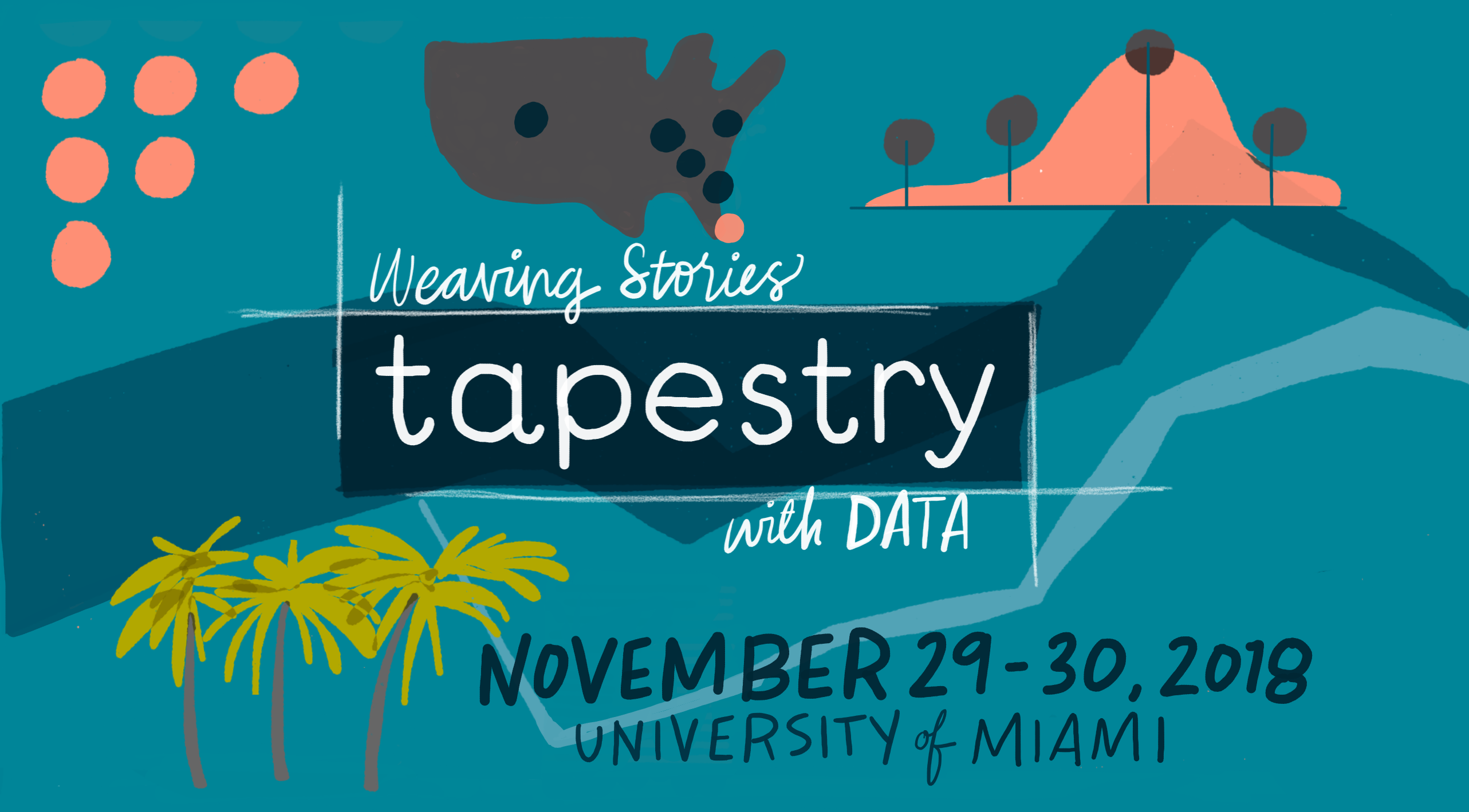
The Tapestry 2018 program is complete, including the three keynotes and eight newly-added short stories. We are now looking for proposals for demos and will send out a call for PechaKucha-style talks to attendees soon, too.

You can find the full program on the Tapestry website. I’ve mentioned the keynotes before (Mona Chalabi of the Guardian, Matthew Kay of the University of Wisconsin, and Elijah Meeks of Netflix).

We’re excited to also have a great selection of awesome speakers and topics:

  • Aritra Dasgupta, As you show, so shall you reap: causes and consequences of bad design in (scientific) visual communication
  • Jason Forrest, The Data Visualizations of W.E.B. Du Bois
  • Kenneth Field, The Cartography of Elections
  • Jonni Walker, Bringing the Genome Home – Bridging the Gap between Conservation and Data Storytelling
  • Kristin Henry, Storytelling with Color
  • Bill Shander, WORDS > VISUALS 
  • Alex Wein, Charts as Utterances
  • Nadja Popovich, Personalizing Climate Change

The conference takes place November 29 and 30 at the University of Miami – so if you’ve been on the fence about going, now is the time to register and book your travel!

To submit a demo proposal, use this demo submission form. We’re still working out logistics and aren’t sure how many demos we’ll be able to accommodate. We should know early next week, so get your proposal in by Friday (November 9)!

Filed Under: Blog 2018 Tagged With: tapestry

Robert Kosara is Data Visualization Developer at Observable. Before that, he was Research Scientist at Tableau Software (2012–2022) and Associate Professor of Computer Science (2005–2012). His research focus is the communication of data using visualization. In addition to blogging, Robert also runs and tweets. Read More…

Reader Interactions

Leave a Reply Cancel reply

This site uses Akismet to reduce spam. Learn how your comment data is processed.

Primary Sidebar

More Blog 2018 Articles

  • New Vis Research Blog: Multiple Views
  • IEEE VIS 2018, Part 3: New Approaches, Meet the Founders, Perception and Cognition
  • IEEE VIS 2018, Part 2: Time, Evaluation, Dashboards, The Future of VIS
  • IEEE VIS 2018, Part 1: VisComm, VisInPractice, BELIV, Best Papers
  • Tapestry 2018, Details and Keynote Speakers

Recently Popular

  • The US ZIPScribble Map
  • New, Improved Traveling Presidential Candidate Map
  • The Travelling Presidential Candidate Map
  • The Interactive ZIPScribble Map
  • Data: Continuous vs. Categorical
  • Chart Junk Considered Useful After All
  • New video: Gauges for Data Visualization, The NY Times Election Needle, and Circular Bar Charts
  • Facebook
  • GitHub
  • LinkedIn
  • RSS
  • Twitter
  • YouTube

Subscribe via Email

Footer

  • About
  • Contact
  • License

Copyright © 2006–2022 Robert Kosara · All original materials are available under CC-BY-SA