How do you engage people with data? How do you make them care and pay attention and remember anything about a particular piece of data? One way is dressing the data up as an information graphic. Another might be to get people to play a little game with the data. Nick Diakopoulos and colleagues have built a fascinating research prototype of what this might look like.
The idea of gamification is hard to escape these days, with many websites offering achievements of different kinds for activities from just being somewhere to pushing yourself harder to exercise. At worst, gamification can be an annoying contest for its own sake, but at best it can turn passive observers into active participants.
Guessing Public Health Data
Diakopoulos' Salubrious Nation project attempts to lure people into thinking about data by presenting it as a game. A map presents demographic data about every county in the 48 states of the continental U.S. The system picks one county at random and asks the player to guess a public health statistic about it, like binge drinking, teenage pregnancies, etc. There are two types of interaction: the user can mouse over any county to see demographic data about it (population, poverty rate, life expectancy, etc.), and a slider at the top to enter the player's guess.
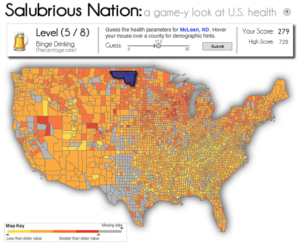
The clever thing about the slider is not only that it indicates the national average as a reference, but that the map responds to it. As the player moves the slider, the counties' colors change depending on whether their value of the statistic is above or below the player's guess. That makes for some interesting comparisons, as the player can either choose to pick a local neighborhood to compare with or pick a county with similar demographics as the reference. Once the guess is submitted, the actual numbers is shown and the player is awarded points depending on how close he or she got to the real value.
After going through eight different questions, with a different county for each, the results are presented as a histogram with some information for the user not just about the total points but also how well he or she did in comparison to other players. I'm a bit mystified why the player's score isn't indicated directly in the histogram though, that would obviously make a lot of sense.

The results of this work were presented as a paper at the CHI 2011 conference. There are some interesting findings in there, like the (expected) higher interest and engagement when there was a game component as opposed to a more undirected presentation, but also the (unexpected) issue that the game aspect took people's attention away from the actual data. The game version did lead to more reported insights, however. Picking the right amount of game pressure seems like a delicate balancing act between providing incentives and making the experience enjoyable and turning the data into a mere backdrop for a little game.
Issues
I have some minor issues with the approach. One that I feel makes the game much more tedious than necessary is the extremely poor choice of colors. All colors are yellow or orange, and the two colors that are most important (just above or just below the chosen value) are nearly indistinguishable. Using orange for values above the player's value and blue for ones below would have been a much better choice that would have made it possible to see the switch as one crosses a lot of counties' values at nearly the same time. I also dislike the gray for missing values, I kept thinking it was a middle value rather than a non-value. White (the map background) or a very light gray would have worked better.
My other criticism of the approach is that it's simply too much data. Looking at thousands of counties with a small number picked out per user makes its difficult to gain a clear sense of patterns. Restricting the picks to the player's state would probably help, though it would also bring in additional information that might bias the guesses (which is a bad thing for studying the effectiveness of the technique, but might be a good thing in practice to increase engagement and retention of information). Also, I wonder if the presented demographics are quite enough to make an educated guess about public health issues like teenage pregnancies.
Both of these are relatively minor points though, and don't take away from a very solid central idea.
Conclusions
Finding ways to communicate data is a very interesting problem, and one that visualization can definitely help with. Besides making interesting information graphics, turning the presentation into a game is a good idea to get people more engaged. Of course, the goals of the visualization have to be carefully weighed against the effort and distraction of the game. There is probably also a negative effect here, because some people just won't want to play a game and rather see a more serious presentation. But with more research into which approaches may or may not work, and the more widespread acceptance of gamification from social apps, this seems like a good approach.
Comments (1)
Posting new comments was disabled in 2020.