• Skip to main content
  • Skip to primary sidebar
  • Skip to footer

eagereyes

Visualization and Visual Communication

  • Explore
    • Starter Pack
    • Blog Calendar
    • Blogroll
    • eagereyesTV YouTube Videos
  • Practical
    • Basics
    • Pie Charts
    • Techniques
    • Book Reviews
    • Journalism
  • Academic
    • Speaking Mistakes
    • Acceptance Rates
    • Papers
    • Conference Reports
    • Lists of Influences
    • Criticism
    • Peer Review
  • Admin
    • About
    • Contact
    • License

Robert Kosara / February 8, 2007

What Travelling Presidential Candidates Save

ZIPScribbleMap vs. TPCMap

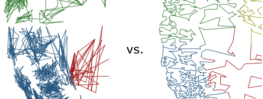
An anonymous commenter asked what the savings were of the Travelling Presidential Candidate Map (ZIPTPCMap) vs. the ZIPScribbleMap. That was not something I had even thought about, and so the result was quite surprising.

The total travel distance on the ZIPScribbleMap is 1,859,224.14km (1,155,268.3mi), while the path through the ZIPTPCMap is only 408,589.32km (253,885.63mi) long. That is a factor of almost 4.6, which is rather significant. The method used to calculate the TPC path is only about 75% optimal, so that if done properly, the factor could be well above 5.

What this shows is that it clearly pays off to follow a presidential candidate around, rather than just blindly following the ZIP code order without thinking.

Filed Under: Blog 2007

Robert Kosara is Data Visualization Developer at Observable. Before that, he was Research Scientist at Tableau Software (2012–2022) and Associate Professor of Computer Science (2005–2012). His research focus is the communication of data using visualization. In addition to blogging, Robert also runs and tweets. Read More…

Reader Interactions

Leave a Reply Cancel reply

This site uses Akismet to reduce spam. Learn how your comment data is processed.

Primary Sidebar

More Blog 2007 Articles

  • Expressive Visualization, Updated Presidents Chart
  • InfoVis 2007: InfoVis for the Masses
  • Further Steps Towards World Visualization Day
  • InfoVis Panel: The Impact of Social Data Visualization
  • A Nobel Prize for Charts

Recently Popular

  • Data: Continuous vs. Categorical
  • Midjourney is a Trip
  • Watch My Outlier Talk: This Should Have Been A Bar Chart!
  • The Simple Way to Scrape an HTML Table: Google Docs
  • New video: Gauges for Data Visualization, The NY Times Election Needle, and Circular Bar Charts
  • Continuous Values and Baselines
  • Paper: More Than Meets the Eye: A Closer Look at Encodings in Visualization
  • Facebook
  • GitHub
  • LinkedIn
  • RSS
  • Twitter
  • YouTube

Subscribe via Email

Footer

  • About
  • Contact
  • License

Copyright © 2006–2022 Robert Kosara · All original materials are available under CC-BY-SA