There is a tendency to just reflexively make fun of certain types of charts, in particular pie charts and 3D charts. While that is often justified, there are also exceptions. Not all pie charts are bad, and not all 3D charts are terrible. But to spot those outliers, we have to suppress the knee-jerk reflex and give them a moment of thought before ripping them apart.
The Chart
About two weeks ago, I posted this chart on Twitter after seeing it in the Wired iPad app (September 2014 issue).
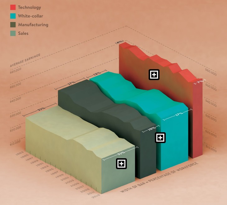
Yes, it is a 3D area chart. The vertical axis is the average salary paid in a number of sectors over time. The one horizontal axis on the left is the time axis, showing 30 years from 1983 to 2013. The other horizontal axis divides the chart up into four elements for four sectors: technology, white-collar, manufacturing, and sales. That axis has a second encoding in the width of the “mountains,” which represent the fraction of the workforce in each of those sectors.
The Good
So there’s a lot of data here. You can see that the tech sector pays a lot more than the others, roughly twice what sales pays, and a good 50% more than manufacturing or white-collar jobs. You can also see the effect of the recession in the ripples along the tops of the mountains, with an interesting lag between white-collar/manufacturing and sales.
I also have to admit to being quite surprised to see how small the tech sector really is: only 7% of the workforce, up from 4% 30 years ago. It’s sometimes hard to remember that there’s a world beyond technology when you’re working at a software company and spend your days on Twitter. White-collar jobs have grown to roughly make up for the loss in manufacturing, but not quite, while the percentage of people in sales has not changed.
Not all of that comes from the chart, it certainly requires some reading of the numbers, in particular for the width of the mountains. But the information is there and it’s not hard to read. The reason for posting this was my surprise at finding myself spending several minutes with this chart and finding it quite informative and fun to explore. There is a bit of interaction too, when you tap on the plus signs, but those don’t give you much additional information.
The Bad
What is wrong with this chart? Sure, it’s 3D. You can’t precisely read the numbers. What was the average salary for manufacturing jobs in 1992? You can’t read that with any sort of precision. 3D is wasteful, you could show more data in that space. But who cares? That is not the point of this chart. You can see the development over time, that’s what matters. And the chart does not seem to wildly distort the reading of those values that are readable (which is a common issue with 3D charts).
I also think that this is a good way to present what are basically eight time series (salaries and workforce percentages for four sectors) in a very concise way that works well in a static image. Of course this could be broken up into two or even three charts, but you would lose some of the cohesion the 3D gives you here. And it would be a lot less fun to explore. The lines for workforce percentage would also look extremely boring (they seem to be changing at a fairly constant pace, and certainly don’t change direction). If you care not just about representing the data but also capturing readers’ interest, this is the better chart. It certainly worked in my case.
A Smarter Discussion
But beyond all those reasons, I just want to see a more nuanced and informed discussion of these things. It doesn’t take much intelligence to sneer at every 3D chart and every pie chart that floats by on Twitter. But things are a bit more complicated than that, and these things do have their place. And just throwing some supposed absolute rules around doesn’t do anybody any favors.
Perhaps Christopher Ingraham was right.
@eagereyes Twitter is only for saying mean things about charts, Robert
— Christopher Ingraham (@_cingraham) September 6, 2014
But I hope that we can get to a point where we can have a more intelligent, nuanced, and respectful discussion. We’re not going to make much progress if we just keep rehashing the same old ideas without putting any new thoughts into them.
If the chart in question isn’t actually misleading (or has significant potential to do so), then it’s probably OK not to be mean about it.
However, the charts aren’t really the problem, it’s the people who make them. If I can get away with an innocuous 3D pie chart one time, does that reduce my critical faculty in future? What’s to stop me thinking all 3D pie charts are OK? I then have a license to mislead, and before you know it, I’ve turned into David McCandless.
Hey, I like playing the skeptical free-thinker as much as the next person, but all knee-jerk reactions aside, this really is a terrible chart. Virtually every piece of information that can be gleaned from it is more difficult than it needs to be. For example, the only way I can tell that the “white collar” and “manufacturing” blocks are higher than the “sales” block (rather than being, say, irregularly spaced) is by focusing on the very front or back ends of the blocks–in other words, by focusing on the 2D aspects of the blocks. The “percentage of workforce” information, like so many stacked bar charts, gives only the roughest indication of the the relative percentages even at a single time point, and I cannot even *begin* to tell what is happening with those percentages over time–I literally have to just read the numbers. For any one particular block, the change in average earnings over time is fairly readable, although again mainly by actively suppressing the 3D aspects of the plot and just focusing on the side of the block. But as for comparing the four average-earnings time series to one another… forget about it. I can see that the “white collar” and “manufacturing” time series tend to have a similar shape, but that’s about it.
Your point seems to be that this chart is fun to explore and it basically gets the job done. I think what you experienced as “fun” many other people recognize as “needless work.” As for getting the job done, it does so in the sense that it tries to show many things at once and does basically not a great job showing any but the most obvious patterns. If actually conveying the data are of any interest, I think it would be well worth sacrificing the “cohesion” of this unitary 3D chart by just using multiple, simple panels. I do appreciate the devil’s-advocate intention of this post, but in my mind this example does nothing but confirm the common rule of thumb and exemplify some of the most frequently cited problems.
What I don’t understand is the vitriol towards visualizations that aren’t optimal. While I understand frustration with misleading visualizations, the dogmatic anger is the same towards non-optimal visualizations.
I wonder if someone’s done a variation of [Cleveland & McGill 1984] where one variant was an actual table of numbers. I’d bet there are tasks where small multiples with pie charts beats a table of text.
Robert I agree with your position that this charting approach has value. When teaching BI I provide guidelines to avoid the overhead of 3D charts if they do not provide additional value. Typically they do not, but context does play a role. A colleague built a similar chart to this a couple of months ago. The chart defined average lifespan for various countries over time. I learned from the visualization that it varies of time, likely driven by government polices. This type of chart provides a good macro view of the data concurrently. It is difficult to provide this macro view with multiple related series in 2D. Using 2D makes the audience perform all kinds of cognitive storage, comparison, and gymnastics to mentally see what is going on with the entire data set. The pinpoint objective can also be accomplished with the same 3D configuration by clicking on an individual year that would highlight the single measurement in each series across the buildups. The entire visualization can also be rotated to give the 2D comparison of the single year measurement.
This post reminds me of the discussion that had emerged from your July 2012 post “A Criticism of Visualization Criticism Criticism” which was in response to a post by Andy Kirk (to which I responded here: http://michaelbabwahsingh.com/2012/07/19/an-analysis-of-visualization-discourse/). Your WIRED example also reminds me of a similar critique-worthy 3D chart featured in a GOOD magazine Transparency from 2009: http://magazine.good.is/infographics/transparency-where-are-all-the-fish
I think the ongoing challenge of advancing understanding and building community in visualization and other fields is managing the behaviors embedded in forums for discussion. Fighting knee-jerk reactions requires some sense of self-awareness, an ability to slow down and reflect before crafting a response, and then consider how that response will be delivered and received. Unfortunately, in many online sharing platforms, the invitation to participate and “share” seems more compelling than the need to apply thoughtful consideration to what is being shared.
Maybe we need to introduce more awareness in the process, like a dialog box that asks “Are you sure you want to publish that tweet/post/comment?” or a five-minute delete/edit window before something goes live? ;-)
@robert: “We’re not going to make much progress if we just keep rehashing the same old ideas without putting any new thoughts into them”
I don’t disagree with your overall assessment, or with this statement in and of itself.
I do think that it misses the point somewhat, however. It assumes that everyone making these charts understands the reasons that they are usually bad, or understands the issues at all.
It seems that a great number of them simply do not. In such cases…rehashing the same reasons to not make a 3D chart or a pie chart when the data can be represented much more clearly is necessary.
And those people who don’t understand the issues at hand can take comfort in articles that tell them that their shitty charts are ok after all, and will keep making them with no consideration for what is good or bad about them.
As far as this chart in particular is concerned, I disagree that it has much merit beyond being pretty. It’s a great piece of visual design.
I can’t tell what happened over time to save my life, except that the number seem to have gone up and down at various times. I can’t tell very well when they did what, because the scale to tell me that is distorted from the direction of the changes over time, and they all appear more or less flat over the full time span to me…