Blog 2012
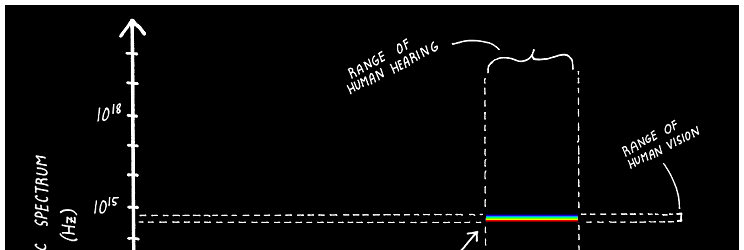
Four Values Can Still Be Worth A Chart
A while ago, Kaiser Fung criticized a chart for its uselessness because it only showed four numbers. The chart appeared on the smart web comic Abstruse Goose (which, as of this writing, is down for a site reorganization). Read more…
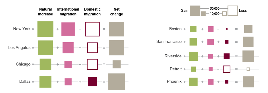
Visual Math Gone Wrong
Data visualization is often used to just display data, with little thought put into supporting visual thinking. Giving people tools to do some visual math is a good idea; the visual properties need to be picked carefully however, to make this work. Read more…
Tapestry, The Conference About Storytelling With Data
Tapestry is a new conference on storytelling with data. While it focuses on visual ways of telling stories in journalism, there will be a broad range of topics, and a line-up of amazing speakers. Read more…
Listen To Me Dispense My Wisdom on the Data Stories Podcast!
Last week, I recorded a guest appearance on the Data Stories podcast with Enrico Bertini and Moritz Stefaner. Find out if the voice you imagine when reading this blog sounds like my voice (spoiler: it doesn't), and how my Austrian accent meshes with Moritz' German and Enrico's Italian ones (spoiler: very well). Read more…
All Responses to Gelman and Unwin in One Convenient Posting
After posting my response to Gelman and Unwin's article on visualization and statistical graphics recently, I have now collected links to all the three other responses as well: Stephen Few, Paul Murrell, and Hadley Wickham. Read more…
Affordances
How do we know what we can do with things in the world or in user interfaces? What makes us push buttons, flip switches, or pick up objects that fit our hands? This guidance comes from affordances, a clever and intuitive theory that has been around for decades but is often misunderstood. Read more…
A Scholarly Discussion with Andrew Gelman and Anthony Unwin
This is how scholarly exchanges used to work: Scientist A publishes a result, Scientist B then writes an angry letter saying that Scientist A is full of it, to which A responds with more insults, etc., and all that published in a fine scholarly journal. I was recently asked to respond to a piece Andrew Gelman and Anthony Unwin had written about visualization for the Journal of Computational and Graphical Statistics, which had some issues. Read more…
The Changing Goals of Data Visualization
The visual representation of data has gone through a number of phases, with its goals switching back and forth between analysis and presentation over time. Many introductions to visualization tend to portray historical examples as all being done for the same purpose. That, I argue in this short, incomplete, and cherry-picked history, is not true. Read more…
VisWeek 2012 Digest, Part 3
This final installment of the digest sums up a few more thoughts on this year's VisWeek. Inside: SciVis, BioVis, and parties! Read more…
VisWeek 2012 Digest, Part 2
In this second installment, I pick some of the more noteworthy papers and events from Wednesday, Thursday, and Friday at VisWeek 2012. There was some remarkable work, which I think and hope will shape the future of visualization research. Read more…
VisWeek 2012 Digest, Part 1
I gorged myself on talks, panels, and tutorials last week. And parties, oh the parties. Time to digest all of it and, um, extract the most important bits. Since there is so much to talk about, I have split this up into three parts. Parts 1 and 2 will discuss individual papers and events, part 3 will add some more general observations. Read more…
VisWeek 2012, Day One
VisWeek 2012 started today, and it started with quite a bang. Here are some observations and highlights from the first day. Read more…
A Few VisWeek Pointers
What good is a blog if it doesn’t serve the noble goal of self-promotion? Here are a few pointers to papers I’m involved in at VisWeek, as well a job posting that’s kind of my fault. Read more…
Review: Alberto Cairo, The Functional Art
When Alberto Cairo first told me about the book he was writing, called The Functional Art, he warned me that only a small part of it was going to be about visualization. I have no idea what he was talking about, the book I read was a visualization book from start to finish. It is one of the most interesting and insightful books on the topic I have read in a while. Read more…
A VisWeek Survival Guide, Part 2
Less than two weeks to go until VisWeek 2012, so it’s time for the crucial second part of the survival guide. There are tons of things to see and do in Seattle, it’s easy to get distracted. Read more…
Goodbye, Academia; Hello (Again), Tableau!
I have decided to quit my job as Associate Professor at UNC Charlotte and join Tableau Software. Monday (September 17) is my first day of work as a full Tableau employee. Why give up the job security of a tenured university professor for the treacherous prospects of a startup? There are many reasons, but here are the main ones. Read more…
Storytelling and Focus
There are many differences between data analysis and presentation. One that is often overlooked is the need to focus a story to just the essential points, and not overload it with unnecessary detail. Minard’s famous map is a great example of reduction to the bare minimum. Read more…
A VisWeek Survival Guide, Part 1
VisWeek 2012 will be held October 14 to 19 in Seattle, WA. The conference keeps growing, and this year is adding a new industry track. If you consider going, you should register by Friday to get the early registration discount. Read more…
Storytelling: Minard vs. Nightingale
There is a lot of confusion about storytelling and what tells a story. I have argued previously that stories do not tell themselves. Rather, we tell the stories given raw materials. Some of these materials lend themselves better to ad-hoc storytelling, so we tend to say that they actually tell the story, when it's really us who do it. Read more…
Edward Tufte's One Day Course: A Review
Last Monday, I got to attend Edward Tufte’s one-day course. I was looking forward to a day of interesting examples, ideas, and discussions, but was disappointed by the amount of rambling and largely historical examples, with little connection to real, current visualization (or presentation) work. Read more…
Cognitive Dissonance on the River Tyne
Moritz Stefaner and Stephan Thiel have created a visualization of sensor data acquired by a floating mill on the river Tyne in Newcastle upon Tyne, Great Britain. Their choice of a flow metaphor for non-flow data creates a cognitive dissonance that makes the visualization difficult to understand. Read more…
Data Display vs. Data Visualization
Gregor Aisch recently wrote a posting about gauges, and how he finds them inspiring and beautiful in their simplicity, even though they are generally disliked in visualization. His posting highlights a common misconception about visualization, and a conflation of different uses of data display, that is worth exploring. Read more…
A Criticism of Visualization Criticism Criticism
Criticism in visualization can be harsh, pedantic, and stupid. But it is also a useful tool that shows the thinking behind the seemingly simple graphical shapes we use, and teaches people things they might not be aware of. While I largely agree with Andy Kirk's criticism of visualization criticism and the danger of scaring people away from visualization, his "grown-up criticism" argument cuts both ways: grown-ups can argue a point without getting upset. Read more…
Science: It's a Curiosity Thing!
This video called Science: It’s a Girl Thing! has been widely criticized for being sexist. What I find even more disturbing is that there is an actual need to dress science and technology up as something they are not. When did kids lose their curiosity? Read more…
List of Influences: Nigel Holmes
Few people have influenced the face of information graphics like Nigel Holmes. I am honored to not only present his very extensive and detailed list of influences here, but also do so on the occasion of his upcoming 70th birthday on June 15, 2012. Read more…
EuroVis 2012, Last Day and Wrap-Up
The last day of EuroVis brought back the sunshine we had seen yesterday, but had missed for the first half of the conference. This was a short day, with only one paper session and the keynote. The latter proved to be quite controversial and interesting. Read more…
EuroVis 2012, Day 3
I missed a few of the papers I wanted to see today, but there were again some interesting ones. The big event of the day was of course the social event at a Heuriger. Read more…
EuroVis 2012, Day 2
Day 2 of EuroVis was a long series of paper presentations, occasionally interrupted with copious amounts of food. Here are some of the highlights. Read more…
EuroVis 2012, Day 1
EuroVis 2012 has officially begun, so here is a brief recap of some of the things I found interesting. Today, that included the EuroRVVV workshop and two papers. Read more…
From Data to Trends
After my recent abstraction exercise created some interesting discussion but kind of went off in a slightly wrong direction, here is another experiment. Read more…
Paper: Conceptualizing Visual Uncertainty in Parallel Coordinates
Visualization is largely defined as the transformation of data into images. Visualization tools don't have a way of assessing their output, though: were there enough pixels to represent all the data? Are there too many overlapping lines? In a paper to be presented at EuroVis next week, Aritra Dasgupta, Min Chen, and I propose a taxonomy of the different sources of uncertainty when working with parallel coordinates. Read more…
A EuroVis Survival Guide, Part 2
Only a few more sleeps until EuroVis! As we approach the big date, here are some practical tips and tricks about Vienna, the local culture and the exotic customs of the natives. Read more…
How Much Data Do You Really Need?
One of the many things Malofiej 20 made me wonder about is how we present data and what we expect from such a presentation. Very often, we essentially narrate the process of discovery, but is that really the best way? And how much data do we need to show when making a point? Just because we start out with lots of data does not mean we really need to show it all. Read more…
Tableau Public Viz of the Day
There is no shortage of sites and twitter accounts that point to a new visualization every day, some even more often than that. So why start another one? Tableau's Viz of the Day is unique in that it draws from the wealth of Tableau Public, and all its picks are interactive visualizations with multiple, linked views. Read more…
A Glimpse Into the New York Times Graphics Department
How does the New York Times Graphics Department produce the fantastic work that wins so many awards? To get a taste of the secret sauce, all you need to do is track down their Twitter accounts and blogs, where they openly share sketches and talk about process. Here is a guide. Read more…
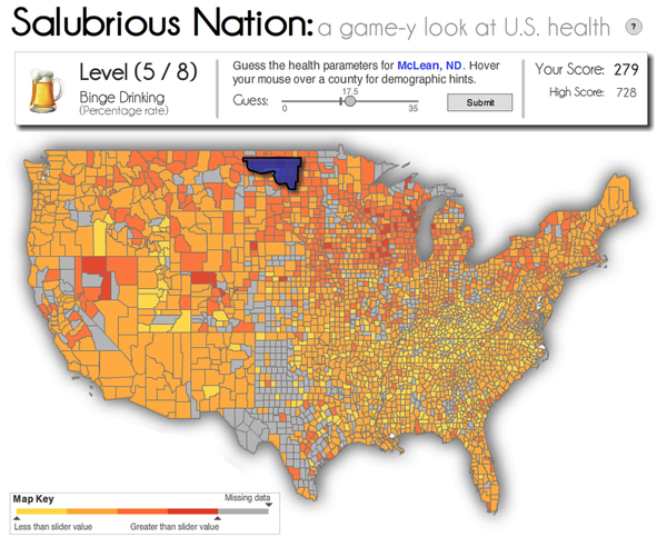
Playable Data
How do you engage people with data? How do you make them care and pay attention and remember anything about a particular piece of data? One way is dressing the data up as an information graphic. Another might be to get people to play a little game with the data. Nick Diakopoulos and colleagues have built a fascinating research prototype of what this might look like. Read more…
A EuroVis Survival Guide, Part 1
EuroVis 2012 is only about six weeks away, so if you haven't booked your travel or hotel, now is the time. Here are a few pointers on where to stay, transportation options in Vienna, etc. Read more…
The Explanatory Power of Data Points
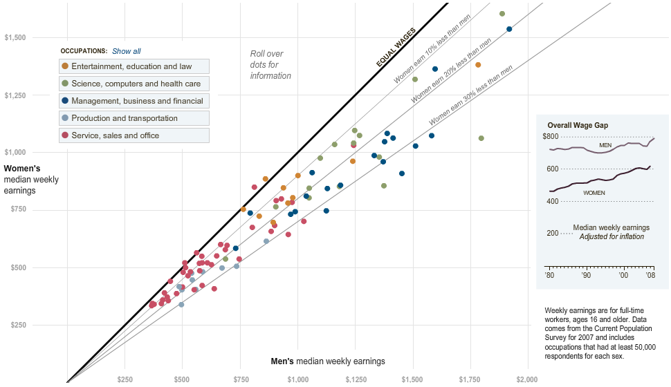
As newspaper graphics go, scatterplots are a fairly advanced technique. They tend to show a reasonably large amount of data as single points, and they require the reader to have an idea what to look for. Most newspapers never bother using scatterplots for that reason, which is really too bad. With some explanation, a scatterplot can be a very effective means of displaying data, and in particular to allow the user to drill into the data a little bit. Read more…
Visual.ly Create
Information graphics are a big and growing business, but the tools that are used for making them are little better than paper and pencil. That is particularly problematic when it comes to infographics that are heavy on data, which not only require a lot of work, but also many repeating steps that could be handled by a machine. Visual.ly's recently launched Create tool takes care of some of this work to create better and more flexible information graphics. Read more…
April is Visualization Challenge Time!
While there has been some criticism of a particular type of visualization challenge recently, there are many other challenges that are organized well and provide good opportunities for people to work on their skills. Two challenges in particular have caught my attention, and are presented here with the official EagerEyes Quality Seal and Stamp of Approval. Read more…
What Does It Mean to Inform?
Information graphics are meant to carry meaning, so that readers can learn something about data, facts, or processes. But what does it mean to inform? And how does the goal of informing in information graphics differ from analytical visualization? Read more…
Malofiej 20
Malofiej was an exhausting week with many great conversations, fascinating insights, and great company. My sleep-deprived and jet-lagged brain is buzzing with things to write about, and this is only the first of several articles about or inspired by Malofiej. I start with a discussion on why I think The New York Times did so well this year, and what other newspapers can do to catch up. Read more…
Upcoming Travel: SxSW and Malofiej
I will be at South-by-Southwest (SxSW) this year to speak on a panel, and also take part in the Malofiej awards and summit, where I will be a judge and speaker. Here are some pointers for those of you who might be at one (or both!) of those events. Read more…
A Storytelling Experiment
I need two minutes of your time. By clicking on the following link, you will be taken to one of several slightly different versions of a visual story about the development of the gross domestic product (GDP) in different countries. Watch it, play with it, and if you like it: share it. You will help us understand which types of storytelling work and which don't. There is no annoying survey, just a little story. Read more…
The Three Types of Chart Junk
A recent posting on Dmitry Fadeyev's design blog got me thinking about decoration and chart junk again. Fadeyev talks about the Victorian obsession with ornamentation, but he could equally be talking about the way charts and infographics are often decorated. A short excursion to the 1850s might help shed some light on the issue of chart junk. Read more…
The Bikini Chart
The Obama administration released a chart a while ago that shows job losses during the last year of the Bush administration and the first year after Obama took office. The chart is simple yet effective in the way it communicates a message. It also has some very subtle design elements that communicate a much more negative undertone than is immediately obvious. Read more…
Quo Vadis, Many Eyes?
Remember when visualization for the masses was all the rage, back in 2007? We were so young and hopeful. Many Eyes and Swivel were the harbingers of a new age of data literacy and well-informed debate. Visualization was going to be social and change the world. Alas, it was not to last. Swivel is gone, and Many Eyes clearly seen its best days. This is despite the fact that interest in visualization is growing, and it turns out that Many Eyes is as busy now as never before. I have scraped some data from the site that shows that despite the lack of updates and new features, people's use of it is still increasing. The data also gives some interesting insights into what people use it for. Read more…
Another Metaphor for Visualization: Writing
Andrew Gelman recently wrote a blog posting in which he draws an interesting comparison between writing styles and graphics styles. I think he's on to something, and the comparison can be taken a bit further to illustrate some common misunderstandings around visualization. Read more…
Watchlist: Jessica Hullman
Among the papers that stood out at InfoVis 2011 were two that shared an author, and that were presented in the same session by the same person: Jessica Hullman. These papers were Benefitting InfoVis with Visual Difficulties (with Eytan Adar and Priti Shah) and Visualization Rhetoric: Framing Effects in Narrative Visualization (with Nicholas Diakopoulos). Read more…
Graphs Beyond the Hairball
Networks are usually drawn using a technique called node-link diagrams. While that works well for small graphs (the technical name for networks), it breaks down beyond a few dozen nodes. Better techniques exist, though these are currently focused on specific types of graphs or answer particular questions. Read more…
Venn Diagrams
Venn diagrams are a great way to visualize the structure of set relationships. They're also an example of a technique that works very well for a particular purpose, but that entirely fails outside its well-defined scope or when the number of sets gets too large. Read more…
Where Infographics Are Going
At their best, information graphics can be informative, exciting, and attractive. At their worst, they can be misleading, overdesigned, and empty. Infographics are still in their infancy, with a lot of untapped potential. Ideas from visualization can help figure out a future that is much more exciting. Read more…
The State of Information Visualization, 2012
Another year has come and gone, and many exciting things have happened in information visualization. Here is a look back at some interesting events from last year, as well as what I expect for 2012 and the next few years. Read more…
Hello from Tableau (and Seattle)!
I am spending the entire year 2012 in Seattle, working with Tableau Software. The topics I will be working on include storytelling and Tableau Public, plus some super-secret projects even I don't know yet (mostly because we haven't decided on them). Read more…
An Interactive Version of the ZIPScribble Map
For more than five years, the ZIPScribble Map and its related pages have been the most popular feature on my website. To freshen things up a bit, I am adding an interactive version that runs in your browser. I have also added a few more countries, for a new total of 38. Read more…
Embracing Uncertainty in Two-Line Charts
As we're heading towards elections again, there is a chart type that is as unavoidable as political ads, baby-kissing, and smear campaigns: line charts showing polling data. The most common pitch two candidates against each other, and often make a big deal out of the fact that the lines cross. Not only are these charts misleading in the way they depict the choice, they also hide an important fact: the number of undecided voters. Read more…
New Posting Frequency for 2012
In my enthusiasm about switching to WordPress, I made the mistake of tweeting about potentially increasing my posting frequency in 2012. While I have tried to stick to a roughly weekly schedule in the past, there have been weeks when I did not write anything. My hope is to increase the frequency to roughly twice a week and see how that goes. John Peltier and Jorge Camoes are planning on doing the same. Read more…
My Review of Visualize This and Visual Complexity for Science Magazine
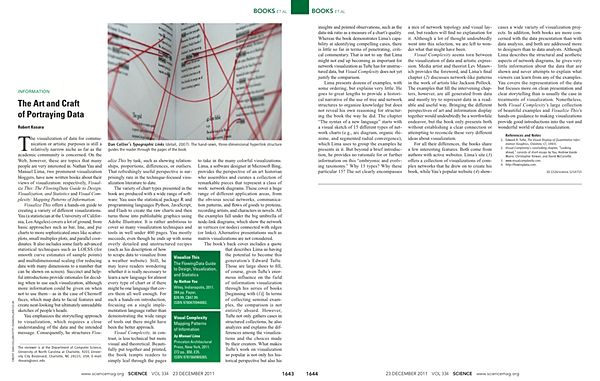
I was asked to write a review of two recent visualization books for Science: Nathan Yau's Visualize This and Manuel Lima's Visual Complexity. The piece appeared in the last issue of 2011, right before Christmas. Below is a link and some additional comments on the review and the two books. Read more…
Why I Switched From Drupal to WordPress
After more than five years, switching the content management system (CMS) on eagereyes was not an easy decision. I've been thinking about doing that for a while though, and I want to explain my reasons and what I expect WordPress to do better than Drupal below. This should also be useful for anybody who is on the fence about starting a blog (or has a blog that hasn't been updated in a while). Read more…