Blog 2019 (20 posts, 1 archived)

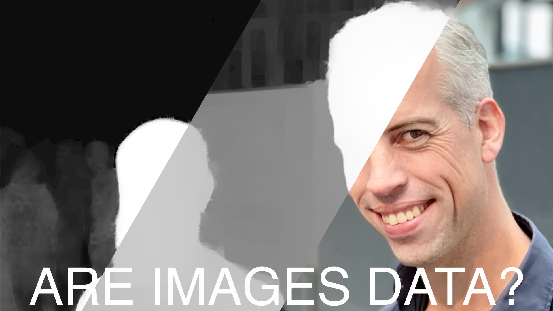
eagereyesTV: What Is Data? Part 2, Are Images Data?

Visualization turns data into images, but are images themselves data? There are often claims that they are, but then you mostly see the images themselves without much additional data. In this video, I look at image browsers, a project classifying selfies along a number of criteria, and the additional information stored in HEIC that makes things like portrait mode and relighting possible.

ISOTYPE Book: Young, Prager, There’s Work for All

This book from 1945 contains a very interesting mix of different charts made by the ISOTYPE Institute, some classic and some quite unusual. As a book about labor and unemployment, it also makes extensive use of Gerd Arntz’s famous unemployed man icon.

Review: Alberto Cairo, How Charts Lie

Alberto Cairo’s new book, How Charts Lie, takes readers on a tour of how charts are used and misused, and teaches them how to not be misled. It’s a useful book for both makers and consumers of charts, in the news, business, and pretty much anywhere else.

Prolific, the (Much Better) Mechnical Turk Alternative

Prolific is a crowd-sourcing platform for running studies. In contrast to the widely-used Mechanical Turk, it’s specific to studies, has a much better interface, pricing that’s fair to participants, and useful filters to find the right people for your study.

eagereyesTV Episode 3: 3D Pie Charts For Science!

How do we read pie charts? This seems like a straightforward question to answer, but it turns out that most of what you’ve probably heard is wrong. We don’t actually know whether we use angle, area, or arc length. In a short paper at the VIS conference this week I’m presenting a study I ran to answer this question – a study using 3D pie charts!

eagereyesTV Episode 2: Unit Charts, Dot Plots, ISOTYPE, and What Makes Them Special

Charts usually show values as visual properties, like the length in a bar chart, the location in a scatterplot, the area in a bubble chart, etc. Unit charts show values as multiples instead. One famous example of these charts is called ISOTYPE, and you may have seen them in information graphics as well. They’re an interesting family of charts and they seem to have some unusual properties that most other charts don’t have.

XIII

This website is now thirteen years old. While it has slowed down somewhat recently, it’s still alive and kicking. Now in its teens, it is looking for new experiences and trying out new things.

Data: Intent and Primary Interpretation

Take a JPEG image file and a CSV file. Which of these two is data? Is one of them more obviously data than the other? I think the key difference is the intent behind the data and its primary interpretation.

Highlights from EuroVis 2019, Part 2

This is the second part of my highlights from EuroVis earlier this year in Porto, Portugal. There are papers about decision making and interaction, as well as a report on the capstone talk and a look to next year’s conference, which will be a bit different.

Highlights from EuroVis 2019, Part 1

The EuroVis 2019 conference took place in early June this year in Porto, Portugal. While I enjoyed the city and conference venue, I found the program a bit underwhelming this time around. I’ve kept pushing off writing this report because I found myself griping rather than talking about the content.

What Is A Misleading Chart?

I see a lot of discussions of misleading charts lately, and there are certainly many of them out there. One distinction that isn’t always made, but that I feel is important, is whether the chart itself is poorly designed, or whether an otherwise correct chart is taken to mean something it does not. It’s an important difference that often gets glossed over.

Two Short Papers on Part-to-Whole Charts at EuroVis

Why do pie charts look the way they do? What makes this particular way of slicing up a circle the preferred way of showing part-to-whole relationships? In two short papers that I’m presenting this week at EuroVis, I looked at the design space of circular part-to-whole charts, including pie charts.

Critiquing and Redesigning

Criticizing visualizations is a cottage industry of sorts, and an activity I have indulged in in the past as well. Redesigning those charts is also not uncommon, though it's usually other people's charts, and that isn't always welcome. Sarah Leo of The Economist has redesigned some of the charts made by that publication, and not only do her redesigns work better, her thoughts around some of the design issues are also very insightful.