Blog 2021
New Video: The Science of Pie Charts
The common explanation for how pie charts work is that we read them by angle. That of course would mean that donut charts would be bad, because you can't see the angle when you take away the center of the pie. Changing the radius of a slice wouldn't matter though, because that doesn't change the angle. But there is no evidence that angle is how we read pie charts, quite the opposite actually. In this new video, I walk through five reasons why angle is not how we read pies, and what that means for other things we like to assume about them. Read more…
Paper: From Jam Session to Recital: Synchronous Communication and Collaboration Around Data in Organizations
Who are the people who use data and visualization as part of their work every day? In particular, how do people use data as part of meetings, to present to others, to discuss their findings and recommendations, etc.? My colleague Matt Brehmer and I ran a pair of studies to find out. Read more…
EagerEyes Turns 15
EagerEyes is 15 years old today! Rather than look back at 15 years of visualization and blogging (though I will do a little of that too), I want to reflect a bit on what blogging means today and where things are going. Read more…
Can A Timeline Pie Chart Work?
Can you put ranked data into a pie chart that also represents time? This chart tries, and I think it succeeds. Read more…
New video: Chart Appreciation, Iraq's Bloody Toll by Simon Scarr
How do you make people not just see numbers when looking at a chart, but feel something? This chart of the number of deaths during the Iraq war has always given me a visceral response like no other, and it’s still as powerful as when it was made almost ten years ago. So I made a chart appreciation video to explain what I think is so great about it. Read more…
When the Wrong Chart Is the Right Choice
We all agree that the direction of the bars in a bar chart should correspond to the direction in which the values grow. Or do we? When it comes to running or audio recording and processing, it turns out that the seemingly wrong choice can be the right one – because a more semantically meaningful representation can help us understand and use the data much more easily. Read more…
New Video: Linear vs. Quadratic Change
Scaling objects to represent a value is a key part of visualization, but it's not without its pitfalls. Especially when it comes to fancy infographic bar charts, it can easily distort the value's appearance. Why that is, and where else this can happen, isn't always obvious. In my new video, I show how it happens and how to do it right – and how this issue inspired ISOTYPE. Read more…
New video: Florence Nightingale's Famous Rose Chart (aka "Coxcomb")
It's Florence Nightingale's 201st birthday tomorrow! Since I missed her 200th, I figured I'd make a video about her famous chart. What made it tick? What was it about? Who was Nightingale, anyway? Read more…
New video: Chart Appreciation, Black vs. White Boys and The Punishing Reach of Racism
Dots fly across the screen, some of them moving up, some down. They represent black and white boys, and how their income differs from that of their parents and from each other. It's a great way to show this data in an engaging way and without having to explain percentiles. This is a chart appreciation. Read more…
The Dearth of Videos about Visualization
To appropriate the famous Martin Mull quote, writing about visualization is like dancing about architecture. Why are we using written words, like this blog post, to talk about visualization instead of moving images, like in a video? Read more…
eagereyesTV: Minard's Famous "Napoleon's March" Chart – What It Shows, What It Doesn't
This chart is a staple in every visualization course and many visualization talks. But what does it show, and what does it leave out? There's a lot more to Napoleon's Russian Campaign and to Charles Minard's work than this one chart. My new video looks beyond the surface of what is perhaps the most famous chart out there. Read more…
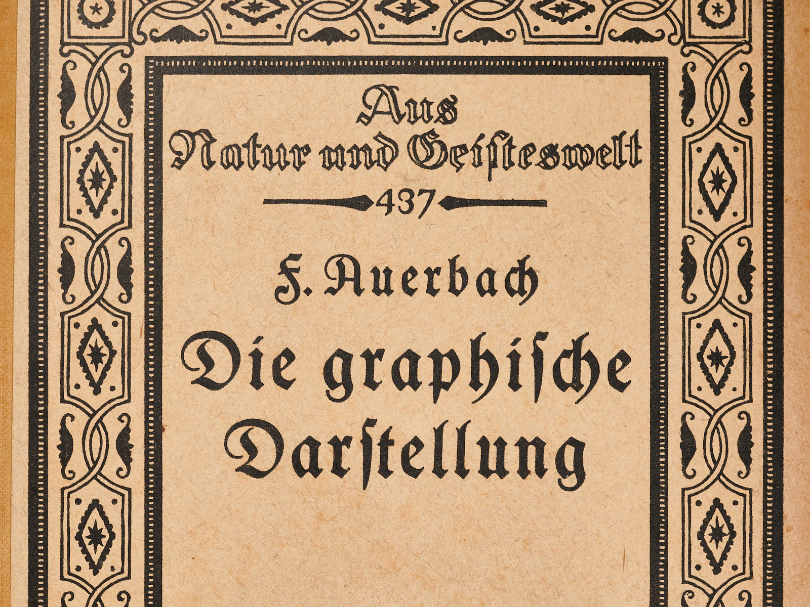
Felix Auerbach, Die Graphische Darstellung (Graphical Representation, 1914)
This little book covers a large number of different ways of showing data. There are also some mathematical graphs, but the focus is on representations of data “from all areas of science and practice.” It’s a fascinating look into what was known in the early 1900s, and how people thought about graphical representations as tools. Read more…