Blog 2016 (65 posts, 5 archived)

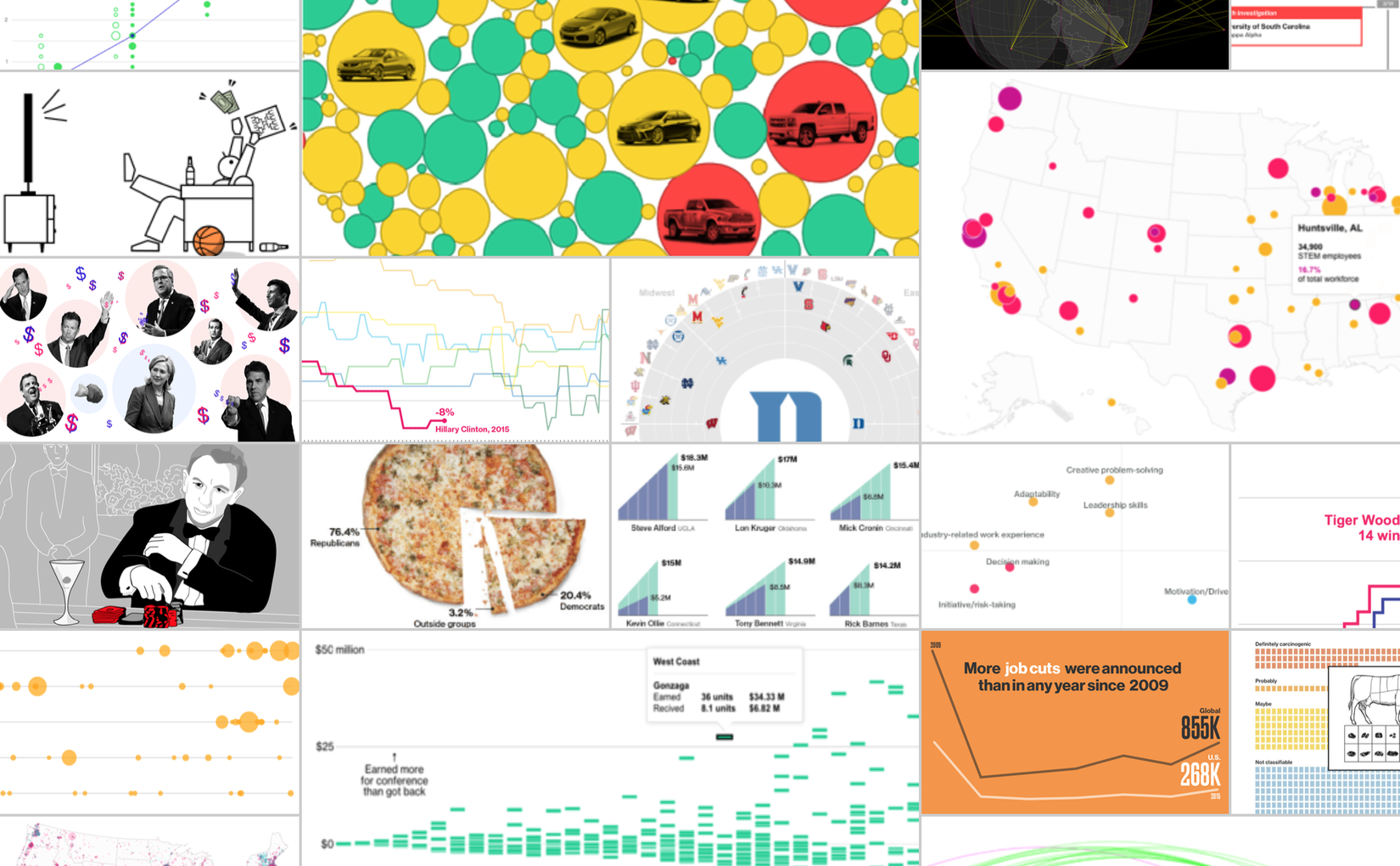
A Roundup of Year-End News Graphics Roundups

The end of the year is always a good time to look back at the great work done in the world of news graphics – and this year in particular, to relive all the heartbreak and disillusionment. Here is a list of year-end news graphics round-ups for your enjoyment and edification.

The Dumbest User Interface of 2016

It is my great honor and pleasure to announce the winner of the Worst User Interface Award 2016: it goes to the new chip-enabled credit card terminals introduced in the U.S. this year. My congratulations, as it is very well deserved.

When Rankings Are Just Data Porn

Rankings are a common way of talking about data: who made the most money, who won the most medals, etc. But they hide issues in the underlying data. Is the difference between first and second meaningful or just noise? Here is a data video that nicely demonstrates the problem.

The EagerEyes Holiday Shopping Guide

Are you looking for the perfect gift for the data or visualization geek in your life? Did that crazy self-driving water bottle Kickstarter still not deliver, leaving you hunting for an overpriced Nintendo Classic? The EagerEyes Holiday Shopping Guide has all the geeky, uncool gifts you could possibly want.

Review: Jon Schwabish, Better Presentations

Presentations can be dreadful. Badly thought-out slides, boring structure, poorly delivered. I once told a colleague after a practice talk to please shoot me before she’d ever make me sit through such a talk again (to be fair, she had called the talk boring herself before she even began).

The Problem with Vis Taxonomies

Most taxonomies in visualization and HCI are useless. They carve up the space, but they don’t provide new insights or make predictions. Designing a useful taxonomy is a difficult problem, but that's no excuse for publishing lots of mediocre ones.

RJ Andrews' Profiling the Parks

RJ Andrews has created a great little video about the National Parks in the U.S. Have you ever thought about how the different parks compare? Which one is wider, which one is deeper, which one's at higher or lower elevation?

Dealing with Paper Rejections

For some reason, the topic of reviewing and getting papers rejected came up several times in conversations at VIS recently. Getting your work rejected and learning to deal with rejection is part of life as an academic, and it’s worthwhile to think about the process a bit.

Graphic Continuum Flash Cards

Jon Schwabish and Severino Ribecca have turned their Graphic Continuum poster into a set of cards. They're a good way to expand your visual vocabulary and find new ideas for how to represent your data.

Ten Great Talks at Information+ 2016

The Information+ Conference took place in Vancouver earlier this year. It brought together people from information visualization and information design (and design more in general). All of the talk videos are online on the website, but since there were a lot and it's kind of hard to decide where to start watching, I'm listing my favorites below.

All Those Misleading Election Maps

Would you make a bar chart where the length of the bar doesn't actually scale with the number being shown? Would you draw a line chart with the lines all over the place, not where the values actually are? Of course not. Yet somehow, every single election map works like that.

Common Speaking Mistakes To Avoid

Whenever I go to academic conferences, I have to sit through some terrible talks. It continues to amaze me that so many people make mistakes that are so easy to avoid. Here are a few I noticed just in the last two days.

A Treemap Chart Pie

After his recent early chart pie attempts, Ben Shneiderman has now achieved the ultimate in chart pie baking: a treemap chart pie.

IEEE VIS Pointers and Running

VIS is around the corner, taking place in Baltimore next week. Here are some pointers to a handful of interesting papers, as well as how to catch one of my live performances or attend the blogging and podcasting meetup – plus a reminder to bring your running shoes!

Paper: An Empire Built On Sand

It's not a secret that I think that we need to ask some harder questions about the foundations that we're building visualization on. In a paper to be presented at the BELIV workshop at VIS next week, I'm making the case for that more extensively than I have so far. The full title of the paper is An Empire Built On Sand: Reexamining What We Think We Know About Visualization.

The Winding Path of Data Analysis

Data analysis is not a straight-forward process: you try out lots of things, you go down a path that seems promising but then turns out to not work out, and suddenly you hit upon the thing you were looking for.

A Decade of EagerEyes

So here we are. 10 years. A decade. 3653 days. 452 postings. Some good stuff. Some bad stuff. Some terrible stuff. A decade is a long time. But its end is also just the beginning of the next one.

The EagerEyes Origin Story

Have you ever wondered where the weird name comes from, what the site was like before it was a blog, and how it all got started? This posting has all the answers.

Why I Do This

Why spend countless hours writing a blog like this? What do I get out of it? What do I hope to accomplish? What is the purpose?

Meet the New Logo and Theme!

This site has gone through many different looks and designs. I haven't kept count, but I'd be surprised if it was fewer than ten. So far, they have all either been off-the-shelf generic designs or ones I had created myself. For its tenth birthday, I decided to splurge and get eagereyes a complete makeover: a new theme and a real, custom logo.

The Controversies

I have opinions. I state those opinions. Not everybody likes my opinions. And sometimes it's not just a matter of opinion, but also of tone and approach. Criticism can be a useful tool or it can be an angry attack. Figuring out which is which isn't always easy while you're doing it.

Eagereyes' Early History

Just ahead of the first decade of this website's history clicking over, here's a look back at where things started. Some of those postings were terrible, some of them were quite prescient or are even still popular.

Ben Shneiderman's Chart Pies

So turns out Ben Shneiderman is into pies! Actual pies that is, but in the form of charts. Rather than, you know, the other way around. Feast your eyes on delicious-looking chart pies!

Link: xkcd's Earth Temperature Timeline

Randall Munroe has done it again. His latest xkcd comic is an enormous timeline of the Earth's temperature, showing the enormously long time we have temperature estimates for, and how little it has changed until very, very recently.

Review: Lupi, Posavec, Dear Data

Giorgia Lupi and Stefanie Posavec have turned their Dear Data project into a book. It's a great example of the kind of creative work you can do around visualization without computers, entirely by hand. What started with a simple idea turned into an amazing project.

Link: Jérôme Cukier's Series on Visualization with React

While D3 is the standard way of doing visualization on the web right now, there's a lot of interesting stuff happening in the world of JavaScript framework React. And it turns out, you can do some really interesting visualization stuff with React, once you understand the basics. In a series of very thorough postings, Jérôme Cukier takes you through the fundamentals of React and how to use it by itself or together with D3.

Nassi-Shneiderman Diagrams

Programming languages use words and symbols to represent structures like blocks and conditions. A visual representation of these structures seems useful to keep track of all the different cases, see the scope of variables, etc. Nassi-Shneiderman diagrams offer just such a representation.

Stacked Bars Are the Worst

Bar charts are great. They always work. They're always the safe choice. Right? Well, no. Stacked bar charts are deceiving because we think they work just like regular bars, when they're really pretty terrible.

Two Ideas for a Better Visualization Web

There is a reasonable amount of information about visualization available on the web. There are still huge gaps though, especially when it comes to bridging the gap between academic research and the rest of the world, though. Here are two ideas: one simple, one rather involved.

The Repetitive and Boring History of Visualization

When people talk about the history of data visualization, the same set of names always comes up: Playfair, Nightingale, Snow, Minard. They are historically important, alright, but why do they overshadow all the other work that was done? And what do we know about how important they actually were?

Link: Our World in Data

Our World in Data looks at a wide variety of data about the world: health, population, energy, growth, inequality, etc. Max Roser and his colleagues dig through the vast amounts of open data to find many interesting connections and insights.

The Bits Are Rotting in the State of Data Journalism

News articles are an incredibly important source of historical information. Online media and interactive pieces are much more at risk of breaking or disappearing, at least in theory. Well, it's not just theory. A quick look around shows a number of even fairly recent pieces in major publications that are broken today.

New, Improved Traveling Presidential Candidate Map

Many years ago, when this website was still young, I created a map of all the ZIP codes in the U.S. in numeric order and then wondered about the shortest path through all of them. I dubbed that The Traveling Presidential Candidate Map. Here is an improved version that's interactive and much more efficient than the old one.

The Café Wall Illusion in a Bar Chart

The Café Wall Illusion makes you to see perfectly parallel lines as being at an angle. It's a curiosity and a cool perceptual illusion – except when it shows up in a bar chart, as it did in this example.

An Illustrated Tour of the Pie Chart Study Results

In two papers, Drew Skau and I recently showed that our idea of how we read pie charts is wrong, that donut charts are no worse than pie charts, and a few more things. Here is a detailed walk-through of the results of the three studies we conducted for this purpose. Let's go on a little journey through some real data and do a little science together!

Publicize, Don't Just Publish!

What does it mean to publish a paper? Is it just to add a bullet point to your CV, or do you want the world to know about your research? What does it mean to publish today? Here are some thoughts and pointers on how to get the word out about the amazing work you do.

A Pair of Pie Chart Papers

How do we read pie charts? Do they differ from the even more reviled donut charts? What about common pie chart designs like exploded pies? In two papers to be presented at EuroVis next week, Drew Skau and I show that the common wisdom about how we read these charts (by angle) is almost certainly wrong, and that things are much more complicated than we thought.

The Scrollytelling Scourge

Scrollytelling is a common way of interacting with stories these days. Scroll down and the story unfolds! Except it's often awkward, brittle, and gets in the way.

Row-Level Thinking vs. Cube Thinking

Our mental model of a dataset changes the way we ask questions. One aspect of that is the shape of the data (long or wide); an equally important issue is whether we think of the data as a collection of rows of numbers that we can aggregate bottom-up, or as a complete dataset that we can slice top-down to ask questions.

MTurk IDs Are Not Anonymous

The worker IDs Amazon's Mechanical Turk gives you may look pretty random and anonymous, but they can reveal personally-identifiable information. They need to be removed from datasets, especially when they are shared or published.

3D Bar Charts Considered Not That Harmful

We've turned the understanding of charts into formulas instead of encouraging people to think and ask questions. That doesn't produce better charts, it just gives people ways of feeling superior by parroting something about chart junk or 3D being bad. There is little to no research to back these things up.

Spreadsheet Thinking vs. Database Thinking

The shape of a dataset is hugely important to how well it can be handled by different software. The shape defines how it is laid out: wide as in a spreadsheet, or long as in a database table. Each has its use, but it's important to understand their differences and when each is the right choice.

The Personified User Interface Trap

Personified user interfaces, like chat bots or agents, are the new thing once again. But despite advances in artificial intelligence, they still have many issues and drawbacks compared to direct-manipulation interfaces. There was a debate around these interfaces in the 1990s, and it seems to be bound to repeat itself.

Links: Scott Klein on the History of Data Journalism

The history of data journalism goes back much farther than most people assume. Long before computers or punch cards, and before even the first newspapers the way we know them today, data was being published. ProPublica's Scott Klein has been digging up a lot of interesting history.

The Two-Paper Package

Much of academic work is focused on writing papers. This doesn't just include the work that goes into the research and the writing, but also strategy – beyond the single paper. Here is one that worked. Even if it's a bit coincidental, I think it's a good model for other papers.

Ye Olde Pie Chart Debate

You may think that the debate over pie charts was a new one, but it has raged on for at least 100 years. Brinton started it in 1914, and great drama unfolded in the pages of the Journal of the American Statistical Association in the 1920s.

The State of Information Visualization, 2016

Oh hello, new year! I almost didn't see you there! Lots of interesting things happened last year: Dear Data, deceptive visualization, storytelling research, new tools and ideas, etc. And this year is already shaping up to be quite strong, too.