Blog 2009
Temperature Baseline Differences
Tableau started the beta of its Tableau Public program today, and what better way to kick the tires than to run some more climate data through it? Below, you can look at temperature data from 343 weather stations over twenty years (77172 obervations) to compare the difference from the baseline numbers in the 1970s and 2000s. Read more…
A Look At Climate Data
Wether you believe that global warming is real or not, a bit of validation of the source data is still interesting. This is my second look at the global temperature data recently released by the UK's Met Office, this time using Tableau. There are some interesting data issues here, and a rather analytical visualization. Read more…
Interactively Explore Climate Data
The United Kingdom's Met Office recently released temperature data for about 1700 weather stations across the globe from 1701 to 2009. Here is an interactive visualization (built using Protovis) of that data for you to explore. Read more…
Curing A Sick Chart
I recently criticized Ben Fry's visualization of health care cost data from GE and claimed that I knew how to do it better. While my analysis may not be as pretty and flashy as Fry's, it provides actual insight into the data. It also reveals an interesting issue: the data is really dull. So dull, in fact, that a visualization was needed to cover up that fact. Read more…
The Unrecorded Life is Not Worth Living
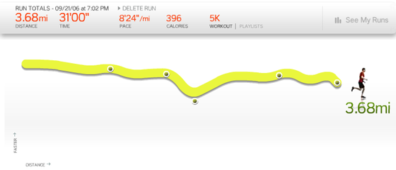
It has never been easier to record your daily activities. The data is all well and good, but the real value comes from visualizing it. Why visualize your mundane, boring life? Because it helps you track what you are doing, and provides motivation to get your ass to the gym. Read more…
Bring Out Your Dreadful Charts!
There are many terrible charts out there, whether visually ugly and cluttered, or pretty but empty or even misleading (like this beautiful pie chart example featured on Fox News recently). Andrew Vande Moere at infosthetics is hosting a competition to find the ugliest and most useless charts. Read more…
The Cost of a Sick Chart
General Electric recently commissioned Ben Fry and Seed Media to visualize health data to communicate the costs of different kinds of diseases to the public. The result is pretty and colorful, but of little value if you actually want to learn something. Read more…
The Simple Way to Scrape an HTML Table: Google Docs
Raw data is the best data, but a lot of public data can still only be found in tables rather than as directly machine-readable files. One example is the FDIC's List of Failed Banks. Here is a simple trick to scrape such data from a website: Use Google Docs. Read more…
I Want to BELIV
Evaluation of visualization systems and techniques is a vital part of visualization research, but is often neglected. While there are established methods for basic perception studies, many other kinds of questions are much more difficult to answer in a controlled study. The CHI workshop BELIV (BEyond time and errors: novel evaLuation methods for Information Visualization) is the place to discuss new ideas about evaluating visualization. Read more…
Starting Your Own Visualization Blog
Getting started with your own blog is so easy today that many people never get to actually doing it. One of the goals of the Putting Visualization on the Web workshop was to get more visualization blogs and websites going. So here are some pointers and a few tips on how to avoid some pitfalls that are especially dangerous for technical people. The goal is not to point to millions of resources, but to narrow down the choices so you can get started writing. Read more…
VisWeek Preview: Changing the World with Visualization (Panel)
What good is visualization if it can't save the world? Or maybe at least change it. Make it a little better. Make a difference. I am organizing a panel at InfoVis next week to discuss what visualization already does, and what else we can do to free visualization from the confines of the ivory tower and have an impact in the real world. Three remarkable people will present their views and discuss with the audience. Read more…
VisWeek Preview: Live Coverage
Like last year, I will be live-blogging and tweeting from VisWeek. Here is some information on my plans and links to what others will be doing (that I know of). Feel free to add your links, Twitter handles, etc. in the comments. Read more…
VisWeek Preview: Visualization on the Web Workshop
The workshop Putting Visualization on the Web will be held on Sunday, October 11, from 2pm to 5:30pm at VisWeek 2009. If you are there on Sunday, please join us for discussions on everything related to visualization, blogging, web-based visualization, and a whole lot more. You do not have to register for the workshop separately, and you are welcome whether you submitted a position paper or not. Read more…
Shaking the "Pretty Picture" Stigma
Coming from the academic and computer science side of visualization, I always assumed that it would be self-evident to anybody that visualization is first and foremost useful, and only happens to also produce nice pictures. Alas, this is not actually the case. To most people, visualization means pretty pictures first, and maybe also a fact or two. We have to fight that or risk the trivialization and marginalization of visualization as an analytic tool. Read more…
qnch - A Data Description Language for Tabular Data
A lot of data is tabular in nature, and is efficiently encoded in text files. While such files are easy to produce and read, they bring with them several challenges when used in visualization tools and other programs that have to understand some of the data's properties. Examples include categorical data, special values in numerical columns (which are common in Census data), and information about the data like its producer. Here is a proposal for a simple data description format that provides that missing information. I call it qnch. Read more…
Parallel Sets 2.1 Released
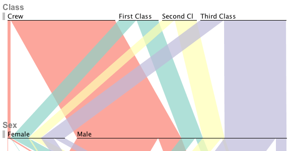
We are happy to announce the release of Parallel Sets 2.1. The new version fixes a number of bugs and introduces a few new features. The biggest changes are under hood, with a new database model that can now handle much more complex datasets (in terms of number of dimensions and categories), and the new streaming import can load in datasets with a much larger number of records. We have also added a way to automatically sort categories by name and size, a screenshot function, and more. Upgrading is strongly recommended. Read more…
OECD Seminar on Turning Statistics into Knowledge
Last week, I attended the seminar on Turning Statistics into Knowledge, organized by the OECD, the World Bank, and the US Census Bureau. That was an interesting way of spending two days, and I saw some interesting ideas and talked to many great people. But it was also a reminder of how little understanding of visualization there really is, and how far we have to go to make good visualizations available and work for a variety of users. Read more…
Looking for Parallel Sets Users with Real Data
We are looking for people who use Parallel Sets with real-world data and who would be interested in taking part in writing up a case study for the InfoVis Discovery Exhibition. You don't have to share your data, and the images can be anonymized, but it has to be real data (and you have to be able to describe what it is and what you learned in a way that is not too general). Read more…
Putting Visualization on the Web – at VisWeek 2009
A while ago, I complained about the state of visualization on the web. To improve things, I am co-organizing a workshop at VisWeek in October to discuss the status quo, potential problems, and to find new ways to get visualization people to make their mark online. Whether you have a blog or website, don't have a blog or website, plan on starting one, are afraid of starting one, or think this whole web thing is just a fad – we want to hear from you! Read more…
A Browser for Data.gov
Data.gov's selection of data is slowly growing, but even with less than 300 datasets, it is difficult to keep an overview of what is there. Below is a little Java applet that provides a way to drill down into data.gov's catalog using a variety of categories: reporting agency, geographic coverage, frequency, data type, etc. Besides giving a better idea what is there, it also shows a number of inconsistencies that make finding data more difficult. Read more…
Data Is A Dish Best Served Raw
The recent opening of Data.gov has led to a number of discussions on data formats, feeds, what kinds of data, which agencies are or are not participating, etc. One key aspect that gets overlooked very easily, but that is really essential, is that what is being published is actual data: original, raw, unprocessed, undigested, naked data. Everything else is secondary. Read more…
Parallel Sets Released!
After an initial commitment, an announcement, and a delay, we are proud to announce that the Parallel Sets application has been released! Mac OS X and Windows versions are ready to be downloaded, and the source code is available for your enlightenment and/or entertainment. Read more…
InfoVis 2009 Discovery Exhibition
After the underwhelming participation in last year's InfoVis contest, there will be a different approach this year: The InfoVis Discovery Exhibition. The goal is to collect reports of visualization is used in real-world scenarios, and how visualization tools can help solve real problems. There are already two examples, and with enough participation, this should turn into a great resource. See below for how you can participate, and what's in it for you. Read more…
Democracy, Public Data, and Data.gov
It's not quite the National Data Agency I envisioned earlier this year, but Data.gov is now live. It's a laudable effort, and there is quite a bit of data there, but it's still very labor-intensive to get the data sets and convert them into usable formats. But it's becoming clear that data needs to be shared, and that access to government data will soon be regarded as much as an inherent part of a democracy as free elections. Read more…
Visualization is not Periodic, Period!
Of all the sins committed against visualization on the Internet, the Periodic Table of Visualization Methods stands out as the most egregious. Its collection of actual visualization methods, structural diagrams, and feel-good business bullshit does not fit a structure that was devised to understand the world – and that is actually a very effective visualization in itself. Read more…
Parallel Sets Release Pushed Back A Bit (Updated)
I'm very sorry, but we have to delay the release. We need to make sure that we have the right to release the program, and this is taking a bit longer than expected. The software was written in part by students paid from the SRVAC, which is funded by DHS and DOE. It is unlikely that there will be a problem, but we don't have the go-ahead yet, either. I am hoping that we can get the green light this week. Read more…
Anybody interested in eagerears.org/.com?
I got the domains EagerEars.org and EagerEars.com for my April Fool's joke. Now the question is: what to do with them? If you have an idea and want to have the domain, let me know. You can have it for the remaining period it was registered for (until January 2010), and then decide what to do with it. I will keep some control over it until then though to make sure EagerEars does not become a spam or phishing site. Read more…
Parallel Sets Release Date
We promised the release of the Parallel Sets program for the end of April, but we have to push it to May 7. The reason is quite simply lack of time: the semester is ending here at UNC Charlotte, and things are rather busy as a result. There is also the nuts-and-bolts work of making this work as an application for end-users that works well on at least two platforms (Windows and Mac OS X), and that can provide useful information when it doesn't. Read more…
Design Tutorials for VisWeek 2009
As one of the Tutorials Chairs at this year's VisWeek (which is the combination of the IEEE Vis and InfoVis conferences, and the VAST symposium), I want to make you aware of the upcoming deadline for submitting tutorial proposals: April 28. We are looking for a wide variety of ideas, but I want to especially encourage the submission of tutorials on design for visualization. VisWeek will take place October 10–16 in Atlantic City, NJ. Read more…
AppStore Billion Apps Live Visualization
Apple's AppStore for iPhone and iPod touch is about to sell its billionth application. You can watch Apple's pretty counter webpage, or you can see the downloads piling up and the rate of downloads visualized below. Unlike the billionth song download a few years ago, this is in (almost) real-time. The collected data and the Python script that generates the images using Google Charts is included. Read more…
Where are the Visualization Tools?
I got several requests in the last few days about tools for doing visualization and visual analytics. Looking around, I don't see a lot of good, affordable (or free) visualization software. There are lots of papers, but few of those programs are available. And those that are often are of very low quality, very limited in their functionality, and are not being maintained. Please help me collect links to visualization tools that let people with data experience that visualization magic. Read more…
New Sister Site: EagerEars.org
Music and visualization are two things that fascinate me. I always felt that they had something in common, and I recently figured out what it was: structure. That may not be the correct musical term, but it should be clear what I mean nonetheless: the rhythmic structure of music, with its repeated patterns and variations, is what makes music. And that is also what makes abstract images interesting to look at, and what we look for in visualization. So I decided to start another website for my musings on music: EagerEars. Read more…
Shining a Light on Data: Florence Nightingale
Florence Nightingale invented modern nursing, and established its importance based on data she collected during the Crimean War in the 19th century. She was not only the first one to realize the role of hygiene and care for wounded soldiers to prevent the spread of disease and death, she also was the first to understand that sound decisions can only be made on data. Not only did she collect that data, she also devised ways to communicate it to decision makers who lacked knowledge of statistics or math. Read more…
A Spike of Interest in Parallel Sets
A few days ago, Michael Blastland published a very interesting little article on the BBC Magazine website, in which he showed an image of Parallel Sets. He also mentioned my name and even though there was no link or email address, I have seen a spike in traffic on this website and my university page, and have gotten a barrage of emails from people who want to try it out. Here is some information on the technique and a plan for getting the tool out into the world. Read more…
Sightings: A Little Space, Please!
"InfoVis and SciVis face off" is how the American Scientist homepage teases for my latest Sightings column. While the comparison between information visualization (InfoVis) and scientific visualization (SciVis) is part of the discussion, I am also describing work by my colleague Anthony Fodor (who works in bioinformatics) to demonstrate the usefulness of InfoVis in science. Read more…
A National Data Agency
President Obama promises a more responsible and accountable government that openly shares information with its people. This includes publishing executive orders and laws before they are signed, so everybody can comment. But it also needs to include the data decisions are based on. An information society needs its data to be available and accessible to make informed decisions – just like its leaders. Read more…
A Better Vis Web Community
When I look around my little corner of the Internet, I see a few other people doing related stuff, but I also see a lot of unrealized potential. Why are there so few people in the visualization community who run a website? Why are the most popular visualization-related sites almost entirely about pointing at colorful pictures done by others, rather than doing their own? And how can we get more original, quality visualization content on the web? Read more…