Blog posts filed under Paper

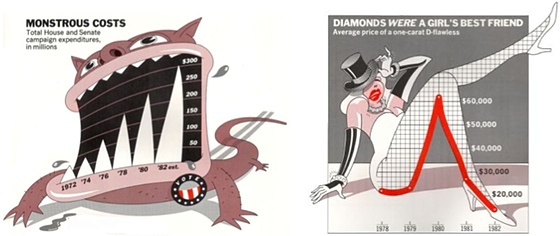
Paper: Business Data Visualization, Beyond the Boring

The words 'business' and 'data visualization' probably put you to sleep before you even reach the end of this sentence. But wake up! There's actually a lot of interesting work to be done in this area, if only we give it a chance.

Paper: Notebooks for Data Analysis and Visualization

Computational notebooks offer an alternative to the common GUI-based tools used for data visualization and BI today. In this new paper, I talk about what they are, their pros and cons, and how research could fill in some important gaps.

Paper: More Than Meets the Eye: A Closer Look at Encodings in Visualization

Encodings play a central role in visualization, but I believe our thinking about them is too simplistic. In a new paper, I argue that we need to distinguish between the encodings that specify how a visualization is drawn and the ones that are readable or actually read by an observer. While they largely or entirely overlap in some charts (like bar charts or scatterplots) they don't in others (pie charts, line charts, etc.). And what exactly do you even specify in more complex visualizations like treemaps?

Prior Work We Missed In Our Connected Scatterplots Paper

In 2016, Steve Haroz, Steven Franconeri, and I published a paper on a technique commonly called the Connected Scatterplot. It turns out that somebody else had research on essentially the same chart 15 years earlier, which we were not aware of. Our work is quite different, but it’s interesting context and it’s also worth reflecting on how we missed this piece of relevant prior work.

Two Short Papers on Part-to-Whole Charts at EuroVis

Why do pie charts look the way they do? What makes this particular way of slicing up a circle the preferred way of showing part-to-whole relationships? In two short papers that I’m presenting this week at EuroVis, I looked at the design space of circular part-to-whole charts, including pie charts.

Paper: Skipping the Replication Crisis in Visualization

Visualization doesn't have the replication issues that some other fields are struggling with right now, but is that because our science is so strong or because nobody actually bothers with replications? And what can we do to get ahead of potential problems before we run into a full-on crisis? In a paper to be presented at BELIV, Steve Haroz and I list potential pitfalls and present possible solutions.

Paper: An Argument Structure for Data Stories

There is talk about stories having a beginning, middle, and end, but what does that mean for data stories? How do you create the overall structure for those? In a paper to be presented at EuroVis next week, I discuss a simple but very useful structure that I have found "in the wild," and that I believe to be useful and generalizable.

InfoVis Papers at CHI 2017

The two main conferences in visualization are VIS and EuroVis, but recently CHI has also gotten some very interesting submissions (CHI is technically a conference about human-computer interaction, or HCI). This year looked particularly strong,

Paper: An Empire Built On Sand

It's not a secret that I think that we need to ask some harder questions about the foundations that we're building visualization on. In a paper to be presented at the BELIV workshop at VIS next week, I'm making the case for that more extensively than I have so far. The full title of the paper is An Empire Built On Sand: Reexamining What We Think We Know About Visualization.

A Pair of Pie Chart Papers

How do we read pie charts? Do they differ from the even more reviled donut charts? What about common pie chart designs like exploded pies? In two papers to be presented at EuroVis next week, Drew Skau and I show that the common wisdom about how we read these charts (by angle) is almost certainly wrong, and that things are much more complicated than we thought.

MTurk IDs Are Not Anonymous

The worker IDs Amazon's Mechanical Turk gives you may look pretty random and anonymous, but they can reveal personally-identifiable information. They need to be removed from datasets, especially when they are shared or published.

3D Bar Charts Considered Not That Harmful

We've turned the understanding of charts into formulas instead of encouraging people to think and ask questions. That doesn't produce better charts, it just gives people ways of feeling superior by parroting something about chart junk or 3D being bad. There is little to no research to back these things up.

Seminal InfoVis Paper: Treisman, Preattentive Processing

A paper on a specific cognitive mechanism may seems like an odd choice as the first paper in this series, but it is the one that sparked the idea for it. It is also the one that has its 30th birthday this year, having been published in August 1985. And it is an important paper, and could play an even bigger role in visualization if properly understood and used.

Study on Creative Data Visualization

To explore how we can make it easier to create new visualization designs, we are running a study based on a new approach, called visualization primitives. It lets you map data to the properties of objects like rectangles and ellipses. Build something with data, have fun, and help us figure out if it works!

Paper: Storytelling, The Next Step for Visualization

Visualization is often considered to consist of three phases: exploration, analysis, and presentation. While the former two topics are covered well in the literature, there has been very little work specifically on presentation. In an upcoming paper, Jock Mackinlay and I argue that presentation, and in particular storytelling and communication of data, are the logical next step for the field, and provide some research directions.

A Scholarly Discussion with Andrew Gelman and Anthony Unwin

This is how scholarly exchanges used to work: Scientist A publishes a result, Scientist B then writes an angry letter saying that Scientist A is full of it, to which A responds with more insults, etc., and all that published in a fine scholarly journal. I was recently asked to respond to a piece Andrew Gelman and Anthony Unwin had written about visualization for the Journal of Computational and Graphical Statistics, which had some issues.

Paper: Conceptualizing Visual Uncertainty in Parallel Coordinates

Visualization is largely defined as the transformation of data into images. Visualization tools don't have a way of assessing their output, though: were there enough pixels to represent all the data? Are there too many overlapping lines? In a paper to be presented at EuroVis next week, Aritra Dasgupta, Min Chen, and I propose a taxonomy of the different sources of uncertainty when working with parallel coordinates.

Paper: Privacy-Preserving Visualization

The point of visualization is usually to reveal as much of the structure of a dataset as possible. But what if the data is sensitive or proprietary, and the person doing the analysis is not supposed to be able to know everything about it? In a paper to be presented next week at InfoVis, my Ph.D. student Aritra Dasgupta and I describe the issues involved in privacy-preserving visualization, and propose a variation of parallel coordinates that controls the amount of information shown to the user.

Pargnostics: Screen-Space Metrics for Parallel Coordinates

Parallel coordinates are a very popular visualization technique for multi-dimensional numerical data. In this paper, we propose a set of metrics to better understand the types of visual structures users commonly look for using this technique. Based on the metrics, we can optimize the display to make it more readable, and allow the user to select dimensions based on their visual structures, rather than their existing ideas about the data.

Beyond Bertin: Seeing the Forest despite the Trees

Visualization needs a new theory. Bertin's ideas about marks and retinal variables have provided a great starting point, but we are now seeing their limitations. We need to turn a new page and move beyond those cosy, familiar ideas, into new territory. A recent paper by Caroline Ziemkiewicz and myself makes an argument why, and provides some possible directions.

Multi-touch Brushing for Parallel Coordinates

Interaction in visualization is incredibly important, but often more tedious than it needs to be. I have developed a new way of brushing in parallel coordinates that uses the multi-touch trackpads on Apple's MacBook and MacBook Pro laptops for faster interaction. The video below demonstrates the technique, and the source code is available.

Paper: Implied Dynamics in Information Visualization

Design is usually considered a minor point in visualization. Does it make a difference what color scheme you use (as long as it's not an atrocious one), how thick your lines are, whether you put a background behind your chart, etc.? Caroline Ziemkiewicz and I presented a paper at Advanced Visual Interfaces (AVI) where we reported on a study we had performed to find out.

Chart Junk Considered Useful After All

There is almost universal agreement that any extraneous elements in a chart or visualization, elements that do not represent numbers, are detrimental to understanding the data. A paper that was presented at CHI recently described a study to figure out just how bad all this chart junk really was. As it turns out, it's actually rather helpful.

Do Mechanical Turks Dream of Square Pie Charts?

User studies are an important part of visualization, but they also require a considerable amount of effort and time. In a paper presented at the BELIV workshop (part of CHI 2010), we discussed our experiences with running a number of visualization studies using Amazon's Mechanical Turk (MTurk) service. Using MTurk, we are able to run large studies in much less time than usual, and at very low cost. We also show how to avoid gaming the system, which had been reported in earlier work using MTurk.

Sightings: A Vennerable Challenge

Venn diagrams are a strange mix of structure and data visualization. In my latest Sightings column (PDF) for American Scientist, I use the example of a visualization challenge from last year to discuss different ways to show the same data about diagnosis techniques for autism in young children. This also sparked the launch of a new site feature: Ask Eagereyes.

The Shaping of Information by Visual Metaphors

In January, my Ph.D. student Caroline Ziemkiewicz told me about an interesting observation she had made: in different papers comparing tree visualizations, treemaps came out as best, worst, or somewhere in the middle. One difference she noticed was how the questions were worded: when a levels metaphor was used, treemaps did badly; a containment metaphor, on the other hand, seemed to favor treemaps. So we decided to investigate – the result will be presented at InfoVis on Monday, October 20.

Sightings: Symmetric Bat Flight

How do bats fly? What are the aerodynamic conditions around their wings? And how do you visualize all that? I did a short interview with David Laidlaw (PDF), who has collaborated with physicists, biologists, fluid mechanics experts, and others, to create a poster that won last year's NSF Visualization Challenge. The interview was done for American Scientist's Sightings column, which I have been invited to write.

Paper on Visualization Criticism in CG&A

A paper on visualization criticism just appeared in the Visualization Viewpoints section of this month's Computer Graphics and Applications (CG&A). Authors are yours truly, Fritz Drury, Lars Erik Holmquist, and David Laidlaw.