Blog 2017 (39 posts, 1 archived)

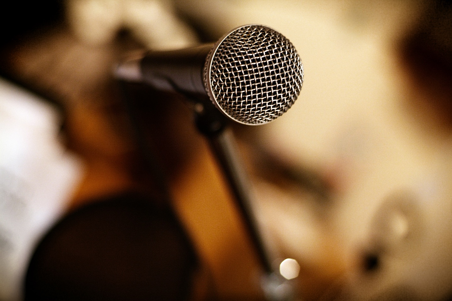
Speaking: How to Use A Microphone

When you’re speaking in front of an audience, you’re almost always using a microphone. The point of the microphone is to help your audience hear you. But it can’t do that if you don’t know how to use it or if you actively work against it.

Vis Potpourri, October 2017

A potpourri isn't usually structured, since it's supposed to be thrown together and mixed. But this one has a section on reports from this year's VIS conference, plus various miscellaneous items like a tool to explore a brain atlas, some history on spreadsheets, and a celebration of Archer, among other things.

Portrait: Danielle Albers Szafir

Danielle Albers Szafir received the Best Paper award for her single-author paper, Modeling Color Difference for Visualization Design at InfoVis this year. She is assistant professor at University of Colorado Boulder and runs the CU VisuaLab there.

IEEE VIS 2017: A SciVis Perspective

Since my (Robert)'s conference reports are almost entirely focused on InfoVis (and a bit of VAST), I have asked Noeska Smit, medical visualization professor and my collaborator in the Vis Potpourri postings, to write about VIS from the SciVis perspective. Everything below are Noeska's words.

IEEE VIS 2017: Best Papers and Other Awards

The IEEE VIS 2017 conference took place last week in Phoenix, AZ. I’m slower to write about it than in previous years, but to make up for that I’m not going in chronological order this time, but will break this report up in a more logical manner. This first part covers the opening, which included presentations of the best papers from all three tracks plus a new Test of Time award category.

Visualization as a Field Is Still Invisible

A new series by the New York Times is equally exciting and painful: it presents visualizations for discussion in class, but the outside help they are getting is coming from statistics rather than visualization. It’s another reminder of just how far we still have to go to even be noticed as a research field.

Vis Potpourri, September 2017

A potpourri is a collection of spices and plants that create a pleasant aroma together. This new series assembles a list of links to recently interesting things in visualization, from both information visualization (InfoVis, which I normally cover on this site) and scientific visualization (SciVis) – the latter covered by new blog collaborator and medical visualization assistant professor, Noeska Smit.

Communicating Uncertainty When Lives Are on the Line

Showing when and where natural disasters like hurricanes are going to cause damage is not just a question of aesthetics – it is literally a matter of life and death. The traditional way hurricane forecasts are shown has a number of problems, but are the alternatives actually better?

The Importance of Context

I use a Misfit activity tracker to count my steps. The Misfit app does a decent job of showing me step counts per day and every month, misfit also sends me a summary of the previous month’s activity. Unfortunately, the numbers in that summary are presented without any context, making that summary almost entirely useless.

Joy Plots

Let’s talk about plots and joy. The Joy of Plots, if you will. Also, Joy Plots.

Building Bridges Between Insular InfoVis Papers

Can you describe what information visualization research does in a few words? What are the driving questions and problems right now? It’s harder than it might seem. I believe that the lack of cohesion in the field is due, at least in part, to how we publish research.

EuroVis 2017 Conference Report, Part 2

On the first full day of the main EuroVis conference, we learned that estimating correlation from scatterplots may not be as great as we thought, saw a number of new ways to show what is and is not in the data, and got some new tools for making browser-based visualization fast.

Paper: An Argument Structure for Data Stories

There is talk about stories having a beginning, middle, and end, but what does that mean for data stories? How do you create the overall structure for those? In a paper to be presented at EuroVis next week, I discuss a simple but very useful structure that I have found "in the wild," and that I believe to be useful and generalizable.

InfoVis Papers at CHI 2017

The two main conferences in visualization are VIS and EuroVis, but recently CHI has also gotten some very interesting submissions (CHI is technically a conference about human-computer interaction, or HCI). This year looked particularly strong,

Linkstravaganza: Schwabish's Story Links and Andrews' Seeking Minard

I don't normally do link dumps, but since I'm behind on blogging and have been meaning to link to these things for a while… here are some articles for you to check out. The first set is on what storytelling means with data, the second about an interesting discovery around Charles Minard.

Averages Are Metadata

When we think of metadata, we tend to think of attributes that describe the data. Where do the numbers come from? What do the values in a categorical column mean? Etc. But there is a type of metadata we rarely even recognize as such: values computed from the data. They're often treated as part of the data, but that's a mistake.

Huge Percentages Are Meaningless

Percentages are incredibly useful when talking about how something is a part of something larger: this many percent tax, that many percent of people are unemployed, etc. When percentages are much larger than 100, however, they lose their meaning and their usefulness. Unfortunately, they seem to be increasingly common.

How Do We Know That? – Video of My Talk at UW

I gave a talk at the University of Washington a few weeks ago. This is an extended version of my BELIV paper An Empire Built on Sand from last year, with more examples and a lot more jokes. You'll learn about various things we know and don't know about visualization, and also whether spinach and carrots actually are good for you.

Sonification: The Power, The Problems

Sonification turns data into sound, just like visualization turns data into pictures. Except it's a lot more complicated and limited. Something about sonification has always bugged me, and I think I've finally figured out what: the crowding on the time axis. I've also recently discovered some of the powers of sonification, though.

Encoding vs. Decoding

Visualization techniques encode data into visual shapes and colors. We assume that what the user of a visualization does is decode those values, but things aren’t that simple.

Hans Rosling: An Appreciation

Hans Rosling died earlier today (Tuesday, February 7). He championed the idea of showing people what the world was really like – and how it was different from their preconceptions – using data and visualization. And he did it with enthusiasm and humor. This is a brief appreciation of his work and legacy.

Let’s Crowd-Fund the Data Stories Podcast!

Enrico and Moritz, the two hosts of the only visualization podcast in the known universe, are trying to crowd-fund their work rather than rely on advertising. If we all chip in a few dollars or euros per show, this will be easy to accomplish.

ISOTYPE Book: Mackenzie, The Vital Flame

The first book in the new series on ISOTYPE books is The Vital Flame by Compton Mackenzie, published by The British Gas Council in 1947. It contains 42 color photographs and five ISOTYPE charts, with a nice variety of different topics and styles.

New Series: ISOTYPE Books

Presenting facts through data is not a recent idea. Otto and Marie Neurath created ISOTYPE in the 1920s and then ran their ISOTYPE Institute for more than two decades. During that time, they created charts for a wide variety of publications. In this series, I will show a number of these charts that I have found, and discuss the context they appeared in.

Posters Program for Tapestry 2017

The Fifth Tapestry conference for storytelling with data is only about six weeks away. To make it easier for academics and students to attend, we are adding a more formal posters program this year.