Blog 2007
Expressive Visualization, Updated Presidents Chart
I used the Presidential Demographics chart in my talk at the Impact of Social Data Visualization panel at InfoVis 2007, and got some interesting responses to that. There is some interest in printing this out, so I have made a new version of the chart that is now also available as a PDF. Stephen Few used Joseph Berk's term "interocular traumatic impact" – a visualization that hits you between the eyes – to describe it. And this is exactly what visualization can do extremely effectively: visual communication, and not just of data. Read more…
InfoVis 2007: InfoVis for the Masses
The InfoVis conference this year had a theme that was not planned, but that made it even more impressive. That theme was InfoVis for the Masses, or Visualization for the People, and it was present throughout the keynote, many paper presentations, the panel, the World Visualization Day BOF, and the capstone. This is the beginning of a new era in visualization, and it is exciting to watch it happen. Read more…
Further Steps Towards World Visualization Day
Since my first posting about the need for a World Visualization Day, I have started a basic website, opened a Facebook group, and taken a first shot at designing a logo. I have refined my ideas on the next steps as well as the support needed. Please support this idea by joining the facebook group, commenting here and on the WVD website, and most of all, by attending the BOF meeting at Vis. Read more…
InfoVis Panel: The Impact of Social Data Visualization
Visualization for the masses is a powerful means of communication, in an age where we have access to incredible amounts of data, but still little understanding based of what it all means. I have argued that visualization sets information free, I have criticized Swivel and Many-Eyes, and I have argued for reassessing who our users are. At Vis/InfoVis, I am organizing a panel with people from Many-Eyes, Swivel, and Gapminder. Read more…
A Nobel Prize for Charts
The recipients of the Nobel Peace Prize 2007 are Al Gore and the UN Intergovernmental Panel on Climate Change. While the decision is undoubtedly a political one (not unlike this year's Nobel Literature Prize), Gore has made a huge impact with his documentary, An Inconvenient Truth. A large part of that comes from his use of graphs and charts. Read more…
A Tale of Two Types of Visualization and Much Confusion
The term visualization is used to mean different things in different contexts, and even visualization that is based on data can be done for different reasons and with different goals. Mixing up these different types of visualization leads to misunderstandings and confusion. Here is an attempt at teasing apart the two major types of data-based visualization, and understanding the differences. Read more…
We Need a World Visualization Day!
Visualization is still mostly done by academics, who are notoriously bad at communicating their work to the world. This is why we need a World Visualization Day: to show the world what visualization can do, and to get some attention from the public and the media. If you're attending the Vis/InfoVis conference, come to the BOF meeting (Mon, Oct 29 at 6pm) to discuss further steps! Read more…
Autism Diagnosis Accuracy - Visualization Redesign
Kaiser at Junk Charts has posted an interesting challenge based on the question how to visualize an Autism diagnosis dataset in a better way (originally posted by Igor Carron at Nuit Blanche). I'm offering my own redesign of the data below, and discuss my different approach and what it tells us about the visualization of sets in general. Read more…
Caring about the Data
When demonstrating Parallel Sets to guests and visitors, I often use the Titanic data set, because people can relate to it and it is entirely categorical. I like pointing out interesting facts the visualization shows (like that the second class was smaller than the first class), but it's really just a collection of numbers to show what the visualization can do. Some of the people I have shown this to feel different about it, though. Read more…
The Summer Lull is Officially Over!
This summer has been a busy one for me and a rather inactive one for EagerEyes. But it is almost over now, and even though things are not getting quieter (quite the opposite with the semester starting), this site will see regular updates (at least once a week) again. Read more…
The Science of Information Visualization: A Sketch
According to one definition(ref), engineering is making things based on scientific principles – as opposed to the intuitive making that defines a craft. Information visualization (InfoVis) is practiced like a craft today, based mostly on practical examples, but not on theoretical basics. Here is a sketch of not only InfoVis as an engineering field, but InfoVis as a science. Read more…
List of Influences: Colin Ware
Several lists of influences reference work by Colin Ware, mostly of course his book Information Visualization: Perception for Design. It therefore makes sense to ask an influencer of influencers about his influences. As it turns out, there are some vicious circles here, with the influenced influencing the influencers back. Read more…
Rethinking the User
A discussion at a seminar in Dagstuhl (Germany) on Information Visualization has led to an interesting insight: what if we completely misunderstood who the users are for visualization? Especially in light of the current developments for broadly usable visualization, we need to rethink the types and levels of expertise that we can expect. Read more…
The Joy of Representation
When peanuts are bombs, clown-shaped cake ornaments are muzzle fires, and young guys are skateboards, we are talking about representation. We take it for granted that words can refer to things or abstract concepts, and colored spots on a piece of paper can depict data. Representation is really quite remarkable, and a better understanding of it will make a big difference in how we build visualizations. Read more…
List of Influences: Penny Rheingans
I was going to describe Penny Rheingans as the first purely scientific visualization person on this list, but that would have been a gross oversimplification. Penny has done groundbreaking work in volume illustration, perception, and uncertainty in visualization. One project of particular interest to me is an experimental evaluation of Chernoff Faces. Penny is also the only person I ever saw knitting at a conference – but after a look at her list of influences (in alphabetical order of the authors below), it all make sense. Read more…
Critiquing in Class Revisited
Another semester is ending, and another class being taught using criticism as a main component is winding down. This time, I had a good mix of computer science, design, architecture, and liberal studies students. All the comments I received regarding the critiques were very positive, and the students' progress in their visualization designs reinforces those. Read more…
Death and Taxes
With Tax Day (Observed) in the US tomorrow on Tuesday (even the IRS gets confused), I felt like a link to Death and Taxes: A Visual Guide to Where Your Federal Tax Dollars Go would be in order. This beautiful information graphic breaks spending down into all the 'small' things that tax money is spent on, from the FCC to the Army Corps of Engineers. A zoomable interface similar to Google Maps makes it possible to explore this huge graph. As Terry Yoo likes to say, the government's a big place! - and this graph gives you an idea just how much there is. Read more…
Visualization Sets Information Free
Enormous amounts of information are technically freely available, but are hard to access in practice. A lot of that data comes from data collection funded by taxpayers, or from data that needs to be reported for legal reasons. While much of that data has been lying around on the Internet for some time, only recently have people started building tools that make it easy (and often even fun) to play with it. Even though the types of data are very different, all these tools have one thing in common: they are primarily visual. Read more…
List of Influences: Alan MacEachren
The first time I saw Alan MacEachren speak was as the keynote speaker at the Diagrams 2000 conference in Edinburgh. Because of his background in geography, he was introduced as "a practitioner" of diagrams – a designation which he immediately resisted. His work is clearly much more than that, connecting cartography, information visualization/design, semiotics, and perception. Alan's book How Maps Work has considerably changed the way representation and communication are understood when it comes to maps. Read more…
InfoVis Contest 2007 Data
Like in the last few years, the InfoVis Conference 2007 is holding a data visualization contest. While the data is available late this year, we hope that by providing it in a very accessible format (XML), and also supplying program code to get you started (at least if you're using Java), we will attract more submissions. The focus is also more on the design than the data analysis this year, and the questions are much more open-ended (in fact, you can make up your own!). Read more…
List of Influences: Jarke "Jack" van Wijk
A colleague of mine describes Jarke van Wijk as "somebody who has not just worked in several areas of visualization, but also written the landmark papers in each of them." His contributions include spot noise and image-based flow visualization, cushion treemaps (with Huub van de Wetering), optimal zooming and panning (with Wim A. A. Nuij), as well as reflections on the value of visualization. His sense of humor is also notable, and his talks are always very enjoyable. Reason enough, therefore, to consider him influential enough to ask him for a list of things that influenced him. Read more…
A Critique of Chernoff Faces
Chernoff Faces are discussed in every information visualization course, and are referenced in many papers that talk about glyphs. Yet the only serious use of faces in visualization is for calibration, not for data display. Faces are so special that we better know their perceptual properties really well before we can use them, which we don't. Read more…
Review: Swivel vs. Many Eyes
Social websites are all the rage right now, and are not just hyped by the media (MySpace and YouTube in particular), but there are also large amounts of money involved (again, MySpace and YouTube). But does the social model make sense for data analysis and visualization? And will users play and interact with data the way they do with other media? Two websites were launched recently to find out: Swivel.com (defunct as of late 2010) and Many Eyes. Here is a first review, looking at the two sites in terms of their founders, approach, social aspects, technology, capabilities, broad appeal, and ethics. Read more…
List of Influences: Chaomei Chen
The second list of influences is by Chaomei Chen. He is an associate professor at Drexel University and the editor-in-chief of the Information Visualization journal. He has also authored or co-authored six books, the most recent of which is Information Visualization: Beyond the Horizon. His research interests include the visualization of social networks in general and co-citation networks in scientific publications. Read more…
What Travelling Presidential Candidates Save
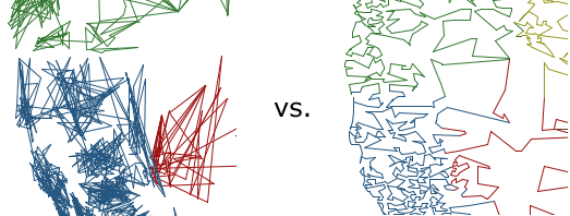
An anonymous commenter asked what the savings were of the Travelling Presidential Candidate Map (ZIPTPCMap) vs. the ZIPScribbleMap. That was not something I had even thought about, and so the result was quite surprising. Read more…
An Uncanny Resemblance
A user in a thread on MetaFilter that linked to the US ZIPScribble Map pointed to a drawing that has an uncanny resemblance to the map: Saul Steinberg's Hen. The bloggy thing of course would have been to just take the image from somewhere and put it next to the map to show it. Instead, I asked for permission. You can probably guess how well that worked. Read more…
Presidential Demographics
With Hillary Clinton and Barack Obama being likely Democratic candidates for the 2008 presidential elections, it is time to look at the demographics of US Presidents over the years. The following diagrams compare their sex, race, and faith with the whole population in 2001. Read more…
More ZIPScribble Maps: AT, AU, CA, CH, DE, ES, FR, HU, IT, NL, NO, SE
The family of ZIPScribble Maps is growing. This update adds maps for a dozen countries, most of them European. Read more…
Improved US ZIPScribble Maps, more Countries to Come
The ZIPScribble Maps of the US obviously hit a nerve, with over 55,000 unique visitors in about two weeks, and more than 70 comments. There was also some criticism, especially regarding some slight problems with coloring the states, and that some of the dividing lines were not, in fact, state lines (and that it was not easy to compare them to state lines). For reasons of convenience, I had also left out Alaska and Hawaii, and there were requests for similar maps for more countries. The US maps have just been updated to solve almost all of the above problems (except for AK and HI, which are included in separate maps for now), and ZIPScribbles for several other countries will be published in the next few days. An interactive version is also in the works. Read more…
List of Influences: Pat Hanrahan
Since Pat Hanrahan was part of the reason for starting this project, it was only fair to ask him first. I also didn't get all the titles written down that he mentioned, so there is also a practical reason ... Read more…
Series: Lists of Influences
Ever wondered where the successful visualization researchers take their ideas from? How they got to know all that stuff that they draw from? What made them work on a certain project? Well wonder no more. EagerEyes.org brings you twelve lists of books, articles, and other things that influenced twelve researchers who influence us. Read more…