Blog 2011
Plot.io
Data visualization startup Plot.io has been making some noise lately. From what I know so far, it looks a lot like Tableau, but presumably works in the browser. This could be a potential successor to Swivel, which folded a bit over a year ago, and maybe what Verifiable was trying to do. Read more…
Comments Closed, Switching to WordPress
After more than five years, I've finally had it with Drupal. I'm switching the site to WordPress over the holidays. If you're reading this through your feed reader, you should not notice a difference. The new site will look different and will have a few simple little features that will make it easier to browse. WordPress also is much more organized on the back-end, so I will hopefully be motivated to write more. Read more…
List of Influences: Ben Shneiderman
Ben Shneiderman’s name has been with me through my entire computing life. In high school, we used to draw Nassi-Shneiderman diagrams to understand structured programming. In the HCI course at my university, his name was on the papers and book chapters we read. When I got into information visualization, he was still everywhere, with treemaps, the visual information seeking mantra, and many other greatly influential pieces of work. What follows below is Ben’s list of influences, in his own words. Read more…
You Only See Colors You Can Name
While color is a purely visual phenomenon, the way we see color is not only a matter of our visual systems. It is well known that we are faster in telling colors apart that have different names, but do the names determine the colors or the colors the names? Recent work shows that language has a stronger influence than previously thought. Read more…
New Series: Watchlist
Some of the most exciting work in our field is done by up-and-coming doctoral students, post-docs, and junior faculty members. In a new semi-regular series, I will highlight some of the people whose work I find particularly interesting and promising. The goal is to get their names onto people's radars earlier than this would have otherwise happened, in particular for those individuals who don't make a lot of noise about their work. Read more…
Visualization is Growing Up
Several topics at this year's VisWeek conference have come up because visualization is playing a bigger role in important decisions. When the consequences can be severe, it is important to know whether a visualization actually works, whether we can trust it, and what biases it might present. Read more…
Blogging BOF at VisWeek 2011
Enrico Bertini and I are organizing a birds-of-a-feather meeting on blogging. Due to some miscommunication, this has turned into two venues, one being the BOF, the other a dinner or drinks or a dinner with drinks or something. Anyway, if you're going to VisWeek, you should definitely attend. Read more…
Paper: Privacy-Preserving Visualization
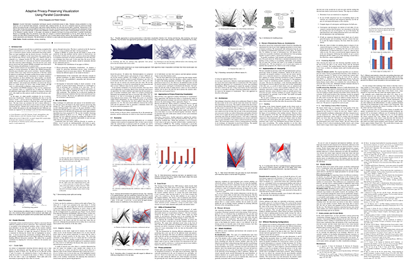
The point of visualization is usually to reveal as much of the structure of a dataset as possible. But what if the data is sensitive or proprietary, and the person doing the analysis is not supposed to be able to know everything about it? In a paper to be presented next week at InfoVis, my Ph.D. student Aritra Dasgupta and I describe the issues involved in privacy-preserving visualization, and propose a variation of parallel coordinates that controls the amount of information shown to the user. Read more…
VisWeek Bingo, Interactive Edition 2011
Last year's VisWeek Bingo was a big success, but it was also conceived of and created in such a rush that I'm embarrassed to even link to it now. For this year, I have created an interactive version of it for your perusal and amusement. It uses code Steve Streza developed for his Apple Keynote Bingo. Read more…
The Many Names of Visualization
Nathan Yau recently wrote a posting about the different words used for visualization and infographics. His definitions are interesting because they reveal quite a bit about his background and main focus, and his blind spots give some insights into the community he's working in. Read more…
Five Years of EagerEyes
In dog years, this website is now (almost) as old as I am. Over the years, it has changed both its direction and design several times; there have been times when I was overwhelmed with my readers' reactions and times when nobody seemed to read the stuff I wrote. While I generally hate “best of” postings and indulging in nostalgia, I want to look back at a few of the things that I believe have shaped this site and how I think about what I'm doing, and revisit a few of the more interesting and/or successful things I've managed to do and write over the years. Read more…
Above All, Do No Harm!
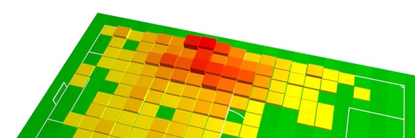
Heatmaps and 3D pie charts are often criticized, and for good reason. But they're not always a bad choice, and can work for simple data presentation. Context is important when criticizing visualizations, especially when there are no obvious improvements that can be made. Read more…
Vote for our SxSW Panel on Visualization!
It's that time of year again when annoying hipsters and wannabes start bugging you about their stupid SxSW panels. The panel proposal that Irene Ros has put together (and that includes yours truly) is different though, and well worth your time to vote. Read more…
Spirals for Periodic Data
The common wisdom in visualization is that to find periodicity in data, it should be displayed on a spiral whose period the user can control. Repeating patterns are easy to spot on a spiral, and its layout suggests repetition. But are spirals really the most effective way of finding periodic patterns? Here is an interactive version that lets you compare spirals against a rectangular layout to find out for yourself. Read more…
Information Visualization vs. Statistical Graphics
Information Visualization shares part of its history and some techniques with statistical graphics. The two fields differ in their approaches though, and in the expectations people have of what they will gain from a visual representation. In two articles, Andrew Gelman and I have written about what we think visualization is, and our points of view could hardly be more different. Read more…
Visual.ly: The Future of Data-Based Infographics
Visual.ly's launch today made big waves, but a lot of people seemed to be disappointed by what they saw. The problem is that what you can see on the website is not the really exciting part of Visual.ly. What is much more interesting is how they want to turn the creation of data-based graphics from a tedious manual process into something fast and flexible. That has a lot more potential impact than you might realize at first. Read more…
Want to Make A Chart Memorable? Add Junk
A common criticism of charts is that they are filled with chart junk, and that removing the extraneous elements would make the chart better and stronger. That argument works for analytical charts, but not for charts that are used for presentation. The way memory works suggests that chart junk is actually very useful to not only get a point across, but make sure the reader remembers it. Read more…
VisWeek 2011 Doctoral Colloquium
The deadline for the VisWeek 2011 Doctoral Colloquium is only a few days away! This is your chance to get your work reviewed and discussed in detail by some of the most experienced researchers in information visualization, scientific visualization, or visual analytics. There is also a stipend to help with your conference registration and travel costs. Read more…
The Camera Metaphor of Visualization Use
A metaphor I've seen used to describe visualization a few times now is a camera: like a camera, visualization can be used to do good and bad things; like a camera, it requires skill to use well; like a camera, it allows you to discover new ways of seeing the world. It's actually quite a useful metaphor, and one that merits some exploration. Read more…
Visualization Choice Influences Decisions
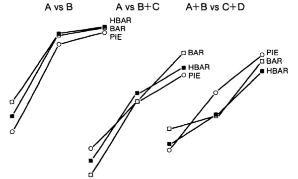
Can different ways of showing the same data lead to different decisions? And can those decisions be about something important, like continuing a clinical trial? A study published in 1999 shows that they can, and the way the data is represented does make a difference. Read more…
Six Niche Visualization Blogs
I don't have to link to infosthetics or flowingdata, you know those. But there are many others that are not as well known, but often contain really interesting work. They offer thoughtful criticism, discussions of the cognitive aspects of visualization, or designers' perspectives on visualization. Here is a list of six of them. Read more…
A Middle Ground
We criticize flashy infographics and bad visualizations, but we also want to attract viewer's attention. We strive for accuracy and efficiency, but we also want to tell stories. We dislike chart junk, but we like beautiful charts. We need to find a middle ground. Read more…
EagerFeet.org: Free Your Nike+ GPS Data
While Nike+ is a neat app and website that gets a lot of people running, it becomes limiting quite quickly: the site is slow and tedious to use, and the cuteness factor wears off fairly quickly to reveal very limited usefulness. There are lots of better services, but many people are reluctant to switch unless they can take their data with them. EagerFeet was designed to let you do just that: you can export all your run GPS data as GPX files, which you can then import into other programs and websites. And even though it's still April, this is a real site and not a joke. Read more…
In Defense of Pie Charts
Pie charts don't get much respect. They're almost always considered the wrong choice by those supposedly in the know. But how do we know that this is true? What evidence do we have to support this? The truth is, not much. And when we start digging for proof, it turns out that pie charts are much better than we want to admit. Read more…
One Chart To Rule Them All
Finding the right chart for complex data is not an easy task. A reader pointed me to a presentation (PDF) by the New Hampshire Department of Education that illustrates some of the thinking behind choosing a new visual representation. The tool of choice here is the bubble chart. Read more…
Tableau Public's New Data Policy
Tableau made a huge mistake when they pulled a visualization of WikiLeaks statistics from their Tableau Public website a few months ago. But they've used the opportunity to develop a new policy for content posted there that is very clear and based on the idea of free speech. This removes a big obstacle for journalists who want to use the service: they no longer have to fear that their hard work might be destroyed because somebody does not like it. Read more…
Anscombe's Quartet
Visualization may not be as precise as statistics, but it provides a unique view onto data that can make it much easier to discover interesting structures than numerical methods. Visualization also provides the context necessary to make better choices and to be more careful when fitting models. Anscombe's Quartet is a case in point, showing that four datasets that have identical statistical properties can indeed be very different. Read more…
Blur and Uncertainty Visualization
When visualizing uncertainty in data, a common choice is to use blur. While that may seem natural, it is unfortunately ineffective. Blur has the effect of guiding attention, but is hard to quantify and annoying to look at. Uncertainty information, or any other data, cannot be shown effectively this way. Read more…
Tufte and the Truth about the Challenger
Almost exactly 25 years ago, on January 28, 1986, Space Shuttle Challenger disintegrated seconds after lift-off. One of Edward Tufte's most famous examples of bad charts are the ones used by engineers who argued against the launch, and who failed to convince. It's a fascinating story, but it has one major fault: it is not true. Read more…
The State of Information Visualization, 2011
Theory in visualization! Swivel disappears! Reappears! Disappears again! Stories told using visualization! A lot happened in visualization last year, and 2011 shows no signs of things slowing down. The direction will be somewhat different, though. Read more…