Blog posts filed under Pie Charts

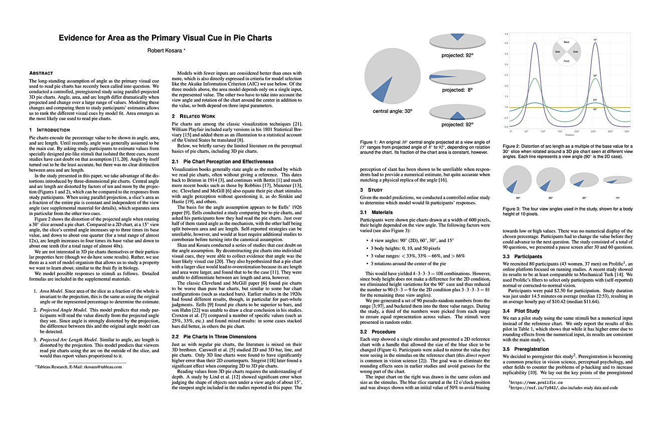
New Video: The Science of Pie Charts

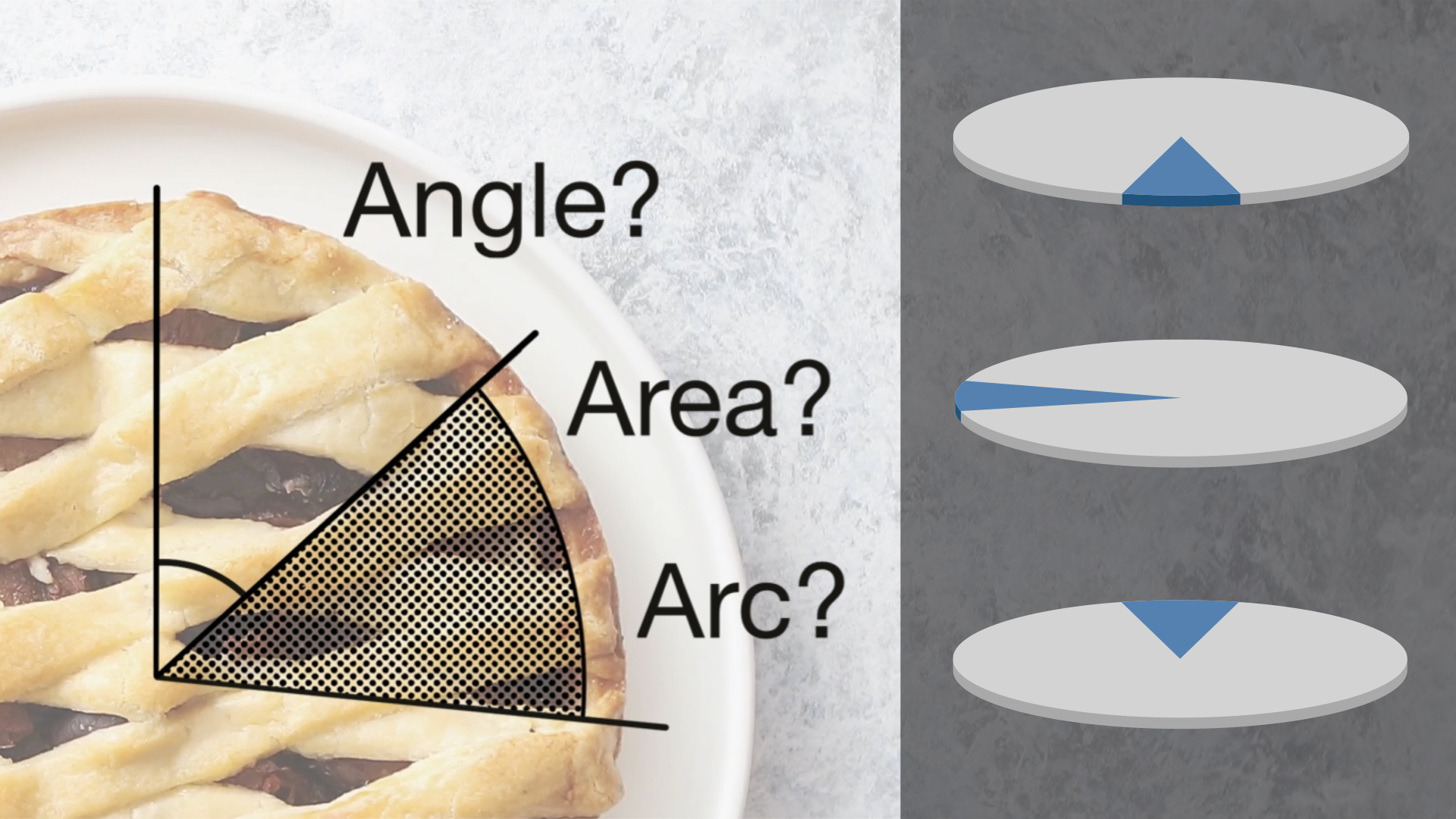
The common explanation for how pie charts work is that we read them by angle. That of course would mean that donut charts would be bad, because you can't see the angle when you take away the center of the pie. Changing the radius of a slice wouldn't matter though, because that doesn't change the angle. But there is no evidence that angle is how we read pie charts, quite the opposite actually. In this new video, I walk through five reasons why angle is not how we read pies, and what that means for other things we like to assume about them.

eagereyesTV Episode 3: 3D Pie Charts For Science!

How do we read pie charts? This seems like a straightforward question to answer, but it turns out that most of what you’ve probably heard is wrong. We don’t actually know whether we use angle, area, or arc length. In a short paper at the VIS conference this week I’m presenting a study I ran to answer this question – a study using 3D pie charts!

Two Short Papers on Part-to-Whole Charts at EuroVis

Why do pie charts look the way they do? What makes this particular way of slicing up a circle the preferred way of showing part-to-whole relationships? In two short papers that I’m presenting this week at EuroVis, I looked at the design space of circular part-to-whole charts, including pie charts.

A Treemap Chart Pie

After his recent early chart pie attempts, Ben Shneiderman has now achieved the ultimate in chart pie baking: a treemap chart pie.

An Illustrated Tour of the Pie Chart Study Results

In two papers, Drew Skau and I recently showed that our idea of how we read pie charts is wrong, that donut charts are no worse than pie charts, and a few more things. Here is a detailed walk-through of the results of the three studies we conducted for this purpose. Let's go on a little journey through some real data and do a little science together!

A Pair of Pie Chart Papers

How do we read pie charts? Do they differ from the even more reviled donut charts? What about common pie chart designs like exploded pies? In two papers to be presented at EuroVis next week, Drew Skau and I show that the common wisdom about how we read these charts (by angle) is almost certainly wrong, and that things are much more complicated than we thought.

Ye Olde Pie Chart Debate

You may think that the debate over pie charts was a new one, but it has raged on for at least 100 years. Brinton started it in 1914, and great drama unfolded in the pages of the Journal of the American Statistical Association in the 1920s.

In Defense of Pie Charts

Pie charts don't get much respect. They're almost always considered the wrong choice by those supposedly in the know. But how do we know that this is true? What evidence do we have to support this? The truth is, not much. And when we start digging for proof, it turns out that pie charts are much better than we want to admit.

Do Mechanical Turks Dream of Square Pie Charts?

User studies are an important part of visualization, but they also require a considerable amount of effort and time. In a paper presented at the BELIV workshop (part of CHI 2010), we discussed our experiences with running a number of visualization studies using Amazon's Mechanical Turk (MTurk) service. Using MTurk, we are able to run large studies in much less time than usual, and at very low cost. We also show how to avoid gaming the system, which had been reported in earlier work using MTurk.

Understanding Pie Charts

Pie charts are perhaps the most ubiquitous chart type; they can be found in newspapers, business reports, and many other places. But few people actually understand the function of the pie chart and how to use it properly. In addition to issues stemming from using too many categories, the biggest problem is getting the basic premise: that the pie slices sum up to a meaningful whole.

Charts and Metaphors

What do pies, waffles, and donuts have in common? They're charts, or rather metaphors for popular charts. Why do we need to name charts after food? And what can we learn from this for getting the idea of visualization across more effectively?

Engaging Readers with Square Pie/Waffle Charts

Engaging viewers with interesting depictions of data always bears the risk of creating misleading or unreadable graphics. The square pie chart (or waffle chart) strikes a good balance between being interesting and not distorting the data. Here is an argument for the power of the pie and against the boredom of the bar.

Women in IT - Squaring the Pie?

Pie charts are a ubiquitous way of showing percentages. But while we can see differences in angles quite well, reading the meaning of the difference is another matter, so for precise data, we still need the numbers. A little known variant of pie charts is not round, but square, and can be read with an accuracy of one percent. We will look at data on women in information technology using this method.