Blog posts filed under ISOTYPE

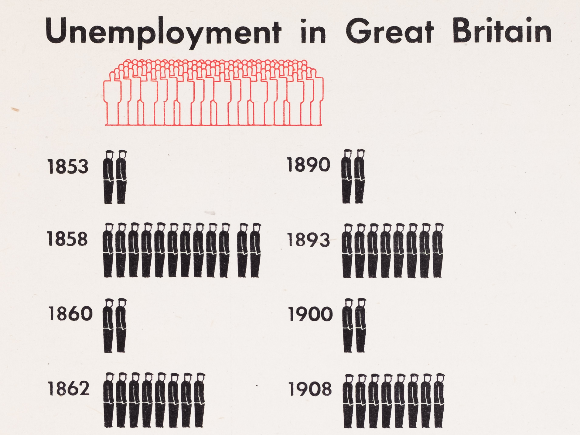
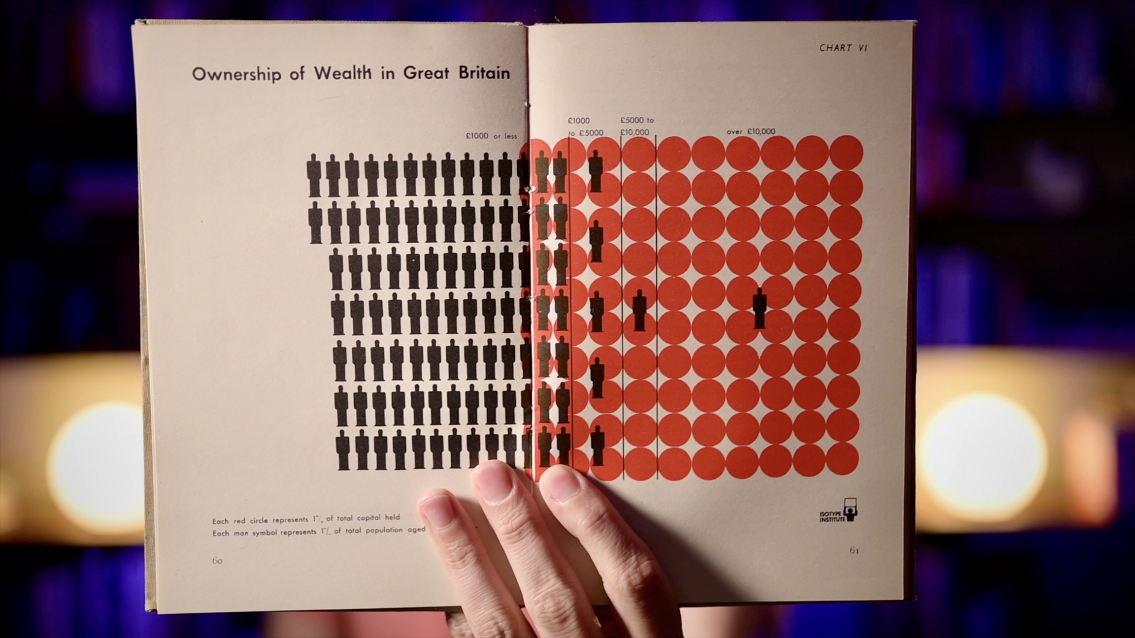
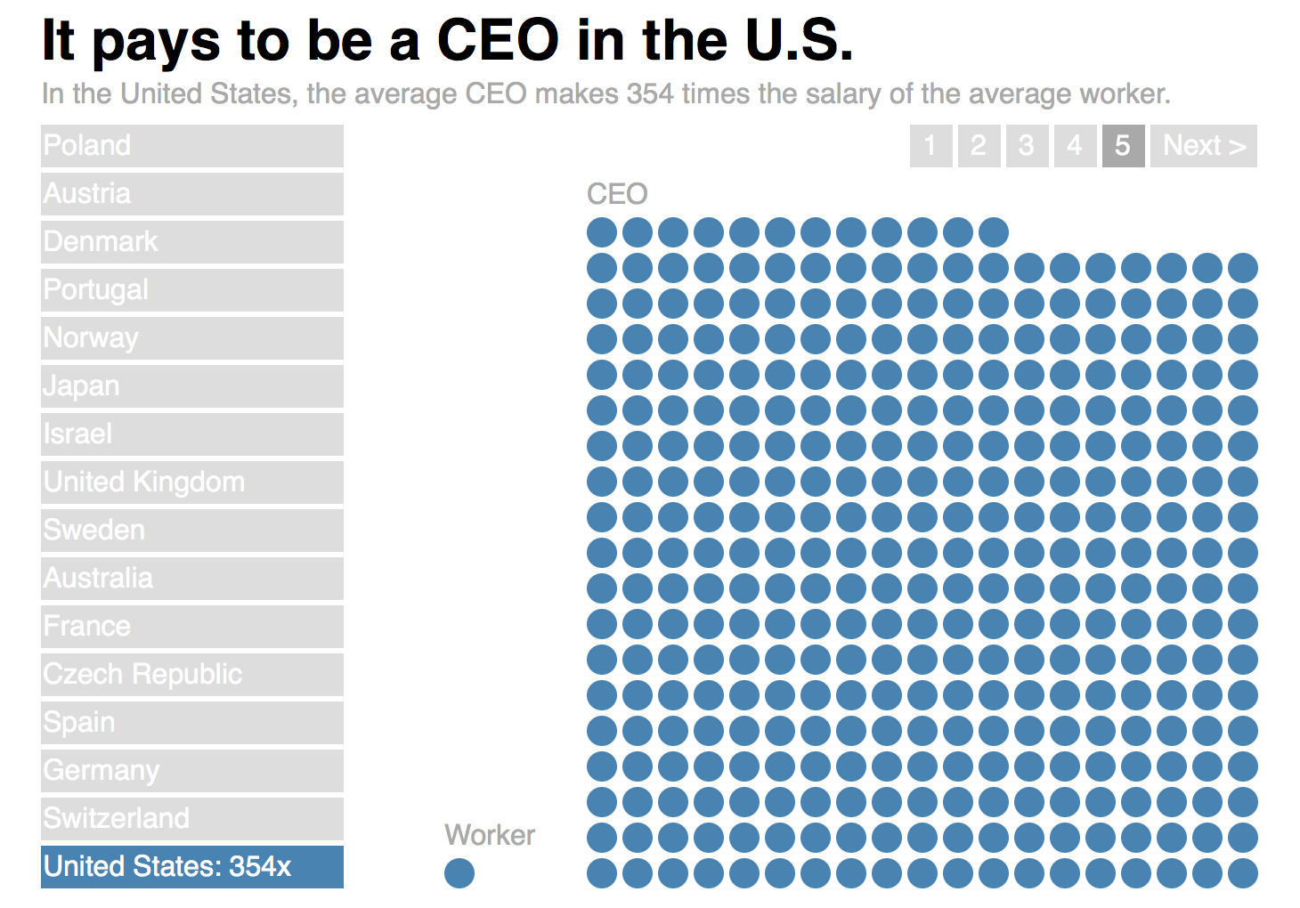
What Happened to ISOTYPE?

Jan Willem Tulp asked me an interesting question on Twitter last week: if ISOTYPE was so great, why isn’t anybody using it anymore? Here are some of my thoughts, but more than that I want to see if anybody has more idea, and maybe even a bit of evidence, on why ISOTYPE fell out of fashion in the 1950s and hasn’t really come back since.

ISOTYPE Book: Young, Prager, There’s Work for All

This book from 1945 contains a very interesting mix of different charts made by the ISOTYPE Institute, some classic and some quite unusual. As a book about labor and unemployment, it also makes extensive use of Gerd Arntz’s famous unemployed man icon.

eagereyesTV Episode 2: Unit Charts, Dot Plots, ISOTYPE, and What Makes Them Special

Charts usually show values as visual properties, like the length in a bar chart, the location in a scatterplot, the area in a bubble chart, etc. Unit charts show values as multiples instead. One famous example of these charts is called ISOTYPE, and you may have seen them in information graphics as well. They’re an interesting family of charts and they seem to have some unusual properties that most other charts don’t have.

ISOTYPE Book: Mackenzie, The Vital Flame

The first book in the new series on ISOTYPE books is The Vital Flame by Compton Mackenzie, published by The British Gas Council in 1947. It contains 42 color photographs and five ISOTYPE charts, with a nice variety of different topics and styles.

New Series: ISOTYPE Books

Presenting facts through data is not a recent idea. Otto and Marie Neurath created ISOTYPE in the 1920s and then ran their ISOTYPE Institute for more than two decades. During that time, they created charts for a wide variety of publications. In this series, I will show a number of these charts that I have found, and discuss the context they appeared in.

Link: The Power of Wee Things

Lena Groeger (of ProPublica) has written a beautiful piece about the Power of Wee Things. She talks about using small things, multiples, and units to display data and get people interested. The article goes through many, many examples covering many different areas and ideas. She also gave a great talk on the topic at OpenVis 2014.

Large Multiples

Getting a sense of scale can be difficult, and the usual chart types like bars and lines don’t help. Showing scale requires a different approach, one that makes the multiplier directly visible.

The ISOTYPE

Communicating data visually is not only about perception and precision, but also understanding. ISOTYPE was developed to bridge the gap between showing data in a way that's easy to read and at the same time easier to understand than unadorned bar charts.