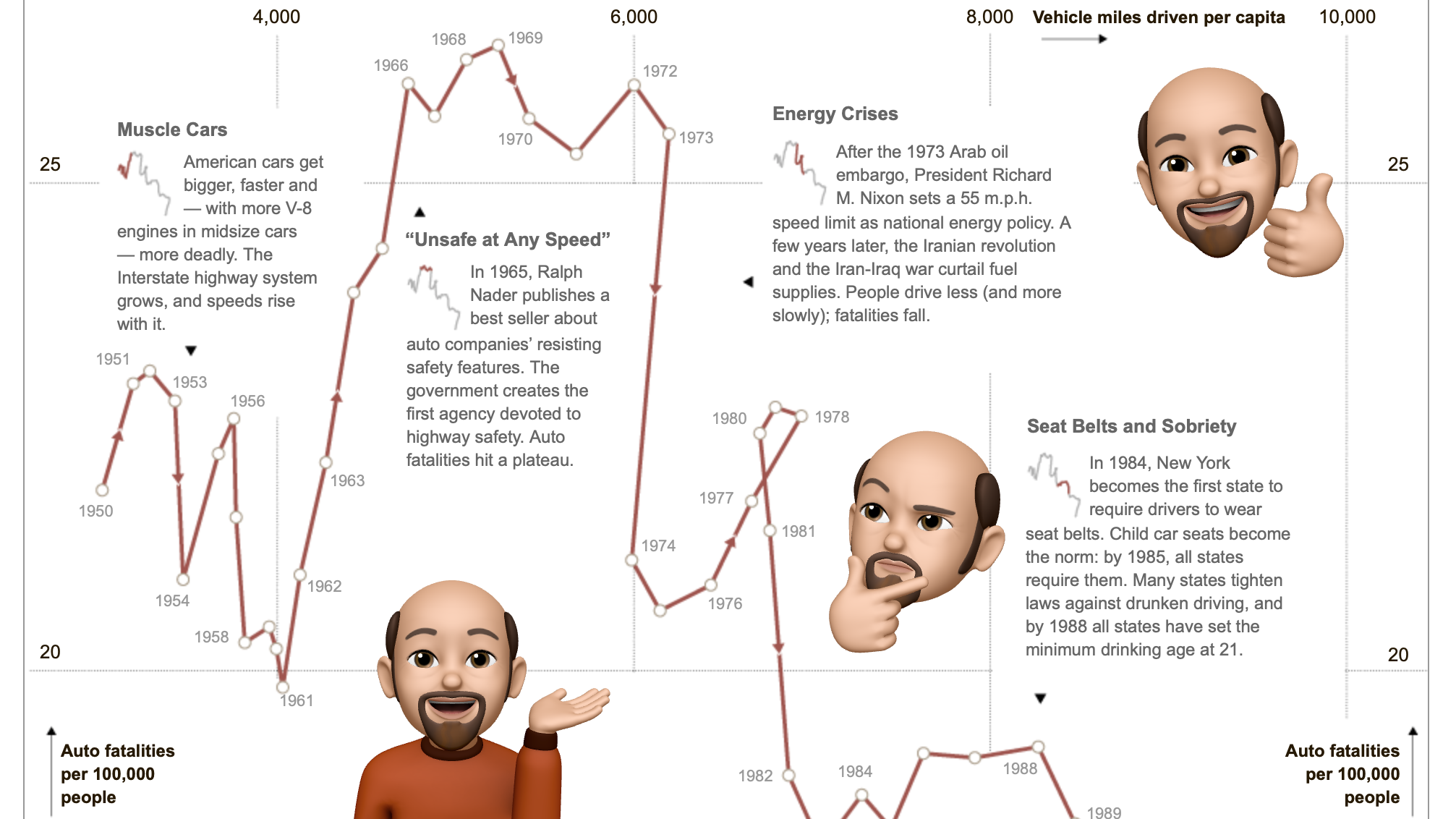
Blog 2020 (14 posts, 1 archived)

All (Line) Charts are Wrong, But Some Are Useful

Line charts are one of the most common and useful charts out there. But why draw straight lines between the data points? They almost never represent what the data is actually doing, no matter if the data is single observations or aggregated over time. How do line charts actually work, and what do they imply about the data?

eagereyesTV: Index Charts, Part 2: Chopping Up and Folding the Time Axis

I covered the more commonly known value index charts in my my last video on index charts, this one is about indexing on the horizontal, or time, axis. It's kind of fascinating how you can fold the time axis to get a better view of your data. I show how it works and walk through a number of examples, using housing prices, camera sales, global warming, and even data about my running!

An Outsider’s Guide to the IEEE VIS Conference 2020

Want to watch a keynote by a Nobel laureate, catch the presentations of the best papers, or attend a workshop on visualization for communication? The IEEE VIS conference is taking place online in two weeks, October 25 to 30, and is free to attend this year. Here are a few starting points if you’ve never been to VIS and don't know why you should attend or what to watch.

What Happened to ISOTYPE?

Jan Willem Tulp asked me an interesting question on Twitter last week: if ISOTYPE was so great, why isn’t anybody using it anymore? Here are some of my thoughts, but more than that I want to see if anybody has more idea, and maybe even a bit of evidence, on why ISOTYPE fell out of fashion in the 1950s and hasn’t really come back since.

New eagereyesTV Video and Series: Chart Appreciation

Time to breathe new life into my little YouTube channel, which I'm calling eagereyesTV. I'm doing so with the start of a new series I'm calling Chart Appreciation. Each episode will be on one particular visualization, news piece, or interactive. As the first one, I picked Hannah Fairfield's Driving Safety, in Fits and Starts from 2012.

Prior Work We Missed In Our Connected Scatterplots Paper

In 2016, Steve Haroz, Steven Franconeri, and I published a paper on a technique commonly called the Connected Scatterplot. It turns out that somebody else had research on essentially the same chart 15 years earlier, which we were not aware of. Our work is quite different, but it’s interesting context and it’s also worth reflecting on how we missed this piece of relevant prior work.

Tracking 19,000 Runners Over 1,000km Across Virtual Tennessee

How do you show large numbers of people without losing track of the outliers? How do you keep a chart useful when the maximum values are orders of magnitude higher than the common ones? In an animated visualization I've built of the progress of over 19,000 runners across a virtual 1000km (635mi) race over 123 days, I've tried to solve some of these issues.

In Praise of the Diagonal Reference Line

Annotations are what set visual communication and journalism apart from just visualization. They often consist of text, but some of the most useful annotations are graphical elements, and many of them are very simple. One type I have a particular fondness for is the diagonal reference line, which has been used to provide powerful context in past news pieces, and is making a comeback in the COVID-19 charts.

The Visual Evolution of the "Flattening the Curve" Information Graphic

Communication has been quite a challenge during the COVID-19 pandemic, and data visualization hasn't been the most helpful given the low quality of the data – see Amanda Makulec's plea to think harder about making another coronavirus chart. A great example of how to do things right is the widely-circulated Flatten the Curve information graphic/cartoon. Here's a look at the work it is built on and how that has evolved from a figure in an academic paper to one of the clearest pieces of visual communication in some time.