Joy Plots
Let’s talk about plots and joy. The Joy of Plots, if you will. Also, Joy Plots.
Let’s talk about plots and joy. The Joy of Plots, if you will. Also, Joy Plots.
Sonification turns data into sound, just like visualization turns data into pictures. Except it's a lot more complicated and limited. Something about sonification has always bugged me, and I think I've finally figured out what: the crowding on the time axis. I've also recently discovered some of the powers of sonification, though.
Programming languages use words and symbols to represent structures like blocks and conditions. A visual representation of these structures seems useful to keep track of all the different cases, see the scope of variables, etc. Nassi-Shneiderman diagrams offer just such a representation.
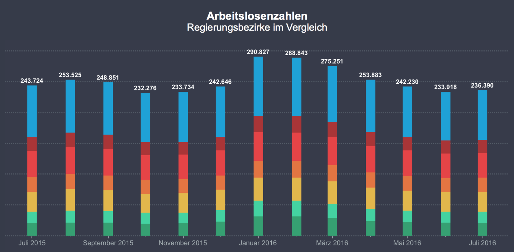
Bar charts are great. They always work. They're always the safe choice. Right? Well, no. Stacked bar charts are deceiving because we think they work just like regular bars, when they're really pretty terrible.
Getting a sense of scale can be difficult, and the usual chart types like bars and lines don’t help. Showing scale requires a different approach, one that makes the multiplier directly visible.
The mirrored line chart is a pet peeve of mine. It's very common close to elections when there are two parties or candidates: one's gains are at the other's expense. But it becomes even more egregious when there are two categories that have to sum up to 100% by their very definition.
The same data can look very different in a line chart depending on its aspect ratio. But what is the perfect shape for a chart? A square? A rectangle? Which rectangle? It depends on the data.
Communicating data visually is not only about perception and precision, but also understanding. ISOTYPE was developed to bridge the gap between showing data in a way that's easy to read and at the same time easier to understand than unadorned bar charts.
How do we know what we can do with things in the world or in user interfaces? What makes us push buttons, flip switches, or pick up objects that fit our hands? This guidance comes from affordances, a clever and intuitive theory that has been around for decades but is often misunderstood.
Networks are usually drawn using a technique called node-link diagrams. While that works well for small graphs (the technical name for networks), it breaks down beyond a few dozen nodes. Better techniques exist, though these are currently focused on specific types of graphs or answer particular questions.
Venn diagrams are a great way to visualize the structure of set relationships. They're also an example of a technique that works very well for a particular purpose, but that entirely fails outside its well-defined scope or when the number of sets gets too large.
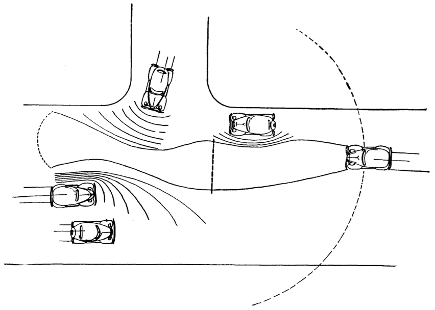
As we're heading towards elections again, there is a chart type that is as unavoidable as political ads, baby-kissing, and smear campaigns: line charts showing polling data. The most common pitch two candidates against each other, and often make a big deal out of the fact that the lines cross. Not only are these charts misleading in the way they depict the choice, they also hide an important fact: the number of undecided voters.
The common wisdom in visualization is that to find periodicity in data, it should be displayed on a spiral whose period the user can control. Repeating patterns are easy to spot on a spiral, and its layout suggests repetition. But are spirals really the most effective way of finding periodic patterns? Here is an interactive version that lets you compare spirals against a rectangular layout to find out for yourself.
When visualizing uncertainty in data, a common choice is to use blur. While that may seem natural, it is unfortunately ineffective. Blur has the effect of guiding attention, but is hard to quantify and annoying to look at. Uncertainty information, or any other data, cannot be shown effectively this way.
Parallel coordinates are one of the most famous visualization techniques, and among the most common subjects of academic papers in visualization. While initially confusing, they are a very powerful tool for understanding multi-dimensional numerical datasets.
Pie charts are perhaps the most ubiquitous chart type; they can be found in newspapers, business reports, and many other places. But few people actually understand the function of the pie chart and how to use it properly. In addition to issues stemming from using too many categories, the biggest problem is getting the basic premise: that the pie slices sum up to a meaningful whole.
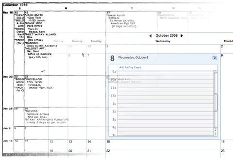
What a difference 22 years make! In 1986, George Furnas published his paper, Generalized Fisheye Views, which described what was to become one of the first (and most prominent) focus+context techniques. One of the examples he used was a calendar that showed the current day in most detail, with less space for the surrounding ones. Yahoo! just started an opt-in beta of their new calendar that uses the same idea.
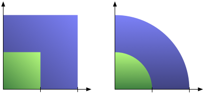
One of the most common mistakes in chart design is to scale an area by two sides at the same time, producing a quadratic effect for a linear change. That overstates the larger numbers and produces a badly skewed chart. A little care and some basic high-school math can help avoid the problem.
Engaging viewers with interesting depictions of data always bears the risk of creating misleading or unreadable graphics. The square pie chart (or waffle chart) strikes a good balance between being interesting and not distorting the data. Here is an argument for the power of the pie and against the boredom of the bar.
Treemaps are the single most used 'real' InfoVis technique there is. Interestingly, they have proven to be even more useful for unstructured data than for the hierarchies which they were originally developed for. Here is a brief history, discussion of current practical uses, and of the importance of treemaps for the adoption and understanding of information visualization.
Visual representations of time are particularly interesting, because they seem so logical. A point in time is a point in the visualization, an interval is a line. But things are not always that simple: planning and temporal uncertainty require more powerful visual tools. Sets of Possible Occurrences (SOPOs) are an example of a visual representation of time that is very flexible and powerful – and totally unintuitive.
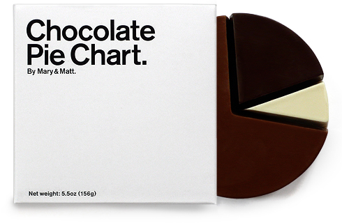
Pie charts are a ubiquitous way of showing percentages. But while we can see differences in angles quite well, reading the meaning of the difference is another matter, so for precise data, we still need the numbers. A little known variant of pie charts is not round, but square, and can be read with an accuracy of one percent. We will look at data on women in information technology using this method.