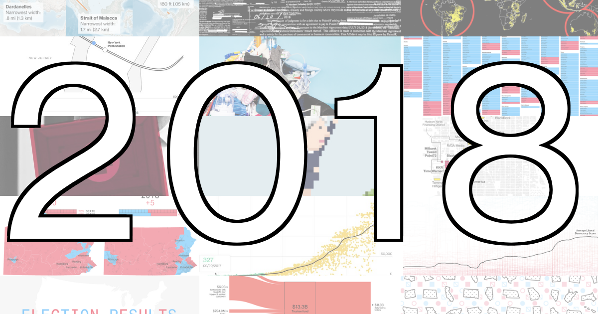
Blog posts filed under Link

Visualization Potpourri, March 2018

Time to wake up from the eagereyes winter hibernation with an aromatic potpourri! This time, we have news about pies, stippling, colors, sorting algorithms, and a few more. Also a video of my collaborator Noeska singing the praises of medical visualization.

Vis Potpourri, October 2017

A potpourri isn't usually structured, since it's supposed to be thrown together and mixed. But this one has a section on reports from this year's VIS conference, plus various miscellaneous items like a tool to explore a brain atlas, some history on spreadsheets, and a celebration of Archer, among other things.

Vis Potpourri, September 2017

A potpourri is a collection of spices and plants that create a pleasant aroma together. This new series assembles a list of links to recently interesting things in visualization, from both information visualization (InfoVis, which I normally cover on this site) and scientific visualization (SciVis) – the latter covered by new blog collaborator and medical visualization assistant professor, Noeska Smit.

Linkstravaganza: Schwabish's Story Links and Andrews' Seeking Minard

I don't normally do link dumps, but since I'm behind on blogging and have been meaning to link to these things for a while… here are some articles for you to check out. The first set is on what storytelling means with data, the second about an interesting discovery around Charles Minard.

A Roundup of Year-End News Graphics Roundups

The end of the year is always a good time to look back at the great work done in the world of news graphics – and this year in particular, to relive all the heartbreak and disillusionment. Here is a list of year-end news graphics round-ups for your enjoyment and edification.

Link: xkcd's Earth Temperature Timeline

Randall Munroe has done it again. His latest xkcd comic is an enormous timeline of the Earth's temperature, showing the enormously long time we have temperature estimates for, and how little it has changed until very, very recently.

Link: Jérôme Cukier's Series on Visualization with React

While D3 is the standard way of doing visualization on the web right now, there's a lot of interesting stuff happening in the world of JavaScript framework React. And it turns out, you can do some really interesting visualization stuff with React, once you understand the basics. In a series of very thorough postings, Jérôme Cukier takes you through the fundamentals of React and how to use it by itself or together with D3.

Link: Our World in Data

Our World in Data looks at a wide variety of data about the world: health, population, energy, growth, inequality, etc. Max Roser and his colleagues dig through the vast amounts of open data to find many interesting connections and insights.

Link: Tamara Munzner Has A Blog!

Late last year, Tamara Munzner started a blog, called Vis & More. So far, she mostly writes in response to Stephen Few's postings late last year about some recent visualization papers. Her style is quite academic (most of her posting titles start with "On"…), but very readable and she has lots of interesting things to say.

Link: The Tapestry YouTube Channel

We recently redesigned the Tapestry website, and unfortunately lost the archive page. It will definitely come back (and better than before), but in the meantime, there's the Tapestry YouTube Channel. You can watch all the talks from the last three years. This includes people like Hannah Fairfield, Alberto Cairo, Martin Wattenberg and Fernanda Viègas, Kim Rees, and many more.

Link: The NIPS Experiment

The conference on Neural Information Processing Systems (NIPS) has conducted a fascinating experiment: split the program committee into two and get 10% of submissions reviewed by both. The article I'm linking to above has a great analysis of what they found (and it's not encouraging).

Link: PolicyViz Blog and Podcast

Jon Schwabish is running a blog and podcast called PolicyViz. In both, he talks about communicating data and how to deal with numbers for the general public. He recently had two interesting guests back-to-back on his podcast: Nigel Holmes and Edward Tufte. Both episodes are well worth listening to.

Link: Visualization Publication Data Collection

People from Georgia Tech, INRIA, University of Stuttgart, and other institutions have put together a comprehensive dataset of all papers presented at Vis/VisWeek/VIS since 1990. This was first collected for a set of visualizations last year, but has been updated with the 2014 data. They intend on keeping it up to date.

Link: Disinformation Visualization

In his piece Disinformation Visualization: How to lie with datavis, Mushon Zer-Aviv makes some interesting points about how framing the same data differently in visualization can make a big difference. Using the example of the abortion debate, he shows the usual chart tricks, cherry-picking, subsetting, etc., that is done to make the data support a particular story.

Video: The Danger of Glitziness

Wayne Lytle created this video about the Viz-O-Matic that provides lots of tools to make visualization glitzier. It's a nice little spoof, and a throwback to the computer graphics of the early 1990s (it was made for SIGGRAPH 1993). This video was brought up in a discussion about storytelling at CHI last week, though I don't think that its lessons are very deep on that subject.

Link: The Power of Wee Things

Lena Groeger (of ProPublica) has written a beautiful piece about the Power of Wee Things. She talks about using small things, multiples, and units to display data and get people interested. The article goes through many, many examples covering many different areas and ideas. She also gave a great talk on the topic at OpenVis 2014.

Link: Design and Redesign in Data Visualization

Fernanda Viégas and Martin Wattenberg have written a wonderful piece titled Design and Redesign in Data Visualization about criticism in data visualization. They thoughtfully analyze the practice and point out some of the issues when people create redesigns, including intellectual honesty and perfect hindsight.

Link: Dear Data

Giorgia Lupi and Stefanie Posavec are collaborating on a clever and beautiful new project they call Dear Data (Twitter account). Every week, they are sending post cards to each other with hand-drawn visualizations of data they have gathered: public transportation, ways they communicate, etc.

Link: Data Journalism in the 19th Century

Scott Klein of ProPublica has written a great story about an early use of data in journalism, and Horace Greeley, the colorful journalist behind it. Greeley found an issue and then gathered the data to show the extent of the problem. This is not unlike today.

Link: CG&A Article on Tapestry

I've written a short piece about the Tapestry conference for the Graphically Speaking column in Computer Graphics and Applications. The article talks about the reasoning behind Tapestry, how it's different from academic conferences, and gives a few examples of talks. It even includes anecdotal evidence to show that the conference has enabled actual knowledge transfer.

Link: The Graphic Continuum

The Graphic Continuum is a poster created by Jon Schwabish and Severino Ribecca (the man behind the Data Visualisation Catalogue). It lists almost 90 different chart types and organizes them into five large groups: distribution, time, comparing categories, geospatial, part-to-whole, and relationships. Some of them are connected across groups where there are further similarities. The poster is printed very nicely and makes for a great piece of wall art to stare at when thinking about data, and maybe to get an idea for what new visualization to try.

Video: Nigel Holmes on Humor in Visualization and Infographics

In this talk, Nigel Holmes talks about the value of and use of humor in communicating visualization. He also has some interesting criticism of academic visualization research (and also some more artistic pieces). It's a fun and interesting talk, as always with Nigel Holmes.

Link: Becksploitation: The Over-Use of a Cartographic Icon

The paper Becksploitation: The Over-Use of a Cartographic Icon by Kenneth Field and William Cartwright in The Cartographic Journal describes Harry Beck's famous map of the London Underground and what makes it great. It also offers a collection of misuses of the superficial structure, and critiques them. I wish we'd had papers (and titles!) like this in visualization.

Link: Tapestry 2015

Tapestry 2015 will take place March 4 in Athens, GA. This is the third time we are holding the conference, and it is again taking place on the day before NICAR. As in the past years, have a kick-ass line-up of speakers.

Link: Data Viz Done Right

Andy Kriebel's Data Viz Done Right is a remarkable little website. He collects good examples of data visualization and talks about what works and what doesn't. He does have bits of criticism sometimes, but he always has more positive than negative things to say about his picks. Good stuff.

Links: 2014 News Graphics Round-Ups

In the past, it used to be difficult to find news graphics from the main news organizations. In the last few years, they have started to post year-end lists of their work, which are always a treat to walk through. With the new year a few weeks behind us, this is a good time to look at these as collections of news graphics.

Link: Businessweek Vintage Graphics

The BizWeekGraphics tumblr (well worth following in general) has a series of postings with a beautiful collection of graphics from the very early days of Businessweek, and also some more recent ones.

Data Stories starring Tamara Munzner

The latest episode of the Data Stories podcast has Tamara Munzner as the guest. They talk about her much-anticipated book, visualization taxonomies, and a lot more. It's a great episode, well worth listening to.

WTFViz, ThumbsUpViz, and HelpMeViz

I have complained, repeatedly, about the lack of good online resources for visualization; in particular, when it comes to discussion and critical reflection. Also, where can you go to get help with a visualization project? A few recent websites are tackling these issues in different ways.

Listen To Me Dispense My Wisdom on the Data Stories Podcast!

Last week, I recorded a guest appearance on the Data Stories podcast with Enrico Bertini and Moritz Stefaner. Find out if the voice you imagine when reading this blog sounds like my voice (spoiler: it doesn't), and how my Austrian accent meshes with Moritz' German and Enrico's Italian ones (spoiler: very well).

Six Niche Visualization Blogs

I don't have to link to infosthetics or flowingdata, you know those. But there are many others that are not as well known, but often contain really interesting work. They offer thoughtful criticism, discussions of the cognitive aspects of visualization, or designers' perspectives on visualization. Here is a list of six of them.

Interactively Explore Climate Data

The United Kingdom's Met Office recently released temperature data for about 1700 weather stations across the globe from 1701 to 2009. Here is an interactive visualization (built using Protovis) of that data for you to explore.

Information vs. Art at MCA Chicago

The Museum of Contemporary Art (MCA) in Chicago currently has an exhibit titled Massive Change: The Future of Global Design (Sep 16 to Dec 31, 2006), which talks about the use of resources, and shows efficient designs for cars, buildings that produce more energy than they consume, etc. The problem: it's not art. While the exhibit is certainly informative and important, it does not fit into an art museum.