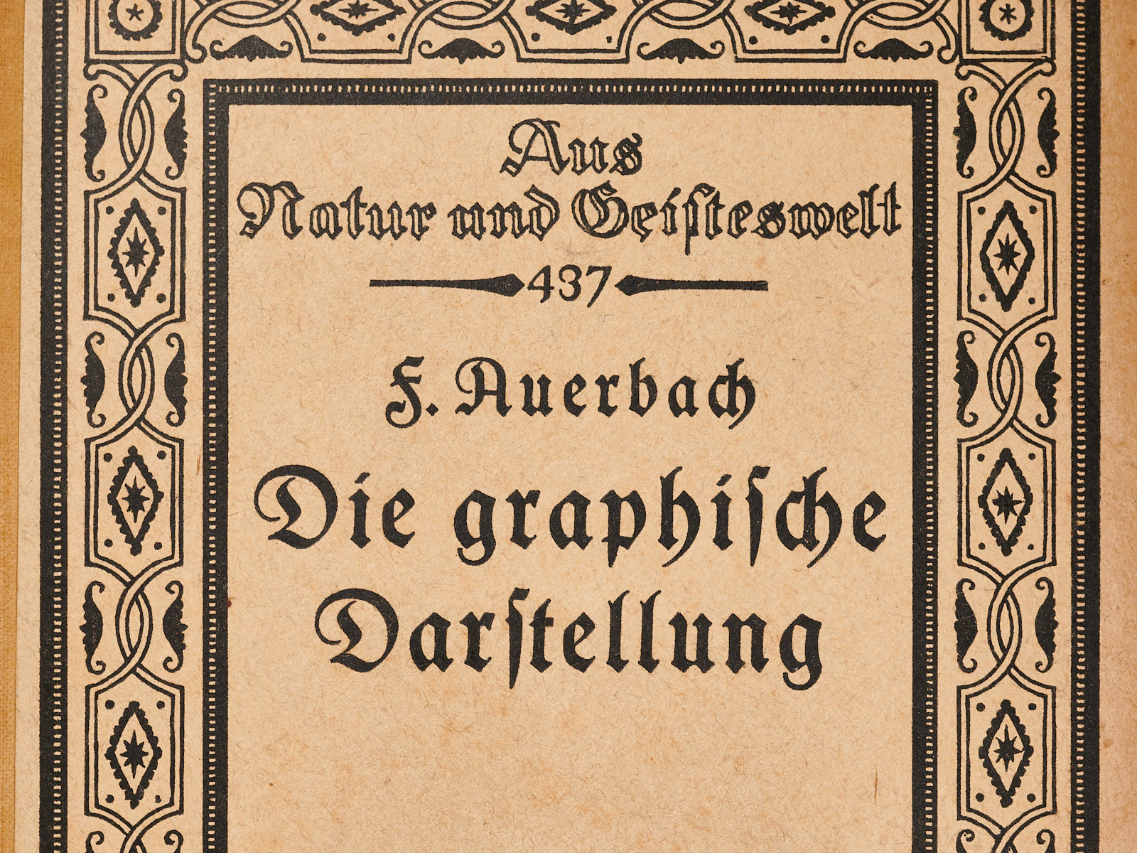
Blog posts filed under Book Review

Review: Alberto Cairo, How Charts Lie

Alberto Cairo’s new book, How Charts Lie, takes readers on a tour of how charts are used and misused, and teaches them how to not be misled. It’s a useful book for both makers and consumers of charts, in the news, business, and pretty much anywhere else.

ISOTYPE Book: Mackenzie, The Vital Flame

The first book in the new series on ISOTYPE books is The Vital Flame by Compton Mackenzie, published by The British Gas Council in 1947. It contains 42 color photographs and five ISOTYPE charts, with a nice variety of different topics and styles.

Review: Jon Schwabish, Better Presentations

Presentations can be dreadful. Badly thought-out slides, boring structure, poorly delivered. I once told a colleague after a practice talk to please shoot me before she’d ever make me sit through such a talk again (to be fair, she had called the talk boring herself before she even began).

Review: Lupi, Posavec, Dear Data

Giorgia Lupi and Stefanie Posavec have turned their Dear Data project into a book. It's a great example of the kind of creative work you can do around visualization without computers, entirely by hand. What started with a simple idea turned into an amazing project.

Review: Wainer, Picturing the Uncertain World

Picturing the Uncertain World by Howard Wainer is a book about statistics and statistical thinking, aided by visual depictions of data. Each article in the collection starts by stating a question or phenomenon, which is then investigated further using some clever statistics.

Review: Kraak, Mapping Time

Can you write an entire book about a single chart? Even if that chart is supposedly the best one ever? Menno-Jan Kraak's new book, Mapping Time: Illustrated by Minard's Map of Napoleon's Russian Campaign of 1812, discusses the historical context of Minard's work, his, life, and walks through a number of design exercises to show the same or similar data in different ways.

Review: Manuel Lima, The Book of Trees

Trees. They’re everywhere. And not just in the physical world, but in data visualization and knowledge representation as well. This is not a new phenomenon, it goes back thousands of years. Manuel Lima’s new book, The Book of Trees, gives an overview.

It's Just Too Easy

Once you’ve seen one visualization book, you’ve seen them all. They tend to all look similar, use the same examples, and don’t provide much depth. Is it too easy to write a book when you can use such compelling images?

Review: Alberto Cairo, The Functional Art

When Alberto Cairo first told me about the book he was writing, called The Functional Art, he warned me that only a small part of it was going to be about visualization. I have no idea what he was talking about, the book I read was a visualization book from start to finish. It is one of the most interesting and insightful books on the topic I have read in a while.

Review: Steven Johnson, The Ghost Map

John Snow's map of the cholera dead after London's 1854 epidemic is often heralded as one of the earliest examples of graphical data analysis. Steven Johnson's The Ghost Map gives a lot of background about the London of the 1850s, Snow's work, and how central the map really was.

Review: Kaiser Fung, Numbers Rule Your World

You all know what statistics is, right? I mean, everybody knows. But if you had to explain why it's useful, and what it's useful for, would you have an answer? Do you know how statistics makes a difference in all our lives, all the time? Even if you (think you) do, check out Kaiser Fung's book, Numbers Rule Your World.

Review: Cornelia Dean, Am I Making Myself Clear?

The first episode of season 4 of Mad Men opens with Don Draper being interviewed by a journalist. He doesn't tell him anything that's of interest and then dodges the question Who is Don Draper? by claiming that he was taught as a child not to talk about himself. Scientists do an equally terrible job at communication, and for many of the same reasons. Cornelia Dean's book Am I Making Myself Clear? offers fascinating insights into both journalism and science, and provides concrete ideas for how to do better.

Beautiful Visualization

Beautiful Visualization is a collection of essays on a wide range of topics in visualization. Don't let the title mislead you: while it has its share of artistic visualization, there is also quite a bit of technical information in there. One of the chapters was written by yours truly.

Book Review: Visual Thinking for Design, by Colin Ware

Colin Ware's latest book Visual Thinking for Design has a promising subtitle: active vision, attention, visual queries, gist, visual skills, color, narrative, design. That's covering quite a bit of ground, and also a lot of things not usually considered in visualization. While this is a book about design, I was interested in what it could teach people in InfoVis, and I review it from that point of view.