• Skip to main content
  • Skip to primary sidebar
  • Skip to footer

eagereyes

Visualization and Visual Communication

  • Explore
    • Starter Pack
    • Blog Calendar
    • Blogroll
    • eagereyesTV YouTube Videos
  • Practical
    • Basics
    • Pie Charts
    • Techniques
    • Book Reviews
    • Journalism
  • Academic
    • Speaking Mistakes
    • Acceptance Rates
    • Papers
    • Conference Reports
    • Lists of Influences
    • Criticism
    • Peer Review
  • Admin
    • About
    • Contact
    • License

storytelling

Robert Kosara / September 18, 2017

Review: Putting Stories to Work and Out On the Wire

Two books I’ve read recently make good points about stories that apply to data stories, without the books being about data: Shawn Callahan’s Putting Stories to Work and Jessica Abel’s Out On the Wire. [Read more…] about Review: Putting Stories to Work and Out On the Wire

Robert Kosara / September 13, 2017

The Season of Storytelling: Kicking It Off With A Podcast

It’s (almost) Fall – a good time for telling stories! Jon Schwabish invited me to be on his PolicyViz podcast again to kick off its new season. And I have a long list of things to write about around that topic, too.

[Read more…] about The Season of Storytelling: Kicking It Off With A Podcast

Robert Kosara / June 4, 2017

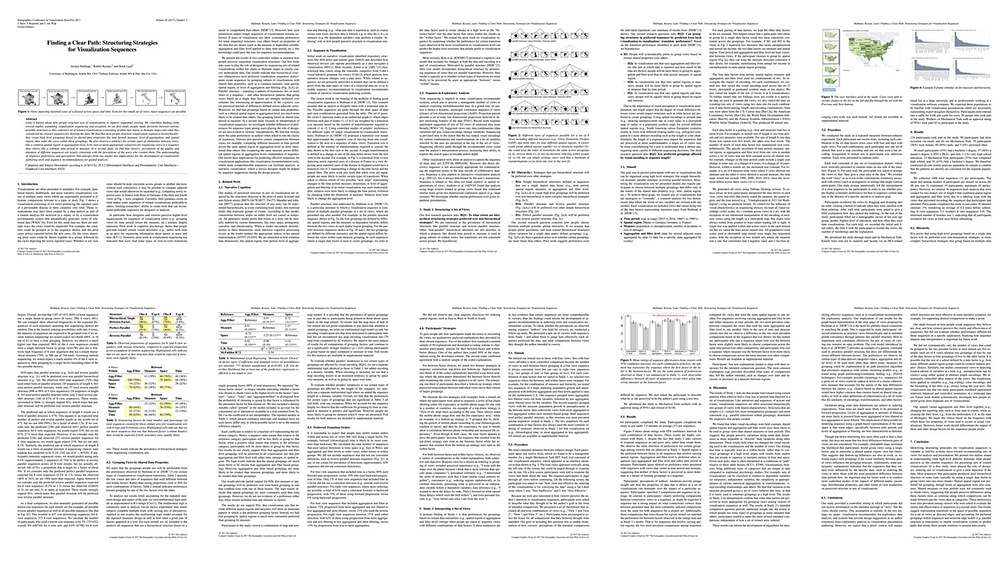
Paper: Finding a Clear Path: Structuring Strategies for Visualization Sequences

How should you sequence information in a data story so it makes the most sense? Are some sequences better than others? Does time have to move forward or does it not matter? In a paper to be published at EuroVis next week, with Jessica Hullman at UW and my Tableau Research colleague Heidi Lam, we report on a pair of studies that looked into this. [Read more…] about Paper: Finding a Clear Path: Structuring Strategies for Visualization Sequences

Robert Kosara / October 6, 2013

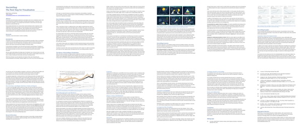
Story Points

I consider presentation and storytelling the next step in visualization, after most of the focus has been on exploration and analysis so far. An upcoming version of Tableau will include a feature called Story Points, which supports presentation directly in the visualization tool. [Read more…] about Story Points

Primary Sidebar

More storytelling Articles

  • Review: Putting Stories to Work and Out On the Wire
  • The Season of Storytelling: Kicking It Off With A Podcast
  • Paper: Finding a Clear Path: Structuring Strategies for Visualization Sequences
  • Story Points

Recently Popular

  • Data: Continuous vs. Categorical
  • The Simple Way to Scrape an HTML Table: Google Docs
  • The US ZIPScribble Map
  • New, Improved Traveling Presidential Candidate Map
  • How The Rainbow Color Map Misleads
  • New video: Gauges for Data Visualization, The NY Times Election Needle, and Circular Bar Charts
  • Watch My Outlier Talk: This Should Have Been A Bar Chart!
  • Facebook
  • GitHub
  • LinkedIn
  • RSS
  • Twitter
  • YouTube

Subscribe via Email

Footer

  • About
  • Contact
  • License

Copyright © 2006–2022 Robert Kosara · All original materials are available under CC-BY-SA