Paper: Evidence for Area as the Primary Visual Cue in Pie Charts
How we read pie charts is still an open question: is it angle? Is it area? Is it arc length? In a study I'm presenting as a short paper at the IEEE VIS conference in Vancouver next week, I tried to tease the visual cues apart – using modeling and 3D pie charts.
The big issue with investigating the visual cues used to read pies is that they all encode the value in a linear way. That doesn't allow us to separate them without creating very specialized stimuli for the study, like Drew Skau and I did back in 2016. We found that angle was unlikely to be the visual cue used to read pie charts, but couldn't decide between area and arc.
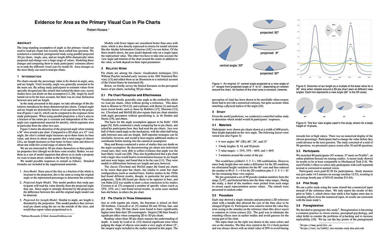
This is where 3D pies come in. Using parallel projection (also called isometric or orthographic), the different visual cues get distorted in different ways, which lets me separate them from each other. The obvious one is the angle at the center: starting from a 30º slice, at a 15º view angle, there's a roughly 12-fold difference between the smallest and the largest angle as it rotates around the pie.
The distortion is even more severe with arc length, which differs by a factor of about 40. What is not distorted, however, is area! For a given view angle and value, the area of a slice does not change as it rotates around the pie.

So for this study, I modeled the distortions and compared people's responses to my model predictions. The best-fitting model is the best explanation for how people read charts.
And the winner is… area! Angle is second, arc last. If we rule out angle from the earlier studies, that means that area is the way we read pie charts. There's certainly more research needed, but I think this study both adds a piece of evidence that area as the visual cue, and it shows an interesting approach to doing studies that's different from most perceptual studies in visualization today.
The paper with the preregistration, an appendix, study data, and code is all available online.
If you're exhausted from reading all this and don't want to read four pages of paper, fear not: I have a video about this paper in the works that I will post early next week.
Robert Kosara, Evidence for Area as the Primary Visual Cue in Pie Charts, IEEE VIS Short Paper Proceedings, 2019.
Comments (2)
Posting new comments was disabled in 2020.