• Skip to main content
  • Skip to primary sidebar
  • Skip to footer

eagereyes

Visualization and Visual Communication

  • Explore
    • Starter Pack
    • Blog Calendar
    • Blogroll
    • eagereyesTV YouTube Videos
  • Practical
    • Basics
    • Pie Charts
    • Techniques
    • Book Reviews
    • Journalism
  • Academic
    • Speaking Mistakes
    • Acceptance Rates
    • Papers
    • Conference Reports
    • Lists of Influences
    • Criticism
    • Peer Review
  • Admin
    • About
    • Contact
    • License
Joy Plots

Robert Kosara / July 10, 2017

Joy Plots

Let’s talk about plots and joy. The Joy of Plots, if you will. Also, Joy Plots.

Henrik Lindberg coined the term Joy Plot on the weekend , and it’s quite clever. Not only does it describe a plot of things people enjoy, it’s also a nice reference to that Joy Division album cover everybody knows even if they’ve never heard the actual music.
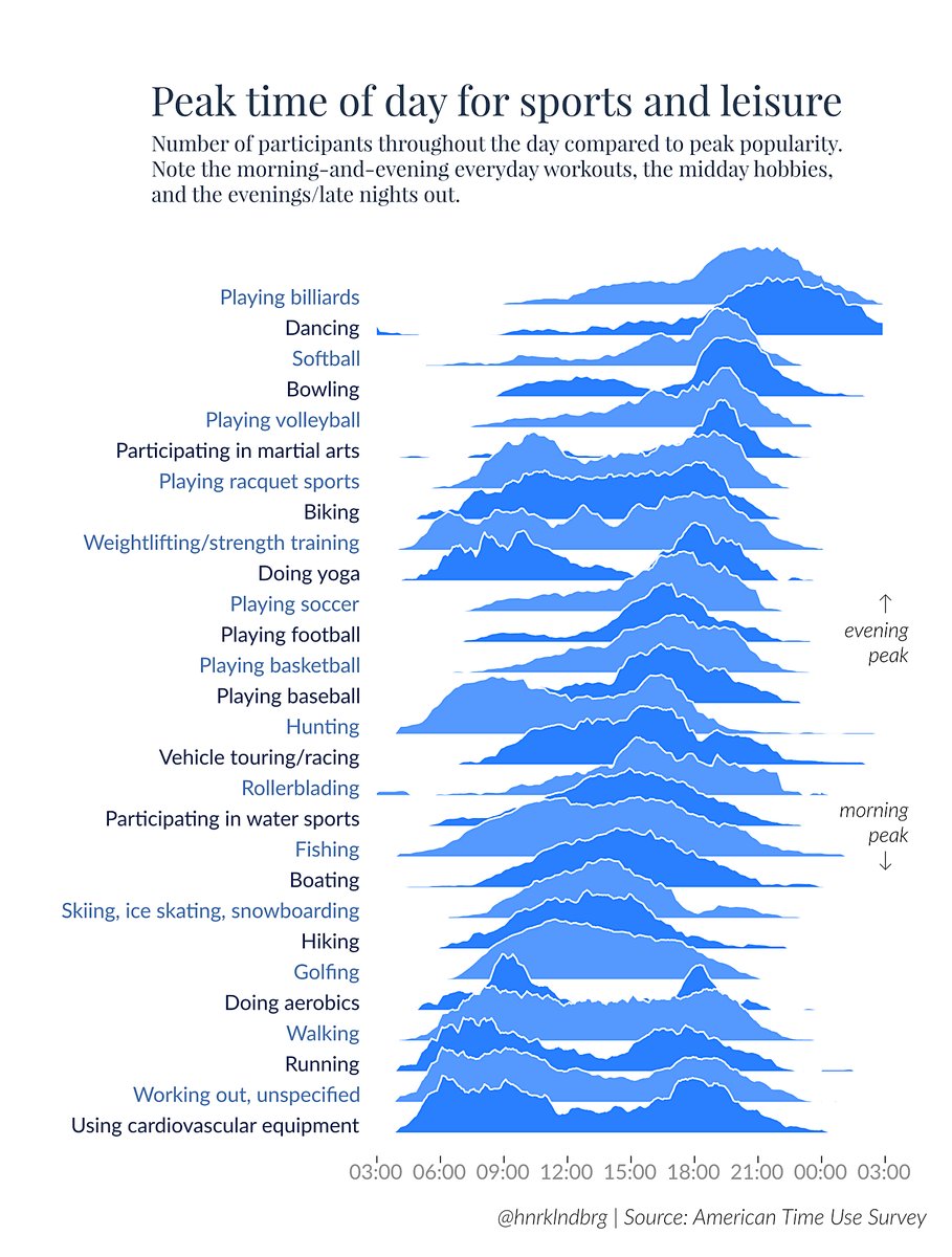
It’s also a clever chart that shows the data quite well. There are some issues with the depth stacking that hide a few parts of the data. We’re not sure what’s happening between the morning and evening peaks in doing aerobics, for example (fifth from the bottom). Is there a small noon bump? A few other timelines also have some parts hidden, but for the most part it’s all visible.

Is there a more “correct” version? Of course there is! The offset y axes might be an issue, as is the slight angle caused by the ordering that makes it harder to see the precise times. Perhaps a heat map would work better? Or a sort of heat map violin plot?

The best solution might be Xan Gregg’s horizon plot redesign:

It’s not a bad chart. But it’s not nearly as interesting (despite the more exciting choice of color). The horizon chart is still harder to read than a plain old bar chart, not as interesting to look at, and it doesn’t evoke the album cover. In a word, it’s… joyless.

Sounds like the lesson from an intellectual's cautionary tale: correct but joyless ?

— Xan Gregg (@xangregg) July 9, 2017

The point of the original wasn’t precision as much as it was just showing some data. So what if you’re missing a few minor details, you get the main ideas and the overall patterns clearly enough. Throw in a clever name and you’ve got something that stands out. The horizon chart just doesn’t do that.

From Bars to Dots and Arrows

Somewhat relatedly, there’s this redesign of a bar chart by Jon Schwabish. The original bar chart shows the data but is hard to figure out:

The redesign gets to the point much more clearly and is easier to read. This may be a tiny bit less precise (and you could quibble about where the zero of that axis is), but it’s not like subtlety is important given these large differences.
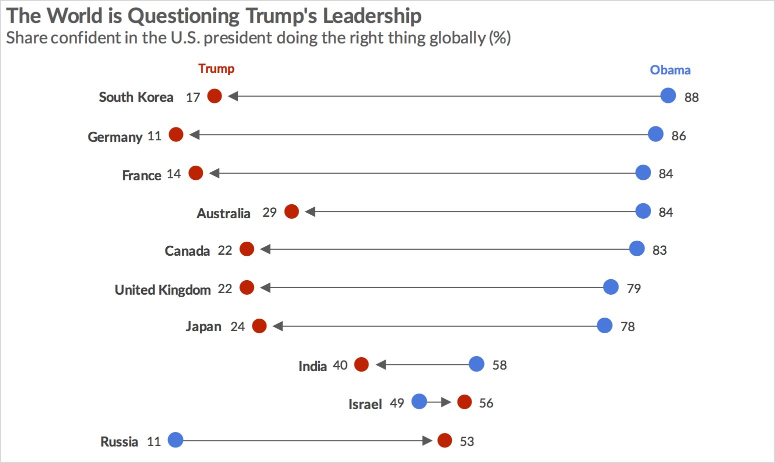
What this chart and the Joy Plot have in common is that they’re the more uncommon charts. They’re not crazy out there, just not the first thing you’d do. But they both succeed in showing data in an interesting way, if perhaps at the expense of a small amount of precision. But what they do is present the data in a way that’s easy to grasp, which strikes me as much more important. If you’re really after precision in these charts, you’d want to have some sort of mouse-over to show you exact numbers anyway.

What they both have in common is also that they show the value and fun in exploring slightly unusual chart types for relatively mundane data. It can be a joy to plot data. Joy plotting data. Joy plots. I’ll just keep saying that because it’s fun to say. Joy plots.

(Also it’s vacation time and nobody’s reading anything I write here anyway)

Filed Under: Blog 2017 Tagged With: bar chart, horizon plot

Robert Kosara is Data Visualization Developer at Observable. Before that, he was Research Scientist at Tableau Software (2012–2022) and Associate Professor of Computer Science (2005–2012). His research focus is the communication of data using visualization. In addition to blogging, Robert also runs and tweets. Read More…

Reader Interactions

Comments

  1. Helwig Hauser says

    July 11, 2017 at 3:40 am

    Fishing (at the very end; for compliments, I mean), right? :-)
    With success, as it seems! :-)
    Nice post with an interesting reflection: correct, but joyless — who prefers what?

    Reply
  2. Bora Beran says

    July 11, 2017 at 4:20 am

    Here is a Tableau version of Joy Division’s Unknown Pleasures with a rotation parameter to manipulate viewing angle/depth

    https://public.tableau.com/views/3DChartsinTableau/VizArt-UnknownPleasures?:embed=y&:showVizHome=no

    Reply
  3. Leigh Fonseca (@missleigh) says

    July 11, 2017 at 8:11 am

    Robert, I like your bar chart redesign. The white space nicely underscores the differences between the values. It’s a nice reminder to promote simplicity for clarity’s sake. I think I’ll add a similar example to my Tableau class this week.

    Reply
  4. Michael Griffiths says

    July 14, 2017 at 2:43 pm

    Minor note — I believe Jenny Bryan coined the term. See here for Henrik Tweet referring to the event: https://twitter.com/hnrklndbrg/status/884536221371949058

    Reply
  5. Kuldeep Sharma says

    July 26, 2017 at 1:53 am

    Great analysis ….the Russian thing is so true :D

    Reply
  6. Avantika Thapa says

    August 22, 2021 at 11:31 pm

    how can we make this graph?

    Reply

Leave a Reply to Avantika Thapa Cancel reply

This site uses Akismet to reduce spam. Learn how your comment data is processed.

Primary Sidebar

More Blog 2017 Articles

  • Speaking: How to Use A Microphone
  • IEEE VIS 2017: A SciVis Perspective
  • IEEE VIS 2017: Machine Learning, Diversity, Parties
  • IEEE VIS 2017: Perception, Evaluation, Vision Science
  • IEEE VIS 2017: Word Clouds, Stories, Interaction

Recently Popular

  • Data: Continuous vs. Categorical
  • The Simple Way to Scrape an HTML Table: Google Docs
  • The US ZIPScribble Map
  • New, Improved Traveling Presidential Candidate Map
  • How The Rainbow Color Map Misleads
  • New video: Gauges for Data Visualization, The NY Times Election Needle, and Circular Bar Charts
  • Watch My Outlier Talk: This Should Have Been A Bar Chart!
  • Facebook
  • GitHub
  • LinkedIn
  • RSS
  • Twitter
  • YouTube

Subscribe via Email

Footer

  • About
  • Contact
  • License

Copyright © 2006–2022 Robert Kosara · All original materials are available under CC-BY-SA


Loading Comments...