After my recent posting on the results of our pie charts studies, Jorge Camoes teased me on Twitter about square pie charts. So I dug up the data from a study we ran many years ago to look at how well they compare to bars, pies, and squares.
In 2009, my then-Ph.D. student Caroline Ziemkiewicz and I ran a study to test the feasibility of Mechanical Turk for perceptual studies. We ended up sending a paper about it to BELIV 2010, which was co-located with CHI that year. It was overshadowed by another paper at the main conference, unfortunately: Jeff Heer and Mike Bostock's Crowdsourcing Graphical Perception: Using Mechanical Turk to Assess Visualization Design. While there was some overlap, theirs was a more thorough, detailed, and – frankly – better, paper. As far as title cleverness was concerned, we clearly had a leg up though: Do Mechanical Turks Dream of Square Pie Charts?
The Study
Here are the chart types we tested: a square pie, a stacked bar chart, a pie chart, and a donut chart. Note that the square pie did not have a grid, like I've used in a few other places. We didn't want to make this too easy. Also, the bar looks a bit thin in comparison here, but it was longer than any of the other charts were wide – I had to rescale it here to fit it in.

The structure of the study was quite similar to the one Drew Skau and I used in our EuroVis papers. The stimuli look quite similar too, which I had not realized until I looked at them again.
Results
What did we find? I did the same analysis of this data as the one for the more recent studies. I'm also using the same structure and charts for confidence intervals here, so read the introduction there if you're not familiar with these.
First, a look at error. This is signed error, so we get a sense of the bias. It looks like all the charts have a slight bias towards underestimation.

Whether that's a real effect or not can only be assessed if we do this calculation relative to one of the charts. I'm choosing the square pie here because it's the closest to zero.

Compared to the square pie, only the donut chart seems to have a real bias here. The effect size is very small though, with a mean of about -0.5 percentage points.
More interesting is the absolute error: how precise are the different chart types?

This will come as a surprise to many people: the bar is doing the worst! How is that possible? It's not really all that surprising if you look at the literature on stacked bars: they suck. I'll have a separate posting about this soon, since it doesn't seem to be widely known. People are too busy slamming pie charts.
Anyway, regarding the pie and donut: they look identical! I remember that that confused us back then, since I was convinced we'd find a difference there. Now I know why, but it didn't dawn on me back then what we had found.
And, not to forget: the square pie chart is doing the best! Let's see just how well it's doing in a direct comparison.

The square pie does significantly better in terms of precision here than any of the other charts. That includes the pie and donut charts, and definitely the bar chart.
Interestingly, the error values we saw in the more recent study were about twice as large on average. I have no explanation for that. The pattern is perfectly consistent with the earlier study, though.
Confidence
One thing we were curious about in this study was whether people would feel more confident in their guesses depending on the chart type.
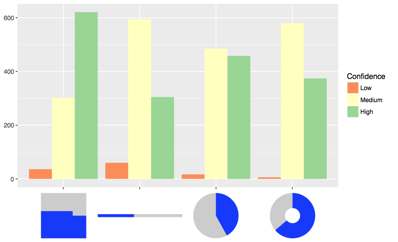
Here, too, we found that the square pie did best and the bar chart the worst. In the paper, we reported a significant effect here, and also that people's confidence ratings were pretty well in tune with their actual performance.
Conclusions
The numbers differ, but this study from 2009 shows some of the same effects as our recent pie charts studies. Pies and donuts are no different, though both are worse than the square pie chart.
I have added the dataset for the study as well as the RMarkdown code used to create these images to the github repository I created for the pie chart study comparison.
Comments (9)
Posting new comments was disabled in 2020.