One of the most common mistakes in chart design is to scale an area by two sides at the same time, producing a quadratic effect for a linear change. That overstates the larger numbers and produces a badly skewed chart. A little care and some basic high-school math can help avoid the problem.
The following detail from a information graphic produced by Princeton’s International Networks Archive illustrates the problem (the numbers are presumably from 2002):
Comparing Starbucks ($4.1bn) and KFC ($8.2bn), the problem becomes clear: the difference is a factor of two, but the KFC logo has four times the area of the Starbucks logo (even more because one is square and the other round). This can be seen in a number of the graphics on that website, though they also have some where they scale correctly.
The reason for the problem here is the use of logos (or of images, more generally) to make charts look better. Scaling a logo in only one dimension (which would be done in a bar chart) does not work because the image would look stretched and ugly. So instead, the image is scaled in two dimensions, leading to a perceived difference that is the square of the actual difference.
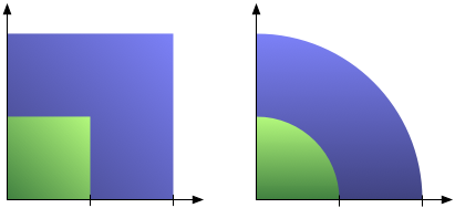
In more general terms, a linear change (I will use a factor of two to illustrate this)
becomes a quadratic change:
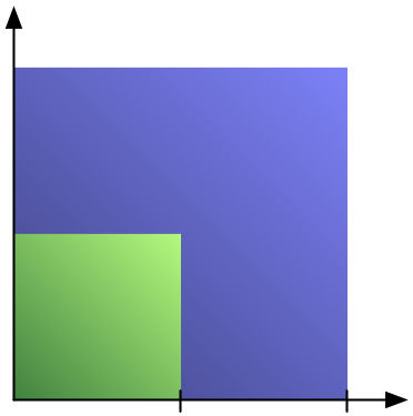
Or, to employ a bit of high-school math: The area of a square A = a2, with a being the length of side of the square. If we double the side length, we get A’ = (2a)2 = 4a2: four times the area. This is the case for many other shapes as well, including circles and circle segments.
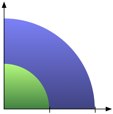
That last part was actually the subject of a discussion I had a while ago with a rather senior visualization person. He did not believe that changing a circle segment’s radius would lead to a quadratic increase in its area. It’s easy to show, though: a circle’s area is r2π (r being the circle’s radius), the area of a circle segment that covers an angle θ is r2π·sin(θ). It is no more difficult to show that doubling the radius will quadruple the area than with the square above.
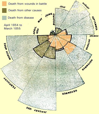
Florence Nightingale already knew this in 1858 when she developed her coxcomb chart (a predecessor to the pie chart): she represented the numbers of soldiers using the area, not the radius, of the circle segments.
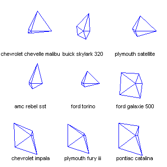
A similar effect can be seen in the petal chart or star glyph, which connects points on a number of axes that radiate from a common point. Whether they are filled in or not, the impression is that of an enclosed area, and that changes in a quadratic way similar to the circle segments above.
The solution? Either use a better visualization (star glyphs in particular are very difficult to read) or scale your circles, squares, and other lengths by the square root of the value you want to represent. That makes the area scale linearly with the value that is to be represented.
16 responses to “Linear vs. Quadratic Change”
This brings to mind the issue of perceptual scaling in cartography, where proportional symbols are deliberately exaggerated in area to make up for a supposed tendency of people to underestimate areas (of circles in particular). John Krygier has a nice summary of perceptual scaling and the debate over it. Though there seems to be no consensus on such a thing now, perhaps there are occasions where perceptual accuracy is more important than data accuracy (but then, perhaps we shouldn’t give in to it). I will say that if I were asked to identify a circle twice the size of another circle, without stopping to think first I probably would point to a linearly scaled circle that’s actually four times the size.
Good point, there are of course more issues here. But the perceptual scaling is also highly dependent on context (the posting you linked to shows that towards the end), so scaling is very tricky. Perhaps the best bet is to stick to correct sizes and provide mouse-over tooltips – or simply use a different visual cue than area (which is hard to do in maps, I know).
This scaling issue has always been a pet peeve of mine – and (coming from my scivis background) it always amazes me that there’s no discussion in techniques such as Wijk’s image-based flow visualization or even in basic things like glyph plots for vector fields.
But to bring this back to infovis: has anyone looked at what happens to this perception on parallel coordinates? In particular, I always wonder about the difference in perception with positively correlated variables and negatively correlated ones, since their projected areas are quite different. And in that case, there does not seem to be a simple coordinate transformation that fixes it.
Your point is well taken that visual designers need to be aware of their scaling decisions. I’m not sure if this means we always need to scale our areal symbols linearly. Andy brings up a great point above about perceptual scaling. In the Intro to Cartography class I TA’d for 3 semesters, we’d discuss linear v. perceptual scaling for proportional symbols. On the upside, perceptual scaling leads to more accurate judgments on average. Since the research of Stevens and Flannery, though, such corrections have been problematized, as there is very high variance within the population. While increasing the legibility of a graphic for some, perceptual scaling reduces it for others who estimate area in a more linear fashion. And if you read William S. Cleveland (1985), he suggests that the “sensible solution to the problem of area judgments is to avoid them.”
Let’s not go that far. But I do think there are reasons for cartographers and other visual designers to stick to strict linear scaling. At least this creates a common baseline, and may lead users to actually improve their estimations as they use charts and maps by different authors (esp. if, as you suggest, the graphic is interactive and the user is able to check their estimates against exact values). If these different charts all utilized different scaling methods or exponents, though, users would constantly have to estimate areas in different ways to form accurate judgments.
One final note on the graphic that starts out your post. I agree that the symbols aren’t correctly scaled by area. But they are scaled correctly by height, which is a more effective visual variable anyway. This only works if the user is aware of the scaling method, and is able to separate the width and height dimensions of the symbol (considering the width dimension in this case to just be noise). And I think it’s an open question as to whether we can effectively do this. But this type of scaling is used in tag clouds, in which the height of the symbol is to be read, not the overall area of the text. This is something I talk about here.
In that last paragraph, I’m referring to the second image in your post (the Princeton-produced one), not the “graphic that starts out your post”.
The problem with that first chart especially is that the different shapes are difficult to compare. Look for example at the difference between KFC and Wendy’s: the boxes are essentially the same size, the only thing that goes higher is the little “head” on the Wendy’s logo. Are you really comparing the heights or are you looking at the overall size (which is much closer to area). The correct thing to do here would be to use a boring old bar chart and put the logos below the bars as labels.
Also, regarding tag clouds: those are a particularly poor visualization in my humble opinion. They may give you a rough idea of which words occurred most frequently, but it’s very hard to compare them. Also, the folks at Many Eyes use the square root to scale the words because of the area perception. In addition, these also have a bunch of other problems, like overemphasizing long words and words with few synonyms, not counting compound words, etc.
I had no idea Many Eyes used area scaling on their tag cloud symbols. Very interesting! But I wonder how effective they are, as the vast majority of the tag clouds we encounter do use font size (so word height, not area) to convey # of occurrences. Many Eyes may be more theoretically correct, but I wonder how they’d stand up to empirical testing. Of course, I’m not saying that designers need to continue using ineffective representations just because they are ingrained, but the consequences of making users relearn a symbology they’re pretty familiar with should be considered as well.
I agree that the problem with the Princeton graphic is the use of irregular and complex shapes to represent quantitative data. But I doubt the graphic would be any easier to read if the same symbols were scaled correctly by area. With such complex shapes, accurate area estimations would be nearly impossible. Agreed, though — a bar chart, utilizing the viz variable of length but without the confusing noise of varying widths, would do just fine here.
I don’t think we’re anywhere near understanding the perceptual and cognitive issues of the visualizations we use. There is a lot more work to be done to have a decent basis for not just producing visualizations, but actually knowing what to look for when trying to find specific structures.
“the confusing noise of varying widths”
Indeed, why vary the symbols in two dimensions when the data only vary in one? That to me seems like the first problem with the fast food chart.
Area scaling is definitely a problem. I deal mostly with Excel graphics, and among the most popular chart types is the pie chart, with donut charts a close second. I think radar charts are not as popular, because they’re lower in the options, and users don’t scroll that far.
One option to include the logo with the data is to make a bar chart that is built up of a stack of logos, where the number of logos is proportional to the value. A tall stack of golden arches might be frightening.
The better option is either a logo below the base of the bars, or above the top end of the bars. Or make a chart with horizontal bars, with the name spelled out along the vertical axis, and the logo to the right of the appropriate bar.
Using the logo as a category indicator is less likely to misrepresent the information in the chart than trying to scale the logo in some way to capture the value.
Is there software available that generates a Coxcomb Chart or a Polar-Area Diagram?
While trying to find a way to generate a coxcomb chart, I came across this article (http://dd.dynamicdiagrams.com/?p=428), it shows that Florence Nightingale did not represent the number of deaths on area, but actually the radius, and therefore, it was deceptive.
I just came across this article that says that she did it wrong in the beginning, but then corrected her mistake. I read somewhere else that she got this right, though I can’t point to a source right now. So I think I’ll stick to the story of scaling by area.
I don’t know of any software, tho I’ve created Actionscript 3 code, which can be used on many platforms with the free Flex SDK: http://indiemaps.com/blog/2008/10/nightingales-roses-in-actionscript-3/
Haven’t read all the comment, but if we think how perception is logarithmic, then it makes sense to give up linearity. I guess it will depend on the application, but it should maybe be explicited.
objects may be larger/smaller than they appear