When the Wrong Chart Is the Right Choice
We all agree that the direction of the bars in a bar chart should correspond to the direction in which the values grow. Or do we? When it comes to running or audio recording and processing, it turns out that the seemingly wrong choice can be the right one – because a more semantically meaningful representation can help us understand and use the data much more easily.
Running Pace
This discussion started with this tweet by Andy Kirk making fun of a chart made by Under Armour, which shows pace for kilometer splits of somebody's run:

On the face of it, this looks completely bonkers. Here’s a bar chart where the vertical axis is upside down, and it’s not even starting at 0 at either end. How can this possibly make any sense?
If you’re a runner, you probably understand what’s going on here. Pace is measured in units of time per distance, so usually minutes and seconds per mile or kilometer. That makes for a much more relatable way of thinking about speed at human scale where a difference of, say, 10 seconds per mile is meaningful. Translated into km/h or mph, that would be miniscule.
The issue with this measurement is that unlike speed, pace gets smaller as you get faster. Running a mile in eight minutes is faster than doing it in ten minutes. So a numerically smaller 8 min/mi pace is going to make you quite a bit faster than a numerically larger 10 min/mi.
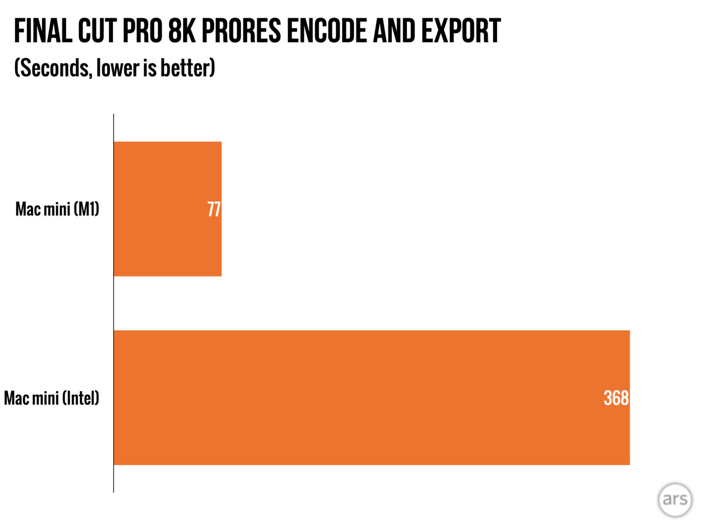
In a chart, that’s kind of weird. You could just do the “correct” thing in the visualization sense and ignore the meaning. But you’d end up having to explain that the shorter bars mean faster pace. That’s not very logical, and it’s not motivating – you want to see larger bars for faster miles. Performance benchmarks that measure completion time of a task (like these ones at Ars Technica) have a similar problem, so they usually include an annotation to say whether higher is better or lower is better (especially when that changes between different benchmarks).
Running apps have long shown pace data upside down. Here’s a quick screenshot I posted from Strava where they’re using a line chart. Note the scale on the right.

Line charts tend to get a pass when it comes to zero baselines (though that isn't actually warranted). Strava also shows splits as bars though, with the same inverted axis.

Other apps tend to do the same, as far as I’m aware. If you’re a runner, I think you’re used to this representation and easily understand what it means: smaller pace number means faster means better, which should make for a taller bar – visualization rules be damned!
We did discuss this a bit further in my twitter thread responding to Andy and started talking about how to represent this data differently (or better, if you will). Andy proposed this alternative, using bars but anchoring them on the average instead of a completely arbitrary baseline:

I agree that this is a good idea. It would actually be quite useful to see negative splits in a race (meaning your pace is faster in the second half than the first) more easily. Instead of the average, you might also pick a target pace to show the bars against. Then all the bars might point up or down, showing you how you were doing relative to your goal (again, most important for a race). But that doesn't change the scale being upside down so faster points up.
Audio Software and Interfaces
There are other places where axes can be scaled in unusual ways and make sense. The dB scale on the right edge in this screenshot from audio software iZotope RX goes from -∞ to 0, both up and down. Yes, that infinity. You're looking at not just one infinite scale, but two!

Sure, dB is a logarithmic scale, but the spacing between -20 and -∞ is not to scale here. The range between -20 dB and 0 dB is the most important for finding and fixing problems, so they gave it as much space as possible. And since the signal extends both above and below the zero crossing, they did that for both halves.
A similar reason is likely behind the uneven scaling of the level indicators on this MOTU audio interface. Note that the top three labels on the vertical axis (on the left, this time) are spaced 6 dB apart, and the distance then triples to 18 dB for the lower four. That again gives a lot more space to the range between -12 dB and 0 dB, where you want more precision to avoid overdriving the mic preamps or other input and outputs.

Here's one more example, this one from Logic's compressor. This meter shows the reduction in level by the compressor, so it starts on the right. It's kind of logical actually since the reduction is a negative number, but the spacing is still quite creative: note the even subdivisions on the right side of -10 dB and how they differ from the left. This is not a logarithmic scale either, it's really two different scales that meet at -10.

Visualization dogma of course does not allow such unevenly-spaced axes. But many decades of audio devices show that they work and serve a purpose, just like they do with the (seemingly) weird running pace charts.
Expertise vs. Visualization Rules
I think this little discussion highlighted something important about how we need to think about charts in the context of expertise and use. We aren’t chart-reading machines that mechanically follow supposed chart rules when working with charts. We can adapt. We can use our intelligence. We can read axis labels. We can understand context.
Distorted axes can be a problem, no doubt. But distortion isn’t always wrong, and in fact sometimes is the better way to go. Use case, convention, and expertise trump visualization rules any day. And I think these two examples, in particular the one about running, is one that many people can relate to who otherwise would scoff at the outrageously bad charts used by experts in some field they don’t understand.
Posted by Robert Kosara on June 27, 2021.