Can A Timeline Pie Chart Work?
Can you put ranked data into a pie chart that also represents time? This chart tries, and I think it succeeds.
This chart was posted by Cal Fire a few days ago on Twitter. It shows the acres burned by the 20 largest wildfires in California.

Yes it's a pie chart. We're looking at ranked data here, even though the chart isn't sorted by size of the fire. It's sorted by time, when the fire started. The color scheme is chosen to group fires before 2000, from 2000-2019, and then 2020 and 2021.
The pie chart is clearly the wrong chart here because it's not a part-to-whole comparison. Or is it? Their tweet says, “all but 3 of the top 20 largest wildfires have occurred since 2000." That's a part-to-whole statement. The whole here being the 20 largest wildfires in California's (recorded) history, and the parts the fires before and after 2000. What the pie chart also shows is that these three fires before 2000 made up only a very small fraction of the acres burned. Sure, the top 20 is kind of arbitrary, but it's what they chose for this comparison.
I figured I'd try the usual, this should have been a bar chart. I'm not copying all the colors here, just roughly following their color scheme for the years. You can see which of the fires happened last year and this (red and orange), and also the three that occurred before 2000 (dark gray).
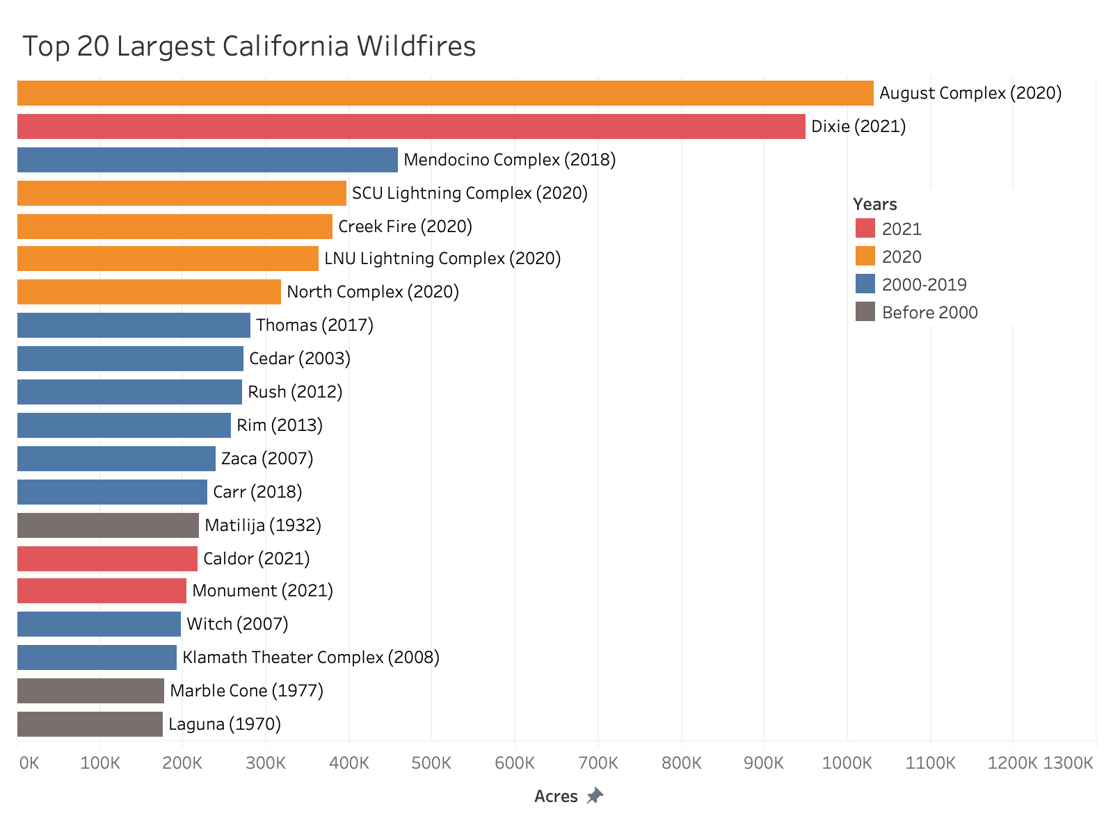
I don't think it works all that well, though. I'm sorting by acres burned, so I'm losing the time grouping (other than through color). But even so, the part-to-whole comparison here is much harder than with the pie. Comparing the sizes of fires is certainly much easier, but that's not the point of the chart.
It's also interesting to see how much more the bars for the largest two fires stick out here. I made a pie chart in Tableau as well just to check that my numbers were correct and that they didn't do something odd with scaling (they didn't, it looks the same). But the difference seems smaller in the pie chart than in the bar chart. It's an interesting effect. And it makes for a chart that lets you focus a lot more on the message, which is the comparison of different time periods, rather than comparing individual fires.
In my opinion, the pie chart is successful here. A bar chart would let you do other things, but it wouldn't work nearly as well to get the point across about the vast majority of the largest wildfires having happened in the last 20 years. And since that is their message, I'd say this is the correct choice of chart.
Posted by Robert Kosara on September 15, 2021.