The second installment of the Protovis tutorial (see part 1 here) introduces some more of its JavaScript-specific features like scales, shows how to anchor marks on other marks, and how to use rules. We also start using real data, and learn how to load that data from a remote source.
Visualization is pointless if it doesn't represent interesting data. For this part of the tutorial, I have prepared a data file that contains all earthquakes of magnitude 1 or above over the last 24 hours. This data file is created by downloading a CSV file from U.S. Geological Survey (USGS) and converting it to the JSON format. The data file (at this URL) is updated once every hour, so if you have a Protovis-capable browser, you are seeing current data in the examples below.
Data in Protovis
There are many ways to get data into Protovis, and several ways of organizing it. The easiest way is to load a file in the JSON (JavaScript Object Notation) format, which is essentially JavaScript syntax for expressing arrays/lists and objects/dictionaries. This is what the earthquake data looks like in the file:
[
    {
        "Src": "ci",
         "Region": "Southern California",
         "Lon": "-116.8408",
         "Datetime": "Thursday, June 10, 2010 01:35:03 UTC",
         "Depth": "4.10",
         "Version": "1",
         "Lat": "34.3186",
         "Eqid": "14740876",
         "Magnitude": "2.0",
         "NST": "79"
    },
    ...
]
The outer square brackets denote an array, which can contain any type of object (including other arrays, numbers, etc.). Curly braces delimit an object, which in other languages would be called a hash table or dictionary. An object maps keys, which have to be strings, to values, which can be of any type.
The example here shows only strings, but that is the result of the conversion not caring about data types. The numbers could also be represented without quotation marks. JavaScript automatically converts strings to numbers as needed, so in practice it makes practically no difference how they are encoded.
JSON data can be retrieved from many sources, instead of or in addition to XML. JSON has the advantage of being smaller than XML, easier to parse, and mapping directly to an object hierarchy in most programming languages. It is also possible to create JSON from CSV and other tabular data with the help of CSV to JSON converters.
There are two ways to get this data into your Protovis visualization. One is like in the Protovis examples, where the data is part of a variable declaration that is read in as a source file. That is fine for examples, but is a bad idea when getting data from remote sources: somebody could alter the file to contain any functionality to hijack your application, spread malware, etc.
So the following way of loading data is more complicated, but also much more secure. It uses the jQuery library to load the data, and the browser's own JSON parser to securely parse the JSON data into a variable we call earthquakes.
var dataURL = "http://data.eagereyes.org/pv/earthquakes.json";

var JSONdata = $.ajax({ type: "GET", url: dataURL,
        async: false }).responseText;
var earthquakes = JSON.parse(JSONdata);
There are a lot more things jQuery can do, including asynchronous downloads of the data, etc., but this is all we'll use for now. Our earthquakes variable now contains the array of earthquakes, with each entry in the array being an object that has fields such as Magnitude.
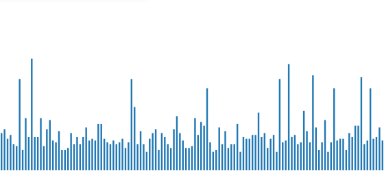
To access this data, we need to set the variable as the data property of the visualization we're building, and provide a function that accesses the data. The following code is very similar to what we ended up with in the first part, with a few modifications. First, it defines a few variables for convenience, then it creates a simple bar chart from the magnitudes of the earthquakes.
var width = 560;
var height = 245;

var barWidth = width/earthquakes.length;
var gap = 2;

new pv.Panel().width(width).height(height+5)
    .add(pv.Bar)
        .data(earthquakes)
        .bottom(0)
        .width(barWidth-gap)
        .height(function(d) d.Magnitude * (height/9))
        .left(function() this.index * barWidth)
    .root.render();
A little detail that will save us some work later on is the definition of the height. Notice that the panel is five pixels higher than the height variable specifies. This gives us a little bit of headroom for later to add things close to the top without cutting them off. You can ignore this for now, though.
The barWidth variable adapts the visualization to the number of earthquakes to show. This number varies, since there can be more or fewer quakes over the course of a day, so we don't want to assume a particular number. An earthquake's magnitude is measured on the Richter scale, which does not have an upper limit. For practical reasons, we'll limit the maximum to 9 here, which fortunately is rather uncommon.
The key points for data access here are the following two lines. The first one tells Protovis to use our earthquakes variable as the data source.
.data(earthquakes)
Protovis does not care what the variable contains, as long as it is an array. It simply walks through all the elements in the array and hands them back to functions we define. One such function determines the height of the bars in our bar chart.
.height(function(d) d.Magnitude * (height/9))
This does two things: it accesses the Magnitude field inside an object and scales that value to fit the height of the visualization. Since the value will be different for each bar, we have to define a function here. The function gets a single parameter, which we call d. Since we've specified the data to be the earthquakes variable, we know that the function will be passed one of the earthquake objects. So inside the function, we know that d has all the fields shown in the JSON code snippet above. One of them is the earthquake's magnitude, in a field called Magnitude. The expression d.Magnitude accesses the value of that field.
The rest of the function scales the value from that field by multiplying it with one-ninth of the height of the panel. That means that if the bar will be the height of the panel if the magnitude is equal to 9, and smaller if it is less than that.
And voilà, the earthquakes of the last 24 hours.
Anchors
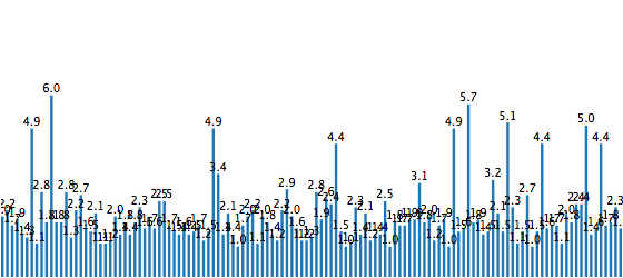
Of course, this doesn't yet tell us a whole lot. How strong were those earthquakes? Were any of them serious? We can do this by attaching labels to the bars that tell us the actual numbers. In Protovis, this can be done in a very elegant fashion. At the end of the pv.Bar definition, before the line that says .root.render(), we add these lines:
.anchor("top").add(pv.Label)
    .text(function(d) d.Magnitude)
    .textBaseline("bottom")
What that does is attach one label to each bar, anchored at the top of the bar. The data is the same as what is used for the bar, which is one of our earthquake objects. So we need to again define a data accessor function that extracts the magnitude from the earthquake object (same as for the bar above). The additional textBaseline definition is used to move the label up, otherwise it would overlap the bar. Labels can be aligned in a number of different ways, to be attached to different sides of objects without getting in the way.
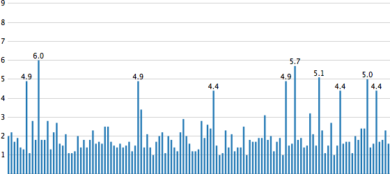
Labeling all the bars gives us this new variation of the chart.
Hiding Marks
That's a start, but it's also very cluttered. Since higher magnitudes are less common, they stand out and are still readable, anyway. But it's clearly a better idea to get rid of all the clutter, and this is very easy:
.visible(function(d) d.Magnitude >= 4)
The visible attribute determines whether a mark will show up or not. As before, we need to define a function here, because the value of the expression will change for each array entry. The rule here is to show the value for earthquakes of magnitude 4 and higher (i.e., earthquakes stronger than "minor"). The function works in a very similar way to the text and height definitions above, only its type is a boolean value: true or false. If the value is greater than or equal to four, the expression will evaluate to true, and the label will be visible. If the magnitude is less than four, the result is false, and the label is not shown.
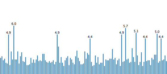
There is no guarantee that there won't be overlaps, but they are a lot less likely now. Also, it makes more sense to label the stronger earthquakes, because those are obviously of more interest.
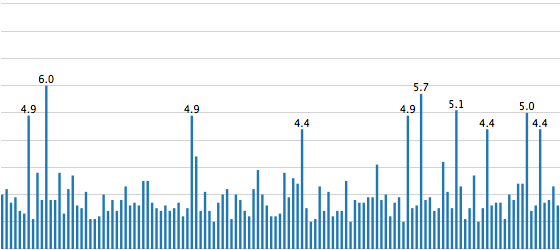
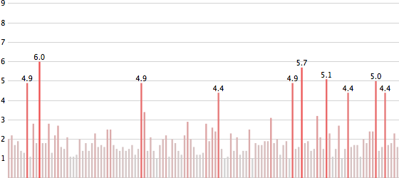
Rules
Now in addition to numbers, let's also add a more visible scale. The mark to use for this is called a rule. Rules are lines that are either horizontal or vertical, depending on what data is specified. By defining a bottom function, we tell Protovis that we want horizontal lines. Rules are added directly to the panel, so let's call the panel we're creating eq.
Just like with bars and other marks, rules need data to be drawn. To do that at regular intervals, we could specify an array that contains the values from 0 to 9, for example. But we can also use a Protovis utility function called range() that creates that array for us. If you are familiar with the range function in languages like Python, this will look familiar: you can specify just the upper limit (which is not included in the array), or add the starting point and step size as well. Since we're starting at 0 and want a step size of 1 (which are the defaults), we can just specify the upper limit.
Finally, the values need to be scaled just like for the bar height. So the formula for that looks exactly like above, only here we are directly getting the numerical values, rather than looking at an earthquake object.
eq.add(pv.Rule)
    .data(pv.range(9))
    .bottom(function(d) d * (height/9))
    .strokeStyle("lightgray");
The result looks like this. Defining this before the bars means that the bars will be painted on top of the lines. Since the bars are quite thin, it looks like the lines are in front, but they are not.
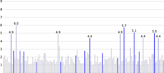
Labeled Rules
Anchoring also works for rules, and it's extremely useful to label them. This specifies that we want to attach labels to all the rules, but we'll hide the one at 0. This is simply to avoid the 0 being cut off, which it would be given its location. There are other ways of doing this, like moving the baseline, but we'll keep this simple for now.
.anchor("left").add(pv.Label)
    .visible(function(d) d > 0);
Notice that we do not even have to specify the text property here. Protovis automatically assumes that the label should show the numbers from the parent object if nothing is specified, and that is what we want here. (This, BTW, is where specifying the panel height as a bit higher than the chart comes in handy: the top-most label would otherwise be cut off. Having a bit of space around the panel is often a good idea, but makes examples a bit more confusing to read, so I'm keeping it to a minimum here.)
As it is, the lines still start at the left edge of the panel, so the labels are actually pushed of the side. We need to move them over to the right a bit, like this:
eq.add(pv.Rule)
    .data(pv.range(10))
    .bottom(function(d) d * (height/9))
    .strokeStyle("lightgray")
    .left(10)
    .width(width-10)
.anchor("left").add(pv.Label)
    .visible(function(d) d > 0);
Also, the bars need to be moved so they don't overlap with the labels. This is done by changing the barWidth definition slightly.
var barWidth = (width-10)/earthquakes.length;
Where that is used to specify the location of the bars, we also need to add the same amount so that the gap is to the left (if we don't add anything, the thinner bars will simply end up being shorter, with a gap on the right).
.left(function() 10 + this.index * barWidth)
That gives us a better view of the data, with a grid and labels.
Scales
Using the same function for the scale in the background is kind of ugly, especially if that means we need to copy code. That is why Protovis has a mechanism for reusable scales that are defined once and then used in several places. This not only makes the code more compact and elegant, it also makes it much easier to change it without running the risk of inconsistencies between the different marks.
To define a scale, we use the pv.Scale class, which has a number of convenience functions. Using the familiar function chaining style, it lets us create two scales, one for the x coordinate and one for the height.
var xScale = pv.Scale.linear(0, earthquakes.length)
                .range(10, width);
var magnitude = pv.Scale.linear(0, 9).range(0, height);
The code should be fairly self-explanatory: we are defining linear scales from 0 to the number of earthquakes, or from 0 to the maximum magnitude we want to show, respectively. The range() function specifies what the output range will be, in our case it's simply the width or height of the panel.
Now remember that this is Protovis, and it will not surprise you that scales are not objects, but functions. That means that you can call xScale() and magnitude() as functions to convert a number from the data domain to the screen domain. The way this is used is shown in the following, which specifies the height and location of the bars.
        .height(function(d) magnitude(d.Magnitude))
        .left(function() xScale(this.index))
If we had a simple array of numbers, we could even just pass it the function, but since we need to access a field for the height, and the index for the x coordinate, we need to define another function. But the rules are more straight-forward.
eq.add(pv.Rule)
    .data(magnitude.ticks())
    .bottom(magnitude)
    .strokeStyle("lightgray");
Notice the definition for bottom, which simply passes the magnitude function in without any modifications. Another trick here is using the ticks() function on the scale, which creates equally-spaced numbers that are suited well for a scale (the exact numbers depend on the range of the scale and the optionally specified number of ticks). This actually means we're calling a function on a function! JavaScript is weird like that.
The result of this looks no different, which is good. But it's now much more elegant and easier to change.
Color Scales
Scales can also be used to interpolate colors. Let's say we wanted to change the color of the bars depending on their value, we could create a color scale like this.
var colors = pv.Scale.linear(1, 9).range("lightgray", "red");
This assigns a light gray to a magnitude of 1, and turns the bar more and more red the closer we get to 9. In the definition of the bar, we can now use the new scale to specify the fill color.
.fillStyle(function(d) colors(d.Magnitude));
At this point, this is a redundant mapping, because the magnitude is already shown as the height of the bar. So let's look at another attribute, like Depth – perhaps there is some correlation between the depth at which a quake happens and its magnitude. To do this, we'll define a new scale, similar to the one above.
var depthColors = pv.Scale.linear(0, 150)
                    .range("lightgray", "blue");
And then use that one instead in the definition of the bars.
.fillStyle(function(d) depthColors(d.Depth));
Done.
Putting It All Together
Here is the entire code for this, including the data loading part. This is also available as a file from the github repository and in a ZIP file together with sample data.
var dataURL = "http://data.eagereyes.org/pv/earthquakes.json";

var JSONdata = $.ajax({ type: "GET", url: dataURL,
                        async: false }).responseText;
var earthquakes = JSON.parse(JSONdata);

var width = 560;
var height = 245;

var barWidth = (width-10)/earthquakes.length;
var gap = 2;

var xScale = pv.Scale.linear(0, earthquakes.length).range(10, width);
var magnitude = pv.Scale.linear(0, 9).range(0, height);

var depthColors = pv.Scale.linear(0, 150).range("lightgray", "blue");

var eq = new pv.Panel().width(width).height(height+5);

eq.add(pv.Rule)
    .data(magnitude.ticks())
    .bottom(magnitude)
    .strokeStyle("lightgray")
    .left(10)
    .width(width-10)
.anchor("left").add(pv.Label)
    .visible(function(d) d > 0);

eq.add(pv.Bar)
    .data(earthquakes)
    .bottom(0)
    .width(barWidth-gap)
    .height(function(d) magnitude(d.Magnitude))
    .left(function() xScale(this.index))
    .fillStyle(function(d) depthColors(d.Depth))
.anchor("top").add(pv.Label)
    .text(function(d) d.Magnitude)
    .visible(function(d) d.Magnitude >= 4)
    .textBaseline("bottom");

eq.render();
Previous: A Protovis Primer, Part 1 Next: A Protovis Primer, Part 3
Comments (20)
Posting new comments was disabled in 2020.