In Defense of Pie Charts
Pie charts don't get much respect. They're almost always considered the wrong choice by those supposedly in the know. But how do we know that this is true? What evidence do we have to support this? The truth is, not much. And when we start digging for proof, it turns out that pie charts are much better than we want to admit.
The Study
In a paper from 1991, Ian Spence and Stephan Lewandowsky performed a number of experiments comparing pie charts to a horizontal stacked bar chart (HBAR in the images), a regular bar chart, and a table of numbers. The paper start off by criticizing earlier studies that relied on measuring how well people can compare areas to each other, rather than areas to sub-areas (which is the more typical use for pie charts), and that used tasks that were different from how people use charts in real life.
The tasks Spence and Lewandowsky picked are more typical for the kinds of questions people would ask of the data, like ‘Do Olivetti and Bull together sell more computers than IBM? (isn't it amazing how this question dates the paper?) They also argue that precision in reading the numbers is secondary to comparison tasks, since a table is obviously going to be more precisely readable than any visualization. They therefore picked comparison rather than estimation tasks, and tested them with different constraints.
Results
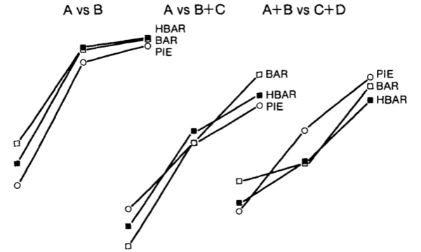
Their first experiment is quite typical for most of their other results, so I will focus on this one here. They showed the three chart types (the table was not included in this experiment) to study participants for 1.5, 3, or 6 seconds. The chart below shows accuracy versus presentation time for the three charts and three different questions: a simple A vs. B comparison, A vs. B+C, and A+B against C+D.
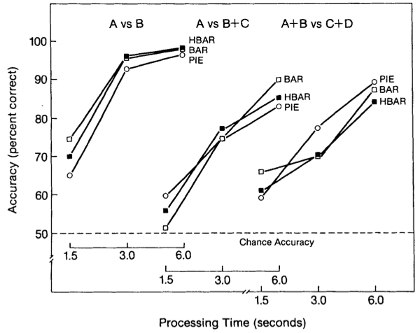
It is easy to see that the differences between charts are minimal. What is much more important is the presentation time and the task. Another thing they tested were different numbers of components, and those charts look quite similar: as long as the number is seven or below (which is what they tested), the differences between them is very small.
In addition to the pie chart not being worse than the bar chart, there is an even more surprising result here: pie charts are doing better for more complex tasks! They performed a separate study to tease out that effect, and it did turn out to be statistically significant.

While it is not surprising that the table doesn't do too well in the more complex tasks (adding up numbers is more difficult than combining areas), the comparatively bad performance of the bar chart is. They did not include the stacked bar chart here for some reason, which presumably would have done better than the regular one.
In their discussion, they mention that adjacent segments in a pie chart are especially easy to combine, whereas the same is not true for a bar chart. And that, I think, is an important point: if we step away from the focus on accuracy in reading numbers, some of the more complex tasks are actually easier to do with the pie chart. The bar chart is great for reading and comparing individual numbers, but when it comes to adding up bars, it's a lot less effective.
Trust the Designers
Spence and Lewandowsky make an interesting point at the beginning of their discussion section:
As Macdonald-Ross (1977) has observed, practical communicators have a good sense of what works, and does not work, in display graphics. He cautions that one should not lightly ignore this accumulated body of practical wisdom even though it may have little formal experimental base.
Visualization people tend to dismiss the collected expertise of designers despite having little more in terms of 'experimental base.' That does not mean that a designer's choices are always right, but it does mean that we have to be a bit more careful. It certainly means that we have to have evidence in hand before we dismiss something as ineffective or wrong – lest we be proven wrong ourselves.
Ian Spence and Stephan Lewandowsky, Displaying Proportions and Percentages. Applied Cognitive Psychology, vol. 5, no. 1, pp. 61–77, 1991.
Posted by Robert Kosara on April 13, 2011. Filed under pie-charts, criticism.