How The Rainbow Color Map Misleads
Colors are perhaps the visual property that people most often misuse in visualization without being aware of it. Variations of the rainbow colormap are very popular, and at the same time the most problematic and misleading.
The rainbow color map is based on the colors in the light spectrum, and is sometimes done correctly, sometimes the colors are in the wrong order. Quick, name the colors in the rainbow in order! See, that's part of the problem. Even if they were used consistently, nobody would know the right sequence anyway. Here is an image to jog your memory, courtesy of Wikipedia.
Now take a look at this map from a paper on water resources published in the Journal of the American Water Resources Association, which I found on Cliff Mass’s fantastic weather blog. It describes the amount of evapotranspiration (loss of rain water through evaporation) by county for the 48 contiguous U.S. states.
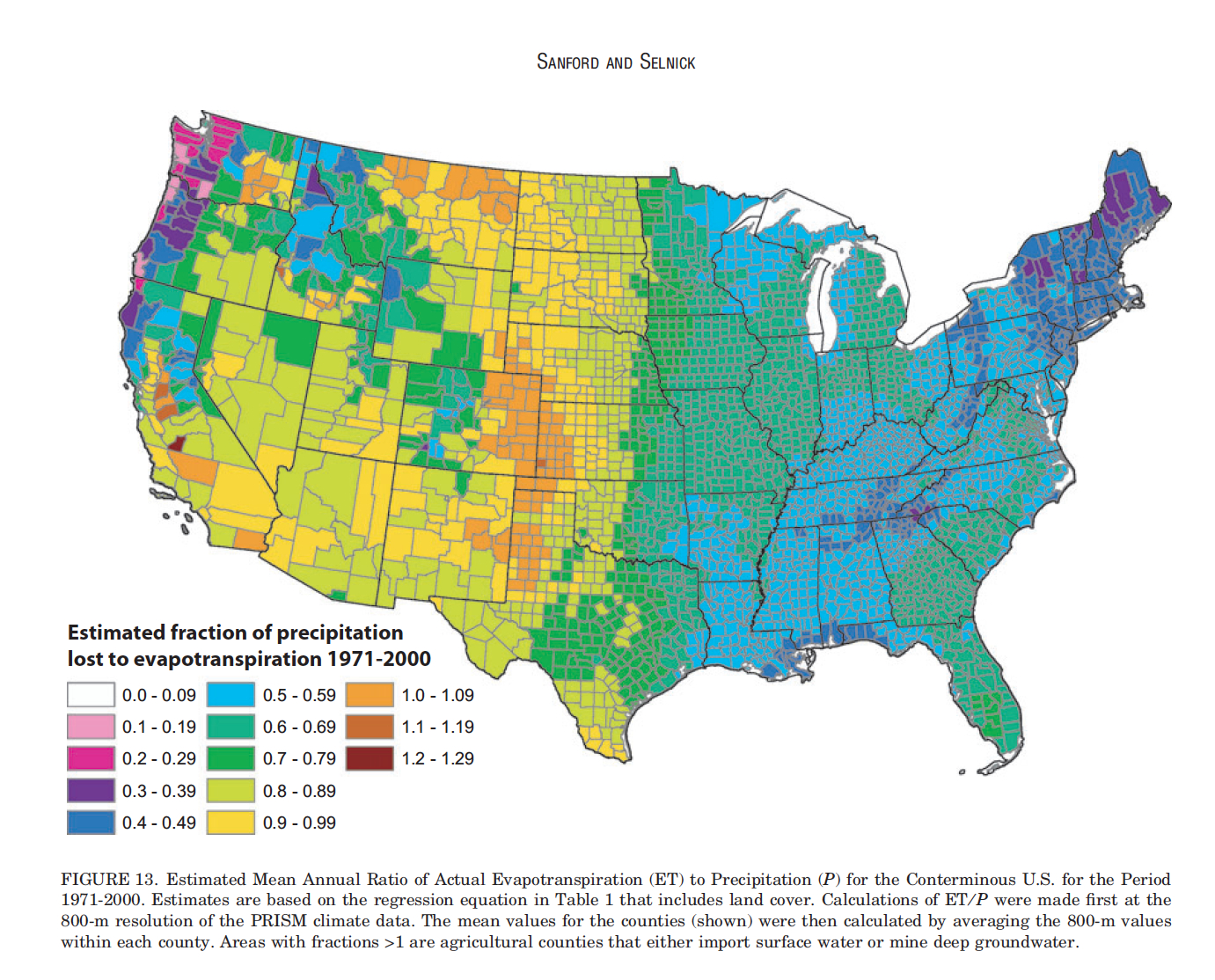
Do you see the how the country is divided down the middle? The Eastern half seems to be all dark green and blue, while the Western half is all light greens, yellow and orange. Surely, there is a huge difference between the two.
But let’s take a closer look at the legend.

As it turns out, the values change smoothly, but the colors do not. There are two problems here: abrupt changes in luminance (perceived brightness of a color) as well as switching between different hues.
Luminance
The combination of smoothly varying and abruptly changing luminance makes it appear as if there were clearly defined regions on the map. A version of the legend that only shows luminance, without hue, makes this a bit more obvious.

The color for 0.3–0.39 is darker than the neighboring colors, the luminance for 0.5–0.59, 0.6–0.69, and 0.7–0.79 is virtually the same, and then there is a big jump to 0.8–0.89. The step size in terms of the data is no different, it’s simply an artifact of the color scheme.
Hue
What is more, the hue changes. As I have explained before, color names influence our perception of color. So let’s look at the full-color version of the legend again, and enumerate the hues.
- White (0.0–0.09). That’s a really odd choice to start with, since the background of the map is also white, and non-colors like white, black, and gray should be used for special values like missing data, etc. But that’s a topic for another posting.
- Pink (0.1–0.19 and 0.2–0.29). These two by themselves would be okay.
- Purple (0.3–0.39). Different color, also much darker.
- Blue (0.4–0.49 and 0.5–0.59). Different color again, and the ramp is going in the opposite direction from the pinks, with the brighter color now representing the higher value.
- Green (0.6–0.69 and 0.7–0.79). Different color again, and the two are virtually the same.
- Greenish yellow (0.8–0.89). Another switch in hue, and this time also a dramatic jump in luminance, for no discernible reason.
- Yellow (0.9–0.99). Hue number seven, and we’re not done yet.
- Orange and brown (1.0 and above). I’ll make this easy by lumping the final brown in with the oranges, even though you might argue that they are different colors (brown is actually just very dark, desaturated orange, but it still has its own name).
So there are eight distinct hues here, sudden jumps in luminance, and the luminance doesn’t even change in a consistent direction. This is a beautiful example of a terrible color map, and one that is incredibly common in the scientific literature.
There are certainly reasons for using more than one hue. If there are ranges of values that are meaningful and important for the discussion to be able to differentiate. Or if there is an inherent distinction, say above and below freezing for temperatures. But there is no indication of that here.
Why Rainbows?
Given the issues, why are the rainbow colormap and its variants so popular? I think the answer is quite simple: it’s attractive. Using a single hue to show the data would be reasonably effective, but much less interesting to look at. What is more, if you’re looking to read off the individual values, the smooth ramp is actually worse because you can’t look for a particular hue anymore. The cost is that you create lots of artifacts in the map, though.
![]()
There is a case to be made for color maps that have more than one or two hues, but that do not produce the sort of issues seen in this example. One approach is to use a color map where the luminance is constant or monotonically increasing (meaning, it never changes direction). Constant luminance leads to very dull colors, but a well-designed color map with increasing luminance can look quite attractive. ColorBrewer has a few of those, at least for two colors.
Alternatives
Everybody in visualization knows ColorBrewer. Everybody. It’s almost silly to link to it again here, because it’s so widely known. And yet every year, there are again papers that use horribly bad color maps. ColorBrewer requires some care when using, but it has explanations to help pick a good color map. ColorBrewer colors tend to be available in many visualization packages (D3, etc.), though mostly the categorical variants.
There is also Adobe’s Kuler, which lets you design color palettes, but which requires some knowledge to use well. There are also many attractive color schemes to explore on that web site, but those were not designed for data visualization.
A paper many people have heard of, but few have read, is Borland and Taylor’s Rainbow Color Map (Still) Considered Harmful. They use synthetic data to show the issues, and go into more detail than I have done here, but I think the effect is much more impressive when it’s shown with a real example published in a science journal.
When mapping a continuous value, a ramp with a single color is always a safe choice. It may not look exciting, but at least it does the data justice. Anything beyond a single hue needs to be done deliberately, and not just to liven up a boring-looking image.
Conclusions
Despite its importance for perception and visualization, color continues to be a surprisingly little understood topic. People often seem to be content with default colors, or with an arbitrary selection that just happens to look good. But without great care when picking colors, you can do a lot of damage to your visualization.
Posted by Robert Kosara on July 7, 2013. Filed under attention.