Above All, Do No Harm!
Heatmaps and 3D pie charts are often criticized, and for good reason. But they're not always a bad choice, and can work for simple data presentation. Context is important when criticizing visualizations, especially when there are no obvious improvements that can be made.
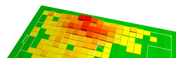
The Chart
Moritz Stefaner tweeted about this chart on the weekend, and he did not like it.

The image in question was posted as part of an article in German magazine Der Spiegel. The point of it is to show the strategy of Dutch soccer player Arjen Robben in a particular match against Germany.

The image caption claims that it shows where he spent most of his time during the game, and even lets you see his movements.
The way the data is shown here is by means of a 3D bar chart overlaid on the soccer field. The information is encoded redundantly in both the height of the bars and their color.
Criticism
It's easy to criticize a tilted 3D bar chart: the bars are distorted by the perspective, and at least in principle it can hide information (shorter bars can disappear behind taller ones). There is a reason why three-dimensional visualizations are rare in information visualization: they are hard to read and navigate, and there are few if any advantages to be gained from the third dimension.
Another problem is that there is a big step between the green parts of the soccer field, which Robben presumably never touched during the game, and the bars for the squares where he spent time. There has to be some kind of cut-off though, or Robben must be able to teleport himself onto some of the disconnected squares.
Above All, Do No Harm
In light of the above, this a bad visualization. However, I argue that it works, and that it does not violate what should be visualization's prime directive: above all, do no harm!
This image is meant to communicate a small amount of information, essentially 20x14 (280) grid cells with numbers. The obvious thing to do, since that is also how the data was acquired, is to map them onto the soccer field. That could be done in 2D or (pseudo-)3D.
The 2D case would be a boring heatmap, where the data would be only encoded using color. If you wanted to be serious about the lower cutoff, there would be no or very few fields with no value (or a 0) where the soccer field could be seen, so there would be little context to guide the viewer. The result might be more in line with common visualization wisdom, but also much less compelling and in need of a lot more explanation to even understand what it shows.
The 3D version has two things going for it: it shows the data in a redundant way (using the bar heights), and it provides useful context. Why also vary color? Well, why not? It's obvious that the bars are much easier to differentiate when their colors differ. Redundant encodings are not very common in visualization, but they often end up being useful, in particular when using visualization for presentation and communication.
The obvious downside of potentially hiding values between the 3D bars is not an issue here, since the distribution of values is nice and smooth. We can see all bars and can compare them reasonably well. The point of this chart is not to precisely compare the exact amounts of time Robben spent in each square, so the fact that we're not able to compare them with great accuracy is simply not an issue.
The cut-off that lets the field shine through also helps this visualization, because it establishes context: this is a soccer field. Not only does it show that immediately, it also gives enough context to judge where on the field the squares are. Sure, there is a bit of inaccuracy in that cut-off, but does that really matter? The point is to show where the guy spent most of his time, not where he was seen once or twice during the entire game.
Finally, the arrow. It's not entirely obvious, but I assume that it shows which goal Robben's team was playing towards. Since the sides are usually switched after the break, they probably rotated the data from the second half to get a more consistent image. This could perhaps be labeled a bit more clearly, but I think it's actually useful to figure out if Robben was playing defense or forward.
Conclusion
Given the amount of data, the point to be made, and the audience, I think that this visualization is a good choice. While it does use a few things that can be problematic, they are non-issues in this case. The point gets across, clearly and accurately enough, and with enough context to make the visualization easy to read and understand.
It's a bit too easy to dismiss a visualization just because it uses a technique that is overused and that is often problematic. We need a bit more subtlety in our criticism, and a bit more care to see if something might work in a particular case, even if it may not in many others.
Posted by Robert Kosara on August 21, 2011. Filed under Visual Communication, criticism.