Paper: Readability and Precision in Pictorial Bar Charts
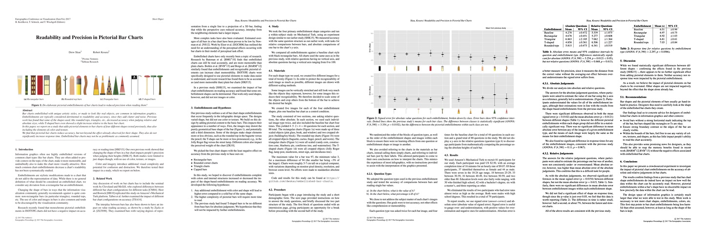
Embellished charts are common in information graphics. But are embellished bar charts actually harder to read than plain ones? In a short paper to be presented at EuroVis next week, Drew Skau and I present a study that looked into this question.
This is a follow-up to Drew's earlier paper on embellished bar charts that looked only at shape. We used that as the basis to pick only the shapes that turned out to not have a discernible negative effect and then filled those in with designs. The shapes included rectangles, triangles, rounded tops, and flags/t-shapes (similar, perhaps, to lollipops?).

The results are interesting because we found almost no differences. The danger with that is that we technically can't claim that there is no difference. But at least we now have reason to believe that visual embellishments in bar charts are problematic because of the distortion of the shape, not the added visual clutter inside the shapes. There's more work to be done here to make this watertight, though.
Drew Skau, Robert Kosara, Readability and Precision in Pictorial Bar Charts, Short Paper Proceedings of the Eurographics/IEEE VGTC Symposium on Visualization (EuroVis), 2017.
Posted by Robert Kosara on June 6, 2017. Filed under paper, papers.

