Data: Continuous vs. Categorical
Data comes in a number of different types, which determine what kinds of mapping can be used for them. The most basic distinction is that between continuous (or quantitative) and categorical data, which has a profound impact on the types of visualizations that can be used.
The main distinction is quite simple, but it has a lot of important consequences. Quantitative data is data where the values can change continuously, and you cannot count the number of different values. Examples include weight, price, profits, counts, etc. Basically, anything you can measure or count is quantitative.
Categorical data, in contrast, is for those aspects of your data where you make a distinction between different groups, and where you typically can list a small number of categories. This includes product type, gender, age group, etc.
Both quantitative and categorical data have some finer distinctions, but I will ignore those for this posting. What is more important, is: why do those make a difference for visualization?
Quantitative Data: Values
Most data sets contain both types of data. It’s actually quite difficult to visualize data that is purely quantitative or purely categorical (parallel coordinates are a good way to show the former, parallel sets for the latter).
Let’s take the example of a hypothetical coffee chain and look at their profits. A simple bar chart can show this data broken down by product type.
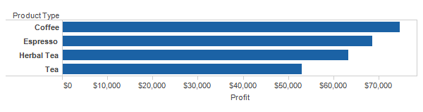
As simple as this chart is, some decisions had to be made how to show the data. The quantitative Profit variable is shown well by position or length. The categorical Product Type naturally divides the data into individual items, hence the bars.
What if we picked a different variable for the second axis, one that is continuous? This changes the type of chart we want to a line chart.

Profit is now on the vertical axis, but it is still a continuous variable. We might treat time as categorical, which would give us another bar chart, perhaps with one bar per month (or whatever granularity we want). But I decided to treat time as continuous here, which results in a line chart. Time is a special case that can be either type, depending on the way you want to look at the data. To focus on individual months, treat time as discrete and use bars. To look at trends and the rate of change (and thus, the space in between the data points), use continuous time.
Line and bar charts can appear to be interchangeable, but they are usually not. The encoding is subtly different (length for the bars, position for the line), and there is a clear implication in the line that there is a continuum between the points. Using a line chart for the product type chart above would not make sense, since there is nothing in between Espresso and Herbal Tea. Even if we only have one data point for each month, though, time is still continuous, so we can treat it as such if we want.
Categorical Data: Breaking Things Down
We often want to see more than two data attributes at the same time. Categorical axes can be used to break data down further. Each category is subdivided by the categories of the additional dimensions. Adding two categorical dimensions, Market and Year to the initial chart gives us a lot more bars.

Here, time is now categorical, which means we get separate bars for each year. We've also broken out the different regions to get individual bars for every combination of market, product type, and year. There are other ways to show the same data: we could stack the bars for the different product groups, for example. Which dimensions are nested, and in what order, is also important. We could decide that we want to see each product type broken down by market instead, rather than the other way around, or maybe break each year down into markets, and look at the products across those combinations.
Which is the right configuration depends on the question you want to ask. But the type of visualization has not changed, we are still looking at bars. Adding categorical dimensions to a visualization usually divides the visualization up rather than changing the type.
The same thing can be done for our line chart. Let's break that one down by product type.

The axis mappings have not changed, they are still (continuous) time and profit. But adding the product type subdivides the total into four separate lines. We can now see how each of them have done over time, which ones are flat, which increasing, etc.
Adding color is not strictly necessary here, but it makes following the lines and identifying them much easier. Color works great for categories, at least as long as the number is reasonably small.
More Encodings
These examples are very straight-forward. Simple charts tend to work well for a small number of data dimensions. More unusual encodings should only be used when more variables are needed. As an example, let's look at sales compared to profits in a scatterplot.

The scatterplot shows two numerical values using position along each axis. I've added two categorical ones: color and shape. This shows me that the West market had the highest sales in all but the Coffee category (look at the locations of the X marks compared to the other shapes of the same color), though not always the highest profits.
Like color, shape works well for a small number of categories, because we can really only tell a very limited number of them apart (10 is roughly the maximum for both).
If we wanted to add another quantitative dimension, we might use size, though that would start to overload the chart. It is usually a better idea to keep the number of visual variables (like color, shape, size, orientation, etc.) small, as they interact and become difficult to read. It is often more effective to create several different charts or rethink the question to make sure all these dimensions are really needed at the same time.
Data types play an important role in visualization because they determine what visualization types can or should be used. That doesn't mean that there is only one chart for any combination of data types, but it does narrow down the possibilities.
Posted by Robert Kosara on April 17, 2013. Filed under basics.