The Revolution Will Be Visualized
In the 1970s, it was the protest songs. In the 1980s, it was the anti-war movies. Today, the protest is no longer happening in songs or movies. Today, it’s online, based on data, and using visualization.
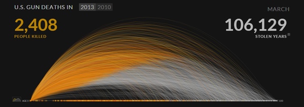
Gun Deaths
It’s a very abstract and yet very clear image: something moves along a trajectory, is suddenly stopped, and drops to the ground. A gun has been fired, somebody has been killed. Periscopic’s U.S. Gun Deaths visualization is visceral and it doesn’t just show data: it makes an argument. People are being robbed of their lives. Hundreds of years are lost every day.
In the deleted slides from his Tapestry talk, Jonathan Corum criticizes the visualization because there are elements that don’t mean anything. The filtered views also don’t work nearly as well as the initial animation. But the point is made there. It’s the impact, the punch in the guts that makes this work.

Drone Strikes
Pitch Interactive’s Out of Sight, Out of Mind shows U.S. drone strikes in Pakistan. It breaks down the victims into high-profile targets, alleged combatants, civilians, and children. It’s essentially a stacked bar chart.
But the animation of the dropping bombs gives the strikes much more of a reality than a mere monthly number would. And the number of people killed is staggering when you see it as bars like that. These aren’t just bars, but they have segments, one for each person.
Switch to the Victims view and it gets even more personal. A small figure is drawn for every person killed. Continuous bars don’t give you a sense of individuals, but little figures do.

Guns Again
The Huffington Post’s Mapping the Dead: Gun Deaths Since Sandy Hook shows gun deaths since the elementary school shooting that got so much attention last December. It's a simple map, but with a twist: it zooms out from Newtown, CT, to reveal the entire U.S. and all the gun deaths over the last few months. It's breathtaking.
Hovering over the bars also gives you something else: names. These are not just numbers, they were real people. Listing them, similar to the figures for the drone strikes, makes them much more tangible and real.
The New Language of Protest
How do you make people notice an issue? How do you get them to care? What if we’re no longer moved by songs (and the artists too comfy and reluctant to take sides) and no longer want to see movies about real issues (and Hollywood won’t take the risk of offending anybody)?
What if the new way to get us to care is with a visceral, raw display of data?
Posted by Robert Kosara on April 3, 2013.