Paper: Implied Dynamics in Information Visualization
Design is usually considered a minor point in visualization. Does it make a difference what color scheme you use (as long as it's not an atrocious one), how thick your lines are, whether you put a background behind your chart, etc.? Caroline Ziemkiewicz and I presented a paper at Advanced Visual Interfaces (AVI) where we reported on a study we had performed to find out.
The prevailing view in visualization is that information is encoded in graphical marks, and those marks are read by the viewer when looking at a visualization. But we know that different chart types have different meanings, and work better for different kinds of data. And, as we have seen, what is often considered chart junk can actually be useful for remembering a chart's message and data.
Zacks and Tversky performed a study where they showed the same data using bar and line charts (PDF), and got their test subjects to come up with nonsensical explanations based on the charts (in one, they showed men's and women's average heights in a line chart and got the response, "It looks like the more male you become, the taller you get."). Another experiment by Elting et al. showed clinical study data to physicians and asked if they thought the study needed to be aborted. They not only found differences depending on the type of chart used, but also which parts of the data were stressed by the use of otherwise meaningless visual attributes.
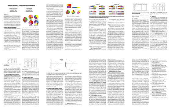
In our study, we picked five widely-used chart types and came up with a set of design variations: do the parts touch or are they separated, are there lines around the parts, is there a line around the entire chart, is there a background behind the chart, etc. We told the study participants that each of these charts represented a company, and asked them to rate it on a number of qualitative criteria: controlled, isolated, structured, unified, well organized, etc. We then picked charts they had rated very differently and asked them to explain their judgments.
We found a number of interesting effects, among them gender effects (men find round shapes more rigid, women thought the same for rectangles) and a variety of differences in how strongly design variations influence different chart types.
But what was actually more interesting were the explanations. They hint at a strong sense of movement and physically-based interpretations of the charts, even though they were abstract and not embellished at all. One effect we found was that in pie and donut charts, when there was an imbalance in the "weight" of different slices (where darker colors are heavier), people thought they were not properly balanced, and might even roll away! Charts whose parts were not touching ("exploded" charts) made people uneasy, ranking generally lower in most criteria, and leading to explanations like "it's about to explode."
What is so interesting about this is that it fits perfectly with a lot of art theory and perception research in art: artists and designers know how to balance their images so that they don't make the viewer uneasy, and type designers create letters that are heavier at the bottom so that they don't fall over. This is not something that has been considered in visualization (AFAIK), but might lead to some interesting new ways of designing and optimizing visualizations and charts.
In work that is currently under review, we took these findings further to see what other kinds of dynamics there are, and what they can be used for. We're also arguing for an expanded view on the theory of visualization in an upcoming Visualization Viewpoints. So stay tuned!
Caroline Ziemkiewicz, Robert Kosara, Implied Dynamics in Information Visualization, Proceedings Advanced Visual Interfaces (AVI), pp. 215–222, 2010.
Posted by Robert Kosara on May 30, 2010. Filed under papers.