Women in IT - Squaring the Pie?
Pie charts are a ubiquitous way of showing percentages. But while we can see differences in angles quite well, reading the meaning of the difference is another matter, so for precise data, we still need the numbers. A little known variant of pie charts is not round, but square, and can be read with an accuracy of one percent. We will look at data on women in information technology using this method.
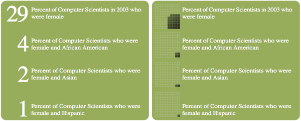
The National Center for Women and Information Technology (NCWIT) publishes a very impressive one-page summary of the under-representation of women in IT (PDF). We all know, of course, how few women there are in IT, especially in leading positions. But seeing the actual numbers is still shocking. The graphics here use parts of that summary to compare numbers and charts.

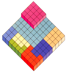
Square pie charts are a technique that I have so far only seen in the book Diagram Collection, without much description (the image at the very top is a scan from the book). But the principle is really very simple: a square is divided into 10x10 fields, and for each number, as many fields are filled in as there are percent. Consequently, the numbers remain readable by simply counting the number of fields covered by one color. Taking a hint from squarified treemaps, the areas should also be as square as possible for better comparability. Square pies are quite compact, the ones in the images on this page are only 50x50 pixels.

Even to somebody not familiar with the technique, and with visualization in general, the technique should be obvious enough not to need an explanation.

Like pie charts, square pies can be sexied up by adding a bit of pseudo-3D – and unlike pie charts, the 3D distortion does not affect the readability of the values, because the lines dividing up the fields are still there, and act as guides. The number of filled-in squares is much more robust than an angle, which changes considerably with any kind of distortion. The rectilinear nature of the display may be less attractive, but it certainly is more readable even under difficult conditions.

There is certainly more to be said about showing more than one value in a square pie chart, about squarifying or not, etc. Percentages over about 50% appear to be larger than they are if the area is squarified. Relative sizes in area are not as easy to judge as relative lengths, but it would be interesting to see how angles compare to both of them. Square pies seem to be most impressive when the percentages are very small.

Is this visualization? Probably not, because it lacks any kind of interaction. It is more a charting technique like pie charts, which can of course be used as a part of a visualization, with added interaction, etc. But it certainly is an interesting variation on existing techniques, and may offer some insight into how to structure visual metaphors for visualization more effectively.
Juice Analytics has picked up the idea of square pie charts and made it into a challenge to implement them in Excel. There are some very interesting submissions and a great screencast explaining two of them.
Posted by Robert Kosara on October 14, 2006. Filed under techniques.

