My Review of Visualize This and Visual Complexity for Science Magazine
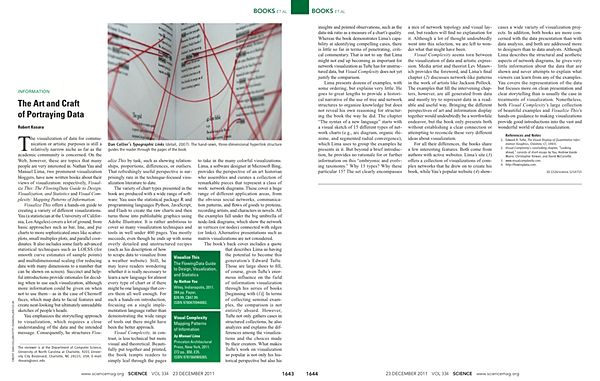
I was asked to write a review of two recent visualization books for Science: Nathan Yau's Visualize This and Manuel Lima's Visual Complexity. The piece appeared in the last issue of 2011, right before Christmas. Below is a link to the review and some additional comments on it and the two books.
Discussing the two books in one review was quite a challenge, because they are so different. Visualize This is very hands-on and walks the reader through a number of examples, while Visual Complexity is an illustrated guide with a heavy theoretical bent.
Visual Complexity
I'm really conflicted about Visual Complexity. While it is a beautiful book that provides a great overview over a large range of visualization examples, it has one big flaw: it doesn't deliver on the promise of structuring and understanding network visualization techniques.
That's disappointing for two reasons: a very prominent quote on the back compares Lima to Edward Tufte, and the book's structure suggests a deeper and clearer understanding of how network visualization works. As I point out in my review, I think the Tufte remark misses the point and actually does more harm than good by raising expectations too high. But as Stephen Few also mentions in his review, expectations of Lima are also higher because of his excellent Information Visualization Manifesto. While there is a lot of historical context to be found in the book (almost too much, in fact), and there are some really good insights, it just feels incomplete. It's as if the book was published before he could finish it.
One issue that is only mentioned in a footnote in the review (and that I had originally intended to leave out completely) are the additional essays by Nathan Yau, Andrew Vande Moere, and others in the final chapter of Visual Complexity. They seem mostly disconnected from the book, and in any case don't appear to contribute anything of substance to the topic of network visualization. The space could have been much better used to expand on some of the interesting discussions in Lima's own final chapter, or the structure of his "new language." As it is, the book only teases what that might be by showing examples, but doesn't go into enough depth on what the structure of that language might be, or how Lima picked his categories.
All that said, it's still a wonderful resource with a huge number of examples and a good first step into figuring out the structure of the design space of network/graph visualization.
Visualize This
Nathan Yau's book is a lot more straightforward, but thus also more complete and well-rounded. It's basically a guide for people who want to build communication-oriented visualizations for publication. Yau goes through a large number of different tools and explains the process from scraping data from a website all the way to finishing up the final visualization in Illustrator. The focus is on presentation and storytelling, rather than analysis, and it works very well. My main issue with the book is that the extreme breadth makes it hard for somebody without a computing background to get enough information to really be effective, since every chapter uses a different tool.
The book's breadth does provide good starting points though, so readers can decide which tool or language to pick to get more acquainted with. It's also a good idea of course to learn new tools and not be stuck with Excel forever. What I find a bit disappointing is how Yau effectively dismisses visualization tools like Tableau, presumably because he hasn't used them much. But it's clearly also a testament to the state of the tools landscape in visualization that we still need to build things from scratch in R, Python, etc. While that is fun to do, many practitioners will want to be able to use more mature tools for the actual visualization, not just the clean-up.
How They Picked Me for the Review
While I would like to think that the Science editors found me when looking for somebody to review these books, what actually happened is different, but quite interesting nonetheless: Ben Shneiderman suggested I write the review to the Science book reviews editor, Sherman Suter. The reason I'm mentioning this here is because it speaks to the importance of being visible: Ben knows my writing and thought that I would do a reasonable job at this. My academic credentials and research activity also help, of course, but I'm not exactly the only one doing work in this area. Getting your name in front of people regularly helps being on their minds when they talk to other people, and that's how things happen.
Read the Review
You can read the review by following the link below to my vanity website and then using the special link there for direct access (I can only put that link on one specific webpage, it won't work if I also post it here).
Robert Kosara, The Art and Craft of Portraying Data. Science, vol. 334, no. 6063, pp. 1643–1644, 2011.
Posted by Robert Kosara on January 4, 2012. Filed under book-reviews, criticism.

