Blog

2026 (1 post)

A Sign of Life in 2026!

I've rebuilt this site, and am in the process of building new features and content. In particular, there's now an interactive version of the ZIPScribble Map. Learn more about how the new site was built, and stay tuned for more.

2024 (2 posts)

Paper: Business Data Visualization, Beyond the Boring

The words 'business' and 'data visualization' probably put you to sleep before you even reach the end of this sentence. But wake up! There's actually a lot of interesting work to be done in this area, if only we give it a chance.

The New York Times now has a web Flash player

Before we had D3 and all this fancy web technology, interactive news pieces on the web were usually built using Adobe Flash. Since the demise of Flash, they have all been broken, but now the NY Times has added a web-based Flash player to their archives so they can be experienced again in all their interactive glory!

2023 (4 posts, 1 archived)

Rainbow Colormaps Are Not All Bad (Paper)

Rainbow colormaps are among the most derided ideas in data visualization, second only to pie charts. And yet, people use them. Why? A recent paper looks at some of the reasons why they are so popular and points to research showing that they might not be so bad if used for the right tasks. There's even opportunity for interesting research in rainbow colormaps!

Paper: Notebooks for Data Analysis and Visualization

Computational notebooks offer an alternative to the common GUI-based tools used for data visualization and BI today. In this new paper, I talk about what they are, their pros and cons, and how research could fill in some important gaps.

2022 (7 posts, 2 archived)

New video: Gauges for Data Visualization, The NY Times Election Needle, and Circular Bar Charts

Gauges aren't very popular in visualization, but they have some interesting properties. There is, of course, the infamous NY Times "election needle," but you're probably using gauges every day without giving them too much thought. There's also an interesting connection with circular bar charts, which I think can work well when used as part-to-whole charts. I talk about all of this in my new video.

Watch My Outlier Talk: This Should Have Been A Bar Chart!

I gave a talk at the Outlier conference earlier this year, with the somewhat elaborate title, The Joys – and Dangers – of Bespoke and Unusual Chart Types. Though I eventually decided to go with the much shorter, This Should Have Been A Bar Chart! You can watch it on YouTube now.

Paper: More Than Meets the Eye: A Closer Look at Encodings in Visualization

Encodings play a central role in visualization, but I believe our thinking about them is too simplistic. In a new paper, I argue that we need to distinguish between the encodings that specify how a visualization is drawn and the ones that are readable or actually read by an observer. While they largely or entirely overlap in some charts (like bar charts or scatterplots) they don't in others (pie charts, line charts, etc.). And what exactly do you even specify in more complex visualizations like treemaps?

The (Possible) Stratagem Behind the Biden Bar

A bar chart with a distorted vertical axis isn't very unusual. But what if that chart was posted by the White House and what if it was done on purpose – not to overstate the number shown, but rather to evoke a particular kind of response?

The NY Times COVID Spiral Is Off-Center

An opinion piece in the New York Times last week got a lot of attention in visualization circles for its use of a spiral chart as its opener. While the choice of chart and color scheme can be debated, I want to discuss the fact that the spiral is disconcertingly off-center.

2021 (12 posts)

New Video: The Science of Pie Charts

The common explanation for how pie charts work is that we read them by angle. That of course would mean that donut charts would be bad, because you can't see the angle when you take away the center of the pie. Changing the radius of a slice wouldn't matter though, because that doesn't change the angle. But there is no evidence that angle is how we read pie charts, quite the opposite actually. In this new video, I walk through five reasons why angle is not how we read pies, and what that means for other things we like to assume about them.

EagerEyes Turns 15

EagerEyes is 15 years old today! Rather than look back at 15 years of visualization and blogging (though I will do a little of that too), I want to reflect a bit on what blogging means today and where things are going.

When the Wrong Chart Is the Right Choice

We all agree that the direction of the bars in a bar chart should correspond to the direction in which the values grow. Or do we? When it comes to running or audio recording and processing, it turns out that the seemingly wrong choice can be the right one – because a more semantically meaningful representation can help us understand and use the data much more easily.

New Video: Linear vs. Quadratic Change

Scaling objects to represent a value is a key part of visualization, but it's not without its pitfalls. Especially when it comes to fancy infographic bar charts, it can easily distort the value's appearance. Why that is, and where else this can happen, isn't always obvious. In my new video, I show how it happens and how to do it right – and how this issue inspired ISOTYPE.

The Dearth of Videos about Visualization

To appropriate the famous Martin Mull quote, writing about visualization is like dancing about architecture. Why are we using written words, like this blog post, to talk about visualization instead of moving images, like in a video?

2020 (14 posts, 1 archived)

All (Line) Charts are Wrong, But Some Are Useful

Line charts are one of the most common and useful charts out there. But why draw straight lines between the data points? They almost never represent what the data is actually doing, no matter if the data is single observations or aggregated over time. How do line charts actually work, and what do they imply about the data?

eagereyesTV: Index Charts, Part 2: Chopping Up and Folding the Time Axis

I covered the more commonly known value index charts in my my last video on index charts, this one is about indexing on the horizontal, or time, axis. It's kind of fascinating how you can fold the time axis to get a better view of your data. I show how it works and walk through a number of examples, using housing prices, camera sales, global warming, and even data about my running!

An Outsider’s Guide to the IEEE VIS Conference 2020

Want to watch a keynote by a Nobel laureate, catch the presentations of the best papers, or attend a workshop on visualization for communication? The IEEE VIS conference is taking place online in two weeks, October 25 to 30, and is free to attend this year. Here are a few starting points if you’ve never been to VIS and don't know why you should attend or what to watch.

What Happened to ISOTYPE?

Jan Willem Tulp asked me an interesting question on Twitter last week: if ISOTYPE was so great, why isn’t anybody using it anymore? Here are some of my thoughts, but more than that I want to see if anybody has more idea, and maybe even a bit of evidence, on why ISOTYPE fell out of fashion in the 1950s and hasn’t really come back since.

New eagereyesTV Video and Series: Chart Appreciation

Time to breathe new life into my little YouTube channel, which I'm calling eagereyesTV. I'm doing so with the start of a new series I'm calling Chart Appreciation. Each episode will be on one particular visualization, news piece, or interactive. As the first one, I picked Hannah Fairfield's Driving Safety, in Fits and Starts from 2012.

Prior Work We Missed In Our Connected Scatterplots Paper

In 2016, Steve Haroz, Steven Franconeri, and I published a paper on a technique commonly called the Connected Scatterplot. It turns out that somebody else had research on essentially the same chart 15 years earlier, which we were not aware of. Our work is quite different, but it’s interesting context and it’s also worth reflecting on how we missed this piece of relevant prior work.

Tracking 19,000 Runners Over 1,000km Across Virtual Tennessee

How do you show large numbers of people without losing track of the outliers? How do you keep a chart useful when the maximum values are orders of magnitude higher than the common ones? In an animated visualization I've built of the progress of over 19,000 runners across a virtual 1000km (635mi) race over 123 days, I've tried to solve some of these issues.

In Praise of the Diagonal Reference Line

Annotations are what set visual communication and journalism apart from just visualization. They often consist of text, but some of the most useful annotations are graphical elements, and many of them are very simple. One type I have a particular fondness for is the diagonal reference line, which has been used to provide powerful context in past news pieces, and is making a comeback in the COVID-19 charts.

The Visual Evolution of the "Flattening the Curve" Information Graphic

Communication has been quite a challenge during the COVID-19 pandemic, and data visualization hasn't been the most helpful given the low quality of the data – see Amanda Makulec's plea to think harder about making another coronavirus chart. A great example of how to do things right is the widely-circulated Flatten the Curve information graphic/cartoon. Here's a look at the work it is built on and how that has evolved from a figure in an academic paper to one of the clearest pieces of visual communication in some time.

2019 (20 posts, 1 archived)

eagereyesTV: What Is Data? Part 2, Are Images Data?

Visualization turns data into images, but are images themselves data? There are often claims that they are, but then you mostly see the images themselves without much additional data. In this video, I look at image browsers, a project classifying selfies along a number of criteria, and the additional information stored in HEIC that makes things like portrait mode and relighting possible.

ISOTYPE Book: Young, Prager, There’s Work for All

This book from 1945 contains a very interesting mix of different charts made by the ISOTYPE Institute, some classic and some quite unusual. As a book about labor and unemployment, it also makes extensive use of Gerd Arntz’s famous unemployed man icon.

Review: Alberto Cairo, How Charts Lie

Alberto Cairo’s new book, How Charts Lie, takes readers on a tour of how charts are used and misused, and teaches them how to not be misled. It’s a useful book for both makers and consumers of charts, in the news, business, and pretty much anywhere else.

Prolific, the (Much Better) Mechnical Turk Alternative

Prolific is a crowd-sourcing platform for running studies. In contrast to the widely-used Mechanical Turk, it’s specific to studies, has a much better interface, pricing that’s fair to participants, and useful filters to find the right people for your study.

eagereyesTV Episode 3: 3D Pie Charts For Science!

How do we read pie charts? This seems like a straightforward question to answer, but it turns out that most of what you’ve probably heard is wrong. We don’t actually know whether we use angle, area, or arc length. In a short paper at the VIS conference this week I’m presenting a study I ran to answer this question – a study using 3D pie charts!

eagereyesTV Episode 2: Unit Charts, Dot Plots, ISOTYPE, and What Makes Them Special

Charts usually show values as visual properties, like the length in a bar chart, the location in a scatterplot, the area in a bubble chart, etc. Unit charts show values as multiples instead. One famous example of these charts is called ISOTYPE, and you may have seen them in information graphics as well. They’re an interesting family of charts and they seem to have some unusual properties that most other charts don’t have.

XIII

This website is now thirteen years old. While it has slowed down somewhat recently, it’s still alive and kicking. Now in its teens, it is looking for new experiences and trying out new things.

Data: Intent and Primary Interpretation

Take a JPEG image file and a CSV file. Which of these two is data? Is one of them more obviously data than the other? I think the key difference is the intent behind the data and its primary interpretation.

Highlights from EuroVis 2019, Part 2

This is the second part of my highlights from EuroVis earlier this year in Porto, Portugal. There are papers about decision making and interaction, as well as a report on the capstone talk and a look to next year’s conference, which will be a bit different.

Highlights from EuroVis 2019, Part 1

The EuroVis 2019 conference took place in early June this year in Porto, Portugal. While I enjoyed the city and conference venue, I found the program a bit underwhelming this time around. I’ve kept pushing off writing this report because I found myself griping rather than talking about the content.

What Is A Misleading Chart?

I see a lot of discussions of misleading charts lately, and there are certainly many of them out there. One distinction that isn’t always made, but that I feel is important, is whether the chart itself is poorly designed, or whether an otherwise correct chart is taken to mean something it does not. It’s an important difference that often gets glossed over.

Two Short Papers on Part-to-Whole Charts at EuroVis

Why do pie charts look the way they do? What makes this particular way of slicing up a circle the preferred way of showing part-to-whole relationships? In two short papers that I’m presenting this week at EuroVis, I looked at the design space of circular part-to-whole charts, including pie charts.

Critiquing and Redesigning

Criticizing visualizations is a cottage industry of sorts, and an activity I have indulged in in the past as well. Redesigning those charts is also not uncommon, though it's usually other people's charts, and that isn't always welcome. Sarah Leo of The Economist has redesigned some of the charts made by that publication, and not only do her redesigns work better, her thoughts around some of the design issues are also very insightful.

The TrustVis Workshop at EuroVis

I'm one of the organizers of the new TrustVis Workshop at EuroVis this year. We haven't done a good publicizing its existence, so here is a reminder and a deadline extension: submit your papers on trust in visualization until April 5!

2018 (17 posts)

Tapestry 2018 Program, Call for Demos

The Tapestry 2018 program is complete, including the three keynotes and eight newly-added short stories. We are now looking for proposals for demos and will send out a call for PechaKucha-style talks to attendees soon, too.

Paper: Skipping the Replication Crisis in Visualization

Visualization doesn't have the replication issues that some other fields are struggling with right now, but is that because our science is so strong or because nobody actually bothers with replications? And what can we do to get ahead of potential problems before we run into a full-on crisis? In a paper to be presented at BELIV, Steve Haroz and I list potential pitfalls and present possible solutions.

Tapestry 2018, Details and Keynote Speakers

We recently announced the speakers for Tapestry 2018, which takes place November 29 and 30 at the University of Miami. It will again be focused on telling stories with data, but we're also making a few changes.

EuroVis 2018, Wednesday through Friday

EuroVis raged on through the end of the week with talks, posters, and lots of food. This second part covers papers about visualization evaluation, high-dimensional structures, graph layouts, etc., as well as the capstone and closing (with information about next year).

Portrait: Jason Dykes

Jason Dykes is professor at City University London, where he also co-leads the giCentre. He straddles the line between cartography and visualization, publishing in both communities and combining ideas from both – which have led to crossover ideas like spatially-ordered treemaps and map lineups.

Visualization: Three Alternate Histories

The academic visualization community largely comes from computer science: most of the professors teach in computer science (or similar) departments, most of the students doing research are computer science students of some flavor or other. It's interesting to consider how the field might be different if visualization had emerged from a different discipline.

Seven Visualization Talks That Terrified Me At CHI

I recently attended CHI 2018 in Montréal, QC. Normally conferences leave me excited for the next idea or the next direction (and also physically exhausted). This was one of the first where I was left feeling terrified: a lot of the work did an excellent job of highlighting core problems about our assumptions as visualization researchers, and poked at big intractable issues that I had mostly been ignoring for a long time. Here are the seven most terrifying talks.

How to Get Excited About Standard Datasets

It can be hard to get excited about the standard datasets that we keep using to show how visualization and statistics work. But if that's the case for you, it's not the datasets's fault, it's you! Here’s how to keep that spark going!

Visualization Potpourri, March 2018

Time to wake up from the eagereyes winter hibernation with an aromatic potpourri! This time, we have news about pies, stippling, colors, sorting algorithms, and a few more. Also a video of my collaborator Noeska singing the praises of medical visualization.

EuroRVVV Call For Papers!

I'm delighted to be one of the co-chairs of the workshop on reproducibility, verification, and validation in visualization (EuroRVVV – quite possibly the worst-acronymed workshop in visualization) at EuroVis. The topic this year is uncertainty, and we're looking for all kinds of contributions to this important topic.

A Smart Take on Election Maps

When maps are used to display data, there is often a discrepancy between the data being shown, which almost never relates to area, and the area of the different parts of the map. This is particularly common in election maps. This new map of votes in the 2016 U.S. Presidential election cleverly combines geography and data in a clear and compelling way.

2017 (39 posts, 1 archived)

Speaking: How to Use A Microphone

When you’re speaking in front of an audience, you’re almost always using a microphone. The point of the microphone is to help your audience hear you. But it can’t do that if you don’t know how to use it or if you actively work against it.

Vis Potpourri, October 2017

A potpourri isn't usually structured, since it's supposed to be thrown together and mixed. But this one has a section on reports from this year's VIS conference, plus various miscellaneous items like a tool to explore a brain atlas, some history on spreadsheets, and a celebration of Archer, among other things.

Portrait: Danielle Albers Szafir

Danielle Albers Szafir received the Best Paper award for her single-author paper, Modeling Color Difference for Visualization Design at InfoVis this year. She is assistant professor at University of Colorado Boulder and runs the CU VisuaLab there.

IEEE VIS 2017: A SciVis Perspective

Since my (Robert)'s conference reports are almost entirely focused on InfoVis (and a bit of VAST), I have asked Noeska Smit, medical visualization professor and my collaborator in the Vis Potpourri postings, to write about VIS from the SciVis perspective. Everything below are Noeska's words.

IEEE VIS 2017: Best Papers and Other Awards

The IEEE VIS 2017 conference took place last week in Phoenix, AZ. I’m slower to write about it than in previous years, but to make up for that I’m not going in chronological order this time, but will break this report up in a more logical manner. This first part covers the opening, which included presentations of the best papers from all three tracks plus a new Test of Time award category.

Visualization as a Field Is Still Invisible

A new series by the New York Times is equally exciting and painful: it presents visualizations for discussion in class, but the outside help they are getting is coming from statistics rather than visualization. It’s another reminder of just how far we still have to go to even be noticed as a research field.

Vis Potpourri, September 2017

A potpourri is a collection of spices and plants that create a pleasant aroma together. This new series assembles a list of links to recently interesting things in visualization, from both information visualization (InfoVis, which I normally cover on this site) and scientific visualization (SciVis) – the latter covered by new blog collaborator and medical visualization assistant professor, Noeska Smit.

Communicating Uncertainty When Lives Are on the Line

Showing when and where natural disasters like hurricanes are going to cause damage is not just a question of aesthetics – it is literally a matter of life and death. The traditional way hurricane forecasts are shown has a number of problems, but are the alternatives actually better?

The Importance of Context

I use a Misfit activity tracker to count my steps. The Misfit app does a decent job of showing me step counts per day and every month, misfit also sends me a summary of the previous month’s activity. Unfortunately, the numbers in that summary are presented without any context, making that summary almost entirely useless.

Joy Plots

Let’s talk about plots and joy. The Joy of Plots, if you will. Also, Joy Plots.

Building Bridges Between Insular InfoVis Papers

Can you describe what information visualization research does in a few words? What are the driving questions and problems right now? It’s harder than it might seem. I believe that the lack of cohesion in the field is due, at least in part, to how we publish research.

EuroVis 2017 Conference Report, Part 2

On the first full day of the main EuroVis conference, we learned that estimating correlation from scatterplots may not be as great as we thought, saw a number of new ways to show what is and is not in the data, and got some new tools for making browser-based visualization fast.

Paper: An Argument Structure for Data Stories

There is talk about stories having a beginning, middle, and end, but what does that mean for data stories? How do you create the overall structure for those? In a paper to be presented at EuroVis next week, I discuss a simple but very useful structure that I have found "in the wild," and that I believe to be useful and generalizable.

InfoVis Papers at CHI 2017

The two main conferences in visualization are VIS and EuroVis, but recently CHI has also gotten some very interesting submissions (CHI is technically a conference about human-computer interaction, or HCI). This year looked particularly strong,

Linkstravaganza: Schwabish's Story Links and Andrews' Seeking Minard

I don't normally do link dumps, but since I'm behind on blogging and have been meaning to link to these things for a while… here are some articles for you to check out. The first set is on what storytelling means with data, the second about an interesting discovery around Charles Minard.

Averages Are Metadata

When we think of metadata, we tend to think of attributes that describe the data. Where do the numbers come from? What do the values in a categorical column mean? Etc. But there is a type of metadata we rarely even recognize as such: values computed from the data. They're often treated as part of the data, but that's a mistake.

Huge Percentages Are Meaningless

Percentages are incredibly useful when talking about how something is a part of something larger: this many percent tax, that many percent of people are unemployed, etc. When percentages are much larger than 100, however, they lose their meaning and their usefulness. Unfortunately, they seem to be increasingly common.

How Do We Know That? – Video of My Talk at UW

I gave a talk at the University of Washington a few weeks ago. This is an extended version of my BELIV paper An Empire Built on Sand from last year, with more examples and a lot more jokes. You'll learn about various things we know and don't know about visualization, and also whether spinach and carrots actually are good for you.

Sonification: The Power, The Problems

Sonification turns data into sound, just like visualization turns data into pictures. Except it's a lot more complicated and limited. Something about sonification has always bugged me, and I think I've finally figured out what: the crowding on the time axis. I've also recently discovered some of the powers of sonification, though.

Encoding vs. Decoding

Visualization techniques encode data into visual shapes and colors. We assume that what the user of a visualization does is decode those values, but things aren’t that simple.

Hans Rosling: An Appreciation

Hans Rosling died earlier today (Tuesday, February 7). He championed the idea of showing people what the world was really like – and how it was different from their preconceptions – using data and visualization. And he did it with enthusiasm and humor. This is a brief appreciation of his work and legacy.

Let’s Crowd-Fund the Data Stories Podcast!

Enrico and Moritz, the two hosts of the only visualization podcast in the known universe, are trying to crowd-fund their work rather than rely on advertising. If we all chip in a few dollars or euros per show, this will be easy to accomplish.

ISOTYPE Book: Mackenzie, The Vital Flame

The first book in the new series on ISOTYPE books is The Vital Flame by Compton Mackenzie, published by The British Gas Council in 1947. It contains 42 color photographs and five ISOTYPE charts, with a nice variety of different topics and styles.

New Series: ISOTYPE Books

Presenting facts through data is not a recent idea. Otto and Marie Neurath created ISOTYPE in the 1920s and then ran their ISOTYPE Institute for more than two decades. During that time, they created charts for a wide variety of publications. In this series, I will show a number of these charts that I have found, and discuss the context they appeared in.

Posters Program for Tapestry 2017

The Fifth Tapestry conference for storytelling with data is only about six weeks away. To make it easier for academics and students to attend, we are adding a more formal posters program this year.

2016 (65 posts, 1 archived)

A Roundup of Year-End News Graphics Roundups

The end of the year is always a good time to look back at the great work done in the world of news graphics – and this year in particular, to relive all the heartbreak and disillusionment. Here is a list of year-end news graphics round-ups for your enjoyment and edification.

The Dumbest User Interface of 2016

It is my great honor and pleasure to announce the winner of the Worst User Interface Award 2016: it goes to the new chip-enabled credit card terminals introduced in the U.S. this year. My congratulations, as it is very well deserved.

When Rankings Are Just Data Porn

Rankings are a common way of talking about data: who made the most money, who won the most medals, etc. But they hide issues in the underlying data. Is the difference between first and second meaningful or just noise? Here is a data video that nicely demonstrates the problem.

The EagerEyes Holiday Shopping Guide

Are you looking for the perfect gift for the data or visualization geek in your life? Did that crazy self-driving water bottle Kickstarter still not deliver, leaving you hunting for an overpriced Nintendo Classic? The EagerEyes Holiday Shopping Guide has all the geeky, uncool gifts you could possibly want.

Review: Jon Schwabish, Better Presentations

Presentations can be dreadful. Badly thought-out slides, boring structure, poorly delivered. I once told a colleague after a practice talk to please shoot me before she’d ever make me sit through such a talk again (to be fair, she had called the talk boring herself before she even began).

The Problem with Vis Taxonomies

Most taxonomies in visualization and HCI are useless. They carve up the space, but they don’t provide new insights or make predictions. Designing a useful taxonomy is a difficult problem, but that's no excuse for publishing lots of mediocre ones.

RJ Andrews' Profiling the Parks

RJ Andrews has created a great little video about the National Parks in the U.S. Have you ever thought about how the different parks compare? Which one is wider, which one is deeper, which one's at higher or lower elevation?

Dealing with Paper Rejections

For some reason, the topic of reviewing and getting papers rejected came up several times in conversations at VIS recently. Getting your work rejected and learning to deal with rejection is part of life as an academic, and it’s worthwhile to think about the process a bit.

Graphic Continuum Flash Cards

Jon Schwabish and Severino Ribecca have turned their Graphic Continuum poster into a set of cards. They're a good way to expand your visual vocabulary and find new ideas for how to represent your data.

Ten Great Talks at Information+ 2016

The Information+ Conference took place in Vancouver earlier this year. It brought together people from information visualization and information design (and design more in general). All of the talk videos are online on the website, but since there were a lot and it's kind of hard to decide where to start watching, I'm listing my favorites below.

All Those Misleading Election Maps

Would you make a bar chart where the length of the bar doesn't actually scale with the number being shown? Would you draw a line chart with the lines all over the place, not where the values actually are? Of course not. Yet somehow, every single election map works like that.

Common Speaking Mistakes To Avoid

Whenever I go to academic conferences, I have to sit through some terrible talks. It continues to amaze me that so many people make mistakes that are so easy to avoid. Here are a few I noticed just in the last two days.

A Treemap Chart Pie

After his recent early chart pie attempts, Ben Shneiderman has now achieved the ultimate in chart pie baking: a treemap chart pie.

IEEE VIS Pointers and Running

VIS is around the corner, taking place in Baltimore next week. Here are some pointers to a handful of interesting papers, as well as how to catch one of my live performances or attend the blogging and podcasting meetup – plus a reminder to bring your running shoes!

Paper: An Empire Built On Sand

It's not a secret that I think that we need to ask some harder questions about the foundations that we're building visualization on. In a paper to be presented at the BELIV workshop at VIS next week, I'm making the case for that more extensively than I have so far. The full title of the paper is An Empire Built On Sand: Reexamining What We Think We Know About Visualization.

The Winding Path of Data Analysis

Data analysis is not a straight-forward process: you try out lots of things, you go down a path that seems promising but then turns out to not work out, and suddenly you hit upon the thing you were looking for.

A Decade of EagerEyes

So here we are. 10 years. A decade. 3653 days. 452 postings. Some good stuff. Some bad stuff. Some terrible stuff. A decade is a long time. But its end is also just the beginning of the next one.

The EagerEyes Origin Story

Have you ever wondered where the weird name comes from, what the site was like before it was a blog, and how it all got started? This posting has all the answers.

Why I Do This

Why spend countless hours writing a blog like this? What do I get out of it? What do I hope to accomplish? What is the purpose?

Meet the New Logo and Theme!

This site has gone through many different looks and designs. I haven't kept count, but I'd be surprised if it was fewer than ten. So far, they have all either been off-the-shelf generic designs or ones I had created myself. For its tenth birthday, I decided to splurge and get eagereyes a complete makeover: a new theme and a real, custom logo.

The Controversies

I have opinions. I state those opinions. Not everybody likes my opinions. And sometimes it's not just a matter of opinion, but also of tone and approach. Criticism can be a useful tool or it can be an angry attack. Figuring out which is which isn't always easy while you're doing it.

Eagereyes' Early History

Just ahead of the first decade of this website's history clicking over, here's a look back at where things started. Some of those postings were terrible, some of them were quite prescient or are even still popular.

The Ten Years of EagerEyes Blogstravaganza

October 1 marks the ten-year anniversary of this website. Well, it’s really older than that, but the first posting in its modern history is dated October 1, 2006. To celebrate, this week will see a posting every day, so hold on to your hats!

Tapestry 2017: St. Augustine, FL on March 1st

We just announced next year's Tapestry Conference – the fifth episode (chapter? act?)! It will take place on March 1st, 2017, in St. Augustine, FL. We have three exciting keynotes, and we're looking for your talk proposals, posters, and demos!

Ben Shneiderman's Chart Pies

So turns out Ben Shneiderman is into pies! Actual pies that is, but in the form of charts. Rather than, you know, the other way around. Feast your eyes on delicious-looking chart pies!

Link: xkcd's Earth Temperature Timeline

Randall Munroe has done it again. His latest xkcd comic is an enormous timeline of the Earth's temperature, showing the enormously long time we have temperature estimates for, and how little it has changed until very, very recently.

Review: Lupi, Posavec, Dear Data

Giorgia Lupi and Stefanie Posavec have turned their Dear Data project into a book. It's a great example of the kind of creative work you can do around visualization without computers, entirely by hand. What started with a simple idea turned into an amazing project.

Link: Jérôme Cukier's Series on Visualization with React

While D3 is the standard way of doing visualization on the web right now, there's a lot of interesting stuff happening in the world of JavaScript framework React. And it turns out, you can do some really interesting visualization stuff with React, once you understand the basics. In a series of very thorough postings, Jérôme Cukier takes you through the fundamentals of React and how to use it by itself or together with D3.

Nassi-Shneiderman Diagrams

Programming languages use words and symbols to represent structures like blocks and conditions. A visual representation of these structures seems useful to keep track of all the different cases, see the scope of variables, etc. Nassi-Shneiderman diagrams offer just such a representation.

Stacked Bars Are the Worst

Bar charts are great. They always work. They're always the safe choice. Right? Well, no. Stacked bar charts are deceiving because we think they work just like regular bars, when they're really pretty terrible.

Two Ideas for a Better Visualization Web

There is a reasonable amount of information about visualization available on the web. There are still huge gaps though, especially when it comes to bridging the gap between academic research and the rest of the world, though. Here are two ideas: one simple, one rather involved.

The Repetitive and Boring History of Visualization

When people talk about the history of data visualization, the same set of names always comes up: Playfair, Nightingale, Snow, Minard. They are historically important, alright, but why do they overshadow all the other work that was done? And what do we know about how important they actually were?

Link: Our World in Data

Our World in Data looks at a wide variety of data about the world: health, population, energy, growth, inequality, etc. Max Roser and his colleagues dig through the vast amounts of open data to find many interesting connections and insights.

The Bits Are Rotting in the State of Data Journalism

News articles are an incredibly important source of historical information. Online media and interactive pieces are much more at risk of breaking or disappearing, at least in theory. Well, it's not just theory. A quick look around shows a number of even fairly recent pieces in major publications that are broken today.

New, Improved Traveling Presidential Candidate Map

Many years ago, when this website was still young, I created a map of all the ZIP codes in the U.S. in numeric order and then wondered about the shortest path through all of them. I dubbed that The Traveling Presidential Candidate Map. Here is an improved version that's interactive and much more efficient than the old one.

The Café Wall Illusion in a Bar Chart

The Café Wall Illusion makes you to see perfectly parallel lines as being at an angle. It's a curiosity and a cool perceptual illusion – except when it shows up in a bar chart, as it did in this example.

An Illustrated Tour of the Pie Chart Study Results

In two papers, Drew Skau and I recently showed that our idea of how we read pie charts is wrong, that donut charts are no worse than pie charts, and a few more things. Here is a detailed walk-through of the results of the three studies we conducted for this purpose. Let's go on a little journey through some real data and do a little science together!

Publicize, Don't Just Publish!

What does it mean to publish a paper? Is it just to add a bullet point to your CV, or do you want the world to know about your research? What does it mean to publish today? Here are some thoughts and pointers on how to get the word out about the amazing work you do.

EuroVis Coverage and Running

For people not attending EuroVis: I will be tweeting from there next week and write postings here, like I have in the previous years. For people who will be attending: let's meet up and run!

A Pair of Pie Chart Papers

How do we read pie charts? Do they differ from the even more reviled donut charts? What about common pie chart designs like exploded pies? In two papers to be presented at EuroVis next week, Drew Skau and I show that the common wisdom about how we read these charts (by angle) is almost certainly wrong, and that things are much more complicated than we thought.

The Scrollytelling Scourge

Scrollytelling is a common way of interacting with stories these days. Scroll down and the story unfolds! Except it's often awkward, brittle, and gets in the way.

Row-Level Thinking vs. Cube Thinking

Our mental model of a dataset changes the way we ask questions. One aspect of that is the shape of the data (long or wide); an equally important issue is whether we think of the data as a collection of rows of numbers that we can aggregate bottom-up, or as a complete dataset that we can slice top-down to ask questions.

MTurk IDs Are Not Anonymous

The worker IDs Amazon's Mechanical Turk gives you may look pretty random and anonymous, but they can reveal personally-identifiable information. They need to be removed from datasets, especially when they are shared or published.

3D Bar Charts Considered Not That Harmful

We've turned the understanding of charts into formulas instead of encouraging people to think and ask questions. That doesn't produce better charts, it just gives people ways of feeling superior by parroting something about chart junk or 3D being bad. There is little to no research to back these things up.

Spreadsheet Thinking vs. Database Thinking

The shape of a dataset is hugely important to how well it can be handled by different software. The shape defines how it is laid out: wide as in a spreadsheet, or long as in a database table. Each has its use, but it's important to understand their differences and when each is the right choice.

The Personified User Interface Trap

Personified user interfaces, like chat bots or agents, are the new thing once again. But despite advances in artificial intelligence, they still have many issues and drawbacks compared to direct-manipulation interfaces. There was a debate around these interfaces in the 1990s, and it seems to be bound to repeat itself.

Links: Scott Klein on the History of Data Journalism

The history of data journalism goes back much farther than most people assume. Long before computers or punch cards, and before even the first newspapers the way we know them today, data was being published. ProPublica's Scott Klein has been digging up a lot of interesting history.

The Two-Paper Package

Much of academic work is focused on writing papers. This doesn't just include the work that goes into the research and the writing, but also strategy – beyond the single paper. Here is one that worked. Even if it's a bit coincidental, I think it's a good model for other papers.

Ye Olde Pie Chart Debate

You may think that the debate over pie charts was a new one, but it has raged on for at least 100 years. Brinton started it in 1914, and great drama unfolded in the pages of the Journal of the American Statistical Association in the 1920s.

The State of Information Visualization, 2016

Oh hello, new year! I almost didn't see you there! Lots of interesting things happened last year: Dear Data, deceptive visualization, storytelling research, new tools and ideas, etc. And this year is already shaping up to be quite strong, too.

Link: Tamara Munzner Has A Blog!

Late last year, Tamara Munzner started a blog, called Vis & More. So far, she mostly writes in response to Stephen Few's postings late last year about some recent visualization papers. Her style is quite academic (most of her posting titles start with "On"…), but very readable and she has lots of interesting things to say.

2015 (54 posts)

Link: The Tapestry YouTube Channel

We recently redesigned the Tapestry website, and unfortunately lost the archive page. It will definitely come back (and better than before), but in the meantime, there's the Tapestry YouTube Channel. You can watch all the talks from the last three years. This includes people like Hannah Fairfield, Alberto Cairo, Martin Wattenberg and Fernanda Viègas, Kim Rees, and many more.

Link: The NIPS Experiment

The conference on Neural Information Processing Systems (NIPS) has conducted a fascinating experiment: split the program committee into two and get 10% of submissions reviewed by both. The article I'm linking to above has a great analysis of what they found (and it's not encouraging).

Tapestry 2016 Open For Applications

Tapestry 2016 will take place March 9 next year in a historic hotel near Denver, CO. We have put together another exciting line-up of keynote speakers and are looking for applications from people who want to attend or speak.

VIS 2015 – Friday

The final day of the conference was much shorter, only one full session and then the closing with the capstone. Here is a report on a few more papers, the capstone, a panel left over from Thursday, and a few random tidbits.

VIS 2015 – Thursday

Between the sessions, parties, discussions, running, and the occasional short sleep break, I fell a bit behind on the blogging about VIS 2015. After separate postings for Tuesday and Wednesday, this part covers Thursday. The posting about Friday will be short, but squeezing both days into one felt like a bit too much.

VIS 2015 – Wednesday

The second full day of VIS 2015 brought lots of papers on applications and design studies, and also a panel on solved problems in visualization. As on the first day, I have some observations and thoughts.

When Details Hide the Story

Kaiser Fung doesn't like this graphic that accompanied a recent story about the bird flu in the Wall Street Journal. His redesign shows a lot less overlap and a lot more detail; so much, in fact, that it obscures the point of the chart.

Vizable, data worlds for iPad

Tableau today released a new visualization tool for iPad, called Vizable. This is a completely new app built specifically for exploring data using touch. It is based on a new approach to visual analysis that focuses on the data and task, rather than providing a chart toolbox.

VIS Running Club 2015

I will organize runs again at IEEE VIS in Chicago two weeks from now. As with previous years, organization will be minimal: just show up ready to run. I will prepare routes in the 3-6mi (5-10km) range.

Link: PolicyViz Blog and Podcast

Jon Schwabish is running a blog and podcast called PolicyViz. In both, he talks about communicating data and how to deal with numbers for the general public. He recently had two interesting guests back-to-back on his podcast: Nigel Holmes and Edward Tufte. Both episodes are well worth listening to.

Visualization Research, Part I: Engineering

Conventions in visualization can seem arbitrary, and quite a few are. But there is also a vast body of research, and it is growing every day. Just how does visualization research work? How do we learn new things about visualization and how it can and should be used?

Why Is Metadata So Hard?

The U.S. Department of Education just released an amazing dataset about the costs of going to college, earnings potential, etc. They're doing so many things right, it's really great. But what is still lacking is the metadata, making analysis harder than it needs to be.

Encounters with HCI Pioneers

Ben Shneiderman has put together a series of postings about the Pioneers of Human-Computer Interaction (HCI). Each includes a brief biography, some personal notes by Ben, as well as Ben's photos of them. The latter are particularly remarkable, often going back to the 1980s – like the gem at the top of this page, showing the man himself in 1986.

The Point Of A Chart

When creating charts, it's important to pick the one that actually fits not just the data, but the task. That can require going outside your comfort zone to use something beyond the four or five most common chart types. Here is an example where the original chart does not support comparison between two different sets of numbers, but it's easy to fix.

Talk: How to Visualize Data

Last week, I gave one of the visualization primer talks at BioVis in Dublin. My goal was to show people some examples, but also criticize the rather poor visualization culture in bioinformatics and challenge people to do better. Here is a write-up of that talk.

Link: Visualization Publication Data Collection

People from Georgia Tech, INRIA, University of Stuttgart, and other institutions have put together a comprehensive dataset of all papers presented at Vis/VisWeek/VIS since 1990. This was first collected for a set of visualizations last year, but has been updated with the 2014 data. They intend on keeping it up to date.

Link: Disinformation Visualization

In his piece Disinformation Visualization: How to lie with datavis, Mushon Zer-Aviv makes some interesting points about how framing the same data differently in visualization can make a big difference. Using the example of the abortion debate, he shows the usual chart tricks, cherry-picking, subsetting, etc., that is done to make the data support a particular story.

Report: EuroVis 2015

I attended EuroVis 2015 last week in Cagliari, Sardinia. This is the second-most important conference in the academic visualization world, and there were plenty of good sessions to choose from (full and short papers, state-of-the-art reports, and industry sessions).

EuroVis Running Club

I'm organizing a very informal running club at EuroVis next week. If you're attending the conference, don't forget to bring your running shoes and leave your excuses at home.

Feedback Loops for Better Talks

Feedback loops are a common concept in engineering. When it comes to giving talks, academics would do well to apply some of the thinking behind them to improve their output by observing how it deviates from the desired one, and making changes to adjust it.

Video: The Danger of Glitziness

Wayne Lytle created this video about the Viz-O-Matic that provides lots of tools to make visualization glitzier. It's a nice little spoof, and a throwback to the computer graphics of the early 1990s (it was made for SIGGRAPH 1993). This video was brought up in a discussion about storytelling at CHI last week, though I don't think that its lessons are very deep on that subject.

Conference Report: CHI 2015

Last week, I had the pleasure of attending the CHI 2015 conference in Seoul, South Korea. CHI technically stands for Computer-Human Interaction, but it has become a name rather than an acronym in recent years. And CHI’s scope is very broad, it covers many areas that are not strictly part of HCI (Human-Computer Interaction – why use one acronym when you can have two?).

Link: The Power of Wee Things

Lena Groeger (of ProPublica) has written a beautiful piece about the Power of Wee Things. She talks about using small things, multiples, and units to display data and get people interested. The article goes through many, many examples covering many different areas and ideas. She also gave a great talk on the topic at OpenVis 2014.

Link: Design and Redesign in Data Visualization

Fernanda Viégas and Martin Wattenberg have written a wonderful piece titled Design and Redesign in Data Visualization about criticism in data visualization. They thoughtfully analyze the practice and point out some of the issues when people create redesigns, including intellectual honesty and perfect hindsight.

Link: Dear Data

Giorgia Lupi and Stefanie Posavec are collaborating on a clever and beautiful new project they call Dear Data (Twitter account). Every week, they are sending post cards to each other with hand-drawn visualizations of data they have gathered: public transportation, ways they communicate, etc.

Link: Data Journalism in the 19th Century

Scott Klein of ProPublica has written a great story about an early use of data in journalism, and Horace Greeley, the colorful journalist behind it. Greeley found an issue and then gathered the data to show the extent of the problem. This is not unlike today.

Complications

In watches, a complication is anything that goes beyond the basic function of showing the current time: alarm time, moon phase, etc. I think the term should be adopted in user interface design and visualization.

Link: CG&A Article on Tapestry

I've written a short piece about the Tapestry conference for the Graphically Speaking column in Computer Graphics and Applications. The article talks about the reasoning behind Tapestry, how it's different from academic conferences, and gives a few examples of talks. It even includes anecdotal evidence to show that the conference has enabled actual knowledge transfer.

The Value of Illustrating Numbers

Showing data isn't always about trying to convey an insight, or giving people the means to understand the intricacies of data. It can also be a tool to communicate a fact, an amount, or an issue beyond just the sheer numbers. Data illustration is poorly understood, but it can be very powerful.

Link: The Graphic Continuum

The Graphic Continuum is a poster created by Jon Schwabish and Severino Ribecca (the man behind the Data Visualisation Catalogue). It lists almost 90 different chart types and organizes them into five large groups: distribution, time, comparing categories, geospatial, part-to-whole, and relationships. Some of them are connected across groups where there are further similarities. The poster is printed very nicely and makes for a great piece of wall art to stare at when thinking about data, and maybe to get an idea for what new visualization to try.

Video: Nigel Holmes on Humor in Visualization and Infographics

In this talk, Nigel Holmes talks about the value of and use of humor in communicating visualization. He also has some interesting criticism of academic visualization research (and also some more artistic pieces). It's a fun and interesting talk, as always with Nigel Holmes.

Link: Becksploitation: The Over-Use of a Cartographic Icon

The paper Becksploitation: The Over-Use of a Cartographic Icon by Kenneth Field and William Cartwright in The Cartographic Journal describes Harry Beck's famous map of the London Underground and what makes it great. It also offers a collection of misuses of the superficial structure, and critiques them. I wish we'd had papers (and titles!) like this in visualization.

Spelling Things Out

When visualizing data, we often strive for efficiency: show the data, nothing else. But there can be tremendous value in redundancy to make a point and drive it home. Two recent examples from news graphics illustrate this nicely.

Link: Tapestry 2015

Tapestry 2015 will take place March 4 in Athens, GA. This is the third time we are holding the conference, and it is again taking place on the day before NICAR. As in the past years, have a kick-ass line-up of speakers.

Seminal InfoVis Paper: Treisman, Preattentive Processing

A paper on a specific cognitive mechanism may seems like an odd choice as the first paper in this series, but it is the one that sparked the idea for it. It is also the one that has its 30th birthday this year, having been published in August 1985. And it is an important paper, and could play an even bigger role in visualization if properly understood and used.

Seminal InfoVis Papers: Introduction

Some of the most fundamental and important papers in information visualization are around 30 years old. This is interesting for several reasons. For one, it shows that the field is still very young. Most research fields go back much, much further. Even within such a short time frame, though, there is a danger of not knowing some of the most important pieces of research.

Link: Data Viz Done Right

Andy Kriebel's Data Viz Done Right is a remarkable little website. He collects good examples of data visualization and talks about what works and what doesn't. He does have bits of criticism sometimes, but he always has more positive than negative things to say about his picks. Good stuff.

Why Is Paper-Writing Software So Awful?

The tools of the trade for academics and others who write research papers are among the worst software has to offer. Whether it’s writing or citation management, there are countless issues and annoyances. How is it possible that this fairly straightforward category of software is so outdated and awful?

Links: 2014 News Graphics Round-Ups

In the past, it used to be difficult to find news graphics from the main news organizations. In the last few years, they have started to post year-end lists of their work, which are always a treat to walk through. With the new year a few weeks behind us, this is a good time to look at these as collections of news graphics.

The State of Information Visualization, 2015

It seems to be a foregone conclusion that 2014 was not an exciting year in visualization. When we recorded the Data Stories episode looking back at 2014 last week (to be released soon), everybody started out with a bit of a downer. But plenty of things happened, and they point to even more new developments in 2015.

Link: Businessweek Vintage Graphics

The BizWeekGraphics tumblr (well worth following in general) has a series of postings with a beautiful collection of graphics from the very early days of Businessweek, and also some more recent ones.

2014 (33 posts)

eagereyes will be bloggier in 2015

I always mess with my site around the new year, and this year is no exception. In addition to a new theme, I've also been thinking about content. Here are some thoughts on what I want to do in 2015.

Data Stories starring Tamara Munzner

The latest episode of the Data Stories podcast has Tamara Munzner as the guest. They talk about her much-anticipated book, visualization taxonomies, and a lot more. It's a great episode, well worth listening to.

Review: Wainer, Picturing the Uncertain World

Picturing the Uncertain World by Howard Wainer is a book about statistics and statistical thinking, aided by visual depictions of data. Each article in the collection starts by stating a question or phenomenon, which is then investigated further using some clever statistics.

VIS 2014 – Friday

Wow, that was fast! VIS 2014 is already over. This year’s last day was shorter than in previous years, with just one morning session and then the closing session with the capstone talk.

VIS 2014 – Thursday

Thursday was the penultimate day of VIS 2014. I ended up only going to InfoVis sessions, and unfortunately missed a panel I had been planning to see. The papers were a bit more mixed, but there were agains some really good ones.

VIS 2014 – Tuesday

The big opening day of the conference, Tuesday, brought us a keynote, talks, and panels. Also, a new trend I really like: many talks end with the URL of a webpage that contains a brief summary of the paper, the PDF, and often even a link to the source code of the tool they developed.

VIS 2014 – Monday

IEEE VIS 2014 technically began on Saturday, with the first full day open to all attendees being Sunday. Monday continued the workshops and tutorials, and that is where we join our intrepid reporter.

The VIS Sports Authority

When you think of a conference, does sitting around a lot come to mind? Lots of food? Bad coffee? No time to work out? For the first time in VIS history, there will be a way to exercise your body, not just your mind. The VIS Sports Authority, which is totally an official thing that I didn’t just make up, will kick your ass at VIS 2014.

Large Multiples

Getting a sense of scale can be difficult, and the usual chart types like bars and lines don’t help. Showing scale requires a different approach, one that makes the multiplier directly visible.

Eight Years of eagereyes

What is the purpose of blogging about visualization? Is it to make fun of the bad stuff? Is it to point to pretty things? Is it to explain why things are good or bad? Is it to expand the landscape of ideas and break new ground? Or is it to discuss matters at great length that ultimately don't matter all that much?

Beyond the Knee-Jerk Reaction

There is a tendency to just reflexively make fun of certain types of charts, in particular pie charts and 3D charts. While that is often justified, there are also exceptions. Not all pie charts are bad, and not all 3D charts are terrible. But to spot those outliers, we have to suppress the knee-jerk reflex and give them a moment of thought before ripping them apart.

The Semantics of the Y Axis

The vertical axis is not just important because it embodies one of the most important visual properties, but also because it is much more semantically loaded than the horizontal. Not only does the right choice of mapping help with reading a chart, it can also be confuse people if done wrong.

My Favorite Charts

There are many charts I hate, because they're badly done, sloppy, meaningless, deceiving, ugly, or for any number of other reasons. But then there are the ones I keep coming back to because they're just so clear, well-designed, and effective. All of these are a few years old. Like a fine wine analogy that I could insert here, it probably takes a while for a chart to come up again and again in conversation and when looking for examples to realize how good it is.

What is Data Journalism?

Is a data journalist one who unearths the data, who finds the insights in the data, who finds the right way to visually communicate the data? The answer is, of course, all three. But let's tease them apart and look at each separately.

Putting Data Into Context

Raw numbers are easy to report and analyze, but without the proper context, they can be misleading. Is the effect you're seeing real, or a simple result of the underlying, obvious distribution? Too many analyses and news stories end up reporting things we already know.

Review: Kraak, Mapping Time

Can you write an entire book about a single chart? Even if that chart is supposedly the best one ever? Menno-Jan Kraak's new book, Mapping Time: Illustrated by Minard's Map of Napoleon's Russian Campaign of 1812, discusses the historical context of Minard's work, his, life, and walks through a number of design exercises to show the same or similar data in different ways.

When Bars Point Down

It's so simple it feels entirely trivial: bars in a bar chart pointing down instead of up. But the effect can be striking. And it's not as obvious when to show downward-pointing bars as it might seem.

Data Stories Episode About Data Storytelling

How is it possible that it has taken a podcast called Data Stories 35 episodes to get to the topic of data storytelling? Alberto Cairo and I helped get the topic straightened out, and I think we even convinced Moritz that stories are not the enemy of exploration. It was a fun episode to record, and it touches on many interesting topics.

Review: Manuel Lima, The Book of Trees

Trees. They’re everywhere. And not just in the physical world, but in data visualization and knowledge representation as well. This is not a new phenomenon, it goes back thousands of years. Manuel Lima’s new book, The Book of Trees, gives an overview.

Story: A Definition

What makes a story? What does a story do? In part one of this little series, I argued that stories and worlds are not opposites, but complements. In this part, I try to explain the differences between worlds and stories, and present a definition.

Stories Are Gateways Into Worlds

Moritz Stefaner recently wrote a posting titled Worlds, not stories. He basically argues that while there is a clear role for the designer of a visualization, the result should be a world that users can explore, rather than a story that they’re told. I have a few things to say about this, and will do so in two parts. This is part one.

NewsVis.org, The Directory of News Visualizations

When I was in Portland over the holidays a few weeks ago, I noticed a visualization in the local newspaper, The Oregonian. I had never heard of that before, nor of Mark Friesen, who created it. Wondering how many visualizations I might be missing, I decided to build a website that would collect them all: newsvis.org.

The Mirrored Line Chart Is A Bad Idea

The mirrored line chart is a pet peeve of mine. It's very common close to elections when there are two parties or candidates: one's gains are at the other's expense. But it becomes even more egregious when there are two categories that have to sum up to 100% by their very definition.

Data Stories Podcast: 2013 in Review, Outlook to 2014

The Data Stories podcast starts the new year with Andy Kirk and me as guests. With the hosts, Enrico Bertini and Moritz Stefaner, we discuss the major developments of 2013 and look ahead to what 2014 has in store.

Peer Review, Part 4: Good Reasons for Bad Papers

As a reviewer, you might sometimes ask yourself why people write so many bad papers. And why they bother submitting them. I certainly do. But where do they come from? Who submits bad papers? And why? It may come as a surprise, but there are good reasons to submit bad papers for review.

Peer Review, Part 3: A Taxonomy of Bad Papers

Reviewing is great when you get a good paper where you can make some suggestions to make it even better, and everybody’s happy. Bad papers are much less fun, but they are also much more common. Here are some examples I’ve seen and that I keep seeing.

Peer Review, Part 2: How It Works

Peer review is one of the central pillars of academic publishing. But how does it actually work? What is blind review, and what is it good for? This part will answer those questions, and then tell you how to be a good reviewer yourself.

Peer Review, Part 1: Quilt Plots

What is peer review? How does it work? And is it really as flawed as people claim it is? In this little series, I will talk about all that, and then end up arguing that peer review does, in fact, work - at least in visualization. But first an example where it didn’t.

The State of Information Visualization, 2014

2013 was another exciting year for visualization. Between many new developments in data storytelling, a new wave of news graphics, new visualization blogs, better automated infographics, and visuals designed to hit you hard, it is difficult to decide what was most important. Here is a look back, and some ideas about where we're going.

WTFViz, ThumbsUpViz, and HelpMeViz

I have complained, repeatedly, about the lack of good online resources for visualization; in particular, when it comes to discussion and critical reflection. Also, where can you go to get help with a visualization project? A few recent websites are tackling these issues in different ways.

2013 (42 posts, 2 archived)

Ben Shneiderman's Treemap Art

Art imitates life, and sometimes art is inspired by research. Ben Shneiderman’s Treemap Art is unique in that it is the researcher himself (with Kazi Minhazur Rahman), rather than an artist, who has created the art pieces.

Scaling An Axis to Make A Point

A clever chart redesign last week got a lot of people talking about which one is “right.” What is more interesting to me is not which one is (supposedly) the better representation of the truth, but which purpose each one serves.

A Lack of Communication and Visibility

Finding visualization projects and pretty pictures on the web isn’t exactly difficult, but what about actual research? What if you wanted to know what’s going on in visualization, and get a sense of what current work is the most interesting? There is no resource for this that I’m aware of, but there should be.

A Guide to the Quality of Different Visualization Venues

I recently got an email from a colleague with the subject, “Academic research, is it all bad?” He had looked at a paper presented at a VIS workshop that people were pointing to on Twitter, and had found it lacking (“it’s just a blog posting”). While there are high-quality venues for visualization research, it’s not easy to be sure which ones are good, and which ones are lower quality.

Tapestry 2014 Announced

After a very successful Tapestry conference in February this year, we have been getting a steady stream of questions from people about another event next year. Now we're finally able to announce next year's event. And it will be awesome, again.

The Seven Year Itch

Eagereyes.org turned seven years old last week, on October 1st. Seven years is a long time on the web. In dog years, the site is almost fifty years old! Has it lost its edge? Have I gone soft? Where is the bite? Where is the fight?

Story Points

I consider presentation and storytelling the next step in visualization, after most of the focus has been on exploration and analysis so far. An upcoming version of Tableau will include a feature called Story Points, which supports presentation directly in the visualization tool.

Watch the TCC Keynote Live on Monday

The Tableau Customer Conference (TCC) starts tomorrow with a big keynote that includes demos of upcoming features. Watch it live at this link, and see me demo something new and exciting.

Another Look at Many Eyes, 18 Months Later

In February of last year, I wrote a posting based on some data I had scraped from Many Eyes, and criticizing where I thought it was going (or not going). Here is an update, eighteen months later, of some of the things that have happened in the meantime, and some new data.

Thoughts on Blogging

I was recently asked some questions via email about blogging. Rather than respond via email, I’ve decided to do a Gelman and post my response here.

The Perfect Visualization

There are many rules about how to visualize data. We know how to encode specific types of data, what visual encodings work well, and what does not work so well. But is there such a thing as a perfect visualization for a given set of data?

The Golden Age of Information Graphics

Infographics today are mostly pointless decorations around a few simple facts that add nothing meaningful. But information graphics once deserved their name with dense, meticulously-drawn, well-researched information. Here is an example from 1944.

What Means Mean

Data is often reported as a single number. Unemployment rates, housing prices, crime, etc. are all boiled down to single numbers that average over a large population. But averages, or means, hide much of the richness of the underlying data, and without at least a sense of the spread of the data values, are largely meaningless.

The Most Iconic Visualizations

I was asked about the most iconic data graphics in the last ten years for an article on FastCoLabs last week (so were Andy Kirk and Matt Stiles). It's an interesting question not only because of the actual choices, but also the criteria to use. Is something iconic because of its unique look and/or shape? Does it have to have impact? What is an iconic visualization?

GED Viz, A Data Storytelling Tool

I had the honor and pleasure to keynote an event in Berlin recently that introduced a new visualization tool to the world, GED Viz. What makes it stand out from other web-based visualization tools is its focus on particular data, and the ability to create not just individual views, but little stories.

It's Just Too Easy

Once you’ve seen one visualization book, you’ve seen them all. They tend to all look similar, use the same examples, and don’t provide much depth. Is it too easy to write a book when you can use such compelling images?

Conference Report: Tapestry 2013

About 100 attendees, three keynotes, five short talks, demos, discussions, food, music, and a fantastic atmosphere: the Tapestry conference for storytelling with data took place on February 27 in Nashville, TN. Here is a conference report with links to talk videos, as well as some first news on Tapestry 2014.

How The Rainbow Color Map Misleads

Colors are perhaps the visual property that people most often misuse in visualization without being aware of it. Variations of the rainbow colormap are very popular, and at the same time the most problematic and misleading.

Aspect Ratio and Banking to 45 Degrees

The same data can look very different in a line chart depending on its aspect ratio. But what is the perfect shape for a chart? A square? A rectangle? Which rectangle? It depends on the data.

Schloß Dagstuhl

For many computer science researchers, the name Dagstuhl rings a bell. Anybody who has been there has fond memories of interesting talks, great conversations, and lots of social interaction (lubricated by the abundantly available wine and beer). But what is Dagstuhl?

Why the Obsession with Tables?

Lots of data are still presented and released as tables. But why, when we know that visual representations are so much easier to read and understand? Eric Newburger from the U.S. Census Bureau has an interesting theory.

Continuous Values and Baselines

One of the most common mistakes people make when creating charts is to cut off the vertical axis. But why is that a problem? And what can you do when you need to show data where the amount of change is small compared to the absolute values?

Data: Continuous vs. Categorical

Data comes in a number of different types, which determine what kinds of mapping can be used for them. The most basic distinction is that between continuous (or quantitative) and categorical data, which has a profound impact on the types of visualizations that can be used.

How to Keep Following eagereyes After the End of Google Reader

With Google Reader shutting down July 1st, now is the time to find alternative ways to follow your favorite blogs. For this one, you can now get new postings on Facebook and through a dedicated Twitter feed, in addition to the RSS feed. See below for some RSS aggregator/reader alternatives to Google Reader.

The Revolution Will Be Visualized

In the 1970s, it was the protest songs. In the 1980s, it was the anti-war movies. Today, the protest is no longer happening in songs or movies. Today, it’s online, based on data, and using visualization.

Glimpses of Data: The CBO's Snapshots

Arguments in data visualization are so fierce because the stakes are so low is a great zinger that I’ve heard a few times recently. But it’s not always true. Data visualization influences important decisions every day. The Congressional Budget Office’s new snapshots are but one example.

Study on Creative Data Visualization

To explore how we can make it easier to create new visualization designs, we are running a study based on a new approach, called visualization primitives. It lets you map data to the properties of objects like rectangles and ellipses. Build something with data, have fun, and help us figure out if it works!

A Better Definition of Chart Junk

Maximizing the data-ink ratio sounds like a good idea, but when actually followed to the letter produces terrible and nonsensical results. Here is a more reasonable definition of chart junk that does away with the pretense of a mathematical formula and puts some common sense back into the question of good chart design.

Tableau Desktop Now Free For University Students

If you are a student at a university, you can now get a free license for the full version of Tableau Desktop. No matter if you use it in class or for research, this is the full version that does not restrict the amount of data or the kind of connectivity (like Tableau Public does). The license is good for one year and can be renewed as long as you are enrolled at university.

Visualization Makes Things Real

Vision is the sense we most identify with: it tells us where we are, who we are talking to, what we are doing. It defines our world like no other sense. What we can see is real, for better or worse.

Data Storytelling in Video

I'm not a fan of video. I don't spend time randomly surfing YouTube, and when given the choice between reading an article and watching a video, I'll read. The reason is that videos often don't work well for me: they're too fast or too slow, they take a long time to get to the point, they don't let me skip around and browse easily. I'd rather be in control than having the information pre-packaged for me. But two examples have surfaced in the last few days that show data visualization can tell a very effective story in well-designed, well-paced videos.

The ISOTYPE

Communicating data visually is not only about perception and precision, but also understanding. ISOTYPE was developed to bridge the gap between showing data in a way that's easy to read and at the same time easier to understand than unadorned bar charts.

The Halfway House To Nowhere

What is visualization for? Is it a tool help us understand data and the world, and to make better decisions because of that? Or is it just a debugging tool, a stepping stone towards intelligent machines?

Paper: Storytelling, The Next Step for Visualization

Visualization is often considered to consist of three phases: exploration, analysis, and presentation. While the former two topics are covered well in the literature, there has been very little work specifically on presentation. In an upcoming paper, Jock Mackinlay and I argue that presentation, and in particular storytelling and communication of data, are the logical next step for the field, and provide some research directions.

2012 (59 posts)

Four Values Can Still Be Worth A Chart

A while ago, Kaiser Fung criticized a chart for its uselessness because it only showed four numbers. The chart appeared on the smart web comic Abstruse Goose (which, as of this writing, is down for a site reorganization).

Visual Math Gone Wrong

Data visualization is often used to just display data, with little thought put into supporting visual thinking. Giving people tools to do some visual math is a good idea; the visual properties need to be picked carefully however, to make this work.

Listen To Me Dispense My Wisdom on the Data Stories Podcast!

Last week, I recorded a guest appearance on the Data Stories podcast with Enrico Bertini and Moritz Stefaner. Find out if the voice you imagine when reading this blog sounds like my voice (spoiler: it doesn't), and how my Austrian accent meshes with Moritz' German and Enrico's Italian ones (spoiler: very well).

Affordances

How do we know what we can do with things in the world or in user interfaces? What makes us push buttons, flip switches, or pick up objects that fit our hands? This guidance comes from affordances, a clever and intuitive theory that has been around for decades but is often misunderstood.

A Scholarly Discussion with Andrew Gelman and Anthony Unwin

This is how scholarly exchanges used to work: Scientist A publishes a result, Scientist B then writes an angry letter saying that Scientist A is full of it, to which A responds with more insults, etc., and all that published in a fine scholarly journal. I was recently asked to respond to a piece Andrew Gelman and Anthony Unwin had written about visualization for the Journal of Computational and Graphical Statistics, which had some issues.

The Changing Goals of Data Visualization

The visual representation of data has gone through a number of phases, with its goals switching back and forth between analysis and presentation over time. Many introductions to visualization tend to portray historical examples as all being done for the same purpose. That, I argue in this short, incomplete, and cherry-picked history, is not true.

VisWeek 2012 Digest, Part 2

In this second installment, I pick some of the more noteworthy papers and events from Wednesday, Thursday, and Friday at VisWeek 2012. There was some remarkable work, which I think and hope will shape the future of visualization research.

VisWeek 2012 Digest, Part 1

I gorged myself on talks, panels, and tutorials last week. And parties, oh the parties. Time to digest all of it and, um, extract the most important bits. Since there is so much to talk about, I have split this up into three parts. Parts 1 and 2 will discuss individual papers and events, part 3 will add some more general observations.

A Few VisWeek Pointers

What good is a blog if it doesn’t serve the noble goal of self-promotion? Here are a few pointers to papers I’m involved in at VisWeek, as well a job posting that’s kind of my fault.

Review: Alberto Cairo, The Functional Art

When Alberto Cairo first told me about the book he was writing, called The Functional Art, he warned me that only a small part of it was going to be about visualization. I have no idea what he was talking about, the book I read was a visualization book from start to finish. It is one of the most interesting and insightful books on the topic I have read in a while.

A VisWeek Survival Guide, Part 2

Less than two weeks to go until VisWeek 2012, so it’s time for the crucial second part of the survival guide. There are tons of things to see and do in Seattle, it’s easy to get distracted.

Goodbye, Academia; Hello (Again), Tableau!

I have decided to quit my job as Associate Professor at UNC Charlotte and join Tableau Software. Monday (September 17) is my first day of work as a full Tableau employee. Why give up the job security of a tenured university professor for the treacherous prospects of a startup? There are many reasons, but here are the main ones.

Storytelling and Focus

There are many differences between data analysis and presentation. One that is often overlooked is the need to focus a story to just the essential points, and not overload it with unnecessary detail. Minard’s famous map is a great example of reduction to the bare minimum.

A VisWeek Survival Guide, Part 1

VisWeek 2012 will be held October 14 to 19 in Seattle, WA. The conference keeps growing, and this year is adding a new industry track. If you consider going, you should register by Friday to get the early registration discount.

Storytelling: Minard vs. Nightingale

There is a lot of confusion about storytelling and what tells a story. I have argued previously that stories do not tell themselves. Rather, we tell the stories given raw materials. Some of these materials lend themselves better to ad-hoc storytelling, so we tend to say that they actually tell the story, when it's really us who do it.

Edward Tufte's One Day Course: A Review

Last Monday, I got to attend Edward Tufte’s one-day course. I was looking forward to a day of interesting examples, ideas, and discussions, but was disappointed by the amount of rambling and largely historical examples, with little connection to real, current visualization (or presentation) work.

Cognitive Dissonance on the River Tyne

Moritz Stefaner and Stephan Thiel have created a visualization of sensor data acquired by a floating mill on the river Tyne in Newcastle upon Tyne, Great Britain. Their choice of a flow metaphor for non-flow data creates a cognitive dissonance that makes the visualization difficult to understand.

Data Display vs. Data Visualization

Gregor Aisch recently wrote a posting about gauges, and how he finds them inspiring and beautiful in their simplicity, even though they are generally disliked in visualization. His posting highlights a common misconception about visualization, and a conflation of different uses of data display, that is worth exploring.

A Criticism of Visualization Criticism Criticism

Criticism in visualization can be harsh, pedantic, and stupid. But it is also a useful tool that shows the thinking behind the seemingly simple graphical shapes we use, and teaches people things they might not be aware of. While I largely agree with Andy Kirk's criticism of visualization criticism and the danger of scaring people away from visualization, his "grown-up criticism" argument cuts both ways: grown-ups can argue a point without getting upset.

Science: It's a Curiosity Thing!

This video called Science: It’s a Girl Thing! has been widely criticized for being sexist. What I find even more disturbing is that there is an actual need to dress science and technology up as something they are not. When did kids lose their curiosity?

List of Influences: Nigel Holmes

Few people have influenced the face of information graphics like Nigel Holmes. I am honored to not only present his very extensive and detailed list of influences here, but also do so on the occasion of his upcoming 70th birthday on June 15, 2012.

EuroVis 2012, Last Day and Wrap-Up

The last day of EuroVis brought back the sunshine we had seen yesterday, but had missed for the first half of the conference. This was a short day, with only one paper session and the keynote. The latter proved to be quite controversial and interesting.

From Data to Trends

After my recent abstraction exercise created some interesting discussion but kind of went off in a slightly wrong direction, here is another experiment.

Paper: Conceptualizing Visual Uncertainty in Parallel Coordinates

Visualization is largely defined as the transformation of data into images. Visualization tools don't have a way of assessing their output, though: were there enough pixels to represent all the data? Are there too many overlapping lines? In a paper to be presented at EuroVis next week, Aritra Dasgupta, Min Chen, and I propose a taxonomy of the different sources of uncertainty when working with parallel coordinates.

How Much Data Do You Really Need?

One of the many things Malofiej 20 made me wonder about is how we present data and what we expect from such a presentation. Very often, we essentially narrate the process of discovery, but is that really the best way? And how much data do we need to show when making a point? Just because we start out with lots of data does not mean we really need to show it all.

Tableau Public Viz of the Day

There is no shortage of sites and twitter accounts that point to a new visualization every day, some even more often than that. So why start another one? Tableau's Viz of the Day is unique in that it draws from the wealth of Tableau Public, and all its picks are interactive visualizations with multiple, linked views.

A Glimpse Into the New York Times Graphics Department

How does the New York Times Graphics Department produce the fantastic work that wins so many awards? To get a taste of the secret sauce, all you need to do is track down their Twitter accounts and blogs, where they openly share sketches and talk about process. Here is a guide.

Playable Data

How do you engage people with data? How do you make them care and pay attention and remember anything about a particular piece of data? One way is dressing the data up as an information graphic. Another might be to get people to play a little game with the data. Nick Diakopoulos and colleagues have built a fascinating research prototype of what this might look like.

The Explanatory Power of Data Points

As newspaper graphics go, scatterplots are a fairly advanced technique. They tend to show a reasonably large amount of data as single points, and they require the reader to have an idea what to look for. Most newspapers never bother using scatterplots for that reason, which is really too bad. With some explanation, a scatterplot can be a very effective means of displaying data, and in particular to allow the user to drill into the data a little bit.

Visual.ly Create

Information graphics are a big and growing business, but the tools that are used for making them are little better than paper and pencil. That is particularly problematic when it comes to infographics that are heavy on data, which not only require a lot of work, but also many repeating steps that could be handled by a machine. Visual.ly's recently launched Create tool takes care of some of this work to create better and more flexible information graphics.

April is Visualization Challenge Time!

While there has been some criticism of a particular type of visualization challenge recently, there are many other challenges that are organized well and provide good opportunities for people to work on their skills. Two challenges in particular have caught my attention, and are presented here with the official EagerEyes Quality Seal and Stamp of Approval.

What Does It Mean to Inform?

Information graphics are meant to carry meaning, so that readers can learn something about data, facts, or processes. But what does it mean to inform? And how does the goal of informing in information graphics differ from analytical visualization?

Malofiej 20

Malofiej was an exhausting week with many great conversations, fascinating insights, and great company. My sleep-deprived and jet-lagged brain is buzzing with things to write about, and this is only the first of several articles about or inspired by Malofiej. I start with a discussion on why I think The New York Times did so well this year, and what other newspapers can do to catch up.

Upcoming Travel: SxSW and Malofiej

I will be at South-by-Southwest (SxSW) this year to speak on a panel, and also take part in the Malofiej awards and summit, where I will be a judge and speaker. Here are some pointers for those of you who might be at one (or both!) of those events.

A Storytelling Experiment

I need two minutes of your time. By clicking on the following link, you will be taken to one of several slightly different versions of a visual story about the development of the gross domestic product (GDP) in different countries. Watch it, play with it, and if you like it: share it. You will help us understand which types of storytelling work and which don't. There is no annoying survey, just a little story.

The Three Types of Chart Junk

A recent posting on Dmitry Fadeyev's design blog got me thinking about decoration and chart junk again. Fadeyev talks about the Victorian obsession with ornamentation, but he could equally be talking about the way charts and infographics are often decorated. A short excursion to the 1850s might help shed some light on the issue of chart junk.

The Bikini Chart

The Obama administration released a chart a while ago that shows job losses during the last year of the Bush administration and the first year after Obama took office. The chart is simple yet effective in the way it communicates a message. It also has some very subtle design elements that communicate a much more negative undertone than is immediately obvious.

Quo Vadis, Many Eyes?

Remember when visualization for the masses was all the rage, back in 2007? We were so young and hopeful. Many Eyes and Swivel were the harbingers of a new age of data literacy and well-informed debate. Visualization was going to be social and change the world. Alas, it was not to last. Swivel is gone, and Many Eyes clearly seen its best days. This is despite the fact that interest in visualization is growing, and it turns out that Many Eyes is as busy now as never before. I have scraped some data from the site that shows that despite the lack of updates and new features, people's use of it is still increasing. The data also gives some interesting insights into what people use it for.

Another Metaphor for Visualization: Writing

Andrew Gelman recently wrote a blog posting in which he draws an interesting comparison between writing styles and graphics styles. I think he's on to something, and the comparison can be taken a bit further to illustrate some common misunderstandings around visualization.

Watchlist: Jessica Hullman

Among the papers that stood out at InfoVis 2011 were two that shared an author, and that were presented in the same session by the same person: Jessica Hullman. These papers were Benefitting InfoVis with Visual Difficulties (with Eytan Adar and Priti Shah) and Visualization Rhetoric: Framing Effects in Narrative Visualization (with Nicholas Diakopoulos).

Graphs Beyond the Hairball

Networks are usually drawn using a technique called node-link diagrams. While that works well for small graphs (the technical name for networks), it breaks down beyond a few dozen nodes. Better techniques exist, though these are currently focused on specific types of graphs or answer particular questions.

Venn Diagrams

Venn diagrams are a great way to visualize the structure of set relationships. They're also an example of a technique that works very well for a particular purpose, but that entirely fails outside its well-defined scope or when the number of sets gets too large.

Where Infographics Are Going

At their best, information graphics can be informative, exciting, and attractive. At their worst, they can be misleading, overdesigned, and empty. Infographics are still in their infancy, with a lot of untapped potential. Ideas from visualization can help figure out a future that is much more exciting.

Hello from Tableau (and Seattle)!

I am spending the entire year 2012 in Seattle, working with Tableau Software. The topics I will be working on include storytelling and Tableau Public, plus some super-secret projects even I don't know yet (mostly because we haven't decided on them).

Embracing Uncertainty in Two-Line Charts

As we're heading towards elections again, there is a chart type that is as unavoidable as political ads, baby-kissing, and smear campaigns: line charts showing polling data. The most common pitch two candidates against each other, and often make a big deal out of the fact that the lines cross. Not only are these charts misleading in the way they depict the choice, they also hide an important fact: the number of undecided voters.

New Posting Frequency for 2012

In my enthusiasm about switching to WordPress, I made the mistake of tweeting about potentially increasing my posting frequency in 2012. While I have tried to stick to a roughly weekly schedule in the past, there have been weeks when I did not write anything. My hope is to increase the frequency to roughly twice a week and see how that goes. John Peltier and Jorge Camoes are planning on doing the same.

Why I Switched From Drupal to WordPress

After more than five years, switching the content management system (CMS) on eagereyes was not an easy decision. I've been thinking about doing that for a while though, and I want to explain my reasons and what I expect WordPress to do better than Drupal below. This should also be useful for anybody who is on the fence about starting a blog (or has a blog that hasn't been updated in a while).

2011 (30 posts, 1 archived)

Plot.io

Data visualization startup Plot.io has been making some noise lately. From what I know so far, it looks a lot like Tableau, but presumably works in the browser. This could be a potential successor to Swivel, which folded a bit over a year ago, and maybe what Verifiable was trying to do.

List of Influences: Ben Shneiderman

Ben Shneiderman’s name has been with me through my entire computing life. In high school, we used to draw Nassi-Shneiderman diagrams to understand structured programming. In the HCI course at my university, his name was on the papers and book chapters we read. When I got into information visualization, he was still everywhere, with treemaps, the visual information seeking mantra, and many other greatly influential pieces of work. What follows below is Ben’s list of influences, in his own words.

You Only See Colors You Can Name

While color is a purely visual phenomenon, the way we see color is not only a matter of our visual systems. It is well known that we are faster in telling colors apart that have different names, but do the names determine the colors or the colors the names? Recent work shows that language has a stronger influence than previously thought.

New Series: Watchlist

Some of the most exciting work in our field is done by up-and-coming doctoral students, post-docs, and junior faculty members. In a new semi-regular series, I will highlight some of the people whose work I find particularly interesting and promising. The goal is to get their names onto people's radars earlier than this would have otherwise happened, in particular for those individuals who don't make a lot of noise about their work.

Visualization is Growing Up

Several topics at this year's VisWeek conference have come up because visualization is playing a bigger role in important decisions. When the consequences can be severe, it is important to know whether a visualization actually works, whether we can trust it, and what biases it might present.

Blogging BOF at VisWeek 2011

Enrico Bertini and I are organizing a birds-of-a-feather meeting on blogging. Due to some miscommunication, this has turned into two venues, one being the BOF, the other a dinner or drinks or a dinner with drinks or something. Anyway, if you're going to VisWeek, you should definitely attend.

Paper: Privacy-Preserving Visualization

The point of visualization is usually to reveal as much of the structure of a dataset as possible. But what if the data is sensitive or proprietary, and the person doing the analysis is not supposed to be able to know everything about it? In a paper to be presented next week at InfoVis, my Ph.D. student Aritra Dasgupta and I describe the issues involved in privacy-preserving visualization, and propose a variation of parallel coordinates that controls the amount of information shown to the user.

VisWeek Bingo, Interactive Edition 2011

Last year's VisWeek Bingo was a big success, but it was also conceived of and created in such a rush that I'm embarrassed to even link to it now. For this year, I have created an interactive version of it for your perusal and amusement. It uses code Steve Streza developed for his Apple Keynote Bingo.

The Many Names of Visualization

Nathan Yau recently wrote a posting about the different words used for visualization and infographics. His definitions are interesting because they reveal quite a bit about his background and main focus, and his blind spots give some insights into the community he's working in.

Five Years of EagerEyes

In dog years, this website is now (almost) as old as I am. Over the years, it has changed both its direction and design several times; there have been times when I was overwhelmed with my readers' reactions and times when nobody seemed to read the stuff I wrote. While I generally hate “best of” postings and indulging in nostalgia, I want to look back at a few of the things that I believe have shaped this site and how I think about what I'm doing, and revisit a few of the more interesting and/or successful things I've managed to do and write over the years.

Above All, Do No Harm!

Heatmaps and 3D pie charts are often criticized, and for good reason. But they're not always a bad choice, and can work for simple data presentation. Context is important when criticizing visualizations, especially when there are no obvious improvements that can be made.

Vote for our SxSW Panel on Visualization!

It's that time of year again when annoying hipsters and wannabes start bugging you about their stupid SxSW panels. The panel proposal that Irene Ros has put together (and that includes yours truly) is different though, and well worth your time to vote.

Spirals for Periodic Data

The common wisdom in visualization is that to find periodicity in data, it should be displayed on a spiral whose period the user can control. Repeating patterns are easy to spot on a spiral, and its layout suggests repetition. But are spirals really the most effective way of finding periodic patterns? Here is an interactive version that lets you compare spirals against a rectangular layout to find out for yourself.

Information Visualization vs. Statistical Graphics

Information Visualization shares part of its history and some techniques with statistical graphics. The two fields differ in their approaches though, and in the expectations people have of what they will gain from a visual representation. In two articles, Andrew Gelman and I have written about what we think visualization is, and our points of view could hardly be more different.

Visual.ly: The Future of Data-Based Infographics

Visual.ly's launch today made big waves, but a lot of people seemed to be disappointed by what they saw. The problem is that what you can see on the website is not the really exciting part of Visual.ly. What is much more interesting is how they want to turn the creation of data-based graphics from a tedious manual process into something fast and flexible. That has a lot more potential impact than you might realize at first.

Want to Make A Chart Memorable? Add Junk

A common criticism of charts is that they are filled with chart junk, and that removing the extraneous elements would make the chart better and stronger. That argument works for analytical charts, but not for charts that are used for presentation. The way memory works suggests that chart junk is actually very useful to not only get a point across, but make sure the reader remembers it.

VisWeek 2011 Doctoral Colloquium

The deadline for the VisWeek 2011 Doctoral Colloquium is only a few days away! This is your chance to get your work reviewed and discussed in detail by some of the most experienced researchers in information visualization, scientific visualization, or visual analytics. There is also a stipend to help with your conference registration and travel costs.

The Camera Metaphor of Visualization Use

A metaphor I've seen used to describe visualization a few times now is a camera: like a camera, visualization can be used to do good and bad things; like a camera, it requires skill to use well; like a camera, it allows you to discover new ways of seeing the world. It's actually quite a useful metaphor, and one that merits some exploration.

Visualization Choice Influences Decisions

Can different ways of showing the same data lead to different decisions? And can those decisions be about something important, like continuing a clinical trial? A study published in 1999 shows that they can, and the way the data is represented does make a difference.

Six Niche Visualization Blogs

I don't have to link to infosthetics or flowingdata, you know those. But there are many others that are not as well known, but often contain really interesting work. They offer thoughtful criticism, discussions of the cognitive aspects of visualization, or designers' perspectives on visualization. Here is a list of six of them.

A Middle Ground

We criticize flashy infographics and bad visualizations, but we also want to attract viewer's attention. We strive for accuracy and efficiency, but we also want to tell stories. We dislike chart junk, but we like beautiful charts. We need to find a middle ground.

EagerFeet.org: Free Your Nike+ GPS Data

While Nike+ is a neat app and website that gets a lot of people running, it becomes limiting quite quickly: the site is slow and tedious to use, and the cuteness factor wears off fairly quickly to reveal very limited usefulness. There are lots of better services, but many people are reluctant to switch unless they can take their data with them. EagerFeet was designed to let you do just that: you can export all your run GPS data as GPX files, which you can then import into other programs and websites. And even though it's still April, this is a real site and not a joke.

In Defense of Pie Charts

Pie charts don't get much respect. They're almost always considered the wrong choice by those supposedly in the know. But how do we know that this is true? What evidence do we have to support this? The truth is, not much. And when we start digging for proof, it turns out that pie charts are much better than we want to admit.

One Chart To Rule Them All

Finding the right chart for complex data is not an easy task. A reader pointed me to a presentation (PDF) by the New Hampshire Department of Education that illustrates some of the thinking behind choosing a new visual representation. The tool of choice here is the bubble chart.

Tableau Public's New Data Policy

Tableau made a huge mistake when they pulled a visualization of WikiLeaks statistics from their Tableau Public website a few months ago. But they've used the opportunity to develop a new policy for content posted there that is very clear and based on the idea of free speech. This removes a big obstacle for journalists who want to use the service: they no longer have to fear that their hard work might be destroyed because somebody does not like it.

Anscombe's Quartet

Visualization may not be as precise as statistics, but it provides a unique view onto data that can make it much easier to discover interesting structures than numerical methods. Visualization also provides the context necessary to make better choices and to be more careful when fitting models. Anscombe's Quartet is a case in point, showing that four datasets that have identical statistical properties can indeed be very different.

Blur and Uncertainty Visualization

When visualizing uncertainty in data, a common choice is to use blur. While that may seem natural, it is unfortunately ineffective. Blur has the effect of guiding attention, but is hard to quantify and annoying to look at. Uncertainty information, or any other data, cannot be shown effectively this way.

Tufte and the Truth about the Challenger

Almost exactly 25 years ago, on January 28, 1986, Space Shuttle Challenger disintegrated seconds after lift-off. One of Edward Tufte's most famous examples of bad charts are the ones used by engineers who argued against the launch, and who failed to convince. It's a fascinating story, but it has one major fault: it is not true.

The State of Information Visualization, 2011

Theory in visualization! Swivel disappears! Reappears! Disappears again! Stories told using visualization! A lot happened in visualization last year, and 2011 shows no signs of things slowing down. The direction will be somewhat different, though.

2010 (52 posts, 2 archived)

HTML5 and Visualization on the Web

HTML5 is an upcoming new standard not just for web markup, but also new graphical features. It will make it possible to build interactive visualizations right in the web browser, written in JavaScript. And despite what you might think about JavaScript, they will be fast.

My Journey to the Kingdom of NIPS

Over the weekend, I had the opportunity to visit the strange land of NIPS (Neural Information Processing Systems), a kingdom in the far corners of the West, where the Machine Learners dwell. Some of the noblemen there had invited me so that the locals could get a close-up look at one of us Visualization People at one of their workshops.

Review: Steven Johnson, The Ghost Map

John Snow's map of the cholera dead after London's 1854 epidemic is often heralded as one of the earliest examples of graphical data analysis. Steven Johnson's The Ghost Map gives a lot of background about the London of the 1850s, Snow's work, and how central the map really was.

Swivel, Part 2: Solving A Single Problem

After my interview with Swivel founders Brian Mulloy and Dmitry Dimov on what happened to Swivel.com, I felt there were still many open questions. So I reached out to Halsey Minor, whose (cleverly-named) incubator Minor Ventures had funded Swivel, and who had made the decision to pull the plug. In this interview, he talks about his issues with Swivel, his priorities in developing products, and what it would take to bring Swivel back.

Stories Don't Tell Themselves

Storytelling was a big topic at VisWeek this year: there was a workshop, a panel, and at least one paper about how to tell stories with visualization. One sentence I heard over and over was, "this photo/visualization/illustration tells a great story." But pictures don't tell stories, people do. An image, a visualization, data, etc. can only be the material the story is made from. I think it's going to be important for visualization to understand this fundamental difference.

Blogging BOF at VisWeek

Enrico Bertini and I will host a Birds-of-a-Feather meeting Thursday night on Blogging in Visualization. We will talk about our experiences, answer questions, and hopefully dispel some myths about blogging in science. Whether you're going or not, I recommend reading the article You Aren’t Blogging Yet?!? in The Scientist.

The Theory Guide to VisWeek 2010

Theory is a big topic at VisWeek this year. You can get through almost the entire conference purely on theory papers. Whether that's a good idea is another question of course, but here's a guide how to do it.

Pargnostics: Screen-Space Metrics for Parallel Coordinates

Parallel coordinates are a very popular visualization technique for multi-dimensional numerical data. In this paper, we propose a set of metrics to better understand the types of visual structures users commonly look for using this technique. Based on the metrics, we can optimize the display to make it more readable, and allow the user to select dimensions based on their visual structures, rather than their existing ideas about the data.

Open Positions at PNNL

Pacific Northwest National Laboratory (PNNL) is looking to fill three positions related to visualization and visual analytics. If you are interested, see their jobs website for more information and to apply. All positions require the ability to obtain a future security clearance, which requires U.S. citizenship. They're all located in Richland, Washington.

VisWeek Preview: InfoVis Theory Workshop and Panel

This year's VisWeek conference has a distinct theory scent. It starts with the workshop, The Role of Theory in Information Visualization on Monday, and ends with a panel on theory on Friday. There is also a related BOF and a paper session at Vis.

To Those We Lost This Year

2010 has not been a kind year for visualization. Three key people who have made a large impact in the field have passed away this year (in decreasing order of age): Jacques Bertin, Jim Thomas, and Dirk Bartz. They will be sorely missed.

The Rise and Fall of Swivel.com

Earlier this summer, the visualization website Swivel.com disappeared from the internet. To find out what happened, I tracked down and interviewed Swivel's two founders, Brian Mulloy and Dmitry Dimov.

Visualization Without Pictures

A question that I have been asked a few times recently is: what about visualization for the blind? Would it make sense to provide a textual representation? What about a representation that you can feel and touch, isn't that a visualization? And is there perhaps more to visualization than just the pictures?

Why Am I Doing This, Again?

Today marks the fourth anniversary of this humble little website. I've spent countless hours writing, designing, arguing, and thinking about the things that I publish here. What others may consider a waste of time has helped me tremendously to make new connections, meet new people, refine my thinking, and broaden my horizons. If you're not running a website (or blog), you're really losing out.

Review: Kaiser Fung, Numbers Rule Your World

You all know what statistics is, right? I mean, everybody knows. But if you had to explain why it's useful, and what it's useful for, would you have an answer? Do you know how statistics makes a difference in all our lives, all the time? Even if you (think you) do, check out Kaiser Fung's book, Numbers Rule Your World.

Beyond Bertin: Seeing the Forest despite the Trees

Visualization needs a new theory. Bertin's ideas about marks and retinal variables have provided a great starting point, but we are now seeing their limitations. We need to turn a new page and move beyond those cosy, familiar ideas, into new territory. A recent paper by Caroline Ziemkiewicz and myself makes an argument why, and provides some possible directions.

Trivialization for the Masses

There are thousands of visualizations on Many Eyes, but there is little in terms of further analysis and deeper discussion. There are dozens of visualization websites now that let you upload your data, but they all provide the same few visualization techniques and practically no analysis tools. While visualization for the masses may be here, we're not actually seeing much analysis from those same masses.

Parallel Sets Implemented By Third Party

It's nice to see an idea evolve and get picked up by other people. Which is why I'm excited to have spotted the first third-party implementation of Parallel Sets in the wild: a (Windows-only) program called Knowledge Blocks that allows you to visually piece together a query and show the results in a table or a Parallel Sets display.

A Maze of Twisty Little Passages, All Alike

Theoretical research is a tough sell, and not just in computer science. Not only are we expected to produce things we can demo, it's also hard to tell beforehand what exactly the results will be. But that is exactly why we need to do research: because we don't know. Applied research is obviously important, but the current trend towards only applied work is worrying.

The Difference Between Infographics and Visualization

What is the key difference between a visualization and a data-based infographic? The visualization is created by a program that can be applied to many datasets, the infographic is hand-crafted for a particular dataset. It's obvious, which is why it's so hard to figure out.

The Magic of Indirect Multi-Touch Interaction

Direct multi-touch interaction is all the rage right now on mobile devices like iPhones and iPads. Apple is working on a lesser-known variation that is just as useful, but used in their less glamorous laptop computers. The latest development has been their Magic Trackpad, which brings that type of interaction (with some new twists) to the desktop.

Follow Me on Twitter!

If you enjoy reading my website, why not follow me on Twitter, too? So click the birdie above to get to my Twitter page!

Review: Cornelia Dean, Am I Making Myself Clear?

The first episode of season 4 of Mad Men opens with Don Draper being interviewed by a journalist. He doesn't tell him anything that's of interest and then dodges the question Who is Don Draper? by claiming that he was taught as a child not to talk about himself. Scientists do an equally terrible job at communication, and for many of the same reasons. Cornelia Dean's book Am I Making Myself Clear? offers fascinating insights into both journalism and science, and provides concrete ideas for how to do better.

Various VisWeek Workshops

I want to call your attention to three interesting workshops that will be held at VisWeek 2010 in October in Salt Lake City. One is on storytelling in visualization, another on visual analytics in healthcare, and a third one on theory in infovis. The deadlines for two of them are coming up soon.

A Protovis Primer, Part 3

After covering some Protovis basics in part 1, and some more advanced techniques plus data loading in part 2, this part is devoted mostly to using what we've already discussed in a more complex example. We'll also look at some basic interaction.

Multi-touch Brushing for Parallel Coordinates

Interaction in visualization is incredibly important, but often more tedious than it needs to be. I have developed a new way of brushing in parallel coordinates that uses the multi-touch trackpads on Apple's MacBook and MacBook Pro laptops for faster interaction. The video below demonstrates the technique, and the source code is available.

Workshop: The Role of Theory in Information Visualization

Information visualization is a very applied field that prides itself on its practical applications and real-world scenarios. Ignoring the theoretical side is dangerous, however, because it limits our ability to distill useful information about the foundations of the field from the practical work being done, and limits our understanding of how and why our own creations work. The goal of this workshop at VisWeek 2010 is to bring together researchers interested in the theoretical aspects of visualization, define the field, discuss ideas and approaches, and get the word out about the importance of theoretical research in information visualization.

InfoVis Discovery Exhibition 2010

Showing the impact of visualization work is not something we as a community are particularly good at. The Discovery Exhibition at the Information Visualization conferences is a great venue for doing just that. If you have a tool that's used by real users for real work, submit a brief description by July 19.

The End of Verifiable.com

On August 1, 2010, the visualization website Verifiable.com will close. If you don't know Verifiable, I recommend checking them out despite this, it's an interesting site that has explored an important niche of the online visualization (visualization-as-a-service, if you will) world. Its demise can teach us a lot about how visualization for the masses works, and what we need to do to actually make it happen.

Beautiful Visualization

Beautiful Visualization is a collection of essays on a wide range of topics in visualization. Don't let the title mislead you: while it has its share of artistic visualization, there is also quite a bit of technical information in there. One of the chapters was written by yours truly.

A Protovis Primer, Part 2

The second installment of the Protovis tutorial introduces some more of its JavaScript-specific features like scales, shows how to anchor marks on other marks, and how to use rules. We also start using real data, and learn how to load that data from a remote source.

Conference Acceptance Rates

Acceptance rates are one of the key ways of measuring the quality of conferences. I think it's time we collect that data for conferences relevant to visualization. I have put together a page for this, and have found some of that data. But I need your help to fill in the gaps and suggest other conferences that would be of interest.

A Protovis Primer, Part 1

Protovis is a very powerful visualization toolkit. Part of what makes it special is that it is written in JavaScript and runs in the browser without the need for any plugins. Its clever use of JavaScript's language features makes it very elegant, but it can also be confusing to people who are not familiar with functional programming concepts and the finer points of JavaScript. This multi-part tutorial shows how to create a visualization (my interactive Presidents Chart) in Protovis, and explains the concepts that are involved along the way.

Paper: Implied Dynamics in Information Visualization

Design is usually considered a minor point in visualization. Does it make a difference what color scheme you use (as long as it's not an atrocious one), how thick your lines are, whether you put a background behind your chart, etc.? Caroline Ziemkiewicz and I presented a paper at Advanced Visual Interfaces (AVI) where we reported on a study we had performed to find out.

The Fascinating World of (Good) Infographics

Information graphics (infographics) have gotten a bad rep lately because of a sudden wave of badly designed, uninformative graphics. But when they are done right, infographics can be both highly informative and enjoyable to look at and discover. Here are a few recent examples to demonstrate that.

Parallel Coordinates

Parallel coordinates are one of the most famous visualization techniques, and among the most common subjects of academic papers in visualization. While initially confusing, they are a very powerful tool for understanding multi-dimensional numerical datasets.

Visualization Can Never Be Art

Is visualization art? Are video games art? Is programming art? Is art art? You can discuss these questions at length, but without concrete criteria, they end up being academic exercises rather than leading to some kind of conclusion. One criterion, which I believe to be suited especially well for visualization, is the sublime. Art is sublime, visualization is not. Hence, visualization is not art.

Chart Junk Considered Useful After All

There is almost universal agreement that any extraneous elements in a chart or visualization, elements that do not represent numbers, are detrimental to understanding the data. A paper that was presented at CHI recently described a study to figure out just how bad all this chart junk really was. As it turns out, it's actually rather helpful.

Do Mechanical Turks Dream of Square Pie Charts?

User studies are an important part of visualization, but they also require a considerable amount of effort and time. In a paper presented at the BELIV workshop (part of CHI 2010), we discussed our experiences with running a number of visualization studies using Amazon's Mechanical Turk (MTurk) service. Using MTurk, we are able to run large studies in much less time than usual, and at very low cost. We also show how to avoid gaming the system, which had been reported in earlier work using MTurk.

The Visualization Cargo Cult

Visualization is not a very clearly defined field. There are many variations, ways of doing it, and ideas around it. That is valuable, because it keeps the field moving and brings in fresh ideas. But it also brings with it people who like using visualization's tools and talk about visualization, but what they are doing is something else. We need to start calling these things what they are: a cargo cult of visualization.

A Visual Language for Proteins: Jane Richardson

Proteins are among the most complex structures we know. They consist of thousands of atoms, and fold into complex shapes to perform a variety of functions. Understanding how they work is not possible from looking at single atoms, but rather at the overall, three-dimensional structure. The visual language for doing this was developed by Jane Richardson.

March Chart Madness

Terrible charts seem to be in season. Rarely have I come across so many incredibly bad charts in such a short time: information graphics that don't actually depict data, distorted representations, useless color schemes, and the worst pie chart ever.

Tableau Public

With all the data that is now available, more powerful tools are needed to make more sense of it. Tableau Public provides some of the most powerful visualization tools available today, and it's free to use with public data.

JavaScript: The Key to In-Browser Visualization

Most data visualization on the web consists of static images. Typical interactive visualizations use Flash or Java, both of which have drawbacks and require plugins, don't work on mobile devices, etc. A number of recent visualization tools based on JavaScript promise to finally bring visualization to life on the web. The ways they work differ, but they all profit from recent advances in JavaScript performance across all modern browsers.

Understanding Pie Charts

Pie charts are perhaps the most ubiquitous chart type; they can be found in newspapers, business reports, and many other places. But few people actually understand the function of the pie chart and how to use it properly. In addition to issues stemming from using too many categories, the biggest problem is getting the basic premise: that the pie slices sum up to a meaningful whole.

The State of Information Visualization

Information Visualization (InfoVis) is an exciting field to watch grow and expand into ever new areas. Last year brought some interesting developments that point towards changes in how we do and see visualization. What does 2010 hold in store? Here is a look back and some ideas where we're heading.

2009 (37 posts, 2 archived)

Temperature Baseline Differences

Tableau started the beta of its Tableau Public program today, and what better way to kick the tires than to run some more climate data through it? Below, you can look at temperature data from 343 weather stations over twenty years (77172 obervations) to compare the difference from the baseline numbers in the 1970s and 2000s.

A Look At Climate Data

Wether you believe that global warming is real or not, a bit of validation of the source data is still interesting. This is my second look at the global temperature data recently released by the UK's Met Office, this time using Tableau. There are some interesting data issues here, and a rather analytical visualization.

Interactively Explore Climate Data

The United Kingdom's Met Office recently released temperature data for about 1700 weather stations across the globe from 1701 to 2009. Here is an interactive visualization (built using Protovis) of that data for you to explore.

Curing A Sick Chart

I recently criticized Ben Fry's visualization of health care cost data from GE and claimed that I knew how to do it better. While my analysis may not be as pretty and flashy as Fry's, it provides actual insight into the data. It also reveals an interesting issue: the data is really dull. So dull, in fact, that a visualization was needed to cover up that fact.

The Unrecorded Life is Not Worth Living

It has never been easier to record your daily activities. The data is all well and good, but the real value comes from visualizing it. Why visualize your mundane, boring life? Because it helps you track what you are doing, and provides motivation to get your ass to the gym.

Bring Out Your Dreadful Charts!

There are many terrible charts out there, whether visually ugly and cluttered, or pretty but empty or even misleading (like this beautiful pie chart example featured on Fox News recently). Andrew Vande Moere at infosthetics is hosting a competition to find the ugliest and most useless charts.

The Cost of a Sick Chart

General Electric recently commissioned Ben Fry and Seed Media to visualize health data to communicate the costs of different kinds of diseases to the public. The result is pretty and colorful, but of little value if you actually want to learn something.

The Simple Way to Scrape an HTML Table: Google Docs

Raw data is the best data, but a lot of public data can still only be found in tables rather than as directly machine-readable files. One example is the FDIC's List of Failed Banks. Here is a simple trick to scrape such data from a website: Use Google Docs.

I Want to BELIV

Evaluation of visualization systems and techniques is a vital part of visualization research, but is often neglected. While there are established methods for basic perception studies, many other kinds of questions are much more difficult to answer in a controlled study. The CHI workshop BELIV (BEyond time and errors: novel evaLuation methods for Information Visualization) is the place to discuss new ideas about evaluating visualization.

Starting Your Own Visualization Blog

Getting started with your own blog is so easy today that many people never get to actually doing it. One of the goals of the Putting Visualization on the Web workshop was to get more visualization blogs and websites going. So here are some pointers and a few tips on how to avoid some pitfalls that are especially dangerous for technical people. The goal is not to point to millions of resources, but to narrow down the choices so you can get started writing.

VisWeek Preview: Changing the World with Visualization (Panel)

What good is visualization if it can't save the world? Or maybe at least change it. Make it a little better. Make a difference. I am organizing a panel at InfoVis next week to discuss what visualization already does, and what else we can do to free visualization from the confines of the ivory tower and have an impact in the real world. Three remarkable people will present their views and discuss with the audience.

VisWeek Preview: Live Coverage

Like last year, I will be live-blogging and tweeting from VisWeek. Here is some information on my plans and links to what others will be doing (that I know of). Feel free to add your links, Twitter handles, etc. in the comments.

VisWeek Preview: Visualization on the Web Workshop

The workshop Putting Visualization on the Web will be held on Sunday, October 11, from 2pm to 5:30pm at VisWeek 2009. If you are there on Sunday, please join us for discussions on everything related to visualization, blogging, web-based visualization, and a whole lot more. You do not have to register for the workshop separately, and you are welcome whether you submitted a position paper or not.

Shaking the "Pretty Picture" Stigma

Coming from the academic and computer science side of visualization, I always assumed that it would be self-evident to anybody that visualization is first and foremost useful, and only happens to also produce nice pictures. Alas, this is not actually the case. To most people, visualization means pretty pictures first, and maybe also a fact or two. We have to fight that or risk the trivialization and marginalization of visualization as an analytic tool.

qnch - A Data Description Language for Tabular Data

A lot of data is tabular in nature, and is efficiently encoded in text files. While such files are easy to produce and read, they bring with them several challenges when used in visualization tools and other programs that have to understand some of the data's properties. Examples include categorical data, special values in numerical columns (which are common in Census data), and information about the data like its producer. Here is a proposal for a simple data description format that provides that missing information. I call it qnch.

Parallel Sets 2.1 Released

We are happy to announce the release of Parallel Sets 2.1. The new version fixes a number of bugs and introduces a few new features. The biggest changes are under hood, with a new database model that can now handle much more complex datasets (in terms of number of dimensions and categories), and the new streaming import can load in datasets with a much larger number of records. We have also added a way to automatically sort categories by name and size, a screenshot function, and more. Upgrading is strongly recommended.

OECD Seminar on Turning Statistics into Knowledge

Last week, I attended the seminar on Turning Statistics into Knowledge, organized by the OECD, the World Bank, and the US Census Bureau. That was an interesting way of spending two days, and I saw some interesting ideas and talked to many great people. But it was also a reminder of how little understanding of visualization there really is, and how far we have to go to make good visualizations available and work for a variety of users.

Looking for Parallel Sets Users with Real Data

We are looking for people who use Parallel Sets with real-world data and who would be interested in taking part in writing up a case study for the InfoVis Discovery Exhibition. You don't have to share your data, and the images can be anonymized, but it has to be real data (and you have to be able to describe what it is and what you learned in a way that is not too general).

Putting Visualization on the Web – at VisWeek 2009

A while ago, I complained about the state of visualization on the web. To improve things, I am co-organizing a workshop at VisWeek in October to discuss the status quo, potential problems, and to find new ways to get visualization people to make their mark online. Whether you have a blog or website, don't have a blog or website, plan on starting one, are afraid of starting one, or think this whole web thing is just a fad – we want to hear from you!

A Browser for Data.gov

Data.gov's selection of data is slowly growing, but even with less than 300 datasets, it is difficult to keep an overview of what is there. Below is a little Java applet that provides a way to drill down into data.gov's catalog using a variety of categories: reporting agency, geographic coverage, frequency, data type, etc. Besides giving a better idea what is there, it also shows a number of inconsistencies that make finding data more difficult.

Data Is A Dish Best Served Raw

The recent opening of Data.gov has led to a number of discussions on data formats, feeds, what kinds of data, which agencies are or are not participating, etc. One key aspect that gets overlooked very easily, but that is really essential, is that what is being published is actual data: original, raw, unprocessed, undigested, naked data. Everything else is secondary.

Parallel Sets Released!

After an initial commitment, an announcement, and a delay, we are proud to announce that the Parallel Sets application has been released! Mac OS X and Windows versions are ready to be downloaded, and the source code is available for your enlightenment and/or entertainment.

InfoVis 2009 Discovery Exhibition

After the underwhelming participation in last year's InfoVis contest, there will be a different approach this year: The InfoVis Discovery Exhibition. The goal is to collect reports of visualization is used in real-world scenarios, and how visualization tools can help solve real problems. There are already two examples, and with enough participation, this should turn into a great resource. See below for how you can participate, and what's in it for you.

Democracy, Public Data, and Data.gov

It's not quite the National Data Agency I envisioned earlier this year, but Data.gov is now live. It's a laudable effort, and there is quite a bit of data there, but it's still very labor-intensive to get the data sets and convert them into usable formats. But it's becoming clear that data needs to be shared, and that access to government data will soon be regarded as much as an inherent part of a democracy as free elections.

Visualization is not Periodic, Period!

Of all the sins committed against visualization on the Internet, the Periodic Table of Visualization Methods stands out as the most egregious. Its collection of actual visualization methods, structural diagrams, and feel-good business bullshit does not fit a structure that was devised to understand the world – and that is actually a very effective visualization in itself.

Parallel Sets Release Date

We promised the release of the Parallel Sets program for the end of April, but we have to push it to May 7. The reason is quite simply lack of time: the semester is ending here at UNC Charlotte, and things are rather busy as a result. There is also the nuts-and-bolts work of making this work as an application for end-users that works well on at least two platforms (Windows and Mac OS X), and that can provide useful information when it doesn't.

Design Tutorials for VisWeek 2009

As one of the Tutorials Chairs at this year's VisWeek (which is the combination of the IEEE Vis and InfoVis conferences, and the VAST symposium), I want to make you aware of the upcoming deadline for submitting tutorial proposals: April 28. We are looking for a wide variety of ideas, but I want to especially encourage the submission of tutorials on design for visualization. VisWeek will take place October 10–16 in Atlantic City, NJ.

AppStore Billion Apps Live Visualization

Apple's AppStore for iPhone and iPod touch is about to sell its billionth application. You can watch Apple's pretty counter webpage, or you can see the downloads piling up and the rate of downloads visualized below. Unlike the billionth song download a few years ago, this is in (almost) real-time. The collected data and the Python script that generates the images using Google Charts is included.

Where are the Visualization Tools?

I got several requests in the last few days about tools for doing visualization and visual analytics. Looking around, I don't see a lot of good, affordable (or free) visualization software. There are lots of papers, but few of those programs are available. And those that are often are of very low quality, very limited in their functionality, and are not being maintained. Please help me collect links to visualization tools that let people with data experience that visualization magic.

New Sister Site: EagerEars.org

Music and visualization are two things that fascinate me. I always felt that they had something in common, and I recently figured out what it was: structure. That may not be the correct musical term, but it should be clear what I mean nonetheless: the rhythmic structure of music, with its repeated patterns and variations, is what makes music. And that is also what makes abstract images interesting to look at, and what we look for in visualization. So I decided to start another website for my musings on music: EagerEars.

Shining a Light on Data: Florence Nightingale

Florence Nightingale invented modern nursing, and established its importance based on data she collected during the Crimean War in the 19th century. She was not only the first one to realize the role of hygiene and care for wounded soldiers to prevent the spread of disease and death, she also was the first to understand that sound decisions can only be made on data. Not only did she collect that data, she also devised ways to communicate it to decision makers who lacked knowledge of statistics or math.

A Spike of Interest in Parallel Sets

A few days ago, Michael Blastland published a very interesting little article on the BBC Magazine website, in which he showed an image of Parallel Sets. He also mentioned my name and even though there was no link or email address, I have seen a spike in traffic on this website and my university page, and have gotten a barrage of emails from people who want to try it out. Here is some information on the technique and a plan for getting the tool out into the world.

Sightings: A Little Space, Please!

"InfoVis and SciVis face off" is how the American Scientist homepage teases for my latest Sightings column. While the comparison between information visualization (InfoVis) and scientific visualization (SciVis) is part of the discussion, I am also describing work by my colleague Anthony Fodor (who works in bioinformatics) to demonstrate the usefulness of InfoVis in science.

A National Data Agency

President Obama promises a more responsible and accountable government that openly shares information with its people. This includes publishing executive orders and laws before they are signed, so everybody can comment. But it also needs to include the data decisions are based on. An information society needs its data to be available and accessible to make informed decisions – just like its leaders.

A Better Vis Web Community

When I look around my little corner of the Internet, I see a few other people doing related stuff, but I also see a lot of unrealized potential. Why are there so few people in the visualization community who run a website? Why are the most popular visualization-related sites almost entirely about pointing at colorful pictures done by others, rather than doing their own? And how can we get more original, quality visualization content on the web?

2008 (41 posts, 1 archived)

Sightings: A Vennerable Challenge

Venn diagrams are a strange mix of structure and data visualization. In my latest Sightings column (PDF) for American Scientist, I use the example of a visualization challenge from last year to discuss different ways to show the same data about diagnosis techniques for autism in young children. This also sparked the launch of a new site feature: Ask Eagereyes.

Charts and Metaphors

What do pies, waffles, and donuts have in common? They're charts, or rather metaphors for popular charts. Why do we need to name charts after food? And what can we learn from this for getting the idea of visualization across more effectively?

The Ethics of Business Presentations

I saw a presentation about business dashboard software by a guy from MicroStrategy yesterday, and started to wonder about the ethics of attribution in the business world. He showed a demo of a "bubble chart" that happened to be about fertility rate and life expectancy in different parts of the world over the last 20 years – in other words, Hans Rosling's example and visualization. There was no attribution, he made it sound like he had come up with that himself.

Pushing Data over Email

Email is still a useful transport mechanism for data (like Google Analytics, etc.), despite ftp, web services, etc. Some websites offer email for cheap, while other access can cost a lot of money. Email is also a push service, meaning you do not have to ask periodically if new data has arrived - if you do it right. Of course, that service is rather useless without an automated way to get that data into a database. Here is an introduction to the procmail program and the ancient art of the Unix mail filter.

Design Workshop Questions

Jeff Heer asked me to talk more about the Design, Vision, and Visualization workshop at VisWeek, so here is a list of questions we came up with. While we were not able to discuss them at great length, I think they're very valid, and might lead to a better understanding about how to connect the design and visualization worlds.

Swing States

I always wondered how much those swing states actually swing. So I looked at the results of presidential elections over the last 100 years, and it's not easy to determine which states actually are swing states from just looking at their history. Rather, there seems to be a pattern of relative stability for a few election cycles, and then big, sweeping wins for one side.

The New York Times Visualization Lab

The New York Times' new Visualization Lab uses IBM's Many Eyes technology. While it provides easy access to a wealth of visualization techniques and the possibility to comment, there is one major difference: only data provided by the NY Times can be used. The kind and quality of that data will determine the success of this new site.

VisWeek 2008 Live-Microblog Archive

During VisWeek 2008, I wrote short updates on my website, which I called glimpses (a little pun on tweet). This is an archive of all of those, in reverse chronological order. In my transition to WordPress, I had to get rid of the comments, unfortunately. There were only a small number of those attached to these postings, though.

Lessons Learned from Live-Blogging VisWeek 2008

VisWeek 2008 was an interesting set of conferences again. The live-blog is now archived, and here are a few thoughts on blogging a conference. I had a long summary written up, but it was mostly redundant with the live-blog, so it makes more sense to go there. I will write up further things at greater length over the next few weeks.

Debunking the Cent Smear

A story is making the rounds recently that the Obama campaign has received many contributions with "odd" amounts (i.e., not whole dollars), which is supposedly proof that Obama was being funded by foreign money. Here is a quick look at the data, which shows some interesting patterns, but no evidence of foreign intervention.

NY Times looks at Presidents and the Economy

The New York Times has an interesting interactive visualization on the influence of presidents on the economy. They ask, Can a President Tame the Business Cycle? The visualization they use is not bad, but would be much more readable if it used a better color scale.

Live-Microblog from VisWeek (InfoVis/VAST/Vis) 2008

As promised earlier, I will be live-blogging VisWeek 2008, which will take place next week in Columbus, OH. I will mostly attend InfoVis and VAST, with the odd Vis session and workshop thrown in. The live-blog will appear in a box at the top of the frontpage, and there will be a separate RSS feed for these posts. Coverage should start Sunday (October 19) morning, and there will also be pictures.

The Shaping of Information by Visual Metaphors

In January, my Ph.D. student Caroline Ziemkiewicz told me about an interesting observation she had made: in different papers comparing tree visualizations, treemaps came out as best, worst, or somewhere in the middle. One difference she noticed was how the questions were worded: when a levels metaphor was used, treemaps did badly; a containment metaphor, on the other hand, seemed to favor treemaps. So we decided to investigate – the result will be presented at InfoVis on Monday, October 20.

Sightings: Structures Smaller than Light

Proteins are inherently three-dimensional, complex structures. To understand them, we need to simplify them to focus their main structural components. Jane Richardson has played a key role in the visual language that we use today when talking about proteins: ribbons and spirals. I interviewed her recently for the Sightings column in American Scientist.

Popular vs. Electoral Votes Using Stacked Bar Charts

A few days ago, I looked at how the electoral college system amplifies the lead of the strongest candidate in a US presidential election. The way I made the chart (with the help of PhotoShop) created some interesting reactions, and finally led me to what I consider the best way to do it (using stacked bar charts). I also want to respond to a few comments about the kind of chart used and why I think it is the most effective way to show what it does.

A Fisheye Calendar at Yahoo!

What a difference 22 years make! In 1986, George Furnas published his paper, Generalized Fisheye Views, which described what was to become one of the first (and most prominent) focus+context techniques. One of the examples he used was a calendar that showed the current day in most detail, with less space for the surrounding ones. Yahoo! just started an opt-in beta of their new calendar that uses the same idea.

The Electoral College and Second Terms

The Electoral College is a key aspect of the US presidential elections. Its mechanics and distribution of electors are crucial for presidential campaigns and determine the so-called battleground states – and possibly also distort the will of the people. I was interested this last effect, so I did a little analysis.

Two Years of EagerEyes

This site turns two today. There have been frantic periods of posting and periods of silence. There have been times when I thought nobody would read this and times when I had more than 50,000 visitors in a day. Here is a bit of history, some thoughts on what the site has accomplished, and what I am planning for the future.

The Market Meltdown in Living Color

Images speak louder than words. A lot louder. It would be hard to find a more vivid and impressive visualization of what happened today on the New York Stock Exchange.

The Next YouTube for Charts: iCharts

There's new competition for Swivel and Many Eyes: iCharts. A good name, to be sure, but will they live up to their promise of being "YouTube for Charts" (a claim Swivel also made in the beginning)? A first look at their website suggests that they likely will not.

NY Times: The Best and Worst of Data Visualization

The New York Times uses some of the best information graphics and visualizations on its web site and in the printed paper. But there is also a strange undercurrent of bad graphics, many of which commissioned from other sources, and often published in the New York Times Magazine. It almost feels like between all the good graphs, they need an outlet for the crazy stuff.

Linear vs. Quadratic Change

One of the most common mistakes in chart design is to scale an area by two sides at the same time, producing a quadratic effect for a linear change. That overstates the larger numbers and produces a badly skewed chart. A little care and some basic high-school math can help avoid the problem.

SPSS Viz Designer

SPSS recently released their new Viz Designer, a visualization engine built on Leland Wilkinson's work (The Grammar of Graphics and nViZn). The comparison with Tableau is unavoidable since both are based on the same underlying ideas. Right now, Viz Designer does not look good in that comparison.

Engaging Readers with Square Pie/Waffle Charts

Engaging viewers with interesting depictions of data always bears the risk of creating misleading or unreadable graphics. The square pie chart (or waffle chart) strikes a good balance between being interesting and not distorting the data. Here is an argument for the power of the pie and against the boredom of the bar.

The Sad State of the InfoVis Contest

In some fields, contests drive research and the entire field forward. Those contests are prestigious, and people list the fact that they won the contest in their CVs. In InfoVis, the contest is trying to appeal to researchers, but is getting little attention. What should the role of the contest be? And how can we make it more interesting?

Presidential Demographics, Part II

Would McCain be the oldest US President? Would Obama be the youngest? Who was the youngest president? Were presidents younger in the past or older? What is the highest number of years a former president lived after leaving office? Who served the longest? Whose term was the shortest? The interactive visualization below lets you answer these and a few other questions.

Sightings: Symmetric Bat Flight

How do bats fly? What are the aerodynamic conditions around their wings? And how do you visualize all that? I did a short interview with David Laidlaw (PDF), who has collaborated with physicists, biologists, fluid mechanics experts, and others, to create a poster that won last year's NSF Visualization Challenge. The interview was done for American Scientist's Sightings column, which I have been invited to write.

List of Influences: Jock Mackinlay

Jock D. Mackinlay was working on information visualization long before the field or the term even existed. His Ph.D. thesis on the automatic visual representation of data translated Bertin's semiological texts into a useful piece of software (and badly-needed visualization theory). His work also includes Cone Trees, the Perspective Wall, an analysis of the visualization design space, as well as the Readings in Information Visualization (together with Stuart Card and Ben Shneiderman). Mackinlay worked at PARC from 1986 to 2004, when he joined Tableau Software – a company based on a Ph.D. thesis inspired by his work 15 years earlier.

What is Visualization? A Definition

What is a visualization? The word is problematic, and there have been very few definitions that try to define this field we are working in. More importantly: what is not a visualization? It is easy to argue that anything visual is a visualization in some way – but does that mean anything? Here is a definition of visualization and a few examples to illustrate the different criteria.

The Visual Display of Relevant Information

When Al Gore talks about global warming, Hans Rosling shows the relationship between health and wealth, and the New York Times visualizes primary results and American consumer debt, they communicate visually. But they only use visual representation to get their point across, as a means to an end. When we want to show why visualization is effective, we have to care about the message, too – not just the method.

The YouTube Screening Room

I'm not generally a big YouTube fan. Sure, I've watched all the funny cat movies and seen people dump Mentos into bottles of Diet Coke. But little else has made me go there in some months. This has changed, though, with a new feature of the website: The YouTube Screen Room. Twice a month, four independent short films are added to the site, and the quality is amazing.

Book Review: Visual Thinking for Design, by Colin Ware

Colin Ware's latest book Visual Thinking for Design has a promising subtitle: active vision, attention, visual queries, gist, visual skills, color, narrative, design. That's covering quite a bit of ground, and also a lot of things not usually considered in visualization. While this is a book about design, I was interested in what it could teach people in InfoVis, and I review it from that point of view.

Dance.Draw

My colleague Celine Latulipe has made a nice website about her Dance.Draw project. In what she calls Exquisite Interaction, three dancers wield inertial mice and thus control shapes in a projection behind them. The result is interesting and beautiful.

Paper on Visualization Criticism in CG&A

A paper on visualization criticism just appeared in the Visualization Viewpoints section of this month's Computer Graphics and Applications (CG&A). Authors are yours truly, Fritz Drury, Lars Erik Holmquist, and David Laidlaw.

Visualization Day at City College of New York

The City College of New York will be hosting a visualization day on April 30, with a very interesting line-up of speakers: Ben Shneiderman (who is also listed as a sponsor), Matthew Ericson (NY Times), Catherine Plaisant (University of Maryland), Martin Wattenberg (IBM/Many Eyes), and others.

Treemaps

Treemaps are the single most used 'real' InfoVis technique there is. Interestingly, they have proven to be even more useful for unstructured data than for the hierarchies which they were originally developed for. Here is a brief history, discussion of current practical uses, and of the importance of treemaps for the adoption and understanding of information visualization.

Visualization in the World

On April 24 and 25, the Charlotte Visualization Center at UNC Charlotte will host its second symposium, titled Visualization in the World. We have an impressive line-up of speakers and are expecting fascinating discussions.

UN Make Large Amounts of Data Available

Data is being set free: the United Nations have started a new website called UN Data to share the data collected by a number of UN agencies. 55 million data records are waiting to be explored and visualized. The search interface is very nice and usable, but still lacks power.

The Unbearable Subjectivity of Visualization

While reading Jarke van Wijk's Views on Visualization(ref), I could not help but notice the negative references he makes to the subjectivity of visualization. A visualization science on par with statistics would certainly require the elimination of any and all subjectivity. I do not think that visualization is such a science, or that it being that is even all that desirable.

2007 (31 posts)

Expressive Visualization, Updated Presidents Chart

I used the Presidential Demographics chart in my talk at the Impact of Social Data Visualization panel at InfoVis 2007, and got some interesting responses to that. There is some interest in printing this out, so I have made a new version of the chart that is now also available as a PDF. Stephen Few used Joseph Berk's term "interocular traumatic impact" – a visualization that hits you between the eyes – to describe it. And this is exactly what visualization can do extremely effectively: visual communication, and not just of data.

InfoVis 2007: InfoVis for the Masses

The InfoVis conference this year had a theme that was not planned, but that made it even more impressive. That theme was InfoVis for the Masses, or Visualization for the People, and it was present throughout the keynote, many paper presentations, the panel, the World Visualization Day BOF, and the capstone. This is the beginning of a new era in visualization, and it is exciting to watch it happen.

Further Steps Towards World Visualization Day

Since my first posting about the need for a World Visualization Day, I have started a basic website, opened a Facebook group, and taken a first shot at designing a logo. I have refined my ideas on the next steps as well as the support needed. Please support this idea by joining the facebook group, commenting here and on the WVD website, and most of all, by attending the BOF meeting at Vis.

InfoVis Panel: The Impact of Social Data Visualization

Visualization for the masses is a powerful means of communication, in an age where we have access to incredible amounts of data, but still little understanding based of what it all means. I have argued that visualization sets information free, I have criticized Swivel and Many-Eyes, and I have argued for reassessing who our users are. At Vis/InfoVis, I am organizing a panel with people from Many-Eyes, Swivel, and Gapminder.

A Nobel Prize for Charts

The recipients of the Nobel Peace Prize 2007 are Al Gore and the UN Intergovernmental Panel on Climate Change. While the decision is undoubtedly a political one (not unlike this year's Nobel Literature Prize), Gore has made a huge impact with his documentary, An Inconvenient Truth. A large part of that comes from his use of graphs and charts.

A Tale of Two Types of Visualization and Much Confusion

The term visualization is used to mean different things in different contexts, and even visualization that is based on data can be done for different reasons and with different goals. Mixing up these different types of visualization leads to misunderstandings and confusion. Here is an attempt at teasing apart the two major types of data-based visualization, and understanding the differences.

We Need a World Visualization Day!

Visualization is still mostly done by academics, who are notoriously bad at communicating their work to the world. This is why we need a World Visualization Day: to show the world what visualization can do, and to get some attention from the public and the media. If you're attending the Vis/InfoVis conference, come to the BOF meeting (Mon, Oct 29 at 6pm) to discuss further steps!

Autism Diagnosis Accuracy - Visualization Redesign

Kaiser at Junk Charts has posted an interesting challenge based on the question how to visualize an Autism diagnosis dataset in a better way (originally posted by Igor Carron at Nuit Blanche). I'm offering my own redesign of the data below, and discuss my different approach and what it tells us about the visualization of sets in general.

Caring about the Data

When demonstrating Parallel Sets to guests and visitors, I often use the Titanic data set, because people can relate to it and it is entirely categorical. I like pointing out interesting facts the visualization shows (like that the second class was smaller than the first class), but it's really just a collection of numbers to show what the visualization can do. Some of the people I have shown this to feel different about it, though.

The Summer Lull is Officially Over!

This summer has been a busy one for me and a rather inactive one for EagerEyes. But it is almost over now, and even though things are not getting quieter (quite the opposite with the semester starting), this site will see regular updates (at least once a week) again.

The Science of Information Visualization: A Sketch

According to one definition(ref), engineering is making things based on scientific principles – as opposed to the intuitive making that defines a craft. Information visualization (InfoVis) is practiced like a craft today, based mostly on practical examples, but not on theoretical basics. Here is a sketch of not only InfoVis as an engineering field, but InfoVis as a science.

List of Influences: Colin Ware

Several lists of influences reference work by Colin Ware, mostly of course his book Information Visualization: Perception for Design. It therefore makes sense to ask an influencer of influencers about his influences. As it turns out, there are some vicious circles here, with the influenced influencing the influencers back.

Rethinking the User

A discussion at a seminar in Dagstuhl (Germany) on Information Visualization has led to an interesting insight: what if we completely misunderstood who the users are for visualization? Especially in light of the current developments for broadly usable visualization, we need to rethink the types and levels of expertise that we can expect.

The Joy of Representation

When peanuts are bombs, clown-shaped cake ornaments are muzzle fires, and young guys are skateboards, we are talking about representation. We take it for granted that words can refer to things or abstract concepts, and colored spots on a piece of paper can depict data. Representation is really quite remarkable, and a better understanding of it will make a big difference in how we build visualizations.

List of Influences: Penny Rheingans

I was going to describe Penny Rheingans as the first purely scientific visualization person on this list, but that would have been a gross oversimplification. Penny has done groundbreaking work in volume illustration, perception, and uncertainty in visualization. One project of particular interest to me is an experimental evaluation of Chernoff Faces. Penny is also the only person I ever saw knitting at a conference – but after a look at her list of influences (in alphabetical order of the authors below), it all make sense.

Critiquing in Class Revisited

Another semester is ending, and another class being taught using criticism as a main component is winding down. This time, I had a good mix of computer science, design, architecture, and liberal studies students. All the comments I received regarding the critiques were very positive, and the students' progress in their visualization designs reinforces those.

Death and Taxes

With Tax Day (Observed) in the US tomorrow on Tuesday (even the IRS gets confused), I felt like a link to Death and Taxes: A Visual Guide to Where Your Federal Tax Dollars Go would be in order. This beautiful information graphic breaks spending down into all the 'small' things that tax money is spent on, from the FCC to the Army Corps of Engineers. A zoomable interface similar to Google Maps makes it possible to explore this huge graph. As Terry Yoo likes to say, the government's a big place! - and this graph gives you an idea just how much there is.

Visualization Sets Information Free

Enormous amounts of information are technically freely available, but are hard to access in practice. A lot of that data comes from data collection funded by taxpayers, or from data that needs to be reported for legal reasons. While much of that data has been lying around on the Internet for some time, only recently have people started building tools that make it easy (and often even fun) to play with it. Even though the types of data are very different, all these tools have one thing in common: they are primarily visual.

List of Influences: Alan MacEachren

The first time I saw Alan MacEachren speak was as the keynote speaker at the Diagrams 2000 conference in Edinburgh. Because of his background in geography, he was introduced as "a practitioner" of diagrams – a designation which he immediately resisted. His work is clearly much more than that, connecting cartography, information visualization/design, semiotics, and perception. Alan's book How Maps Work has considerably changed the way representation and communication are understood when it comes to maps.

InfoVis Contest 2007 Data

Like in the last few years, the InfoVis Conference 2007 is holding a data visualization contest. While the data is available late this year, we hope that by providing it in a very accessible format (XML), and also supplying program code to get you started (at least if you're using Java), we will attract more submissions. The focus is also more on the design than the data analysis this year, and the questions are much more open-ended (in fact, you can make up your own!).

List of Influences: Jarke "Jack" van Wijk

A colleague of mine describes Jarke van Wijk as "somebody who has not just worked in several areas of visualization, but also written the landmark papers in each of them." His contributions include spot noise and image-based flow visualization, cushion treemaps (with Huub van de Wetering), optimal zooming and panning (with Wim A. A. Nuij), as well as reflections on the value of visualization. His sense of humor is also notable, and his talks are always very enjoyable. Reason enough, therefore, to consider him influential enough to ask him for a list of things that influenced him.

A Critique of Chernoff Faces

Chernoff Faces are discussed in every information visualization course, and are referenced in many papers that talk about glyphs. Yet the only serious use of faces in visualization is for calibration, not for data display. Faces are so special that we better know their perceptual properties really well before we can use them, which we don't.

Review: Swivel vs. Many Eyes

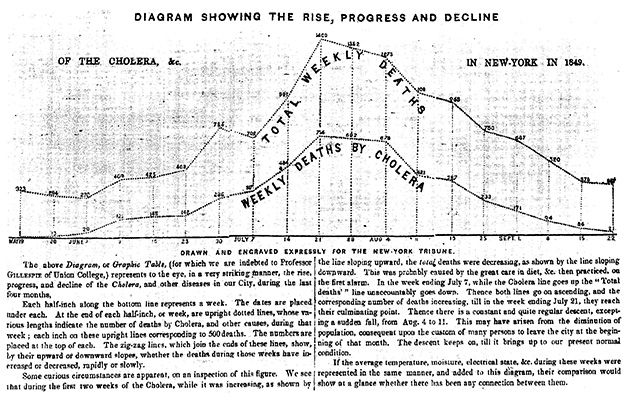
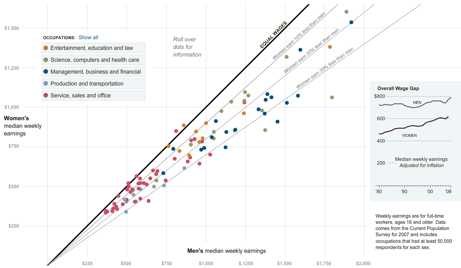
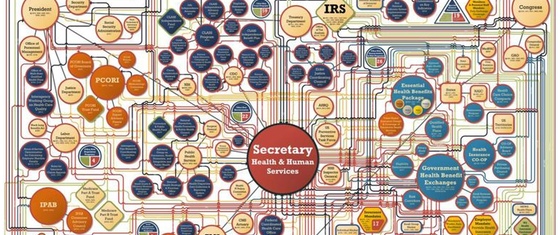
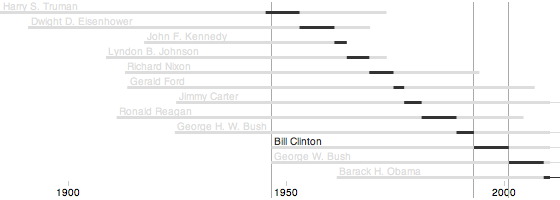
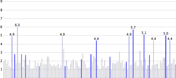
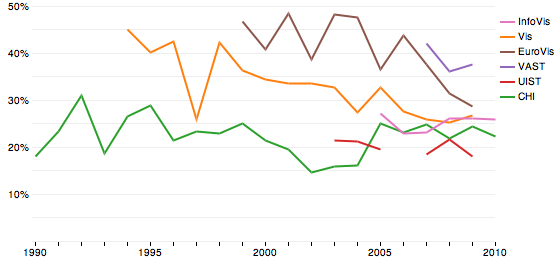
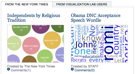
Social websites are all the rage right now, and are not just hyped by the media (MySpace and YouTube in particular), but there are also large amounts of money involved (again, MySpace and YouTube). But does the social model make sense for data analysis and visualization? And will users play and interact with data the way they do with other media? Two websites were launched recently to find out: Swivel.com (defunct as of late 2010) and Many Eyes. Here is a first review, looking at the two sites in terms of their founders, approach, social aspects, technology, capabilities, broad appeal, and ethics.

List of Influences: Chaomei Chen

The second list of influences is by Chaomei Chen. He is an associate professor at Drexel University and the editor-in-chief of the Information Visualization journal. He has also authored or co-authored six books, the most recent of which is Information Visualization: Beyond the Horizon. His research interests include the visualization of social networks in general and co-citation networks in scientific publications.

An Uncanny Resemblance

A user in a thread on MetaFilter that linked to the US ZIPScribble Map pointed to a drawing that has an uncanny resemblance to the map: Saul Steinberg's Hen. The bloggy thing of course would have been to just take the image from somewhere and put it next to the map to show it. Instead, I asked for permission. You can probably guess how well that worked.

Presidential Demographics

With Hillary Clinton and Barack Obama being likely Democratic candidates for the 2008 presidential elections, it is time to look at the demographics of US Presidents over the years. The following diagrams compare their sex, race, and faith with the whole population in 2001.

Improved US ZIPScribble Maps, more Countries to Come

The ZIPScribble Maps of the US obviously hit a nerve, with over 55,000 unique visitors in about two weeks, and more than 70 comments. There was also some criticism, especially regarding some slight problems with coloring the states, and that some of the dividing lines were not, in fact, state lines (and that it was not easy to compare them to state lines). For reasons of convenience, I had also left out Alaska and Hawaii, and there were requests for similar maps for more countries. The US maps have just been updated to solve almost all of the above problems (except for AK and HI, which are included in separate maps for now), and ZIPScribbles for several other countries will be published in the next few days. An interactive version is also in the works.

List of Influences: Pat Hanrahan

Since Pat Hanrahan was part of the reason for starting this project, it was only fair to ask him first. I also didn't get all the titles written down that he mentioned, so there is also a practical reason ...

Series: Lists of Influences

Ever wondered where the successful visualization researchers take their ideas from? How they got to know all that stuff that they draw from? What made them work on a certain project? Well wonder no more. EagerEyes.org brings you twelve lists of books, articles, and other things that influenced twelve researchers who influence us.

2006 (13 posts)

Information vs. Art at MCA Chicago

The Museum of Contemporary Art (MCA) in Chicago currently has an exhibit titled Massive Change: The Future of Global Design (Sep 16 to Dec 31, 2006), which talks about the use of resources, and shows efficient designs for cars, buildings that produce more energy than they consume, etc. The problem: it's not art. While the exhibit is certainly informative and important, it does not fit into an art museum.

The Travelling Presidential Candidate Map

While working on the ZIPScribble map, I started to wonder how to untangle the beautifully scribbly lines, and finding the shortest path through all ZIP codes. In computer science, this is called the Travelling Salesman Problem (TSP), and so I decided to make this the Travelling Presidential Candidate Map.

The Visual Mapping of Poetry

Visualization people often talk about mapping. Mapping is the process that translates data into a visual representation, and the main challenge in the visualization of abstract data. A good mapping is one that leads to insights into the data, while a bad mapping does not. It is important, however, to keep in mind what the purpose of the depiction is, or one runs the risk of applying the wrong standards.

The Loneliness of the Visualization Critic

At a panel discussion at Vis 2006, we were blasted for raising the question, Is there Science in Visualization? A senior visualization researcher said that he was embarrassed that this question was being discussed, and that we were trying to push our way of doing things on the community. The panel was still a success, but this proved just how far we still have to go.

Sets of Possible Occurrences

Visual representations of time are particularly interesting, because they seem so logical. A point in time is a point in the visualization, an interval is a line. But things are not always that simple: planning and temporal uncertainty require more powerful visual tools. Sets of Possible Occurrences (SOPOs) are an example of a visual representation of time that is very flexible and powerful – and totally unintuitive.

When Informative Art Isn't

Making visualization more aesthetically pleasing is certainly an important goal. Another one is to make visualization a part of our everyday lives. Ambient information displays are a way of doing both, and they are often inspired by pieces of art. But what if the viewers think they are just looking at a picture, and don't realize that it presents information to them?

Women in IT - Squaring the Pie?

Pie charts are a ubiquitous way of showing percentages. But while we can see differences in angles quite well, reading the meaning of the difference is another matter, so for precise data, we still need the numbers. A little known variant of pie charts is not round, but square, and can be read with an accuracy of one percent. We will look at data on women in information technology using this method.

Visualization Criticism - A New Way of Thinking about Visualization

The main means of communication in science is the (printed) journal article or conference paper, which only contains text and static images. This limits the way we can illustrate change, interaction, and dynamics. We do not have the appropriate language to effectively describe our work not only in terms of what it shows, but how and why it works. We also lack a means of talking about our own and others' work in ways that critically reflect on what has been done. We need to learn from art criticism, where this is all possible.

She Blinded Me with Eye Candy

The winner of the 2006 Science and Engineering Visualization Challenge (organized by Science and the National Science Foundation, NSF) shows "five well-known mathematical surfaces, rendered as glass objects in a highly realistic 'Still Life.'" Using reflection, colored lighting, and otherwise unstructured sufaces makes for an image that does not convey the actual shapes particularly well. But it sure is pretty.

iTunes (Music) Store Billion Downloads Visualization

On February 23rd, 2006, Apple's iTunes Music Store (iTMS, now called the iTunes Store) sold its one billionth song. In the days leading up that event, Apple had a countdown on its webpages, which provided interesting information about the download habits of its customers. This page provides a visualization of the collected data, as well as of data that others collected leading up to the 100 millionth and 500 millionth downloads.

Taking Visualization to the Next Level

Visualization is the visual communication of information - at least the way the term is understood in computer science. But in many ways, visualization is today mostly technical, empirical, and there is practically no theoretical foundation for what we are doing. There are also obvious connections with psychology, design, art, aesthetics, etc. This website tries to pull them all together and start making connections to push visualization to the next level.