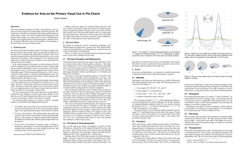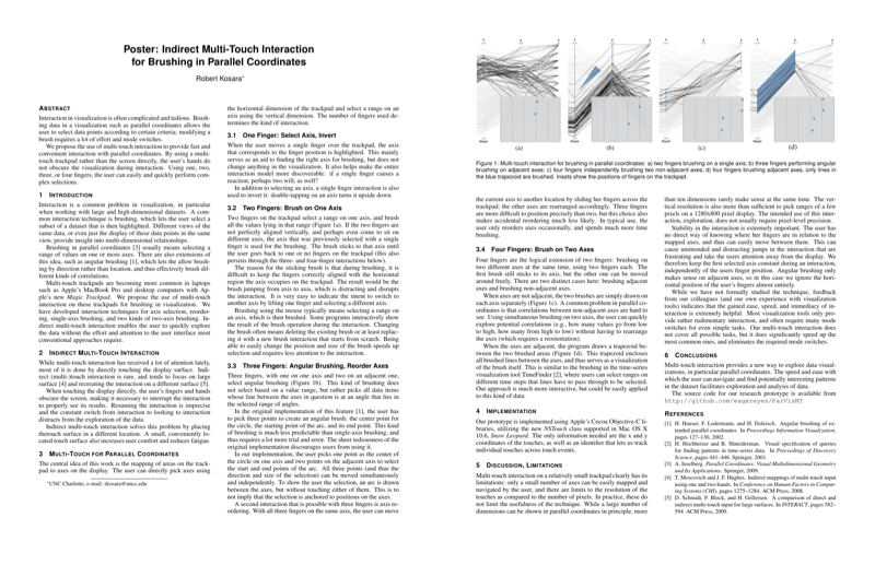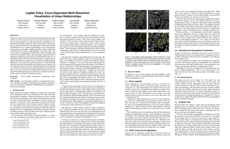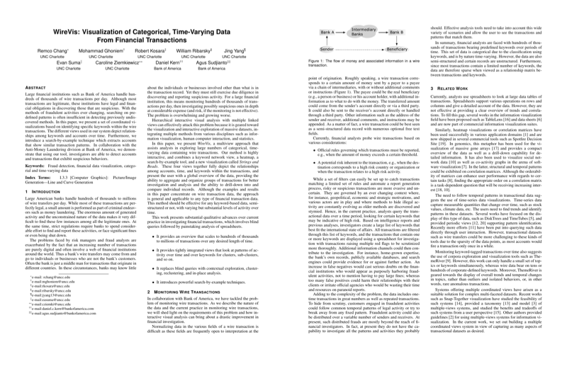
Business Data Visualization, Beyond the Boring
Business uses of charts and visualizations, and by extension business users, are usually considered mundane and boring. But they, too, want to get their audience's attention, emphasize a point they're making, or simply break out of the monotony of the limited palette of common chart types. I believe that there is ample opportunity to develop new approaches and build better tools that go far beyond the current one-size-fits-all approach to creating charts - much more than is currently recognized… [More]
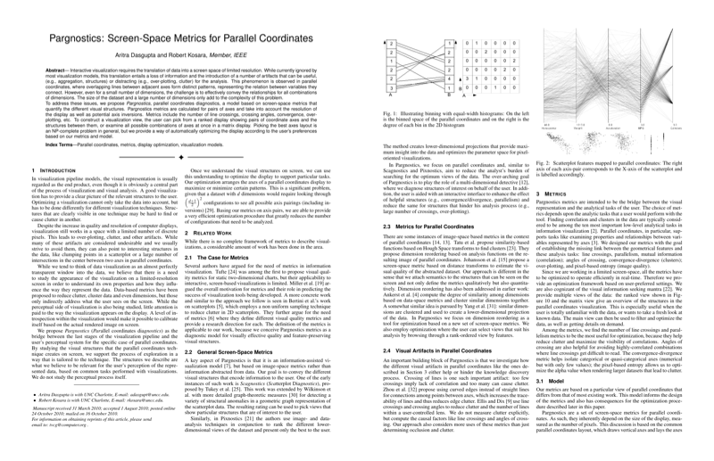
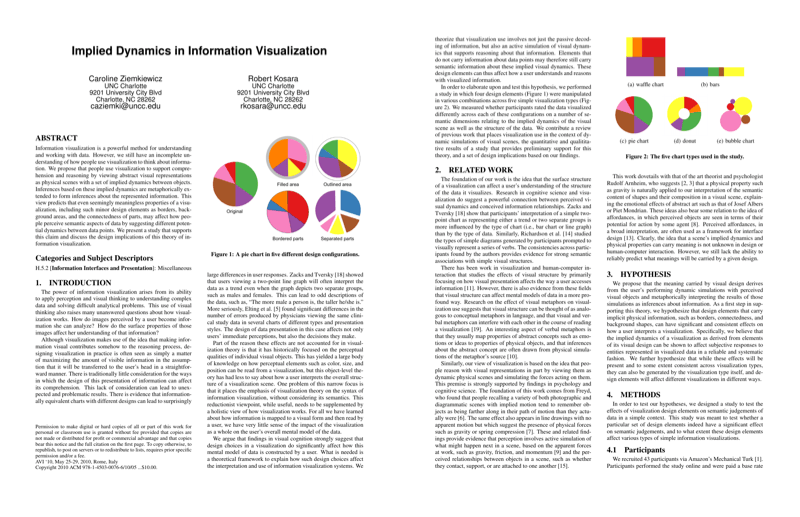
PDF DOI