Exploring the connections between companies with They Rule by Josh On – A Chart Appreciation
How do you turn the public – but boring – information about the board members of publicly-traded companies into a compelling interactive visualization?
How do you turn the public – but boring – information about the board members of publicly-traded companies into a compelling interactive visualization?
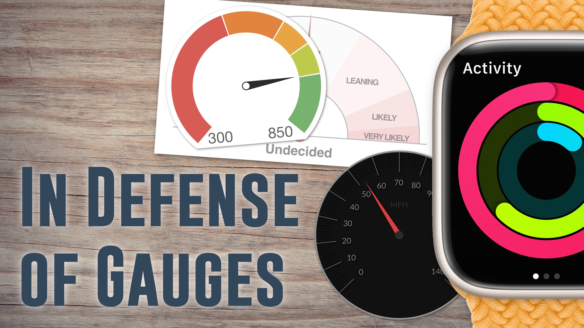
Gauges (or dials) are used to show numerical values, but they're not very well regarded in visualization. I believe that they can work well when used the right way, though. They're also similar to circular bar charts, which also work best when used in a part-to-whole setup, like in the case of the exercise rings on the Apple Watch. Finally, I talk about the infamous New York Times election gauge, also known as "The Needle," and why I think people reacted to it so poorly.
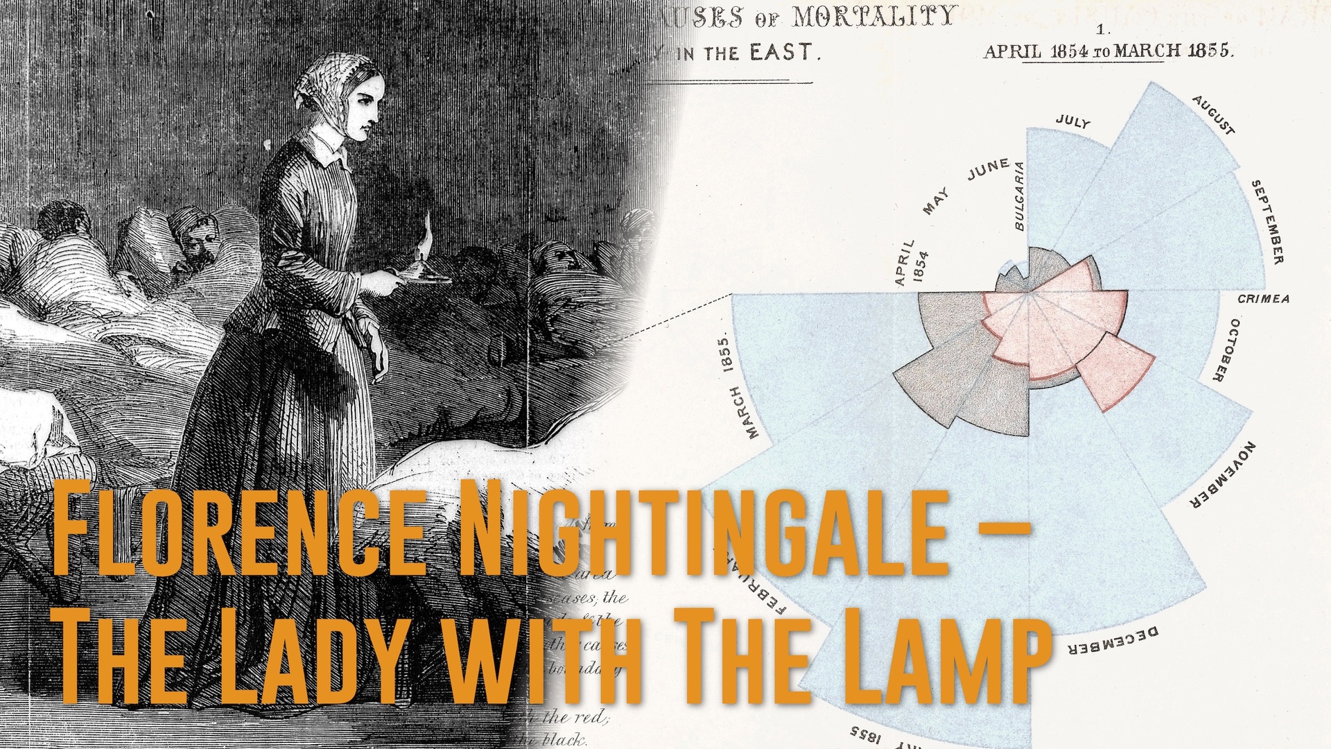
Why was Nightingale's famous rose plot not simply a bar chart? How do you know which chart type to use? Robert discusses examples of specific data viz techniques, why they were used, and how that can help you.
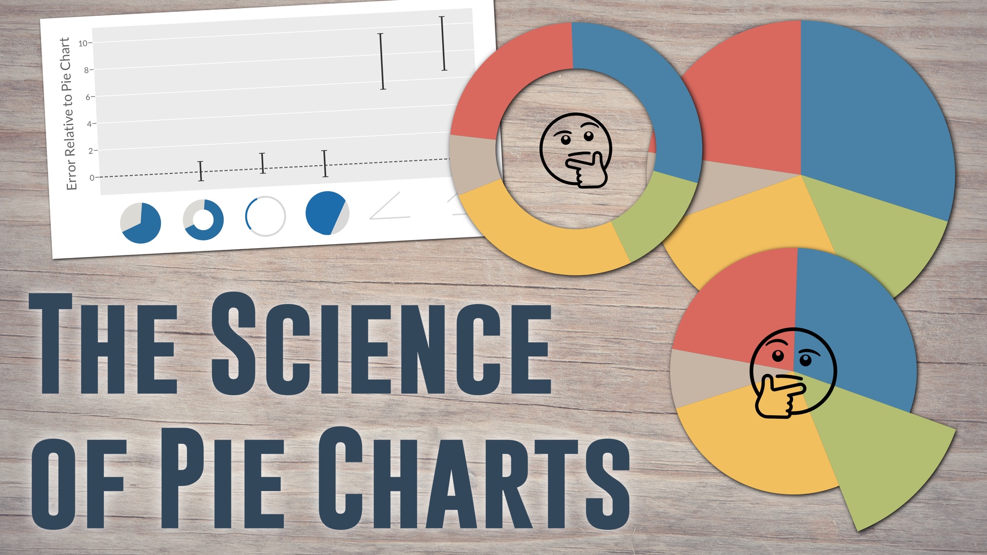
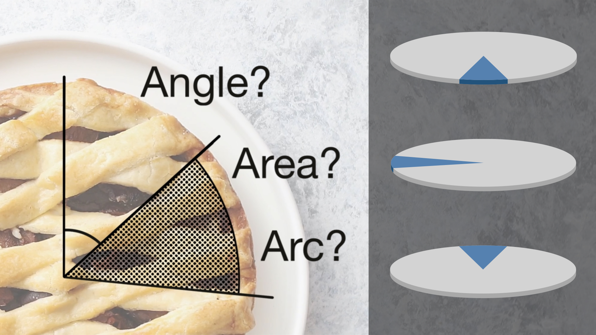
You've been told that we read pie charts by the central angle. But is that true? This video shows five reasons why we're not using angle, based on several studies on pie charts I've conducted over the years.
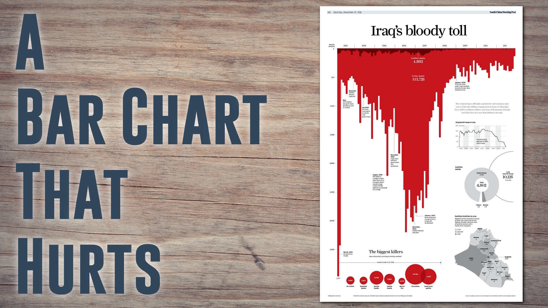
Simon Scarr's news graphic "Iraq's Bloody Toll" has become iconic. It's one of the few bar charts that don't just show number, but hurt. This is an appreciation of this incredible piece. I make connections with other charts and talk about relevant recent research.
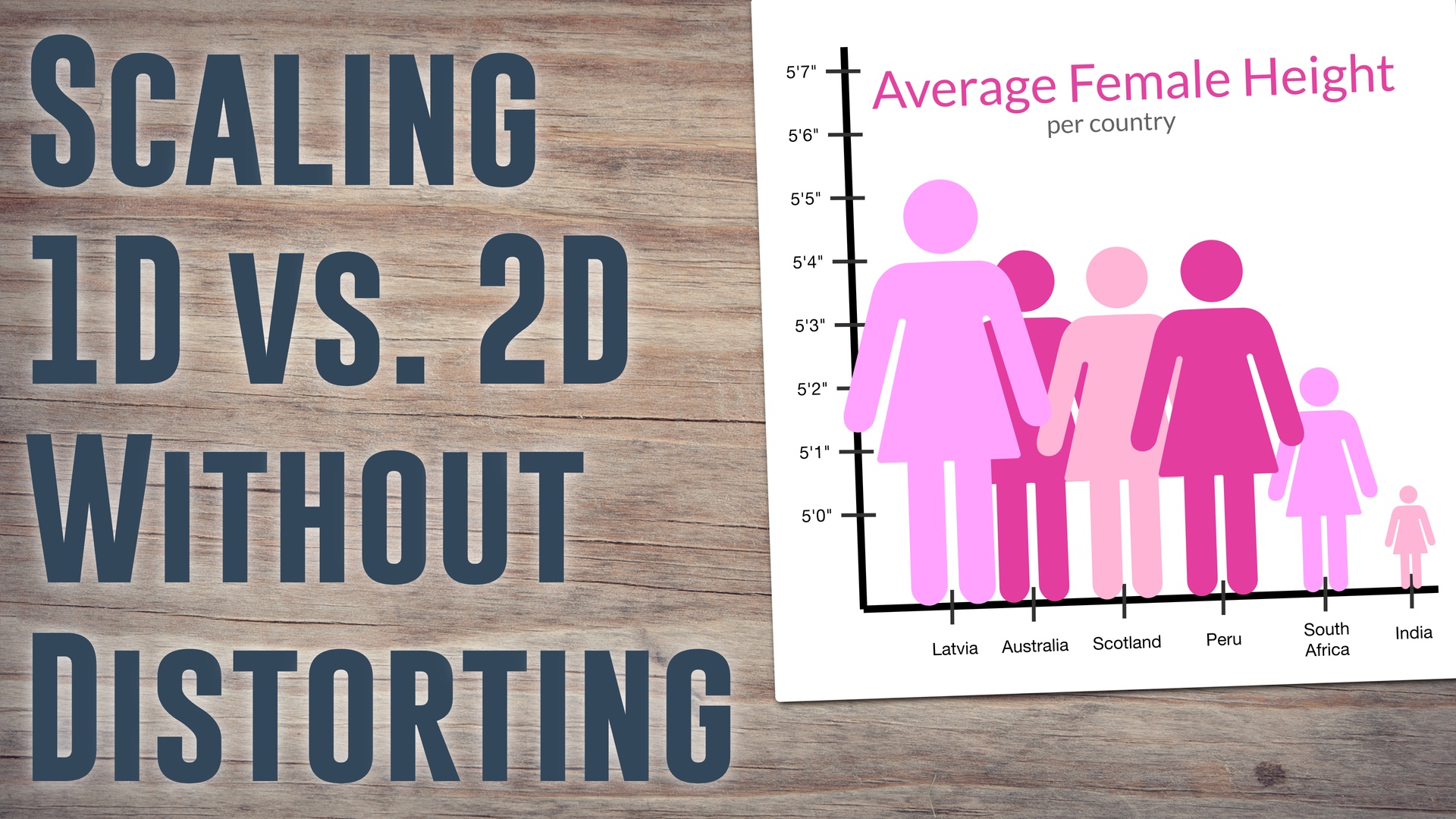
Ever come across an infographic that looks wildly distorted? How does this happen? It can be obvious in some cases, but it's not always quite so apparent what is going wrong. In this video, I talk about the pitfalls of linear and quadratic change when dealing with pictorial bar charts and circular wedge shapes like the Nightingale rose plot.
How does Nightingale's famous rose plot (often erroneously called 'coxcomb') work? What made her choose this strange chart shape? Did it work? And who was Florence Nightingale, anyway?
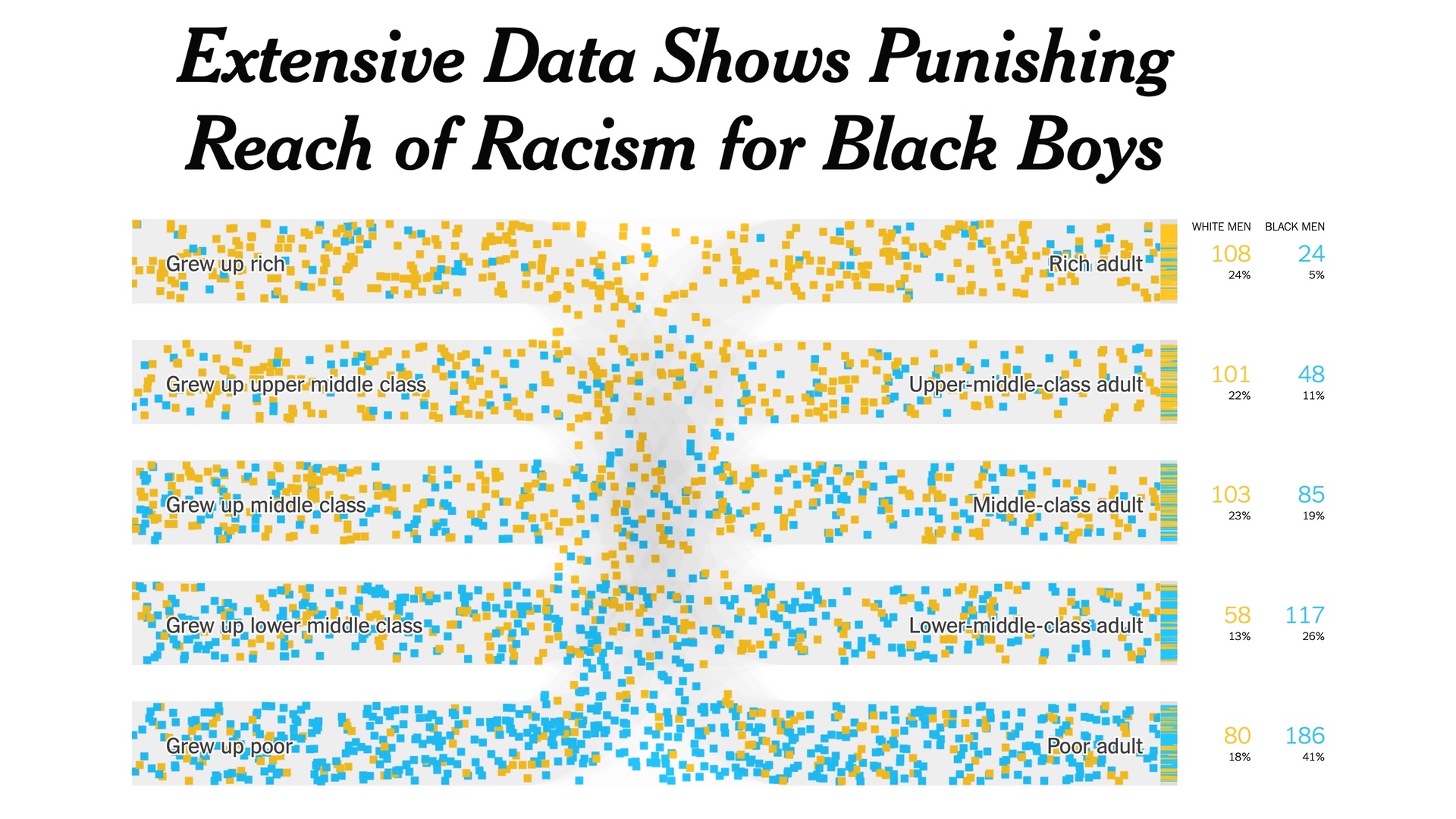
An appreciation of a few charts about the devastating impact of racism on the incomes, incarceration rates, etc., of Black men. They were part of a 2018 article in the New York Times by Emily Badger, Claire Cain Miller, Adam Pearce, and Kevin Quealy, titled: Extensive Data Shows Punishing Reach of Racism for Black Boys
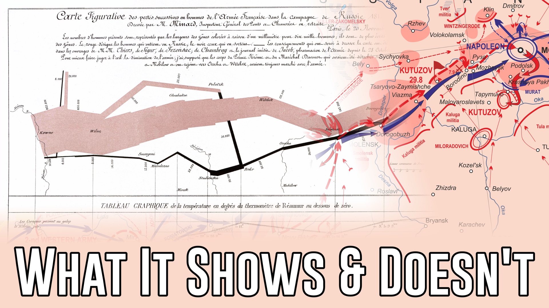
This chart is a staple in every visualization course and many visualization talks. But what does it show, and what does it leave out? There's a lot more to Napoleon's Russian Campaign and to Charles Minard's work than this one chart.
How do you turn line charts into a compelling argument? This piece by by Eric Roston and Black Migliozzi shows us how.
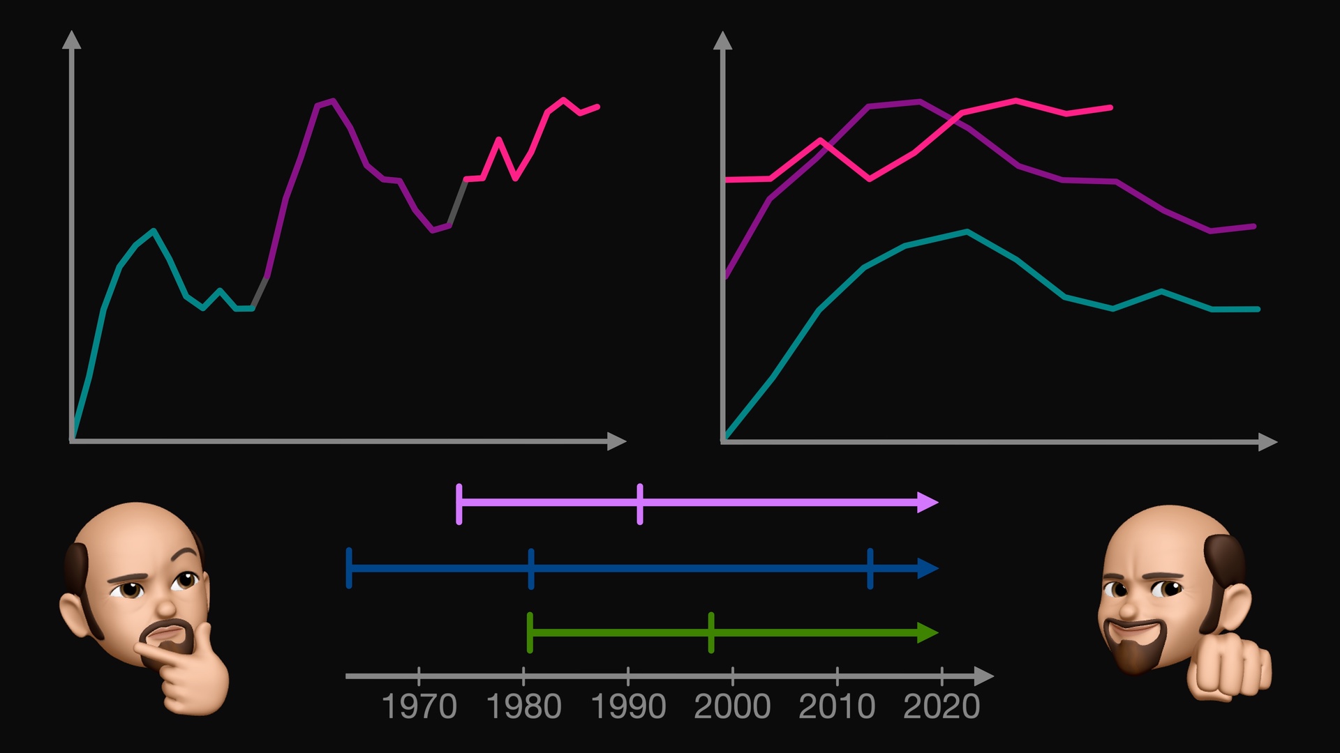
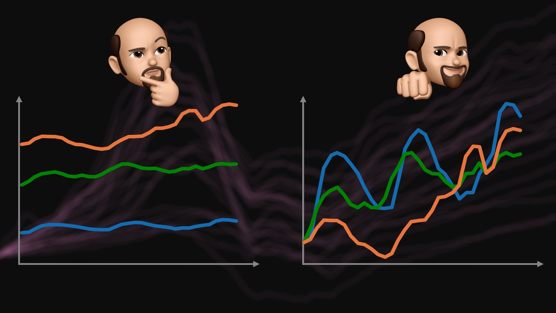
Index Charts that transform the vertical axis are pretty common, but what about indexing on the time axis? That's actually done quite a bit too, even though it's not always obvious. I talk about what indexing on the time axis means, discuss regular and irregular time indexing, and show examples from home price data, camera sales, climate change, and more.
Index Charts show your time series relative to a reference point, which lets you more easily compare them. I describe how they work and show a few common examples, like the Case-Schiller Home Price Index, and how you can re-index them.
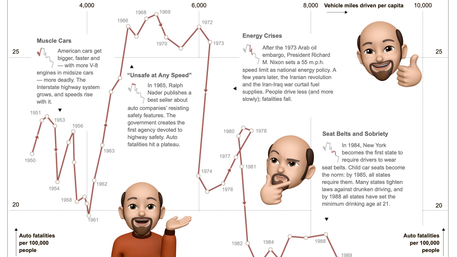
This is the first in a series of videos going into great detail on specific charts or news graphics. The first one is on a piece by Hannah Fairfield in the New York Times from 2012, called Driving Safety, in Fits and Starts. It uses a rather unusual visualization technique called the connected scatterplot and makes great use of it to show how cars have gotten safer over the years.
Visualization turns data into images, but are images themselves data? There are often claims that they are, but then you mostly see the images themselves without much additional data. In this video, I look at image browsers, a project classifying selfies along a number of criteria, and the additional information stored in HEIC that makes things like portrait mode and relighting possible.
We all use data all the time, but what exactly is data? How do different programs know what to do with our data? How is visualizing data different from other uses of data? And isn’t everything inside a computer data in the end?
How do we read pie charts? This seems like a straightforward question to answer, but it turns out that most of what you’ve probably heard is wrong. We don’t actually know whether we use angle, area, or arc length. In a short paper at the VIS conference this week I’m presenting a study I ran to answer this question – a study using 3D pie charts!
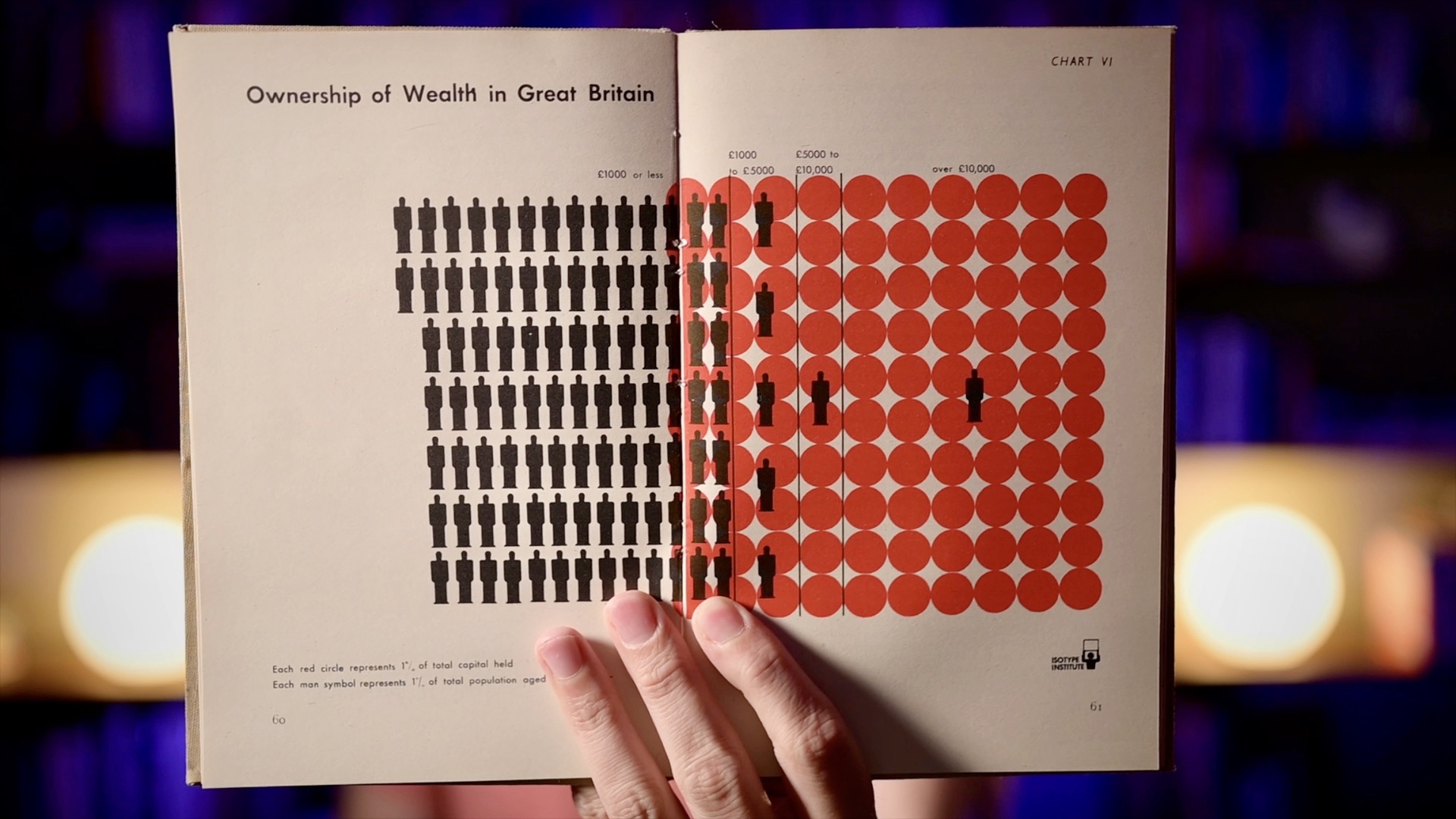
Charts usually show values as visual properties, like the length in a bar chart, the location in a scatterplot, the area in a bubble chart, etc. Unit charts show values as multiples instead. One famous example of these charts is called ISOTYPE, and you may have seen them in information graphics as well. They’re an interesting family of charts and they seem to have some unusual properties that most other charts don’t have.
When dealing with large amounts of data, we often use summary statistics like average, median, standard deviation, sum, etc. They’re useful because they actually hide data, they reduce the amount of information we need to look at to give us a sense of the data. But the same averages and can describe datasets that look vastly different.