
Seven Visualization Talks That Terrified Me At CHI
This is a guest posting by my Tableau Research colleague Michael Correll.
I recently attended CHI 2018 in Montréal, QC. Normally conferences leave me excited for the next idea or the next direction (and also physically exhausted). This was one of the first where I was left feeling terrified: A lot of the work did an excellent job of highlighting core problems about our assumptions as visualization researchers, and poked at big intractable issues that I had mostly been ignoring for a long time. There were also exactly 666 accepted papers, which is not a good omen either.
Of course, there was lots of other interesting vis work at CHI (they even let me give a couple talks this year), but these were the talks I was pondering on the flight home.
1. User engagement and user engagements: the data of online dating
Plenary by Christian Rudder
This was a talk by the ex-CEO of the dating website OKCupid, who talked about the data that he had gathered as part of engineering his site (it seemed to be mostly taken from his work from his blog and his 2015 book Dataclysm). This was a rather tone deaf talk (at least two people on twitter described it as a “garbage fire”) which had a lot of good examples of what not to do if you’re talking about sensitive issues like gender and sexism and dating and engineering big social platforms. For instance, don’t refer to “guys” vs. “females,” really consider if you need a slide with a picture of a woman in a bikini in it, and maybe have a better answer when pressed about ethics than to say “what do you mean, ‘ethics?’.” I was honestly pretty uncomfortable during this talk, and walked out before the Q&A. A large number of folks from the #CHIversity meetup wrote an open letter and gave a speech addressing the issues with the plenary talk in a much more articulate and thoughtful way than I just did.
But this post isn’t about bad talks, it’s about terrifying ones. Rather serendipitously, my light reading on the flight over was Cathy O’Neil’s excellent book Weapons of Math Destruction. Dating websites are exactly the WMDs that O’Neil described: they are opaque (you don’t necessarily know why you got matched with someone), they have to scale to millions of people, and they end up treating people like exemplars of some larger aggregate group, with dire outcomes for the people who slip through the cracks. I wasn’t satisfied with the steps that OKC seemed to take to address issues like racial bias, making people feel safe on the platform, and supporting people who don’t fit in the aggregate categories into which they were placed by the cruel hand of Data.
But what tipped this over into scary was that the academic community seemed to have had very little impact on how this enormous, impactful system was designed and run. Here was an entire conference of people who are paid to think deeply about designing for people, and supporting inclusivity in design, and they had no input on this massive store of human-centered data with millions of human-centered consequences. The incentives of a company running a dating website in terms of the users they want to have, and how they want to interact with the site, and how much they are willing (or unwilling) to shape human behavior, are often fundamentally at odds with what I consider to be the “right” way to design systems, but why would a company hire somebody like me to fix it, if it doesn't impact their bottom line? How do academic and critical voices make themselves heard in Silicon Valley (and elsewhere)? How do we fight the short-term profit motive (and win)?
2. Frames and Slants in Titles of Visualizations on Controversial Topics
Ha-Kyung Kong, Zhicheng Liu, and Karrie Karahalios.
Now that the plenary is over, I get to talk about talks that I liked. Still terrifying, though. This work looked at how people can use the titles of information visualizations to alter the message and rhetorical framing of visualizations. For instance, the U.S. defense budget is increasing in terms of dollars spent, but decreasing in terms of percentage of the U.S. GDP. Are we spending too much, or too little? Is the situation improving, or getting worse? The right title can highlight the intended message, e.g., “No more increase for war.”
There are some neat findings, and some new terminology for the ways that people can frame identical data to match their prior beliefs, but what was terrifying was the result that not only will people recall the content of a visualization differently based on the slant of the title, but that people will often not remember the title in any great detail. That is, the title seems to influence what people get out of the visualization, but is itself not worth remembering. If this is a general pattern, that’s a big problem: it suggests an “undetectable” way of manipulating people. I would like to see a replication or two here, and see how strong and robust this effect really is (does it survive where there’s less ambiguity in the message of the data, for instance). However, given this work, and Cindy Xiong, Lisanne van Weelden, and Steve Franconeri's “The Curse of Knowledge in Visual Data Communication,” from VIS last year, we’re starting to see more and more empirical evidence that the kinds of framing and rhetorical concerns that researchers like Jessica Hullman and Nick Diakopoulos have been talking about for years have real, potentially nefarious impact on how data are consumed and internalized.

The Prophets by Richard Ibghy and Marilou Lemmens, showing sculptural visualizations of economic indicators, on display at the Musée d'art contemporain de Montréal.
3. Investigating the Effect of the Multiple Comparisons Problem in Visual Analysis
Emanuel Zgraggen, Zheguang Zhao, Robert Zeleznik, and Tim Kraska.
The University of Washington’s Interactive Data Lab wrote a nice medium post summarizing this article, but I highly recommend that you read the paper if you’re a designer or user of a visual analytics system. The gist of it is that we often give people visual analysis tools that let them continually drill down into the data, split into categories, filter out subsets, drill down again, and then finally make a conclusion. If the data set has enough facets, and enough noise, we’re guaranteed to see something that looks interesting, even if all we’ve done is pick out the noise. If there’s no way to tell apart the signal from the noise, then a lot (and in this work, the majority) of our “insights” are going to be spurious.
Since visual analytics tools rarely convey uncertainty or statistically validate the (often implicit) insights we get from the data, how can we be sure that we’re not just seeing junk? If (like me) you are on a mission to democratize data analytics, this paper should make you think hard about how much we should be able to trust our users. Later in the week, Albrecht Schmidt, presenting Greis et al.’s Uncertainty Visualization Influences how Humans Aggregate Discrepant Information, was more forceful: people often hide uncertainty information because they think that users are stupid, and “users aren’t stupid!” I agree with him that we should give users the information to let them determine whether their insights will survive in the cold light of day. But, then, there’s the issue of how much complexity and statistical depth we can throw at a user before they bounce off our design completely. And a related issue of how to encourage skepticism in the face of a society that all too often conflates data with truth.
4. The Other Side: Algorithm as ritual in artificial intelligence
Kieran Browne and Ben Swift (artist’s statement)
This was an alt.CHI talk. alt.CHI is the parallel track for outré or avant-garde or just plain out there work. The thesis was that, much as with Clarke’s third law, “any sufficiently advanced technology is indistinguishable from magic:” we treat all sorts of devices superstitiously, because we lack a robust enough mental model of what the technological artifact is actually doing. This work highlights this problem by instantiating the output of a neural net in an Ouija board, and conducting a data séance. Literally. People help their hands over the Ouija board, the lights flickered, the works.
There’s an intense pressure to think of Machine Learning and AI as magic oracles that will give us the right answer, if only we give them enough data, and I find that dangerous. We need to focus on ways of breaking down complexity and demystifying algorithms. The séance illustrates just how tempting it is for people employ magical thinking when interacting with data, especially when using “black box” intermediaries like machine learning. This work dovetailed nicely with a later (and less tongue-in-cheek) panel, “The Algorithm and the User: How Can HCI Use Lay Understandings of Algorithmic Systems?” which talked a lot about “folk” theories of systems, and whether designers need to support how their users think the system operates, versus how it actually does (and the feedback loop of machines learning about user behavior that was altered to try to please the machine).
5. The Dark (Patterns) Side of UX Design
Colin M. Gray, Yubo Kou, Bryan Battles, Joseph Hoggatt, and Austin L. Toombs.<
In 2010 or so, Harry Brignull introduced the notion of “dark patterns:” UX or UI designs that trick people for some nefarious end. For instance, websites that make the “unsubscribe” button tiny and hard to find, or that try to force you to reveal more personal data than you want to through confusingly designed opt-out forms.
This trend of evil UX seems to show no sign of stopping. Ad companies are hiring very creative people who are coming up with some very clever designs that make our lives worse. This work expanded Brignull's vocabulary, identifying some new dark patterns in UX that have emerged as the web moves away from the desktop. My “favorite” was a mobile ad for a shoe where the designer had put a picture of a fake hair over the text. The mobile user might perceive the hair as something that had fallen onto their screen and try to brush it off, inadvertently interacting with the ad. How can we win the race between malicious and helpful UX? How do we train or disincentivize people from doing adversarial design?
6. A Data-Driven Analysis of Workers' Earnings on Amazon Mechanical Turk
Kotaro Hara, Abi Adams, Kristy Milland, Saiph Savage, Chris Callison-Burch, and Jeffrey P. Bigham.
The workers on Amazon’s Mechanical Turk have been the unsung heroes of empirical work in a lot of visualization papers for the past few years. One of their many advantages is that they are cheaper than in-person participants: they are used to doing microtasks for a few cents, so the longer macro tasks may only be worth a dollar or two. This study looked at how much Turkers actually earn, and it’s not a pretty picture. Because there’s so much noise, Turkers spend a lot of time just looking for a HIT they feel capable of doing, and then are paid very little once they actually do it (even assuming that the requestor doesn't reject their work).
It should feel icky that so much of our scientific work is based off an underpaid and exploited population. Projects like Turkopticon have tried to make these labor practices more visible (and make it easier for Turkers to filter out bad requesters), but all of the time sinks of looking for and then validating work add up to hourly rates that are much much lower than minimum wage (a median of just $2/hr). The past few years I’ve been reporting my target hourly rates for Turkers (and indicating whether or not we hit those targets) in my papers. I suggest that everybody else do the same, or at the very least establish just and reasonable norms for Turker compensation for research studies.
7. How the Internet has broken democracy, and what we can do now
Capstone by Sue Gardner
This talk was a welcome antidote to the keynote. Sue Gardner, a journalist and executive who has worked with the Wikimedia Foundation and the Tor Project and the CBC (among other places), talked about all of the ways that the modern internet has failed us in supporting democratic norms. You’ve likely seen most of the examples before, from Cambridge Analytica to Facebook’s connection to the genocide in Myanmar, but it was refreshing to put a name to the beast: “surveillance capitalism,” the big cluster of profit-motives and centralizations and market efficiencies that mean that companies are incentivized to take more and more of your data with less and less oversight, which opens it up to more and more potential for misuse. Gardner called for a digital equivalent of the Pugwash Conference, where scientists get together to try to ameliorate the apocalyptic consequences of the technology they helped to create.
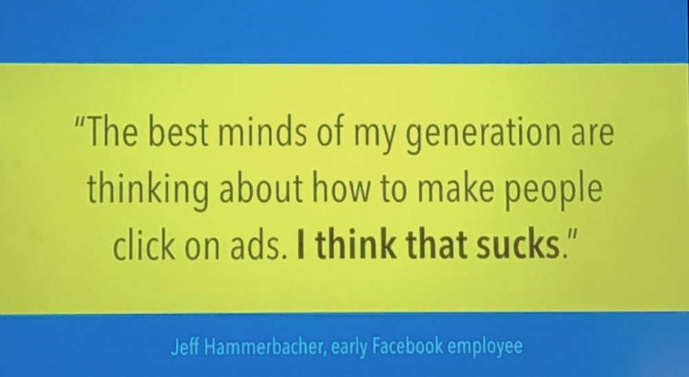
On twitter, Raya Sharbain from UCL pointed to a 2014 talk that was somehow even bleaker than this one, where Maciej Ceglowski called the problem “investor storytime,” or the promise that the targeted ad market will start being better, and you’ll really get to know your customers, if only you get just a little more data. That’s what visualization people promise, too: you will make the right decision if you have the right data. And, if you don’t, well, just get more of it. We need to teach people to be satisfied with less data, to handle and distribute data ethically, and to build visualization systems designed to protect rather than reveal. We also have to think about our ethical responsibilities as designers: we're never "just" engineers or scientists, especially when we work with real data for use by (and, often, on) real people.
Overall Impressions
There’s always a few vis papers at CHI, but this year there were enough that practically every time slot had a visualization or visualization-adjacent session to go to. That was good in that it meant that I always had something I wanted to see, but it made the vis folks at CHI seem less integrated with the main conference than they have in the past. It felt like we were a group of people attending a subconference rather than an intrinsic part of a big discipline. Another issue was that nearly every party or reception thought it would be thematic to serve poutine, and I think the human body is not meant to eat poutine more than once a month, at most.
CHI this year gave me a lot to think about. I think I’ve managed to get my existential terror down to a dull roar, but I’m still particularly worried how we, as visualization designers, empower people to do cool things with data while still trying our best to encourage people to act responsibly and ethically.
Michael Correll is Research Scientist at Tableau Software.
Posted by Robert Kosara on May 2, 2018.