• Skip to main content
  • Skip to primary sidebar
  • Skip to footer

eagereyes

Visualization and Visual Communication

  • Explore
    • Starter Pack
    • Blog Calendar
    • Blogroll
    • eagereyesTV YouTube Videos
  • Practical
    • Basics
    • Pie Charts
    • Techniques
    • Book Reviews
    • Journalism
  • Academic
    • Speaking Mistakes
    • Acceptance Rates
    • Papers
    • Conference Reports
    • Lists of Influences
    • Criticism
    • Peer Review
  • Admin
    • About
    • Contact
    • License
All Those Misleading Election Maps

Robert Kosara / November 2, 2016

All Those Misleading Election Maps

Would you make a bar chart where the length of the bar doesn’t actually scale with the number being shown? Would you draw a line chart with the lines all over the place, not where the values actually are? Of course not. Yet somehow, every single election map works like that.

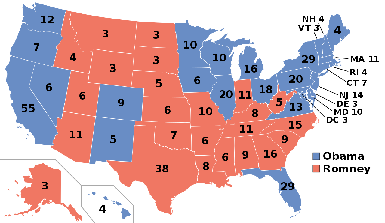
Look at this map from Wikipedia that shows electoral votes on the labels and who won each state. Tell me which candidate won the 2012 election. Don’t go with what you know, use the map that is supposed to show you the data and tell me: who won?

electoralcollege2012-filled


Let’s try something different. Here’s a bar chart of the number of electoral votes for each state. Like with the map, the label shows electoral votes, the bar’s length is the state’s area. Can you tell me which state has the most electoral votes? How many more does Texas have than Montana?

states-alpha

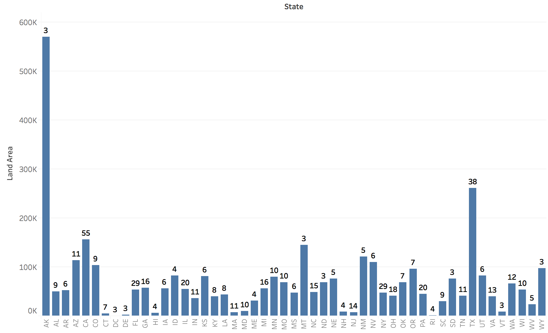
Not helpful? Of course, they were sorted alphabetically. Silly me! Let’s sort by area instead. Now, which one has the most votes?

states-sorted

That is exactly what happens with a map. The map shows you area: rocks, farmlands, pastures, prairie, etc. It does not show you people. It does not show you the immense difference in population density even between states – and it’s much more severe between smaller areas, like ZIP codes or counties. You can put all the labels on it that you want, a choropleth map will always show you area.

So what if the map doesn’t exactly show me votes, you say, how much of a difference could it possible make? How many square miles are there per electoral vote in the different states? Does that number differ in a meaningful way?

Why yes, it does. Alaska has a staggering 190,214 square miles per electoral vote, four times that of the next state, Montana! And it doesn’t stop there. California, which has the most electoral votes (55) has 2,832 square miles per vote – less than one in 67 compared to Alaska with its three votes (or 1 in 17 compared to Montana, same number of votes)!

All the way down the list, we find the District of Columbia, with 20 square miles per electoral vote. The factor between Alaska and D.C. is almost 10,000! Four orders of magnitude! And they both have the same number of electoral votes, too. Yet one is ten thousand times the size on a map, and it often gets distorted way beyond that due to the popular Mercator projection.

This is not a trivial difference, and there is nothing you can do to account for that difference other than not use a map. Transparency, blending colors, nothing will be able to account for a factor of 10,000 between what is being shown and what the data actually represents.

This is not a useful map. This is just a map because people like to see maps. But the way the information is shown is not meaningful, it is wildly distorted. All those millions of acres of open farmland tend to have different political views than the people in the dense cities.

Clearly, it’s too late for this election. And I’m sure I will get yelled at again on Twitter for being stupid (just like I was today). But perhaps this can sink in over the next year or two and somebody can design a visualization for future elections that actually represents the data it’s supposed to show.

Filed Under: Blog 2016 Tagged With: maps, Politics

Robert Kosara is Data Visualization Developer at Observable. Before that, he was Research Scientist at Tableau Software (2012–2022) and Associate Professor of Computer Science (2005–2012). His research focus is the communication of data using visualization. In addition to blogging, Robert also runs and tweets. Read More…

Reader Interactions

Comments

  1. Alex Cookson says

    November 3, 2016 at 2:09 am

    What are your thoughts on what I’ll call pseudo-maps — maps that distort actual area into reflect what they’re measuring? Here’s an example from 538 (bonus: it’s an election map): http://projects.fivethirtyeight.com/2016-election-forecast/?ex_cid=rrpromo#electoral-map

    Reply
  2. Pierre Dragicevic says

    November 3, 2016 at 2:21 am

    Perhaps a prism map? http://67.media.tumblr.com/d91b67abfdaf7407ed3f49cdd56c56db/tumblr_o6z242pbd71svtp5bo1_1280.jpg

    Reply
  3. Olha Buchel says

    November 3, 2016 at 5:30 am

    What about Dorling cartograms? http://mbostock.github.io/protovis/ex/cartogram.html

    Reply
  4. datachefs says

    November 3, 2016 at 9:48 am

    “This is not a useful map. This is just a map because people like to see maps.”

    I agree with the first sentence if your goal is to determine which candidate/party received the most votes. If that’s the case, this map won’t help you. But what if your goal is to see which state voted for which candidate? What if you want to see a regional pattern in the voting? I think it’s useful in those instances.

    And re: the second sentence, doesn’t the fact that people like to see maps suggest that we should find every way possible to use maps–better ones than this one, to be sure–to display data?

    Reply
  5. Bert Sperling says

    November 3, 2016 at 11:44 am

    Sorry Robert, you completely missed the point of the map.
    The map does a great job of identifying how states voted, and most importantly, allows the user to identify regional patterns.

    If we want to get deeper into the election data and analyze electoral voting, then let’s use more appropriate tools such as charts, tables and graphs.

    It’s all about using the right tool for the job.

    Reply
  6. Clément V. says

    November 10, 2016 at 6:48 am

    I guess that this map (link seen in Flowing Data blog) : https://www.washingtonpost.com/graphics/politics/2016-election/election-results-from-coast-to-coast/ is kind of useful and gives good insights on both geographic patterns and state votes.

    What do you think Robert ?

    Reply

Leave a Reply to Clément V. Cancel reply

This site uses Akismet to reduce spam. Learn how your comment data is processed.

Primary Sidebar

More Blog 2016 Articles

  • A Roundup of Year-End News Graphics Roundups
  • The Dumbest User Interface of 2016
  • When Rankings Are Just Data Porn
  • The EagerEyes Holiday Shopping Guide
  • The Problem with Vis Taxonomies

Recently Popular

  • The US ZIPScribble Map
  • New, Improved Traveling Presidential Candidate Map
  • The Travelling Presidential Candidate Map
  • The Interactive ZIPScribble Map
  • Data: Continuous vs. Categorical
  • Chart Junk Considered Useful After All
  • New video: Gauges for Data Visualization, The NY Times Election Needle, and Circular Bar Charts
  • Facebook
  • GitHub
  • LinkedIn
  • RSS
  • Twitter
  • YouTube

Subscribe via Email

Footer

  • About
  • Contact
  • License

Copyright © 2006–2022 Robert Kosara · All original materials are available under CC-BY-SA


Loading Comments...