The Semantics of the Y Axis
The vertical axis is not just important because it embodies one of the most important visual properties, but also because it is much more semantically loaded than the horizontal. Not only does the right choice of mapping help with reading a chart, it can also be confuse people if done wrong.
It's not a coincidence that the vertical is so important for us. An animal that is lying on the ground is dead or sleeping, that's important to know. Vertical movement is also much harder than moving in the other two dimensions, and fast vertical movements can kill us. That is why we overestimate heights: better be scared of a jump that isn't all that dangerous than taking it lightly and getting injured or killed.
We also have some very strong ideas about the vertical direction. Things moving up are generally good, things moving down less so. Being up (standing, walking, moving) is good, being down (lying, sick, dead) is not. We derive many of our metaphors from this fundamental difference too: being down meaning being sad, things looking up or moving up meaning they are good or getting better. Up also means more: more things being stacked or heaped up means more vertical space being used, and more is usually better, so more is up.
Jawbone UP's Sleep Tracking
Jawbone wrote a blog posting about when people slept during the soccer world cup according to the data they were gathering from users of their activity tracker armband. The tracker is called UP, which causes some interesting issues parsing the axis labels in these charts.
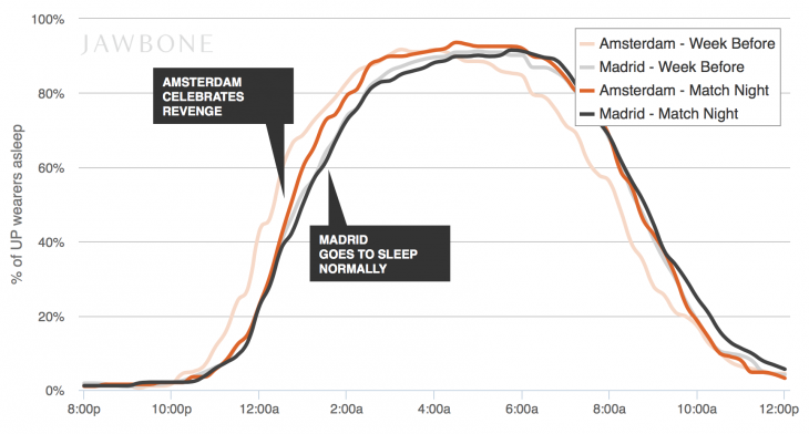
Parsing “% of UP wearers asleep” has you going back and forth between two interpretations: UP meaning people being up/awake, but then you read “asleep.” The number is encoded on the vertical axis as more people meaning the line going higher. So more up meaning more people asleep, fewer people being up. I remember some confused tweets from people struggling with this when this made the rounds.
Jawbone also seems to have noticed, since in their recent posting on the Napa earthquake, they flipped the axis to make the semantic connection easier to follow. Now it's “% UP wearers awake,” which makes a lot more sense. More up, more people are awake or, well, up.

The archetype of these visualizations, the New York Times' How Different Groups Spend Their Day also works like this: the bottom-most layer, and thus the baseline of sorts, is sleep. As it should be.
Which Quadrant
This chart of men's vs. women's earnings that I wrote about recently also uses the vertical axis in a simple, yet smart way. It has men's earnings on the horizontal axis, and women's on the vertical. That is the only way this makes sense, even if technically the other way around would be just as correct.

The difference is the message the majority of the points send. If women's earnings were on the vertical axis, those points would be in the upper left quadrant. Up is good, right? So where's the problem? Placing them in the lower left makes this much more obvious to read. The lines representing women making 10%, 20%, and 30% less also would be quite strange if they were to the top right of the main diagonal.
Bar Charts
I already wrote about this topic in the specific case of bar charts, but it bears repeating. Bars pointing down are unusual, and they grab the viewer's attention. They can help get a point across and help people read the chart more easily.

Larger numbers being up in line charts, bar charts, scatterplots, etc., may be the default in practically all visualization tools (and that makes sense), but it should not just be accepted without thinking about it. The vertical direction should be chosen with care, because it communicates a lot about how to read a chart. And getting it wrong can cause considerable confusion.
Posted by Robert Kosara on September 7, 2014.