The Three Types of Chart Junk
A recent posting on Dmitry Fadeyev's design blog got me thinking about decoration and chart junk again. Fadeyev talks about the Victorian obsession with ornamentation, but he could equally be talking about the way charts and infographics are often decorated. A short excursion to the 1850s might help shed some light on the issue of chart junk.
Product Design in the Victorian Age
Fadeyev uses some illustrations from the catalog of the 1851 Great Exhibition in London, which is available from Google Books. Victorian design was incredibly ornamental and decorated, and that included everyday objects. The Victorian idea of a properly decorated home was that there would be no empty spaces. A bare wall was unthinkable, there had to be something there: a pattern, a mural, anything but a single color.
Fadeyev uses this stove to illustrate the obsession with ornament. Besides the intricacy of the decoration and amount of effort that must have gone into it, it also strikes me as incredibly impractical. I guess part of showing your status was not just the ornaments on the stove, but the matching set of servants that would keep all the little leaves and figurines clean und dust-free.

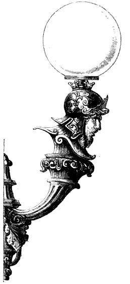
What caught my eye in particular, though, was this gas lamp. All I could think was, why? Why a guy with a helmet on a lamp? What's the point? At least in this case, I don't see the decoration interfering with the function of the lamp. Still, I don't get it.

The catalog has a few more gems, but what inspired this posting is this set of a "silver fish-carver and fork."

Fadeyev points out the way the decorations are not just added on here, but are woven into the functional parts of the object. But more than that, the decoration actually interferes with that function. Look at the fork's tines and the way they point outward: this doesn't look like it actually works very well. Also, things will easily get stuck in the little hooks at the bases of the tines. The knife has a similar problem, though it may not matter so much depending on how much the design on its blade sticks out.
Back to Chart Junk
The modernist movement that was largely inspired by opposition to Victorian design (and also mass-produced goods that needed to be simpler) might have coined a term for these ornaments: design junk. But even though they did not, they despised any unnecessary flourishes and ornamentation. Decoration is sin.
So the way I see it, there are three types of chart junk:
- Useful junk. This includes all the parts of a graphic that do not convey data, but that carry useful or interesting context. In an infographic, this is what makes the infographic work. In a visualization, this may be annotations, explanatory text, etc.
- Harmless junk. This includes parts of a visualization or infographic that do not convey data and also don't help understanding, but also don't get in the way. If you add a pretty picture next to the chart that doesn't interfere, or if you insist on an elaborate border around it. A lot of chart junk falls into this category.
- Harmful junk. The kind of chart junk that actively interferes with reading and understanding of a visualization or infographic. This includes elaborate graphics that hide the true end of a bar, busy background images, etc.
Next time you see an infographic or a visualization that includes seemingly extraneous elements, ask yourself: is this the guy with helmet on the gas lamp (harmless), or is it the fork with the outward-pointing tines (harmful)? Or, perhaps, is the junk even useful?
Posted by Robert Kosara on March 4, 2012.

